Brown kitchen in an interior (120 + Photo) - Successful combinations for Smart ideas
 - Successful combinations for Smart ideas")
In the past few years, many tones have emerged as “new neutrals”. However, one of the most neglected and undervalued tones in decorating is now coming to the fore, it can make an excellent neutral scheme - or be strong enough to make a real statement. Yes, brown is not usually considered the most original choice, but it makes its way into modern interiors.
Content:
Associations associated with brown are autumnal, natural, have an organic feeling that is guaranteed to bring some welcome warmth to your space. He has a huge variety of colors inside. Rich mahogany brown can make a statement, but soft pale brown, parchment-colored or milky coffee, can create a soft, welcoming backdrop for paintings, of furniture, details.
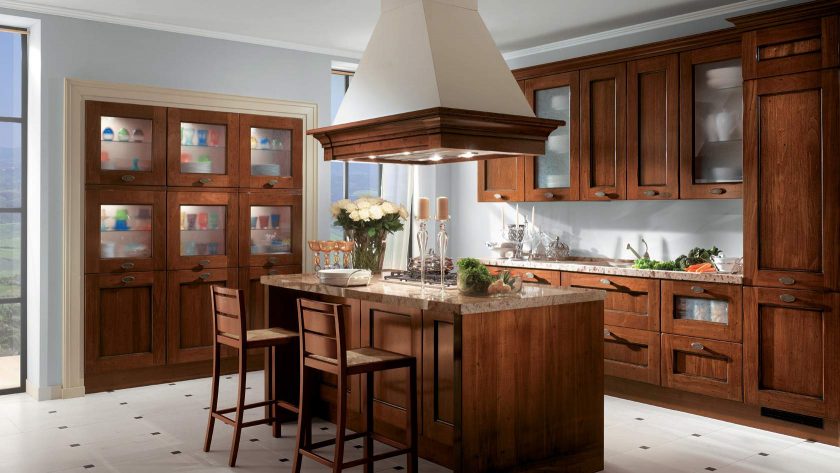
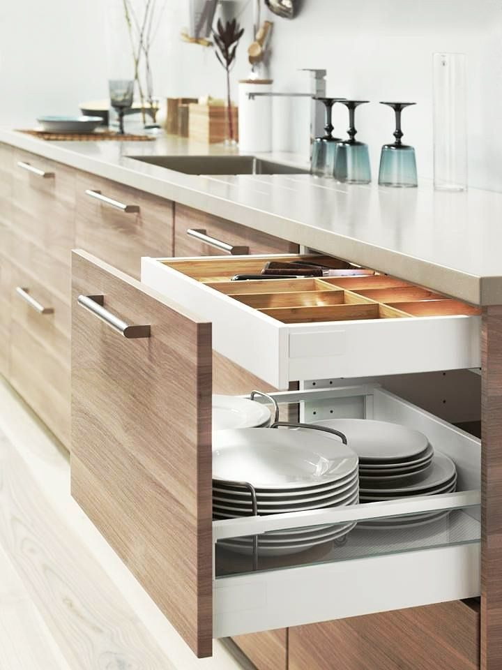
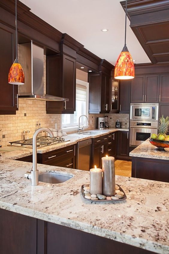
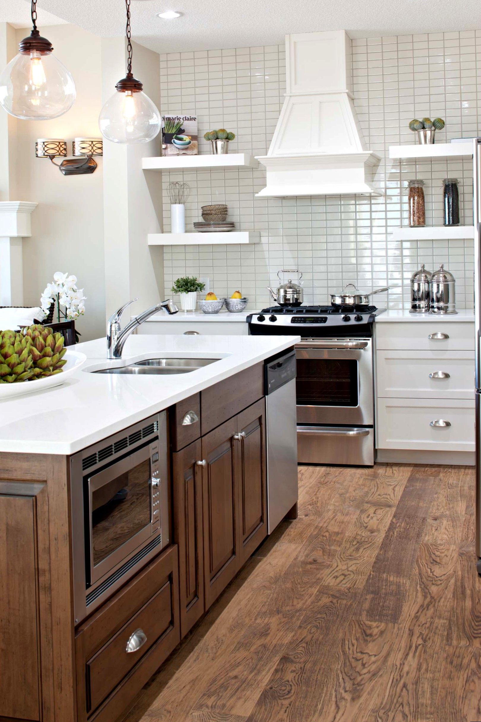
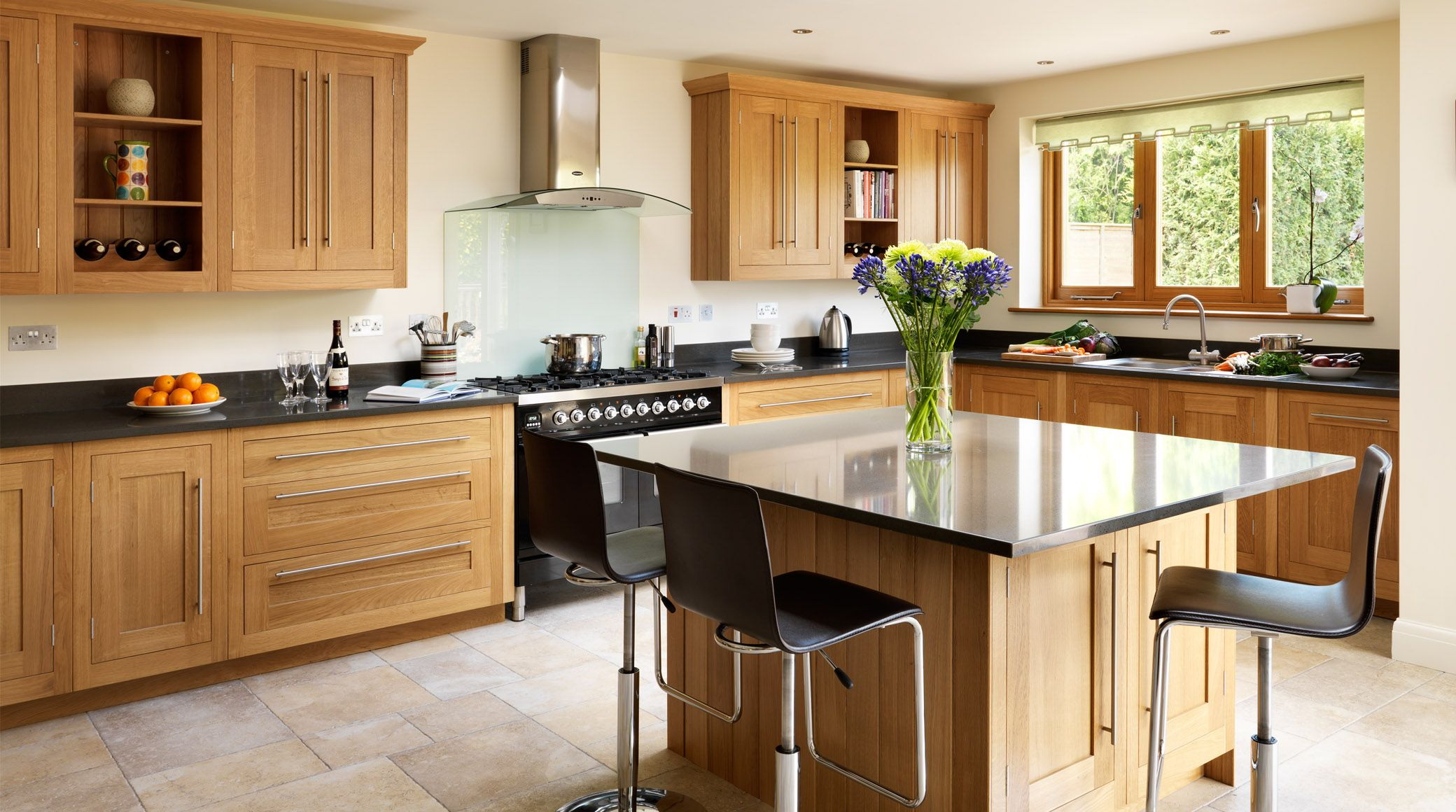
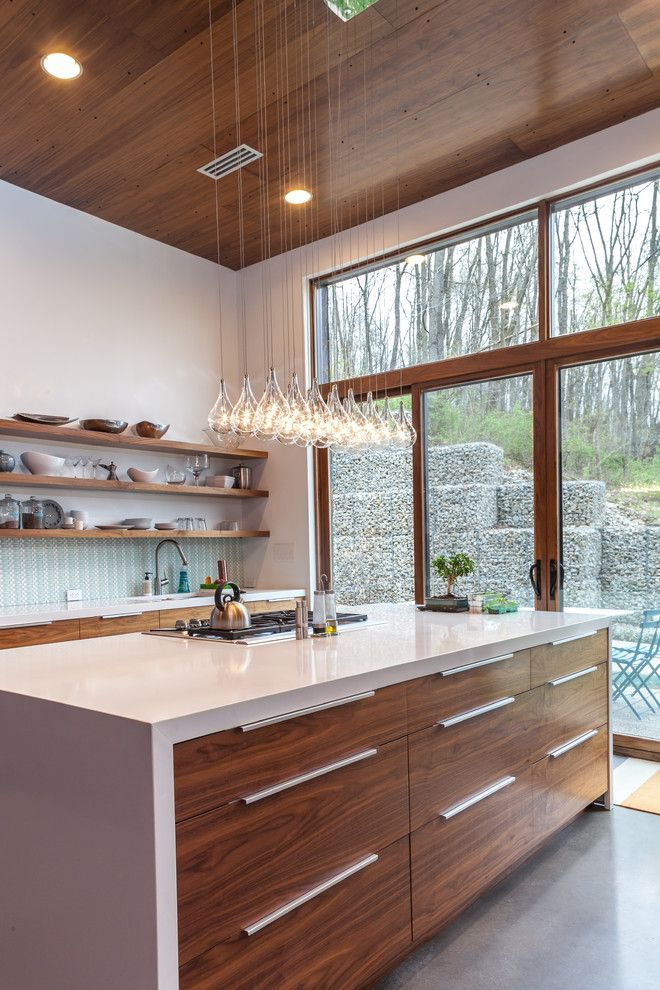
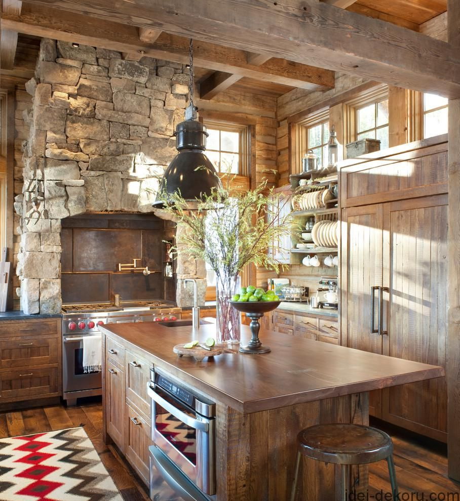
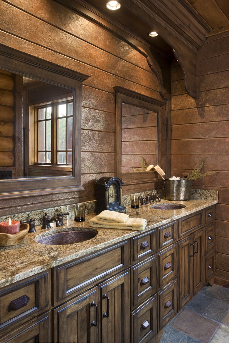
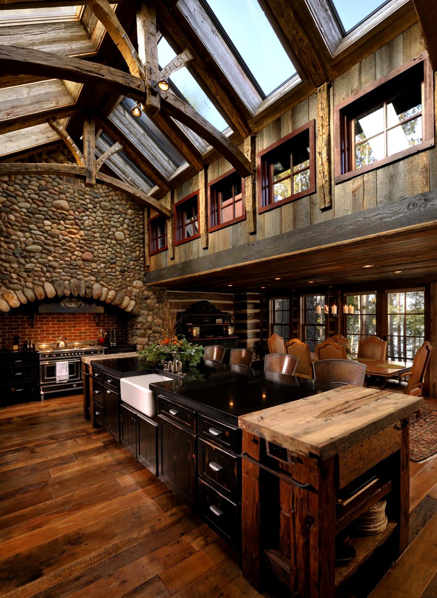
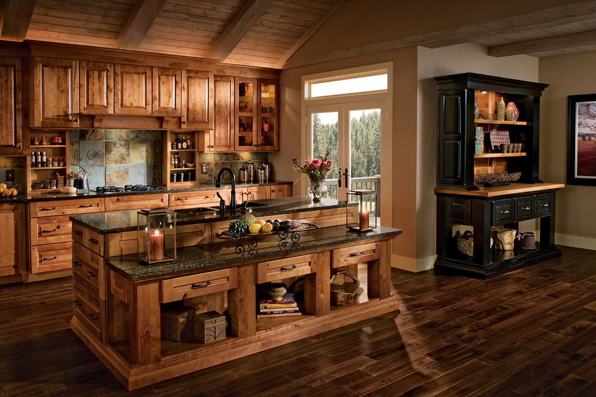
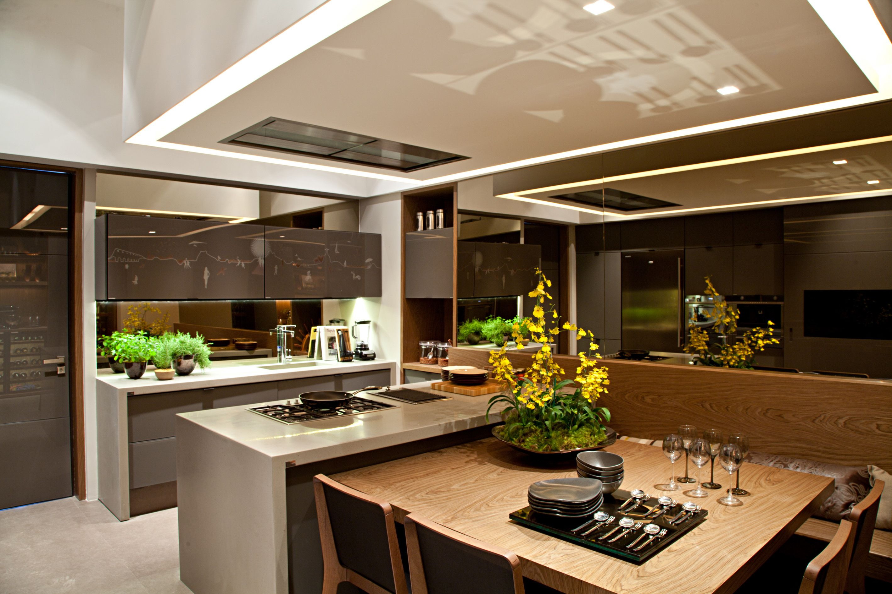
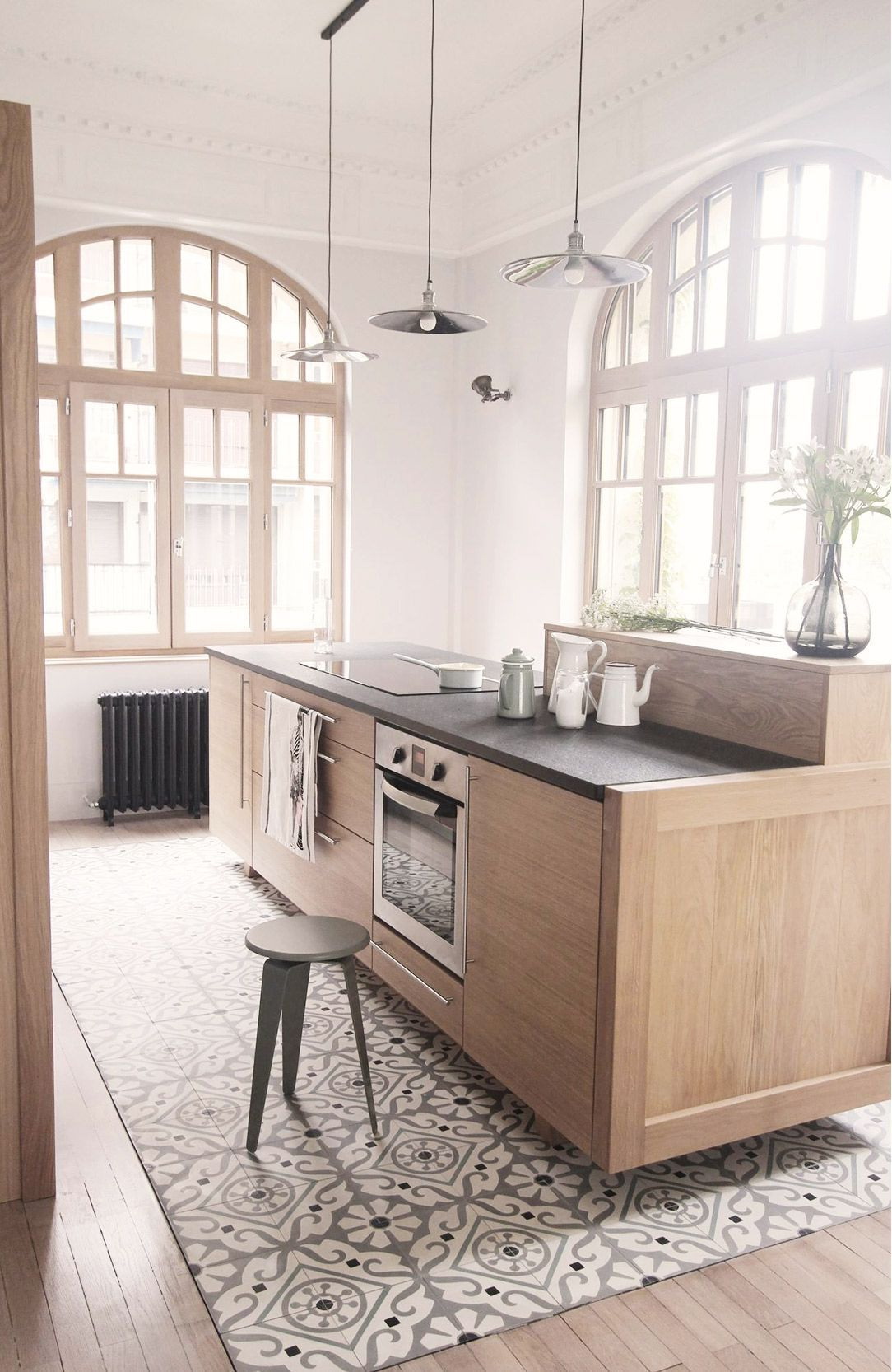
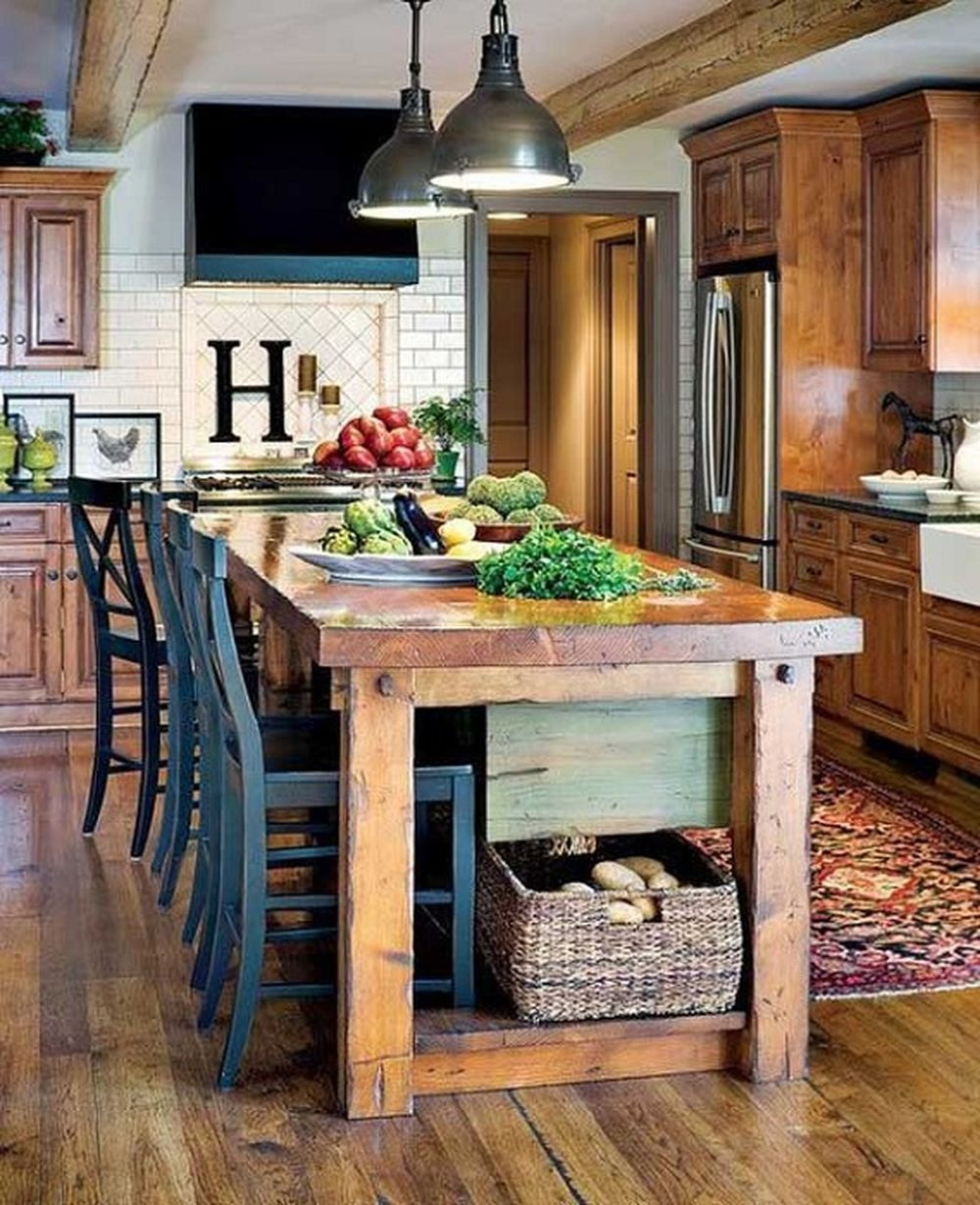
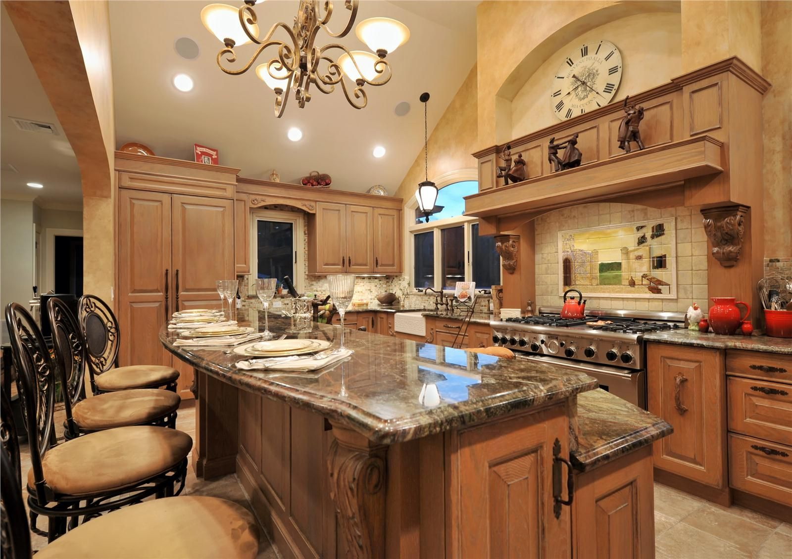
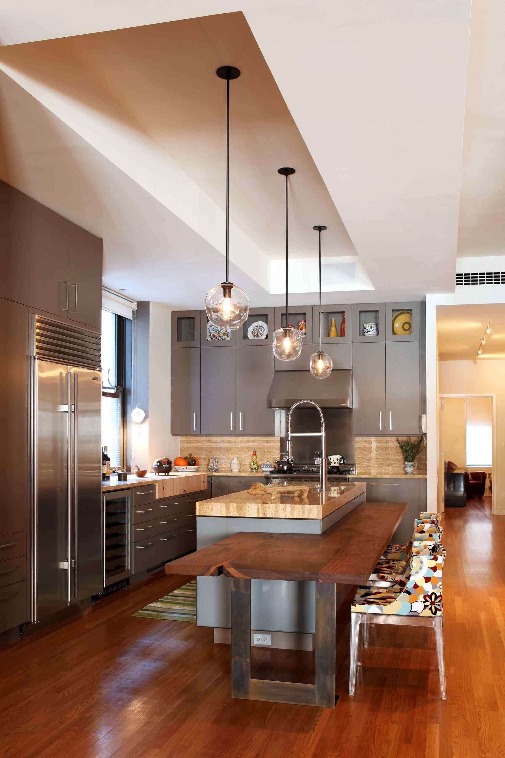
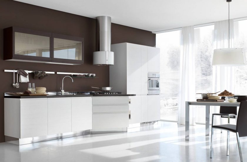
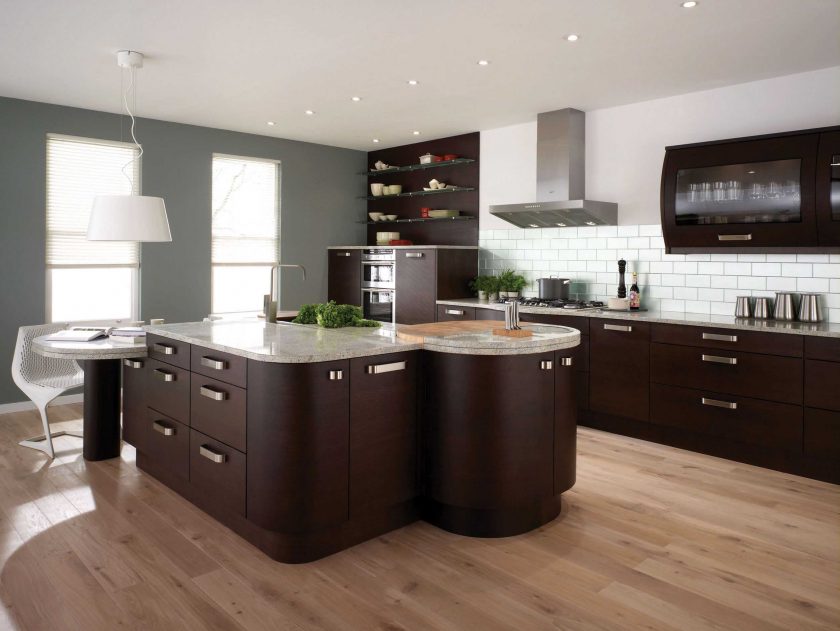
A kitchen that looks solid
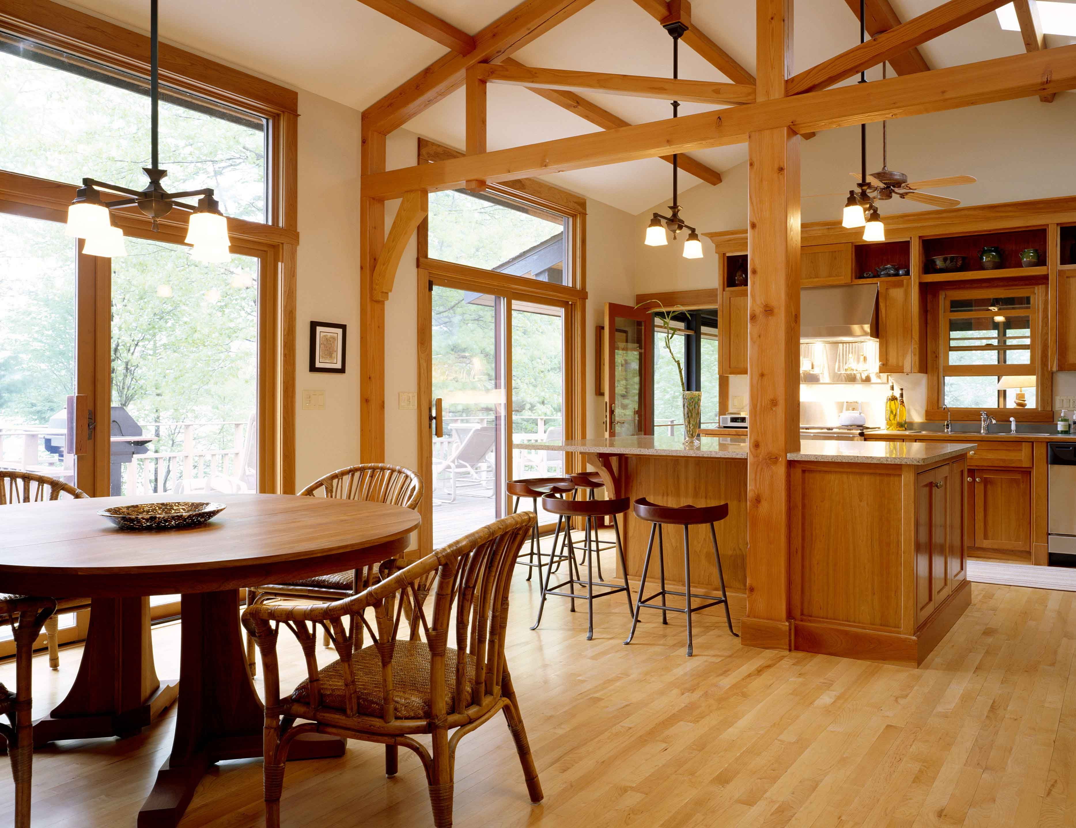
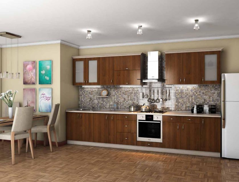
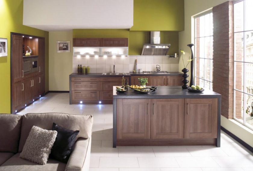
Brown Kitchen Ideas
Brown - the color of dark wood, fertile soil. This is a composite color, consisting of a combination of red, black, yellow. It is widely distributed in nature, wood, soil, it is the coloring of human hair, eyes, skin pigmentation.
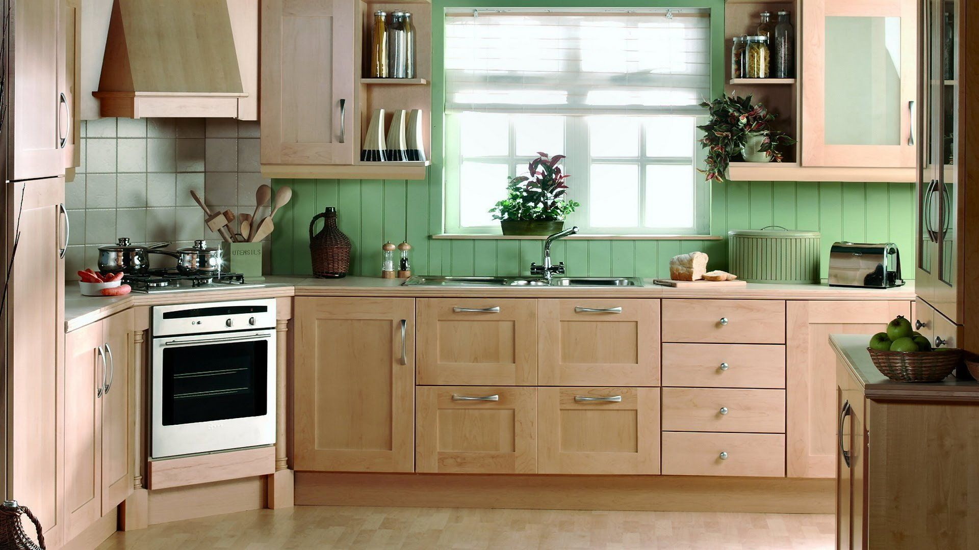
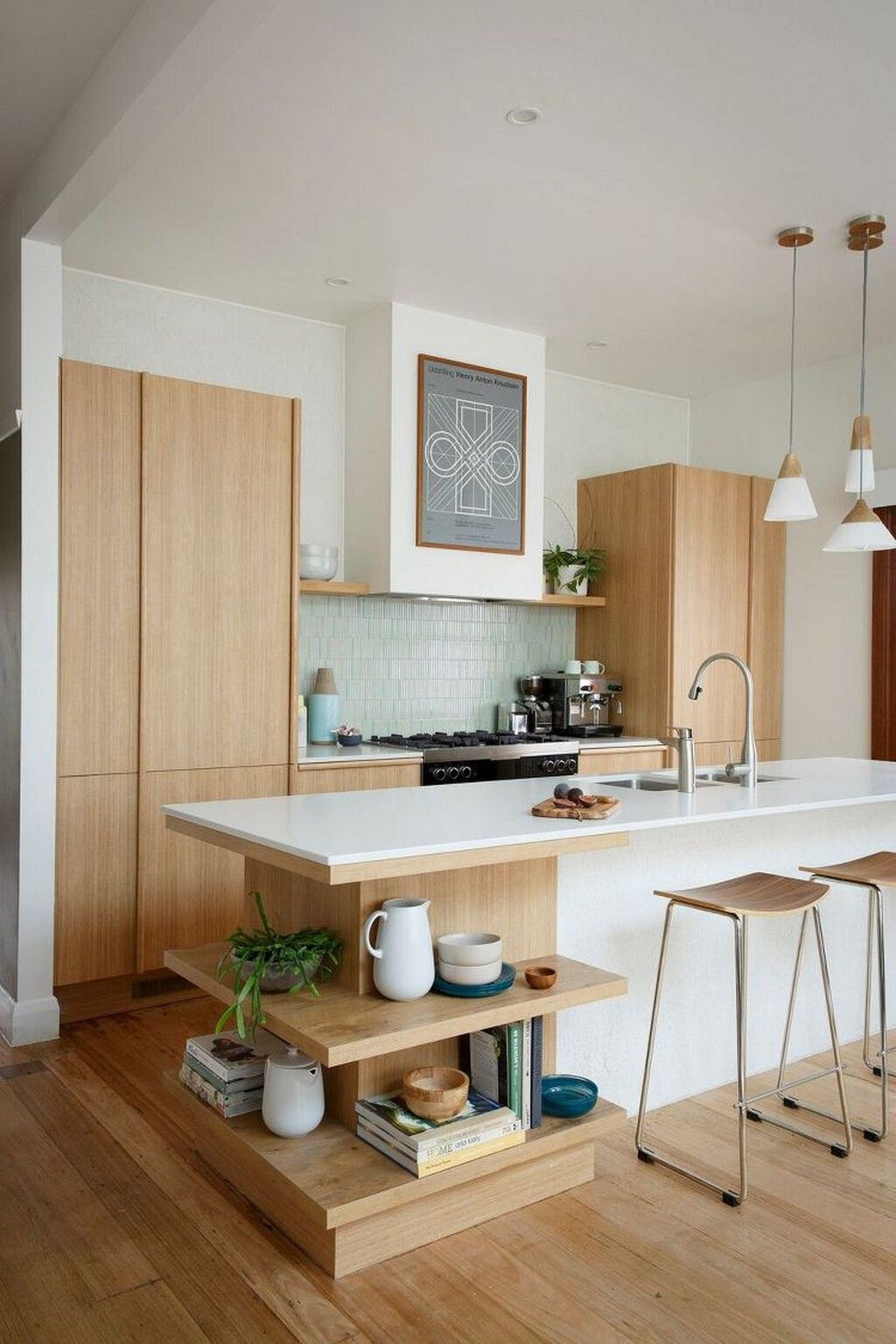
It includes a mass of tones that continue from light beige to dark brown. Some people will think that brown is too angry or boring to decorate their kitchen, but if everything is done correctly, you will be able to create a pleasant, warm kitchen that will be cozy, comfortable.
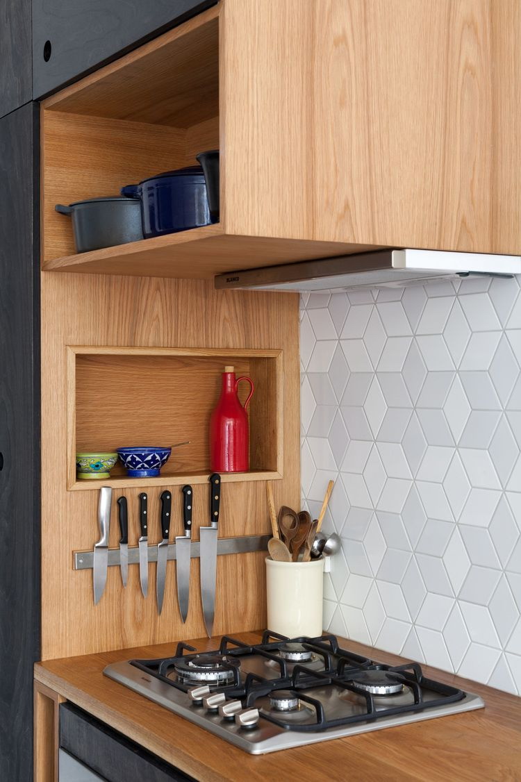
There are many ways in which you can turn it on in the kitchen, delicately using it on a large scale, for example, for cabinets, flooring, other major kitchen components. Shades work well with many different types of metals, textures, trim, technique. You can mix, match different elements, such as window coverings, bar stools, apron etc. If you like the warmth of brown, learn how to use it in the kitchen, then here are a few ideas.

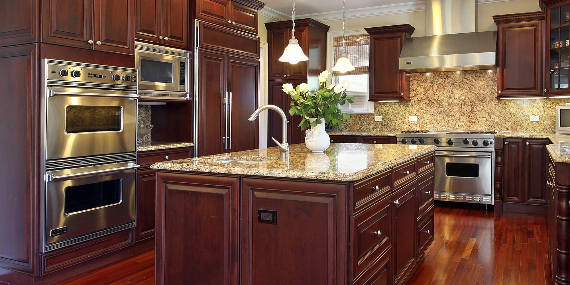
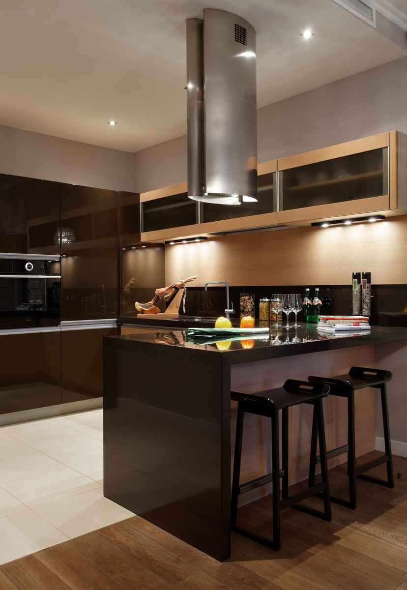
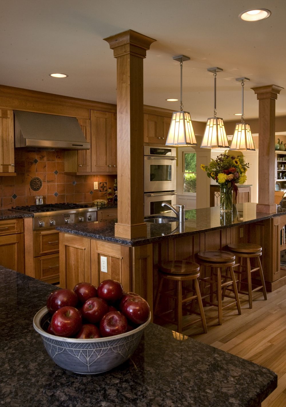
Classic in dark colors
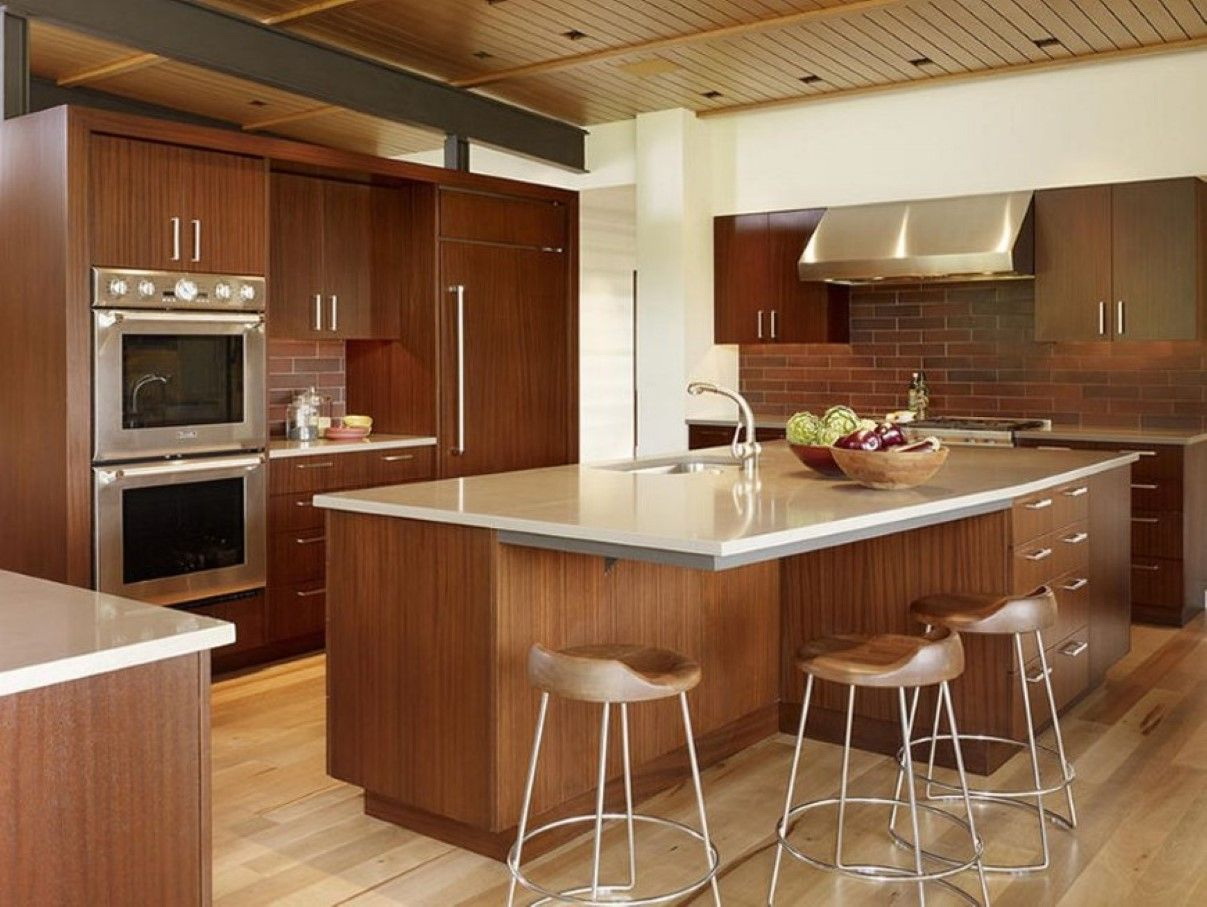
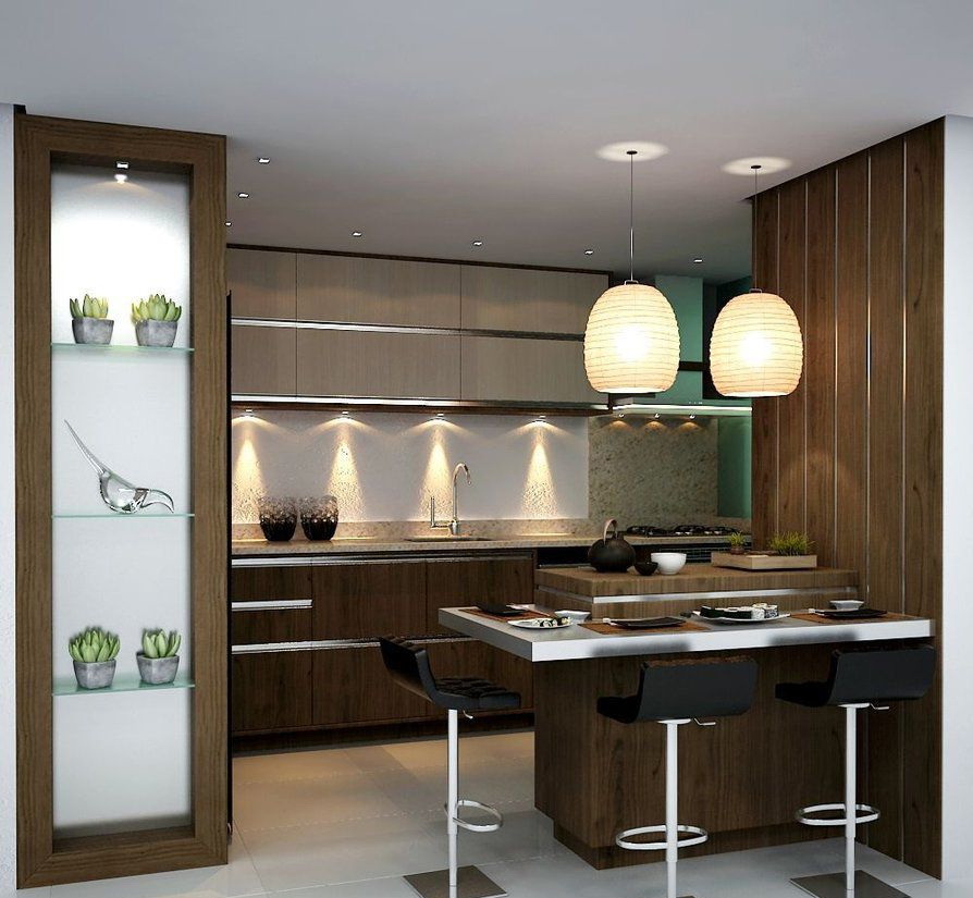
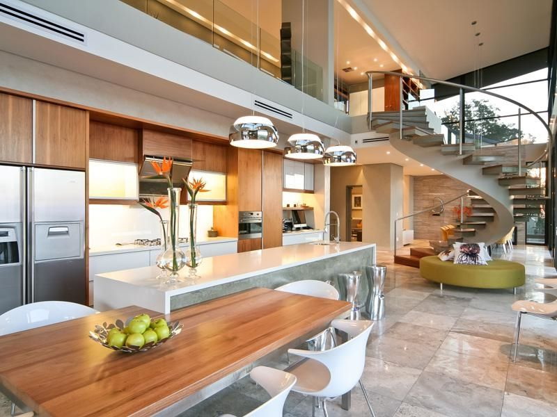
Mix the old with the new
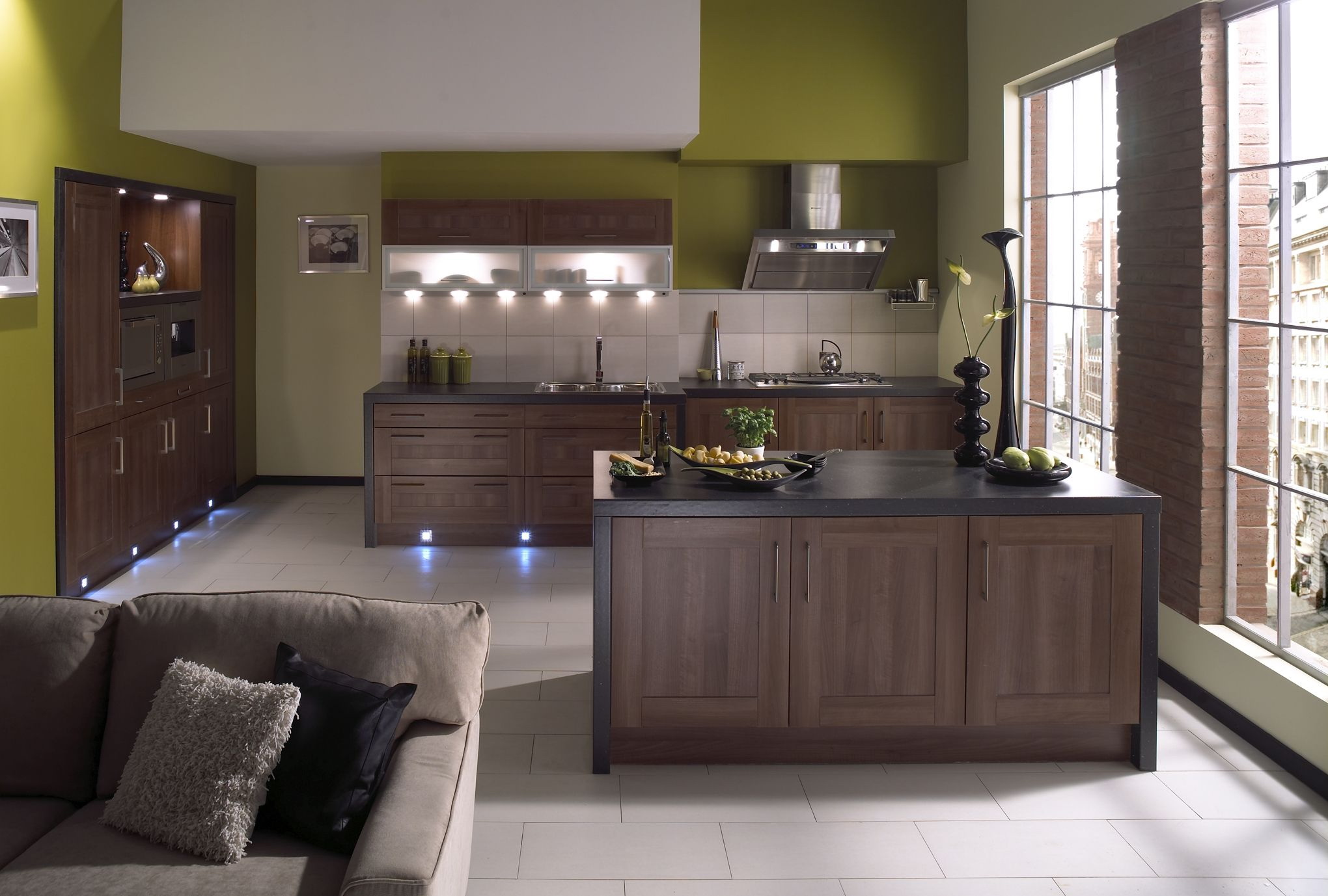
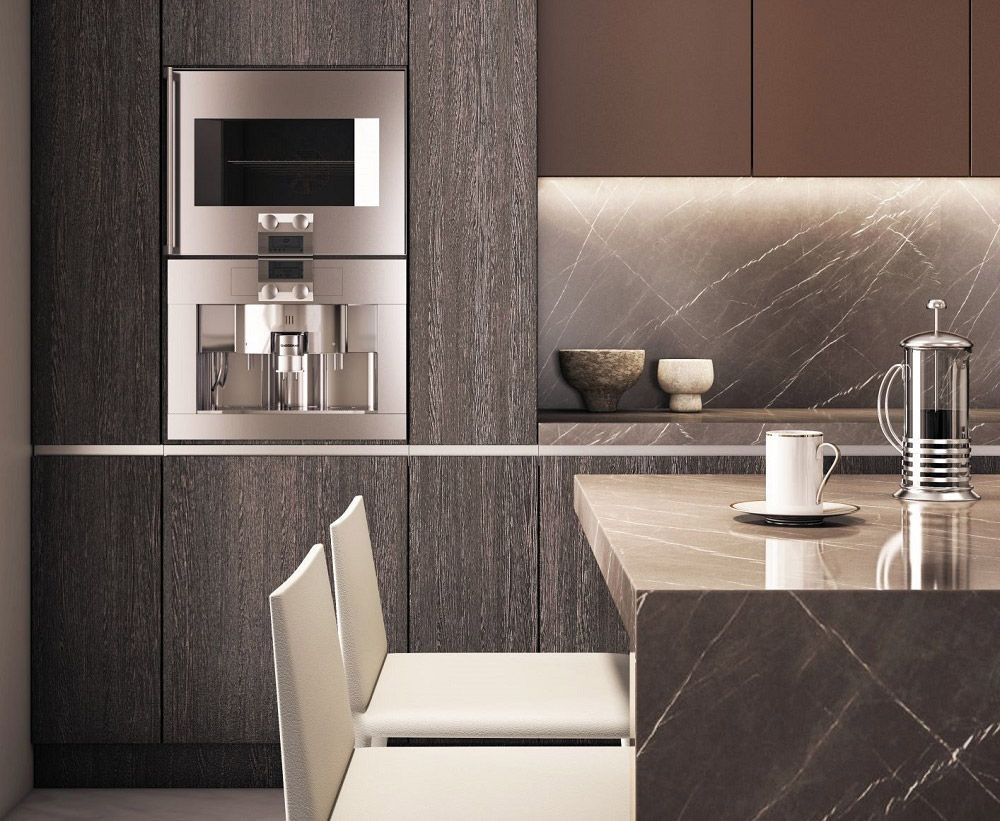
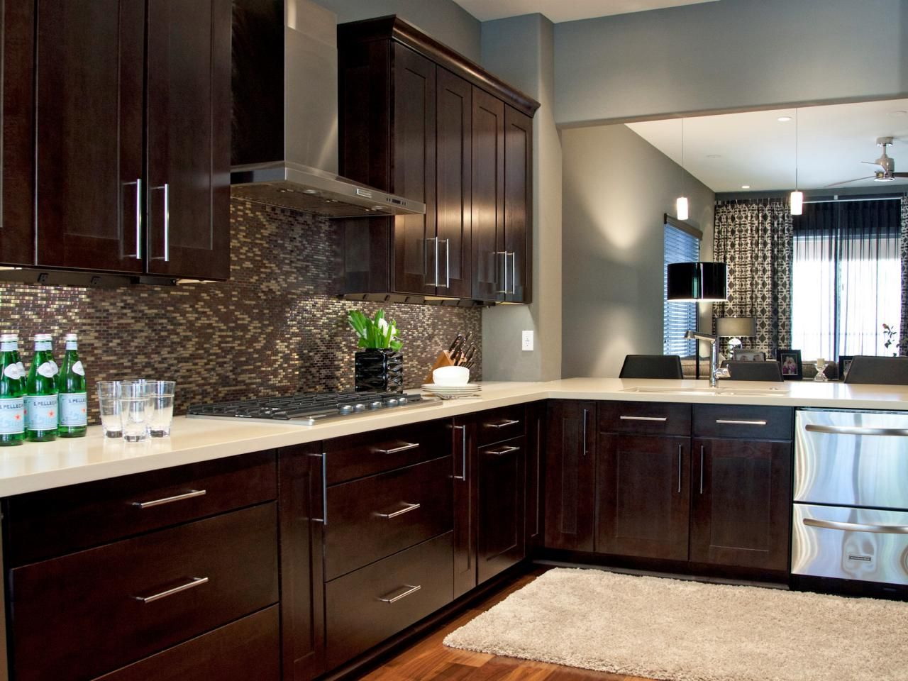
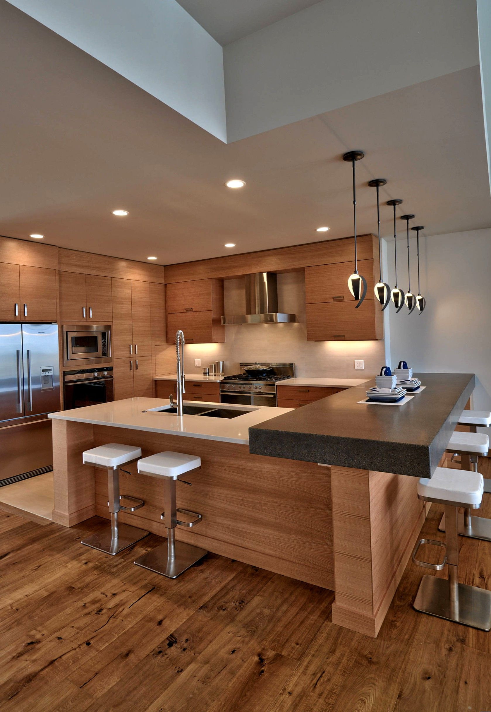
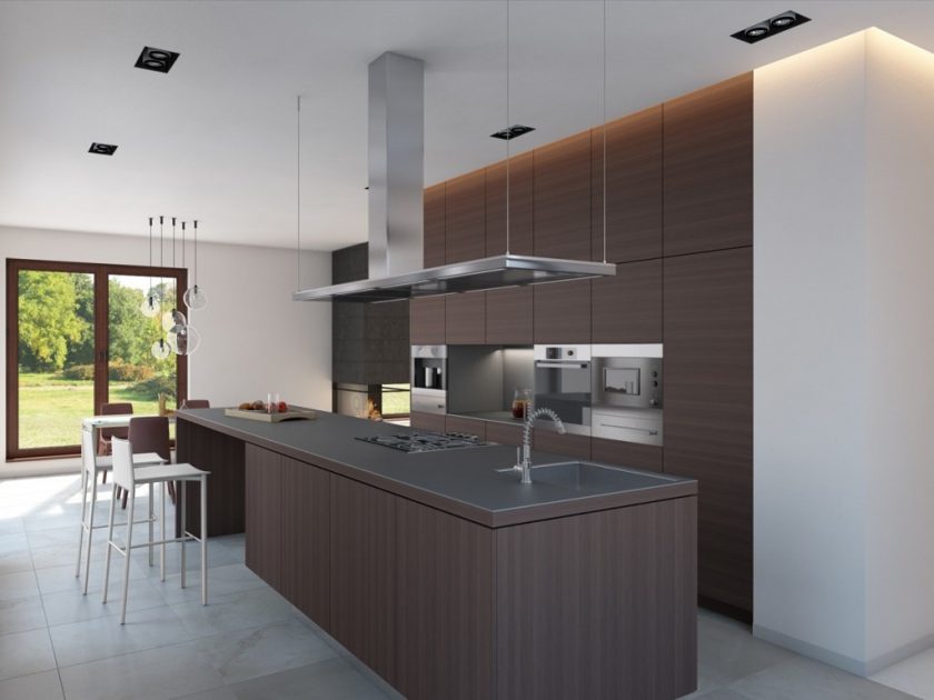
Brown is a great option for combining two types of decoration schemes, such as historical and new style. While brown is often considered an old, more traditional color, you can bring it back from the “old”, add it to the “new” to make it more modern for today. Advanced appliances with sleek, trendy looks, such as brushed nickel or stainless steel, work well with shades of brown.
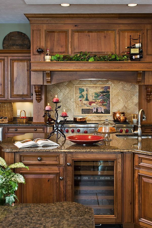
Pop colors
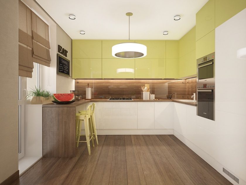
Use a spray of color throughout the kitchen to compensate for the dull brown. Red shades always go well with him. Yellow, gray, orange tones are also often used with brown. Fabrics are the best place for accents, for example, on window coverings or seat cushions. Use a splash of color on the pattern of an apron or lamp that hangs over the kitchen the table.
Add bright elements to the interior
Upgrade your furniture
If you want to create a smart look with a brown color, try choosing more modern furniture, such as a kitchen table, gas stove or sideboard. Find items that will be modern, but not too large.
A large brown table or another large piece of furniture can actually bring too much brown into the kitchen, making it heavier. Modern or painted bar counters, or white with a cream sideboard with glass doors, can successfully decorate your kitchen.
return to menu ↑Combinations of brown
Brown is a serious, down to earth color, which means stability, protection, comfort, support. Since it is solid, durable, mature, men often prefer to use it in interior design.
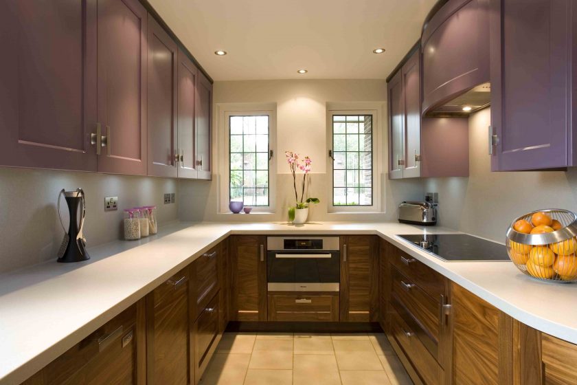
Lilac in combination with brown
Combining brown with a different color in the interior may be as follows:
- gray, metallic silver with brown for an unusual neutral look;
- black, orange-red, whitish with brown for a strong neutral background;
- pale pink, light brown, beige, black for neutral colors;
- light brown, orange citrus, a shade of white for earthly vibrations;
- brown, red, bright teal creates a terrestrial pattern, full of life;
- shades of brown with shades of gray with dark earthy orange-red - this is a strong male pattern;
- dark chocolate as a background works great with orange-brown, yellow, and also with gray shades that add lightness.
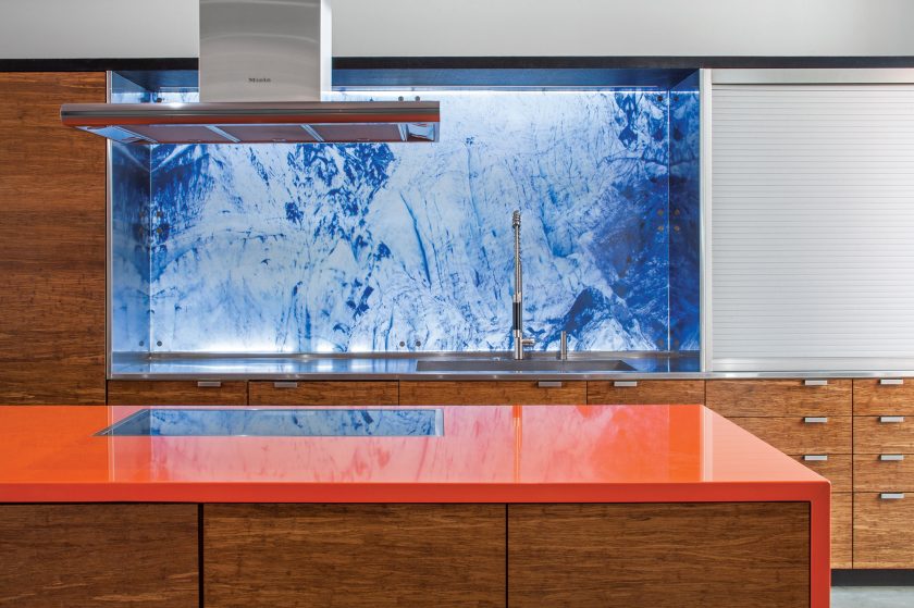
Bright orange table top
The kitchen is the heart of the house, a place where delicious meals are prepared for the whole family. Good food needs an atmosphere, warmth, which are complemented by the surrounding colors. Consider how each shade affects our kitchen on the example of these thoughtful, carefully selected samples.
We mix brown shades with bright, neutral tones.
Light, dark brown shades still occupy an honorable place in new trends in interior design. They are comfortable, safe, elegant, familiar, well suited for any style, layout, architecture. Light, dark shades are universal, fascinating, which allows you to create a calm, peaceful interior design in neutral colors or experiment with bright color combinations, create personalized home interiors.
 - Successful combinations for Smart ideas")
 - Successful combinations for Smart ideas")
 - Successful combinations for Smart ideas")
 - Successful combinations for Smart ideas")
 - Successful combinations for Smart ideas")
Since brown is quite expressive and powerful, even a picture, decorative pillow, flower pot or picture frame in dark brown can beautifully highlight the modern interior design in lighter colors, improving the home interior with strong color contrasts and a comfortable feeling. You can place pictures or photos on the walls in shades of brown for an expressive, unexpected effect.
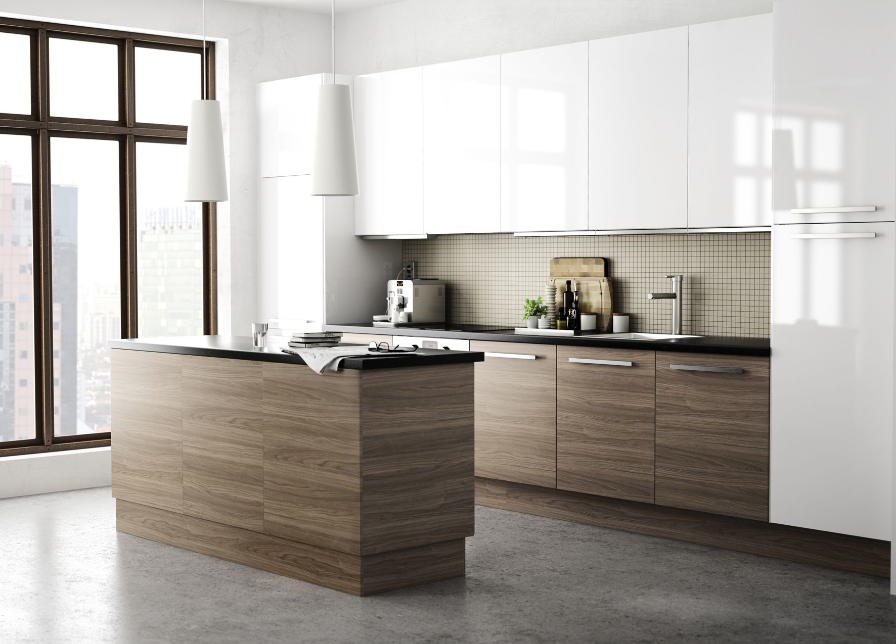
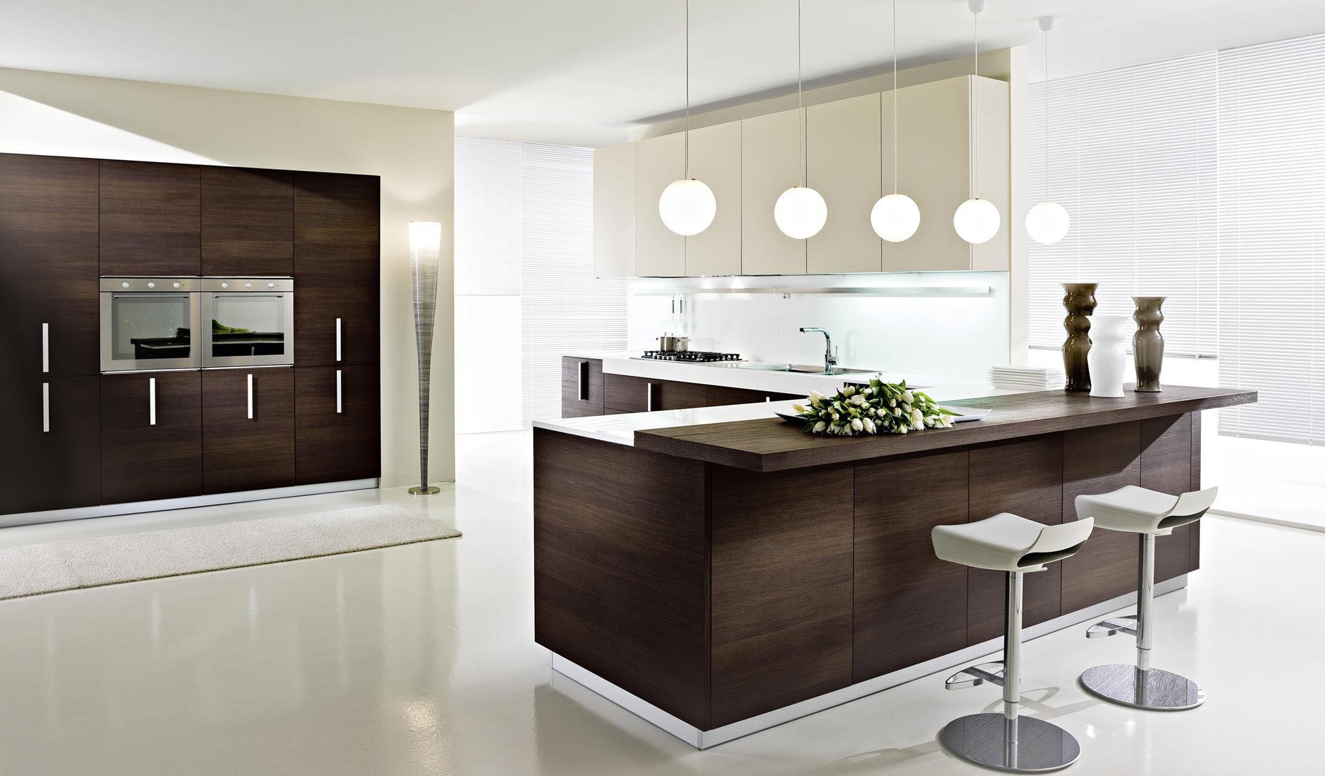
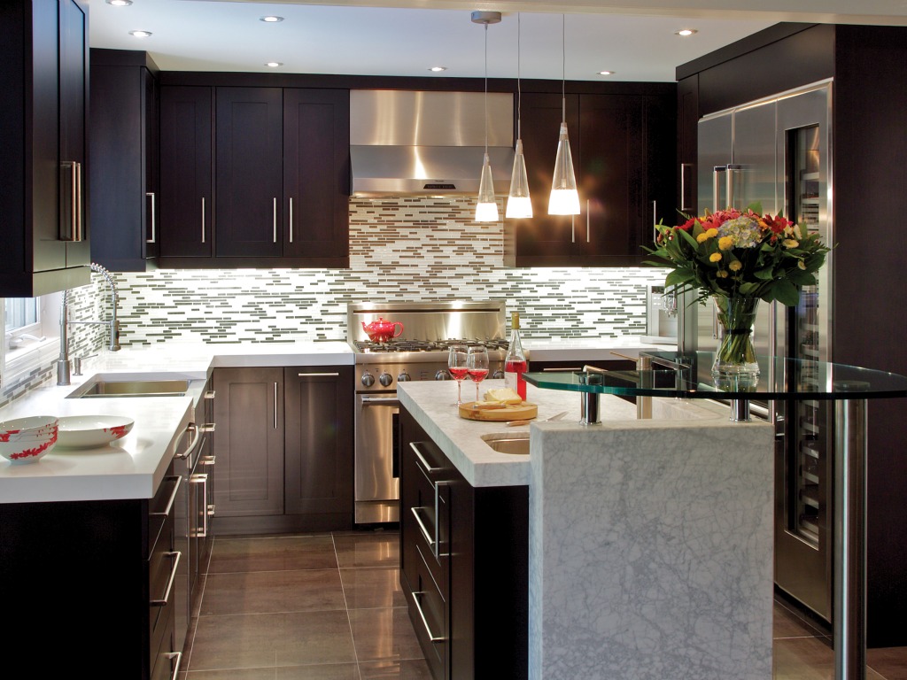
Brown and white combination
Browns look great with white decor, - white room furniture, lighting system, wall painting, curtains for windows, floor mats. White makes the brown more expressive, emphasizes the contrast, together they are like clean air and moist soil. The combination of cream or any shades of white in kitchen textiles are great for creating balanced, bright and comfortable kitchens.
White makes brown more expressive.
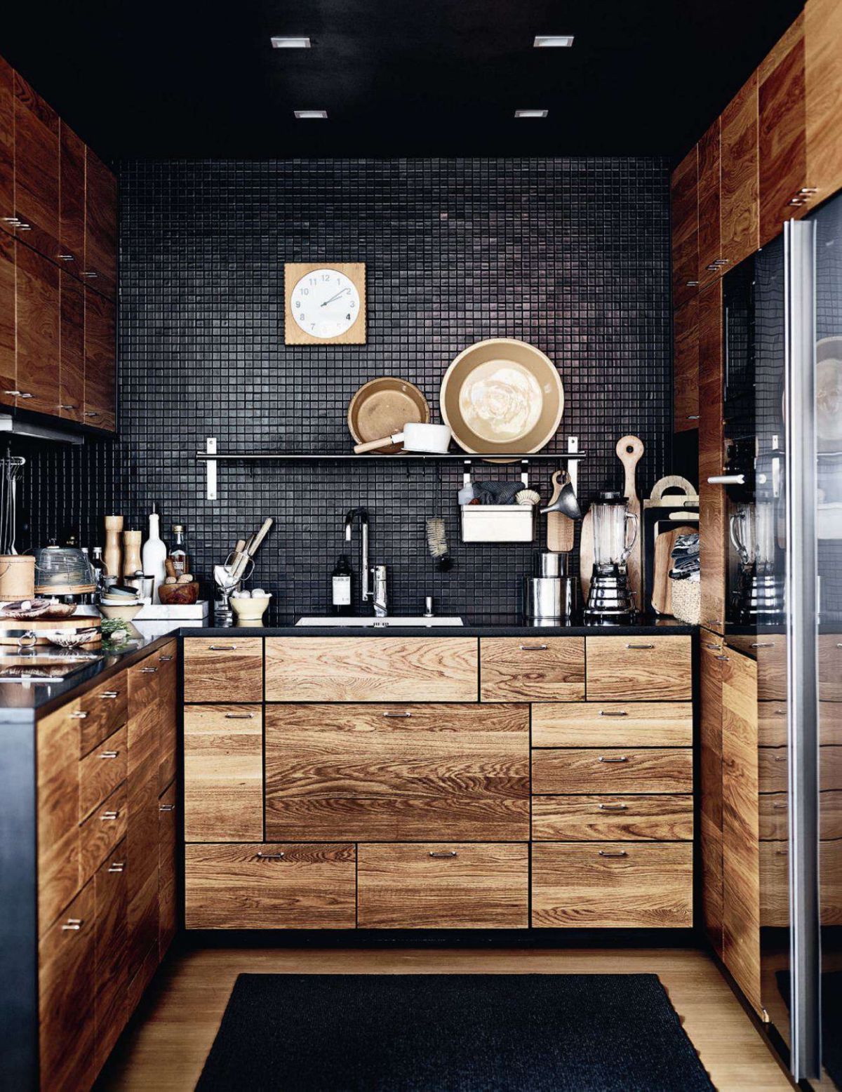
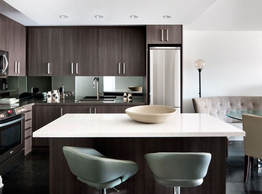
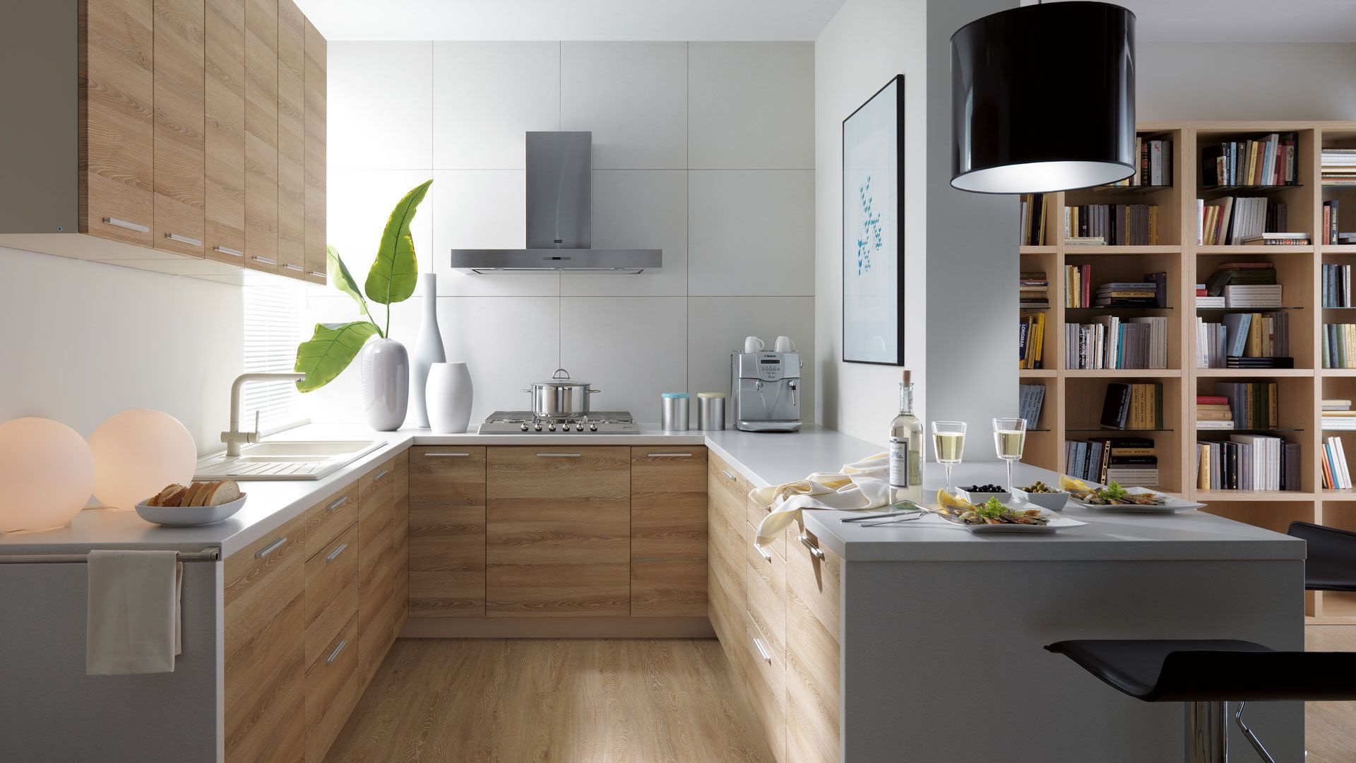
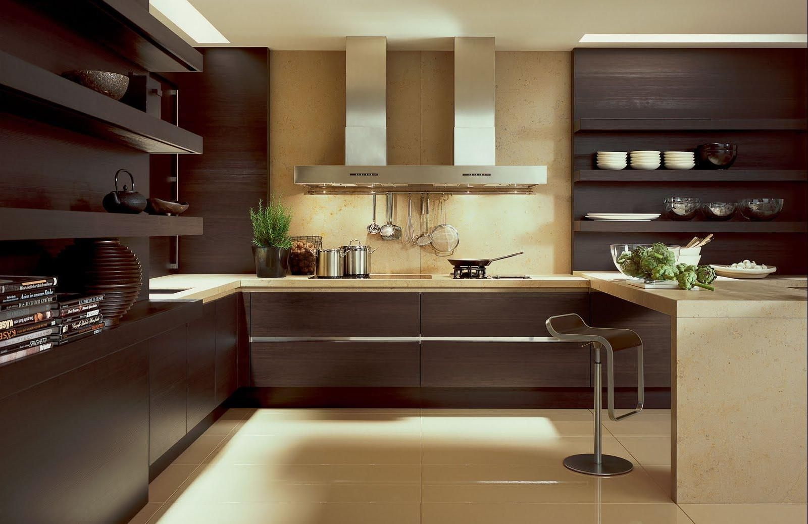
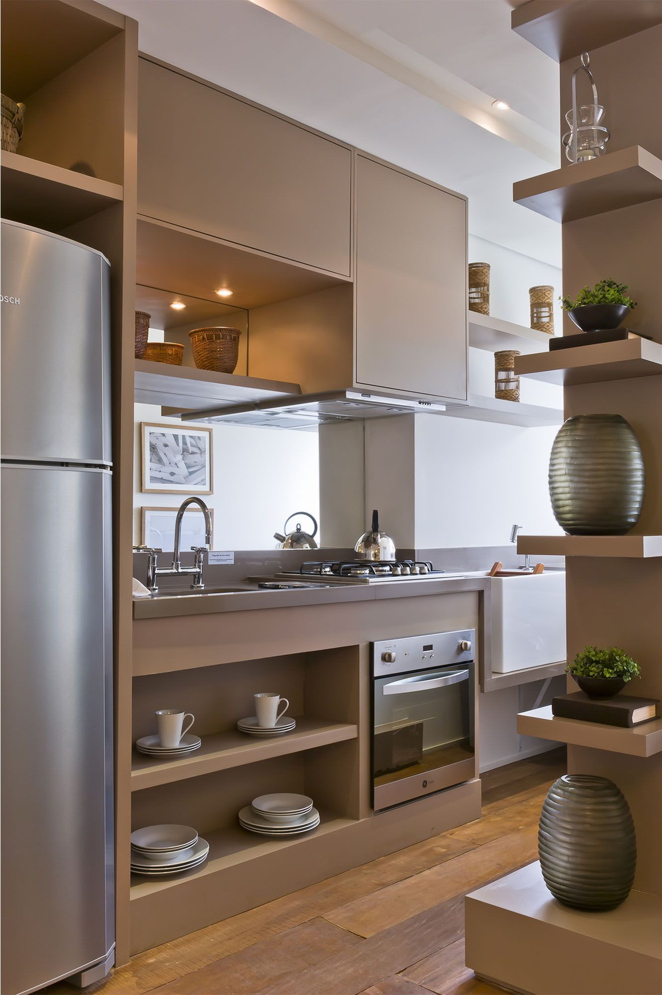
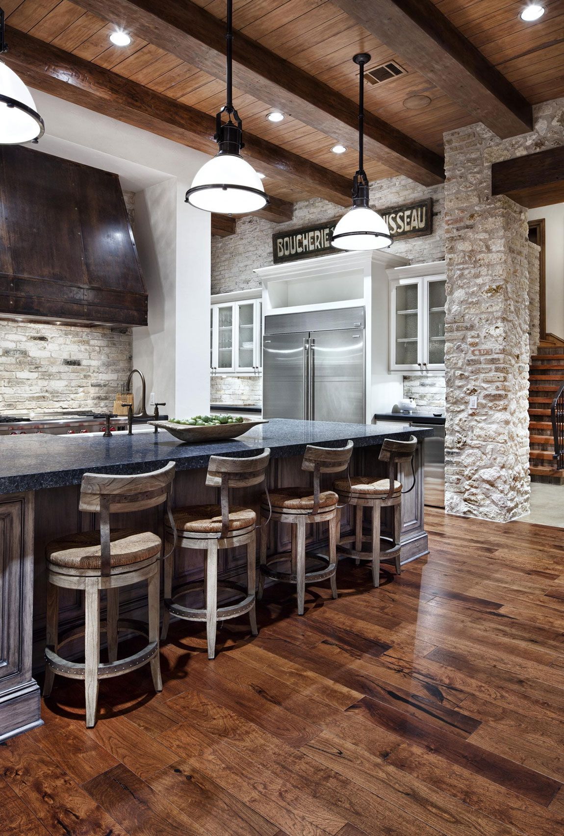
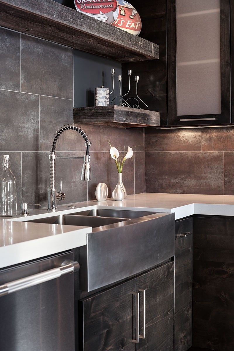
Gray-brown decor
Brown fits well with any texture, looks especially beautiful with natural a tree. Place the gray color in a large technique, so that it contrasts brightly with wood. You can also dilute the tree with concrete walls to draw industrial notes into a cozy atmosphere.
Brown blends well with any texture
Walls
Chestnut walls look best with shades in soft colors. Light brown shades, beige, yellowish brown are perfect for creating a romantic, cozy image, they affect the mood of the room. Bright yellow, emerald green are well suited to create bold, stylish accents, they brighten up modern interior design in neutral shades of brown.
Important. Walls painted chestnut create a unique interior design; they serve as one of the ways to bring a new look to the room, to create unique, very personal home interiors.
Play with contrast
These colors bring interest, enliven the design, which is based on dark and light brown shades.
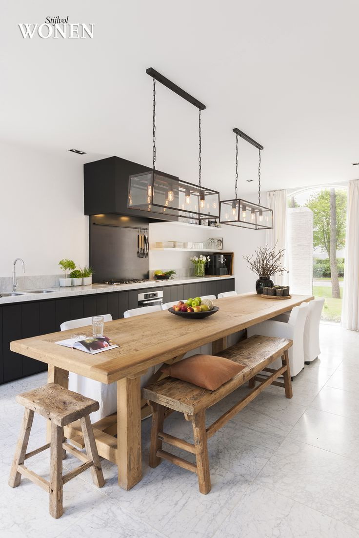
In the style of minimalism
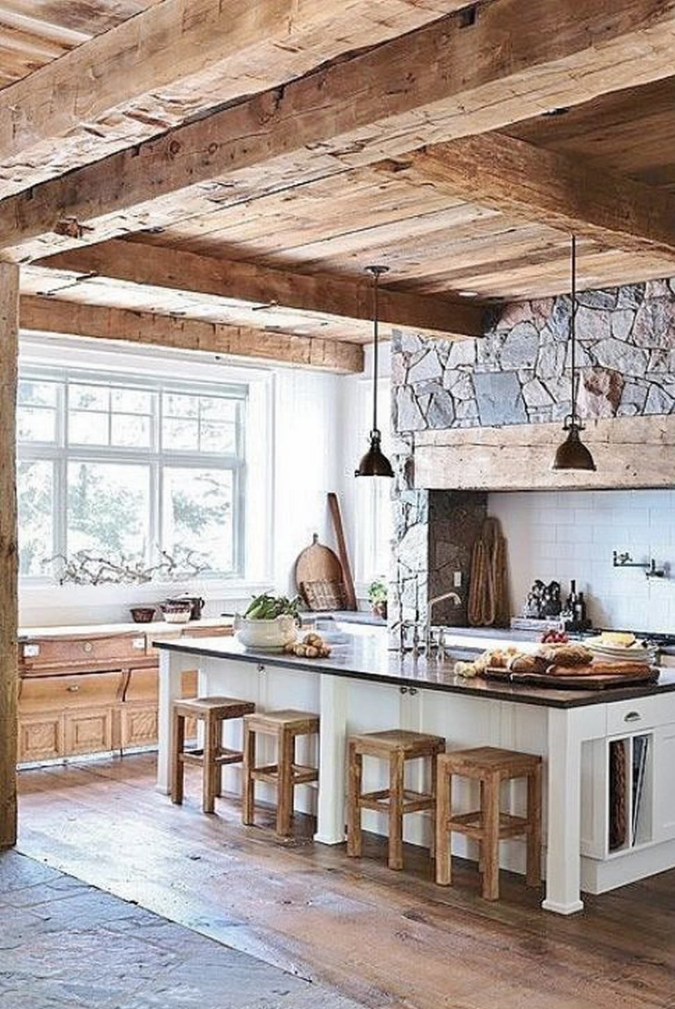
Textures from natural wood and textiles
Chocolate shade is great for furniture. Solid wood, modern wood materials are in harmony with all the dark, light brown shades. Adding decorative accessories in bright colors creates unique, impressive modern ideas.
Ideas with jute create a stylish retreat in eco-style. Chestnut, in combination with stylish patterns and other light-neutral tones can dramatically transform the interior design, surprising with striking details, bringing balance, giving a special look to the interior.
Chocolate shade is great for furniture
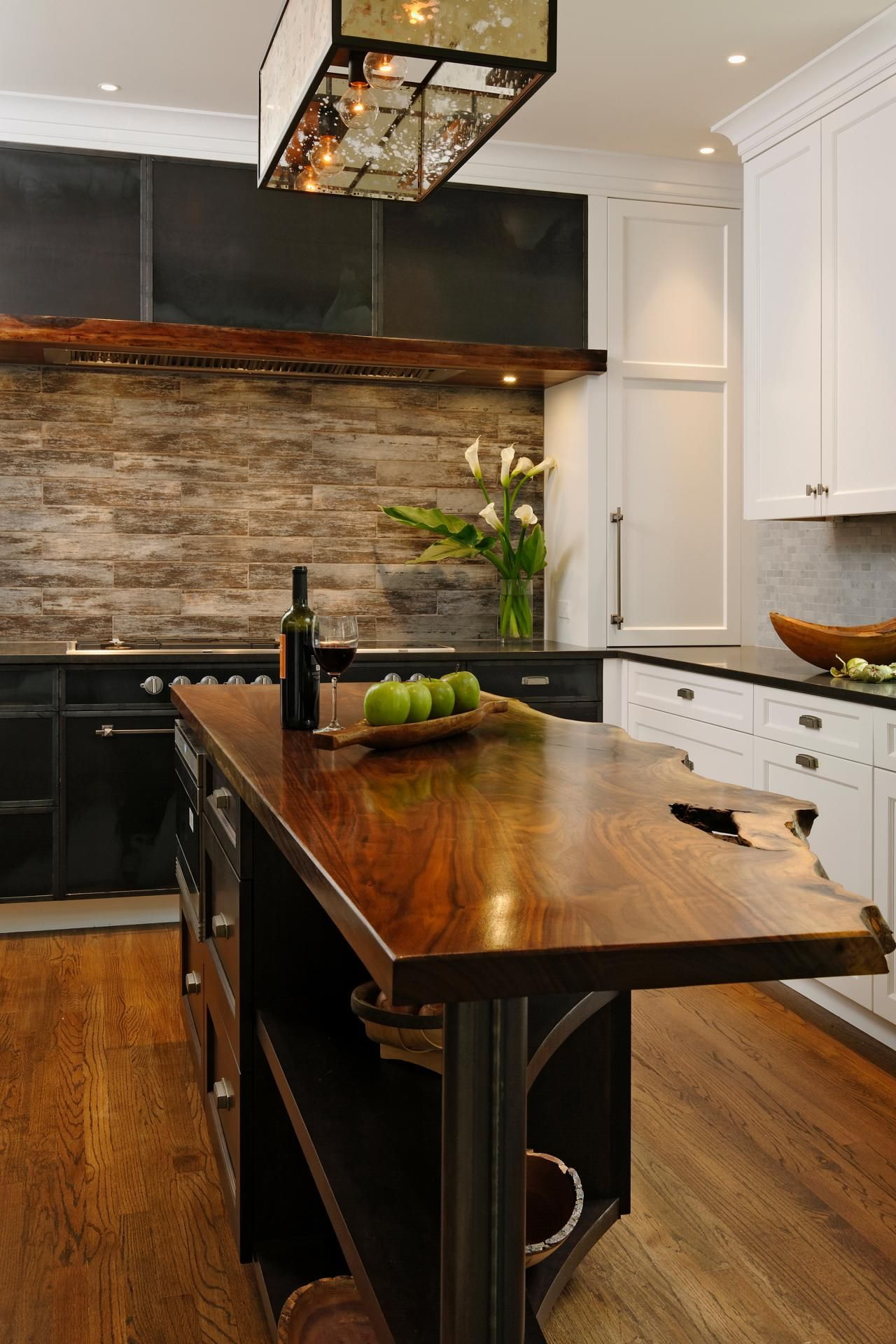
Soft beige and dark brown color combination
Cream, chocolate shades look fabulously romantic, soft. Mixing dark brown with light, such as beige, camel wool, ocher, sand, tan, wheat, as well as the emphasis on modern interior design ideas with light greenish-turquoise, blue, and blue offer ways to create spectacular, but cozy, elegant home interiors.
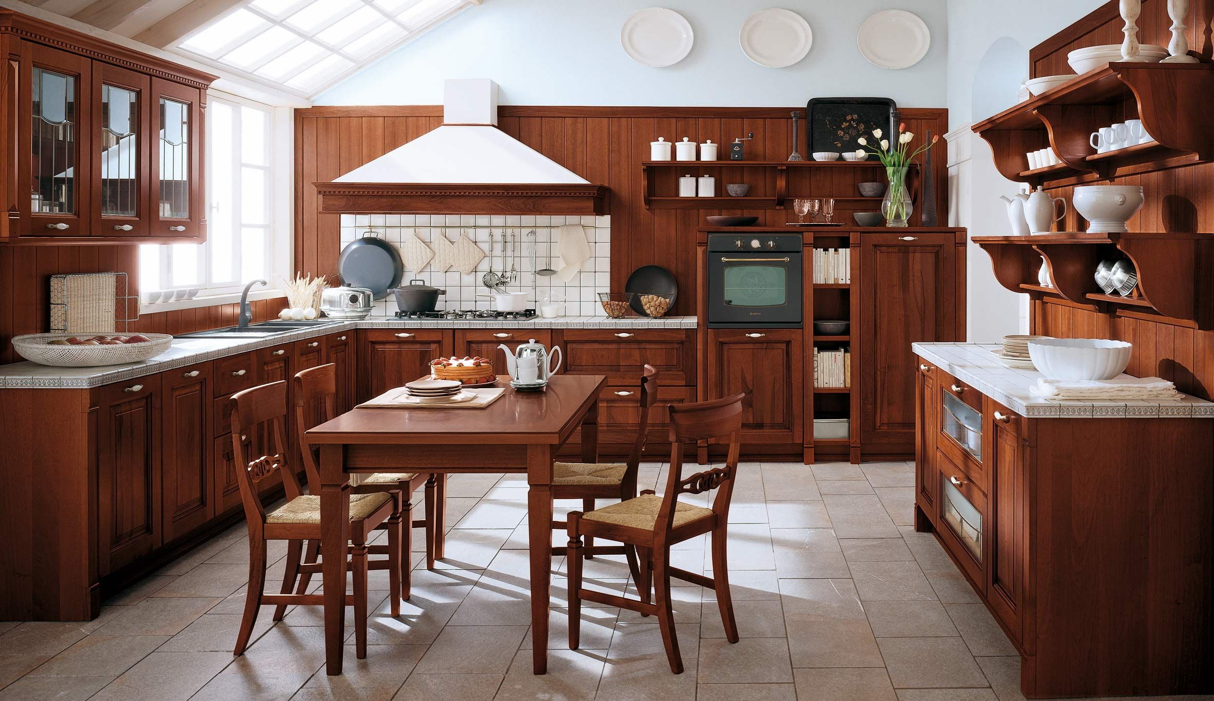
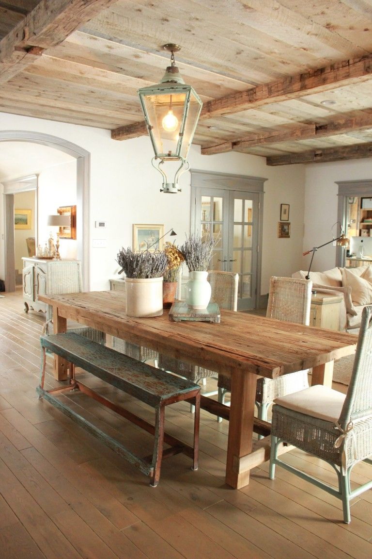
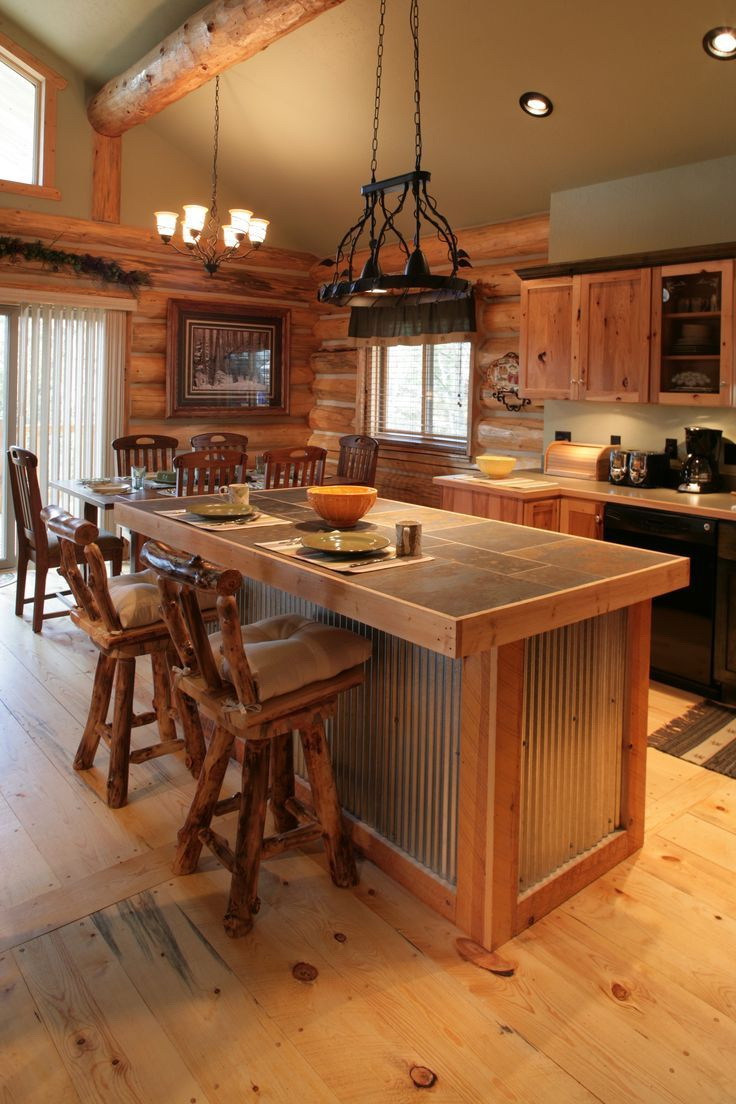
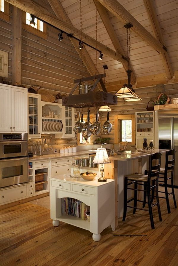
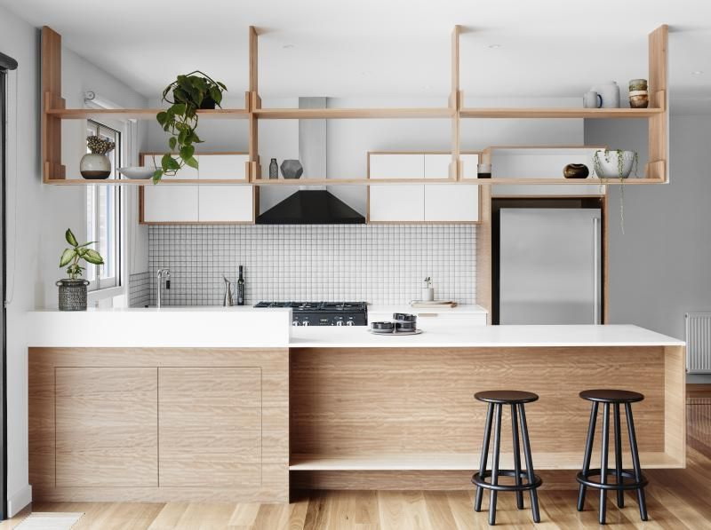
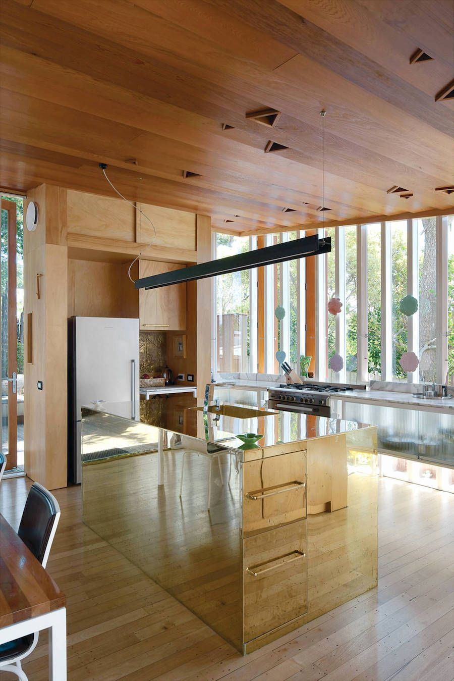
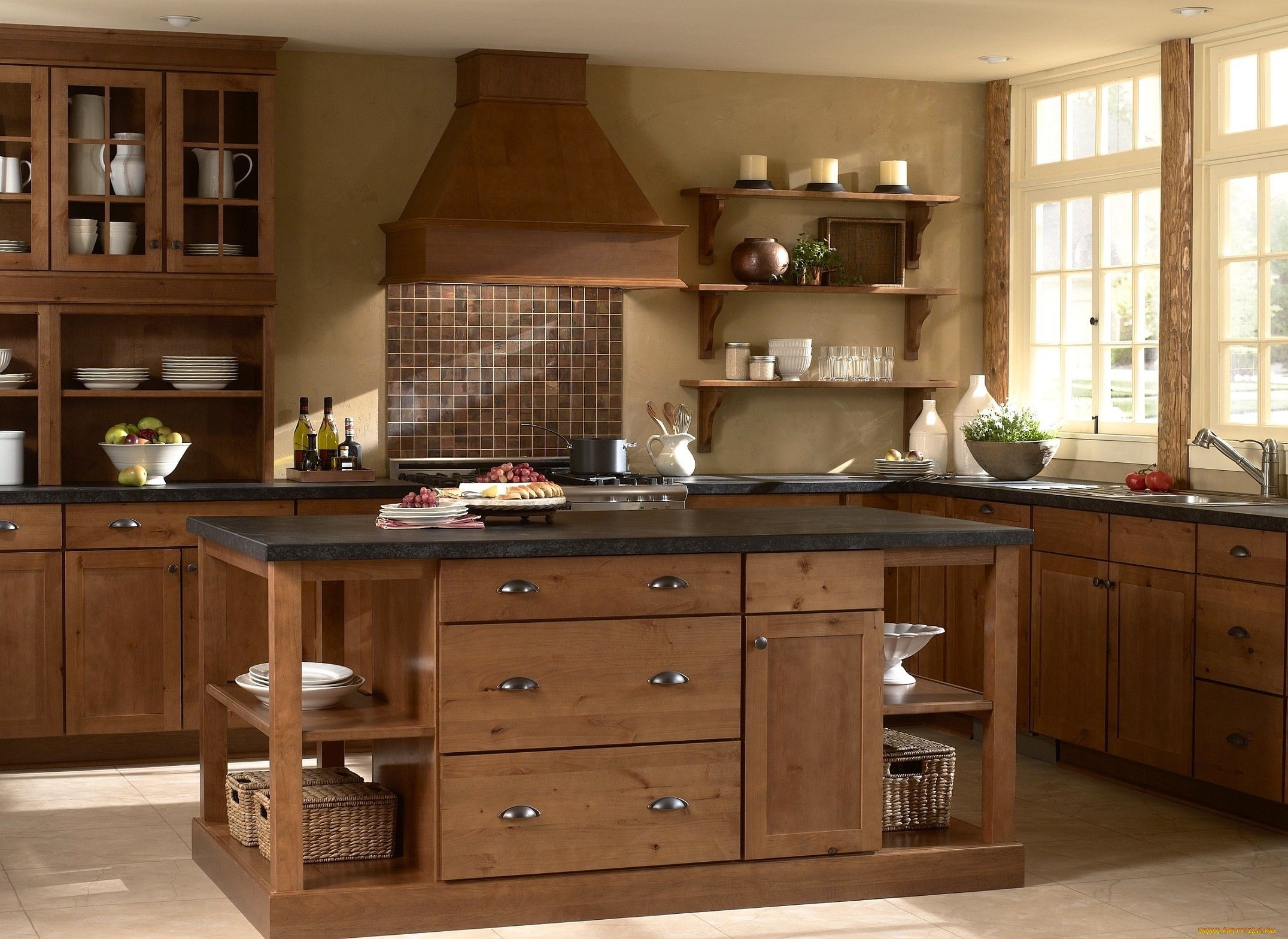
Wooden set
Wooden furniture of natural colors looks comfortable, familiar, well suited for traditional and vintage home interior. But it is also perfect for creating young, fresh, modern interiors that reflect your individuality - just add bold bright colors to the scheme.
Mount on the cabinets natural stone for countertops, so that both materials complement and play with each other.
This kitchen looks cozy
Tan interior
Yellow means creativity and growth. Bright colors soften accordingly with an almost neutral brown tint. Yellow is a bright color that has been found to stimulate thought, imagination and creativity.
Yellow is a versatile color that blends very well with the more conservative brown. Well, when Brown serves as an additional in the scheme, because it has a wide variety of shades from rich amber to pale cream. Brighter shades of yellow include:
- chartreuse;
- chromium;
- gold;
- lemon.
Brown has shades from beige to dark chocolate.
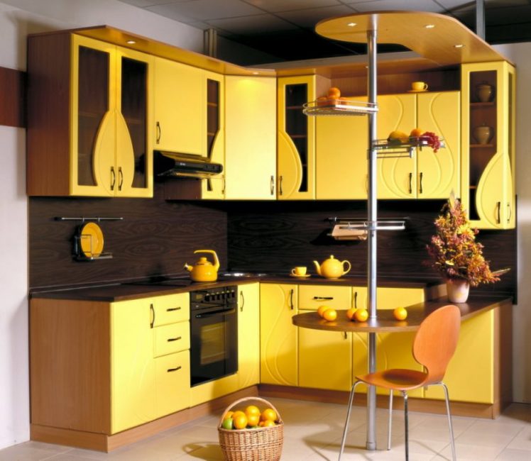
Yellow means creativity and growth.
Warmer shades of yellow, such as cream, butter and lemon paste, go very well with richer, dark brown shades. They give a more traditional look, provide a warm welcome.
You can add:
- bright pop colors;
- chartreuse;
- citrus;
- gold.
Deeper shades of yellow, such as amber and apricot, look sensational with beige and brown hues. So that this combination does not look bleak, add a few drops of red or green or even black as accents to make it interesting.
The color scheme of the room determines its feeling.
Here is what the designers say about this:
- “Since brown is a mixture of red, yellow and black, it is a composite color that looks good with yellow, as it is already contained in the composite. Paint the walls with the color of butter and make cabinets and floors under dark mahogany. Use pale brown-yellow granite for the worktop and finish with an additional brighter shade of the same yellow on the apron. Accents of red on dishes or window frames can add a focal point. ”- Jordan Dane from Jazz Interiors.
- “Make the walls beige and add bright lemon or ranunculus yellow cabinets. Vinyl floor with patterns of beige, white and yellow will look zenith. Add an apron in the same yellow shade with accents of black in the wall covering, rug and dishes ”- Ashley Brown from Pretty Homes.
- “Amber walls with cabinets made of dark wood and the same floor look beautiful. Add beige or cream focal points to make a tasty contrast. The colors blend beautifully and create a really warm and cozy atmosphere. ”- Sandra Lenon.
Yellow is a universal color.
The color scheme of the room determines its feeling. Yellow and brown cuisine is traditional and warm or sharp and modern. Choose your scheme and start creating. Make your own combos.
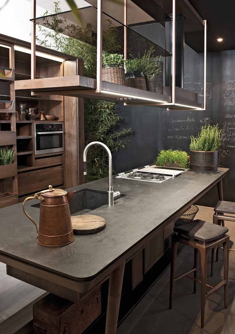
return to menu ↑Summer palette green and brown
Think of a pattern with wooden furniture. The kitchen is a part of the house where you can effectively use wood for style and function at the same time. Here you need to properly use wood for cabinets in various shades of natural brown, and you can combine them with green accents in the little things. Green shades may be in the pot, wallpaper, rugs and curtains. There are houses where green was appropriately used for cabinets. Think about the color scheme in advance before you decide on something.
Add some summer to the interior
Brown cabinets
From shades of rattan to darker shades of oak and walnut - there are multi-colored options for furniture in brown, which you can easily integrate into the scheme. As for the green color, the simplest idea is to use it for walls. When designing walls, you can stick to muted shades of green, which are not as dark as olive, but also not as light as grass. Other colors you can use are white and a little yellow.
Dinner Zone
Green and brown together make the perfect blend for the dining table, provided there is room for a zone. Again, brown elements come in furniture and flooring, while green is used as cover on the table, window frames, as well as in wallpaper, dishes. As an interesting idea to add here, plants are included - in pots, vases, pots, or hanging. Plants work great for those canteens where there is a natural source of light.

Small, bright elements make the kitchen fresher.
The best reason to use the summer palette of brown and green is amazing stability when both colors are in equal / balanced amounts and harmoniously complement each other. White, yellow and black can be used proportionally, without diluting the main theme.
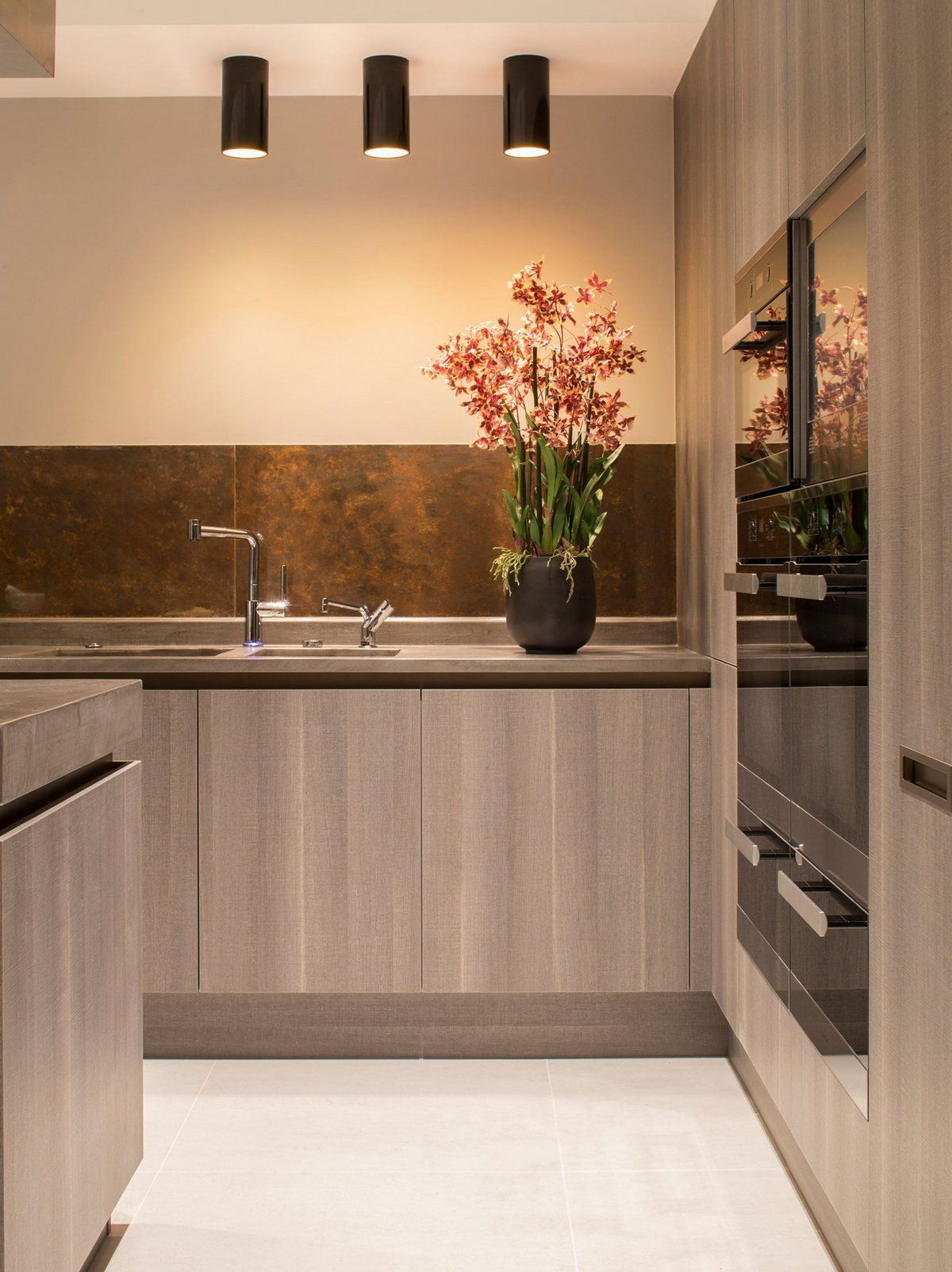
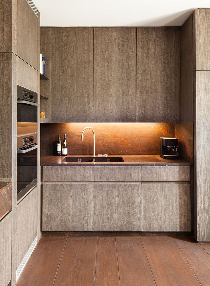
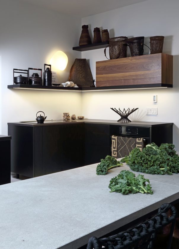
return to menu ↑Amazing combination of brown and gray
The combination of two neutrals - brown and gray - in the room is definitely appropriate, moreover, they are also found in nature. Not only can they be the perfect combination - they also work well with many other colors.
Opposites attract
As with any color, shades of brown and gray may vary from colder to warmer, but overall brown is considered warmer and gray is considered colder. And this is one of the reasons why they are so good together. Gray can provide a pleasant visual rest and note the cold areas of a room with brown furniture, and brown can add warmth to a room that is dominated by gray.
Gray can provide a pleasant stay for the eyes.
Mixing
I especially like wood in warm tones, contrasting with gray walls and white trim. This scheme works great when you want to give a new look to the kitchen with brown cabinets.
And since brown and gray are neutral, they make the perfect backdrop to showcase your current favorite accent colors.
Stylish option for a small room
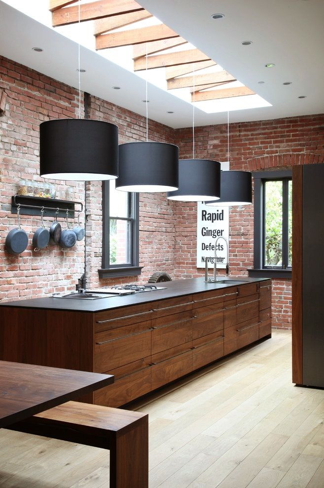
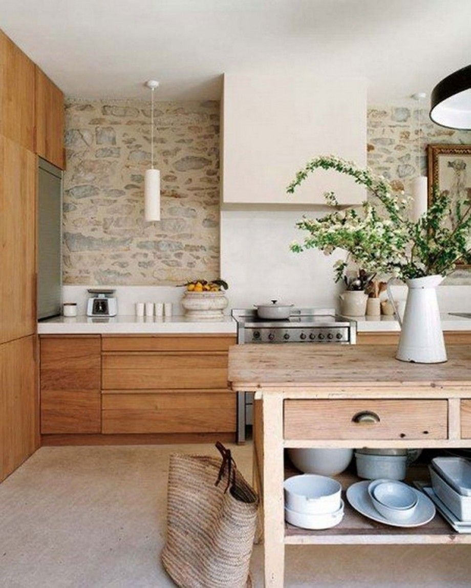
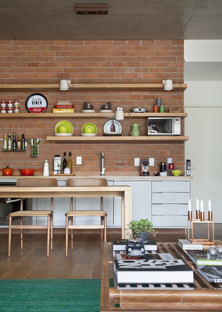
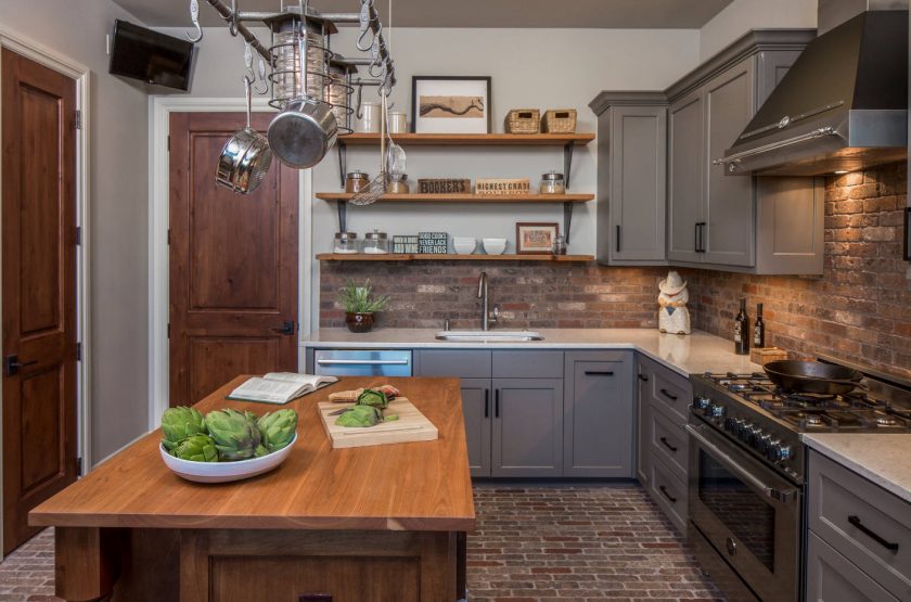
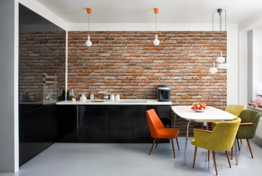
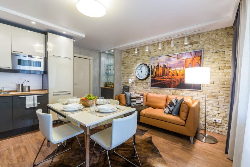
Brick wall
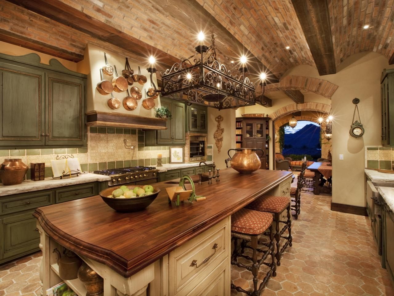
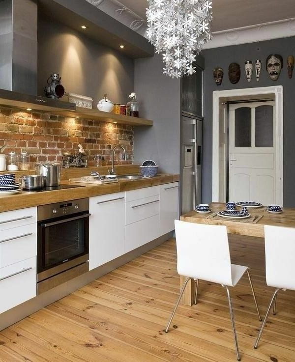
Untreated brick walls define one of the latest trends in modern kitchens. Interior brick surfaces are beautiful and original architectural features that bring vintage style to traditional and modern homes. The authentic brick surface gives a rustic feeling to the living space, creates a cozy atmosphere and emphasizes simple interior design. Open bricks are versatile, suitable for many kitchen styles and look fantastic in small rooms and spacious interiors.
These are beautiful, durable and almost maintenance-free architectural features that blend well with all traditional and modern materials. Small blocks of bricks create beautiful patterns and add warmth to modern kitchens. There is something in the untreated brick wall that attracts the eye.
 - Successful combinations for Smart ideas")
 - Successful combinations for Smart ideas")
 - Successful combinations for Smart ideas")
 - Successful combinations for Smart ideas")
 - Successful combinations for Smart ideas")
Untreated brick walls vary in color, texture and pattern, creating an industrial charm or country-style atmosphere.. Although brown brick looks amazing on its own, it can also be painted partially or completely with paint — gray, white, black or other colors. Any brick design in the kitchen will be unusual.
Wallpaper
It is also quite appropriate to use wallpaper that imitate brickwork. Consider choosing texture boards with a self-adhesive surface that look realistic.
Brick walls look great in classic kitchens. This wall adds expressiveness to the interior design, harmoniously combining a modern approach. Artificially aged brick walls — natural or imitated with photo wallpapers — add a fluted texture that is always appropriate.
This wall adds expressiveness to the design.
Brick wall design
There are several beautiful ways to use an internal brick wall that complements the overall look of the kitchen or dining room. If your kitchen has only one open brick wall, it will be a wall of emphasis.. By adding kitchen cabinets to it, you can turn it into focus.
By placing a storage cabinet on a brick wall or by adding open shelves to an open brick, you can improve your kitchen design with beautiful plates, bowls and cans that create a homely atmosphere. Design with rustic decorations looks especially warm, attractive and friendly.
Brick wall in combination with a cream shade
Kitchen in modern style with brick
The brick wall is an architectural feature that can enrich and decorate modern kitchens, mixing unique textures, patterns and colors with the existing kitchen decor and color scheme. Internal brick walls add warmth and old-fashioned charm to modern kitchens. Open bricks create a unique, relaxing and sophisticated interior design.
return to menu ↑What combination with brown for the kitchen to choose?
In interior design, brown is completely neutral, which can “drown out” other colors. Although at the same time, it can be used almost everywhere, because wooden furniture is usually brown.Neutral brown shades can make the room more spacious, and darker brown shades provide a feeling of safety and comfort. Since it is a more neutral color, plus it is also warm and very versatile, it provides a range of options for color schemes.
return to menu ↑Red
Dark chocolate goes well with a red copper hue. This is the case when the hot red dilutes the dull brown, making the interior interesting and extraordinary.
In combination with red
Blue
Blue paired with chocolate, rich chestnut shades play on contrasts and create a relaxing, enveloping feeling. This is a delicate and peaceful duet..
Delicate and peaceful duet
Gold
For a luxurious look, enrich brown with gold, adding it to accents, light fixtures, kitchen utensils and appliances. The boldness of gold is softened by earthy hues and makes the interior soft and cozy.
return to menu ↑Orange
This is another organic addition to earthy, both colors complement each other, making the interior fashionable and vibrant.
 - Successful combinations for Smart ideas")
 - Successful combinations for Smart ideas")
 - Successful combinations for Smart ideas")
 - Successful combinations for Smart ideas")
 - Successful combinations for Smart ideas")
 - Successful combinations for Smart ideas")
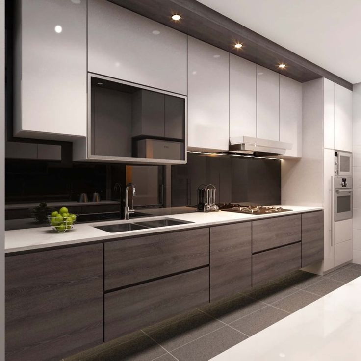
Brown in the interior
We update the kitchen design