Mint color in the interior - the freshness of being and juicy mood (135+ Photos). The combination of colors that you did not expect
. The combination of colors that you did not expect")
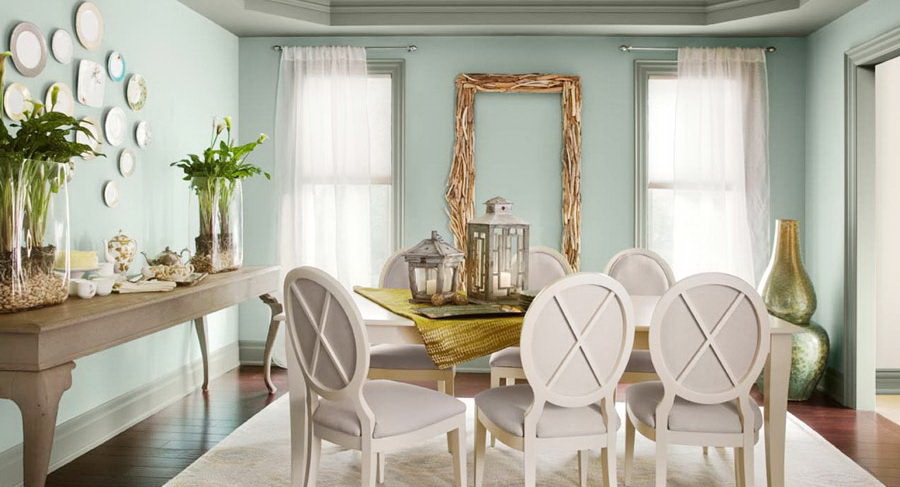
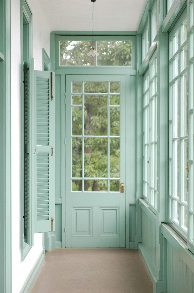
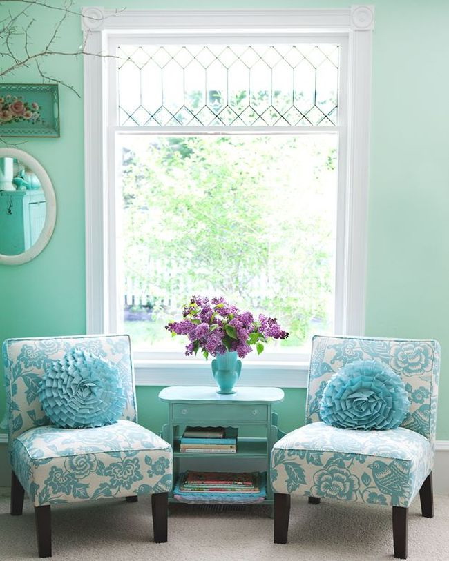
Perhaps the most soothing shade for the human eye, the mint color added to the interior, will give a range of emotions. Like the other shade of green, mint helps create a refreshing atmosphere, especially in places where you want to relax and recharge with new forces, for example, in the bathroom, bedroom. Fresh notes of mint provide a flexible backdrop for other colors. For an elegant color scheme that looks fresh all year round, try mixing soft shades of mint with lace white, pale gray and dreamy lilac.
Content:
Mint is a pastel color that looks good in the interior, it is combined with many shades. Gives a fresh, peaceful feeling, goes well with light, dark tones, metallic, other pastels.
Gives a fresh, peaceful feeling.
This shade, although it received its name from the plant of the same name, actually has little in common with the color of the source. The leaves of the mint plant are dark green, as if covered with a grayish shroud. And the mint flowers are fluffy panicles of dirty blue.
Fluffy green the stem also does not inspire much confidence. In fact, the color of mint does not copy plant, but people have long used mint chewing gum, dragee, tea, so that they have a permanent image of something fresh, similar to aquamarine.
In the palette of green shades the colors of turquoise and mint are very close to each other. A comparison with the blue tones places it next to the blue. Experts identify four shades of mint:
- menthol;
- light turquoise;
- pistachios;
- sea waves.
Thus, we can say that mint is on the border of cold and warm tones.It is enough to add a little yellowness to it to soften it beyond recognition.
Mint is a pastel color that looks good in the interior.
Peppermint was very popular in the 1950s, although it was often used in the 1930s and 1940s. The color is really elastic, very popular today. You can often see mint green walls in modern designs. It often appears in modern accessories, especially in combination with metallic.
Wallpaper
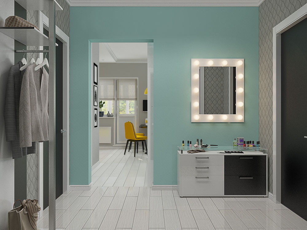
Wallpaper monophonic mint shades are often used in Scandinavian style, which is famous for its visual purity, bordering minimalism. The beautiful palette characteristic of the Scandinavian style, as well as natural materials together with the menthol walls create a balanced, harmonious combination.
The colors of turquoise and mint are very close to each other.
Non-woven mint wallpaper is beautifully decorated nursery room of both sexes.
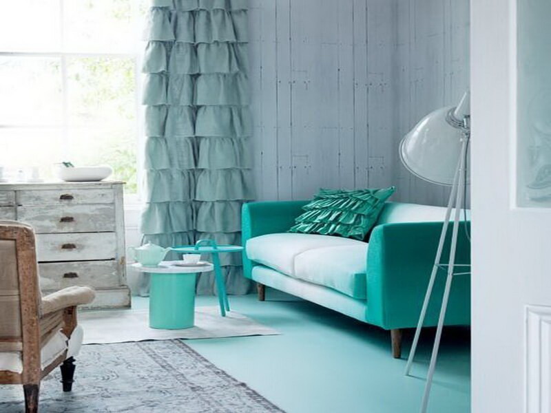
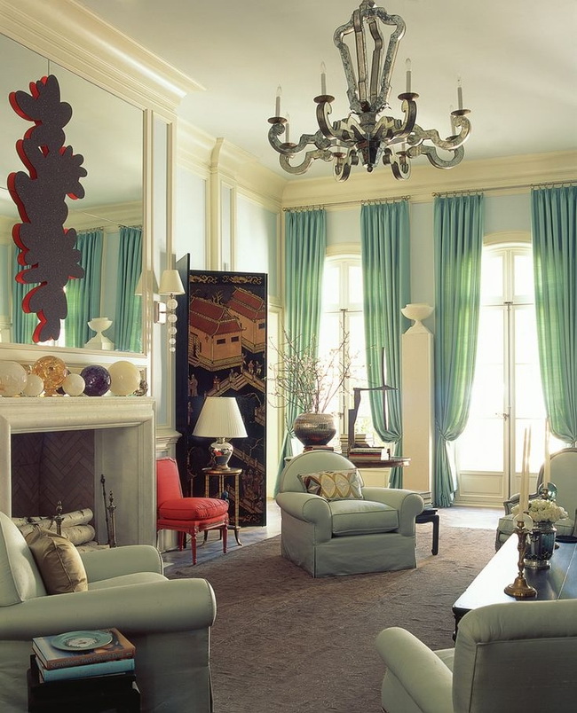
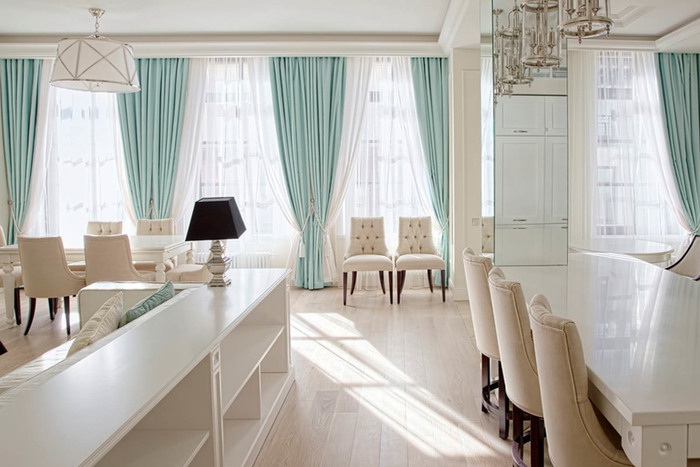
return to menu ↑Upgrade your living room with mint curtains
To living room looked bright and fresh, pay attention to the choice of curtains. They can either create or destroy your design, so choose them carefully. For a renewed, pastel look that will help your living room reach its potential, mint curtains for this are the latest trend!
In a room where there are already mint elements, pastel curtains will contribute to the cohesion of the color scheme.
The color is really elastic, very popular today.
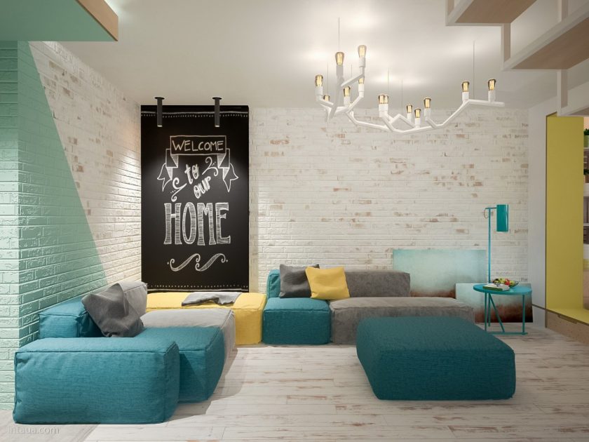
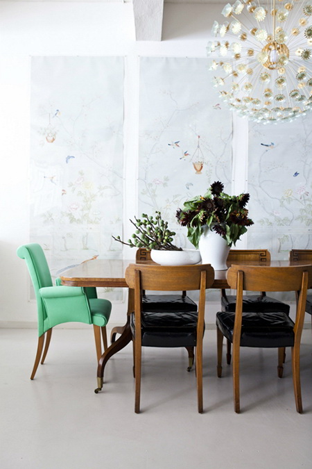
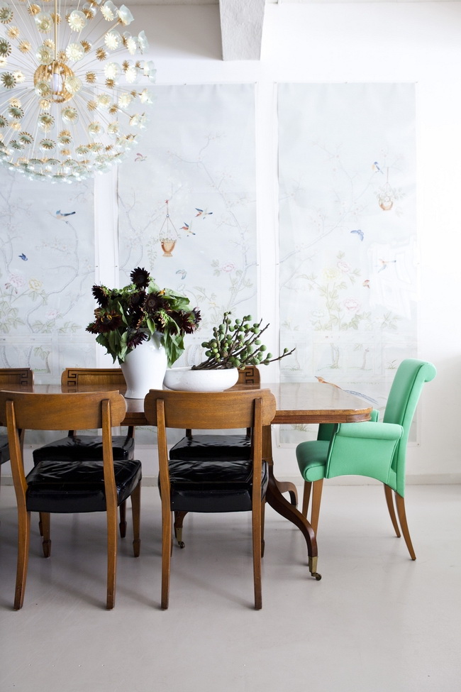
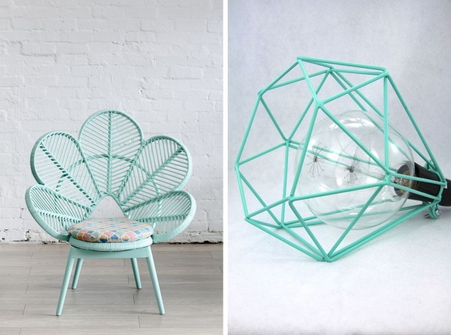
Mint furniture as a perfect pastel element.
The idea of painted walls may seem too constant and therefore frightening for some, therefore there are other ways to liven up your living room with a beautiful mint decor to turn it into pastel perfection.Adding mint furniture guarantees comfort and vigor, two characteristics that any living room can aspire to.:
- In the living room with neutral wooden furniture sofa—bed will be the focal point, the element that takes care of the invigorating effect.
- Mint Coffee tableChairs are the obvious choice. If you don't want the retro feel to be out of control, just add a different shade of chair to balance the fresh mint!
- Bright living rooms, decorated in a clean simple style, are a suitable place for a mint sofa. If you want only a hint of boldness, add a chair in a stronger shade of mint.
- In a modern living room with many attractive elements, it is sometimes difficult to determine the focus, as if it is not known where to look for it. An amazing mint sofa solves this problem in an instant.
- Pastel mint sofa is a fashionable touch that can accommodate any living room.
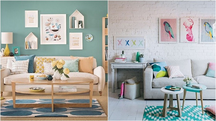
Bright decor
This pastel color can really argue with many other basic pastels, which are commonly used in the interior to provide the background, the decoration base. Consider also dyeing your menthol facadeif you live in private home. It is in harmony with the surrounding nature, universal for the facades of any style.
return to menu ↑Create a mint mood
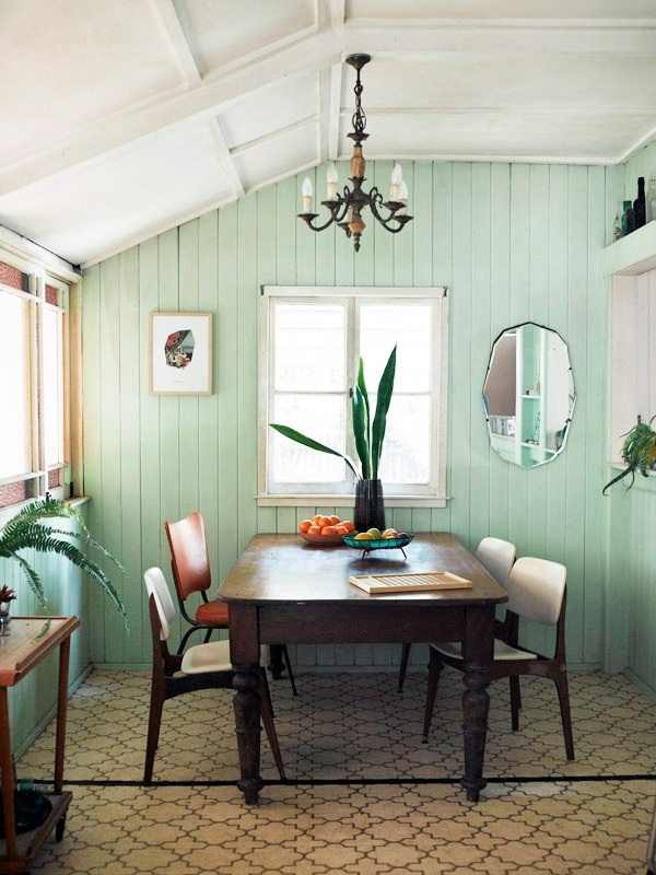
Mint - calm, nice looking. It is suitable for different styles, looks good in modern, minimalist design, traditional rooms, vintage design, shebbi-chic. Since it is combined with many colors, and also works in different types of rooms, the design of the house with this shade is quite simple and a novice decorator can handle it. But, despite its calm nature, there are several important things to remember.
Calm, nice looking palette
This is a two-part color that has many different shades:
- sea foam;
- light turquoise;
- menthol;
- mint;
- pistachio ice cream.
Therefore, every homeowner will find a shade that he likes.
Good for different styles.
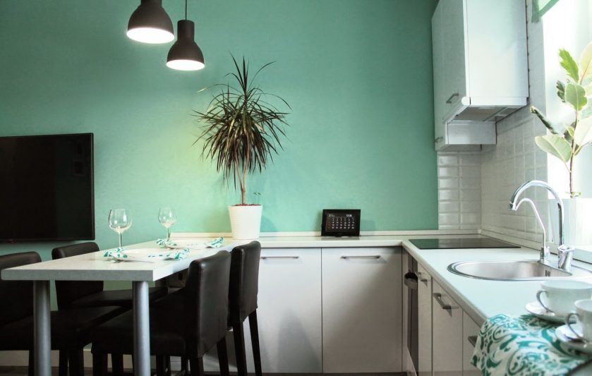
Last year it was very popular, one might even say that it is a trend color - not only in design, but also in fashion. But since he is accustomed in the fashion industry, this is an original novelty in the interior. The peculiarity of this color is space, comfort, therefore it is often used for a bedroom orkitchens. And it is unusually refreshing, makes the room more clean.
Bright and calm
When deciding to use it at home, first of all consider decorating the walls with it. Soft green walls will have a relaxing effect, no matter where you apply them. You can choose green mint as wallpaper, besides wall paint.
Soft green walls will have a relaxing effect.
Mint decor - where and how to apply?
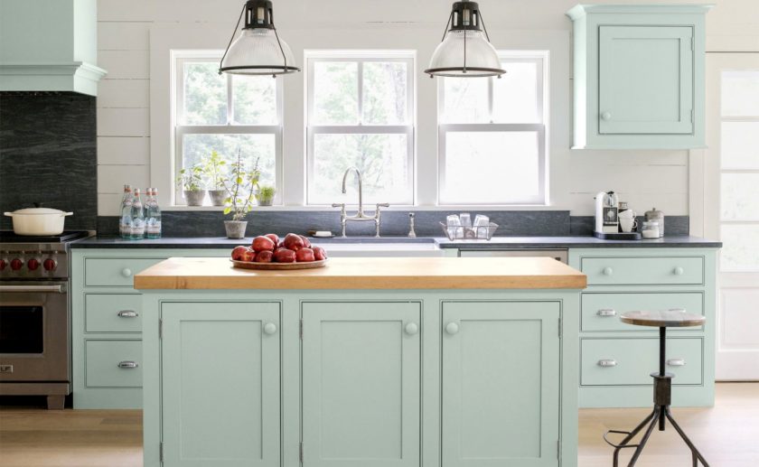
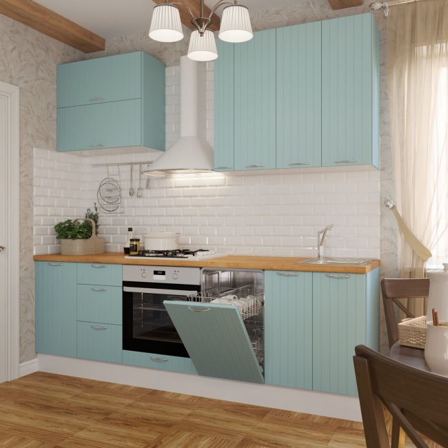
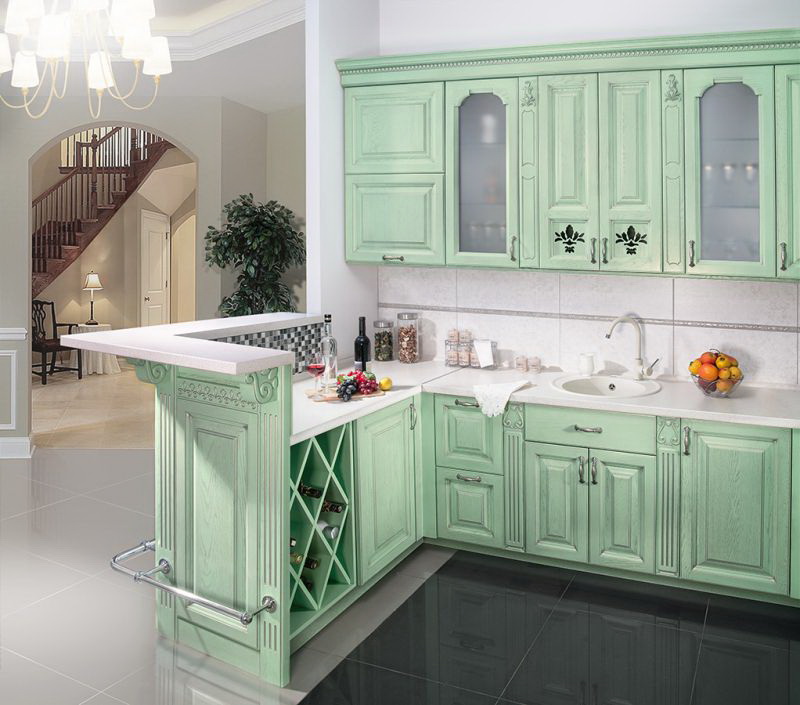
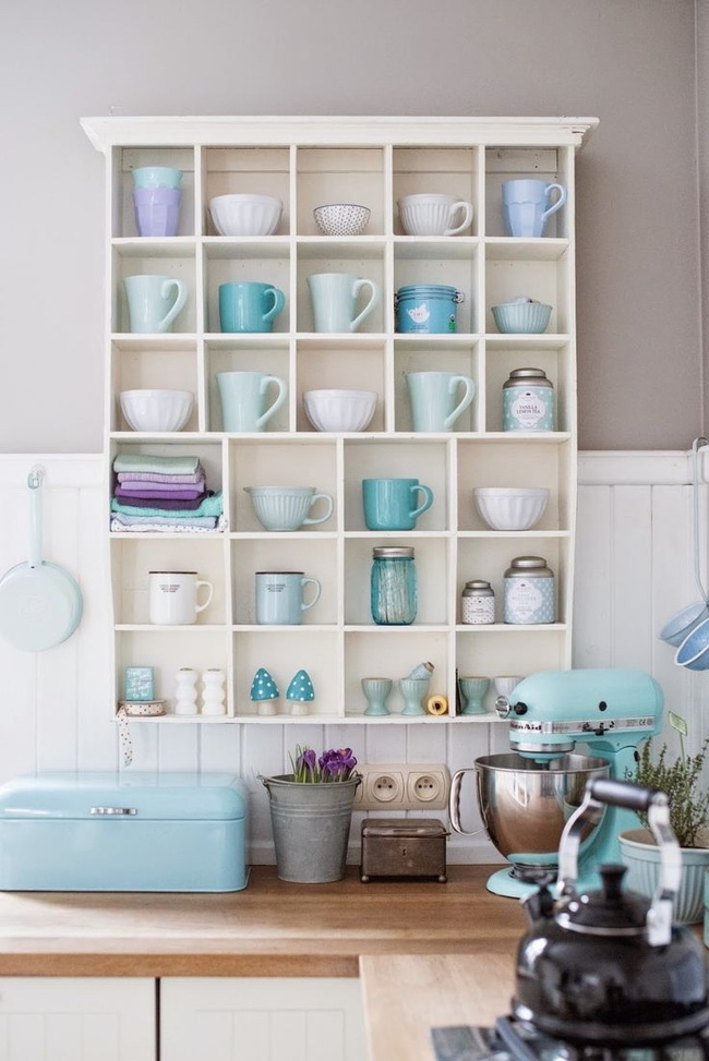
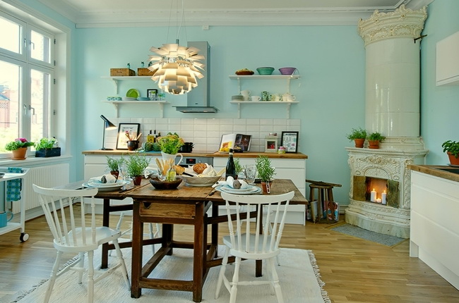
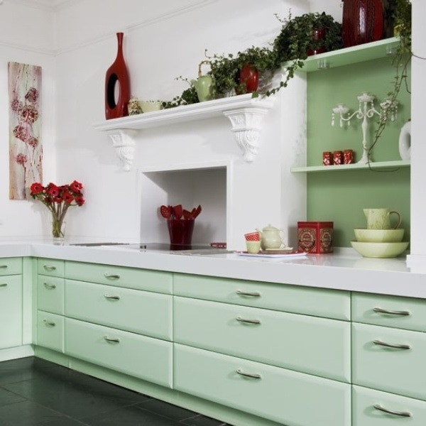
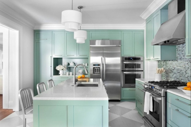
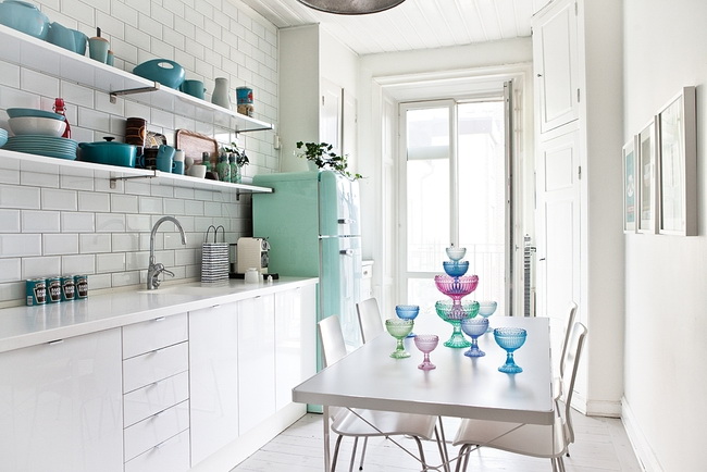
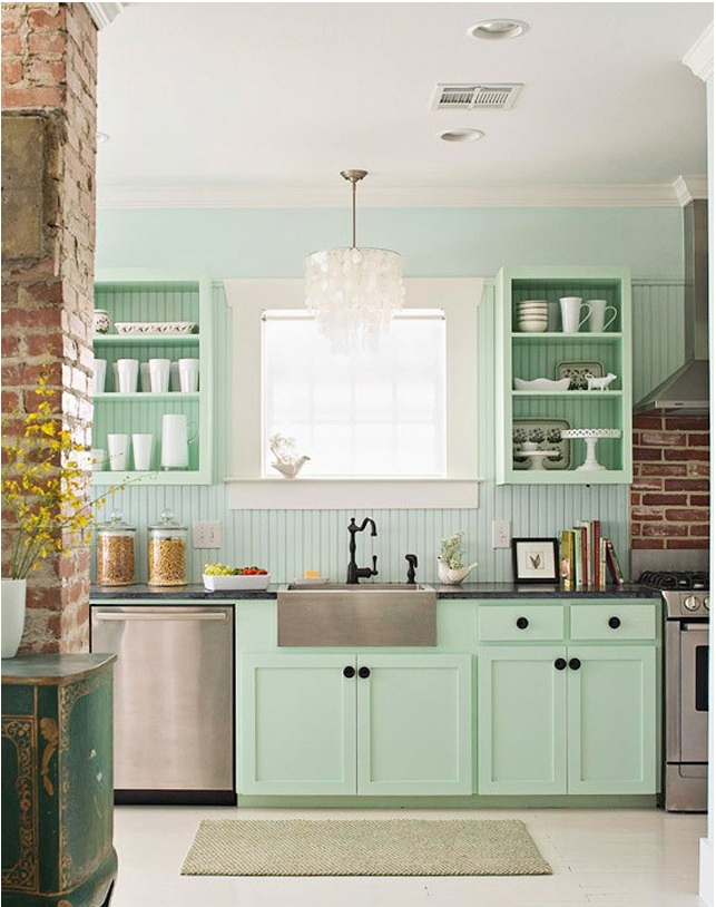
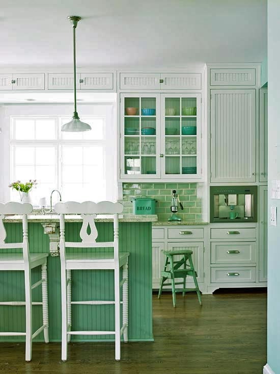
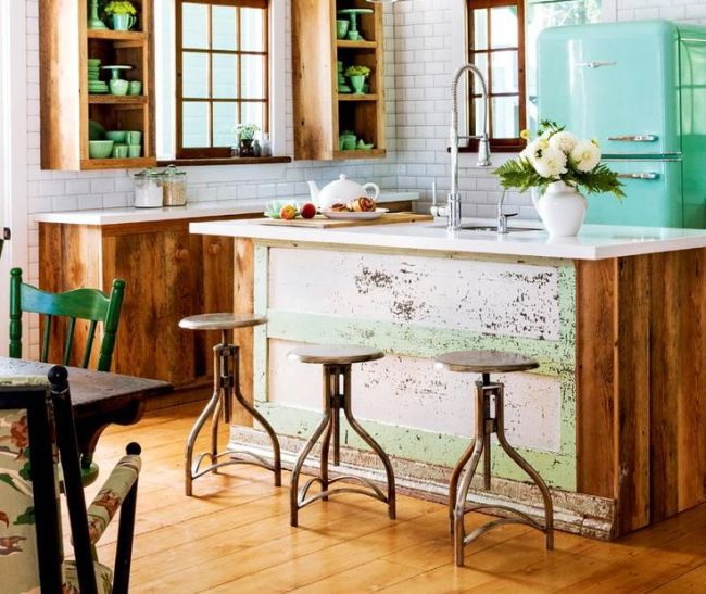
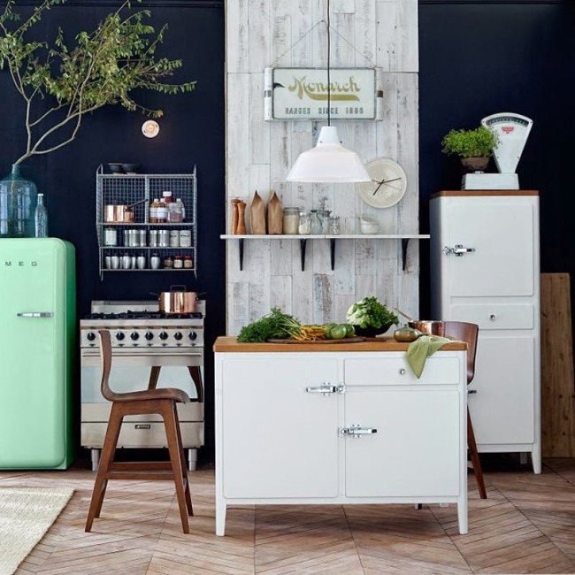
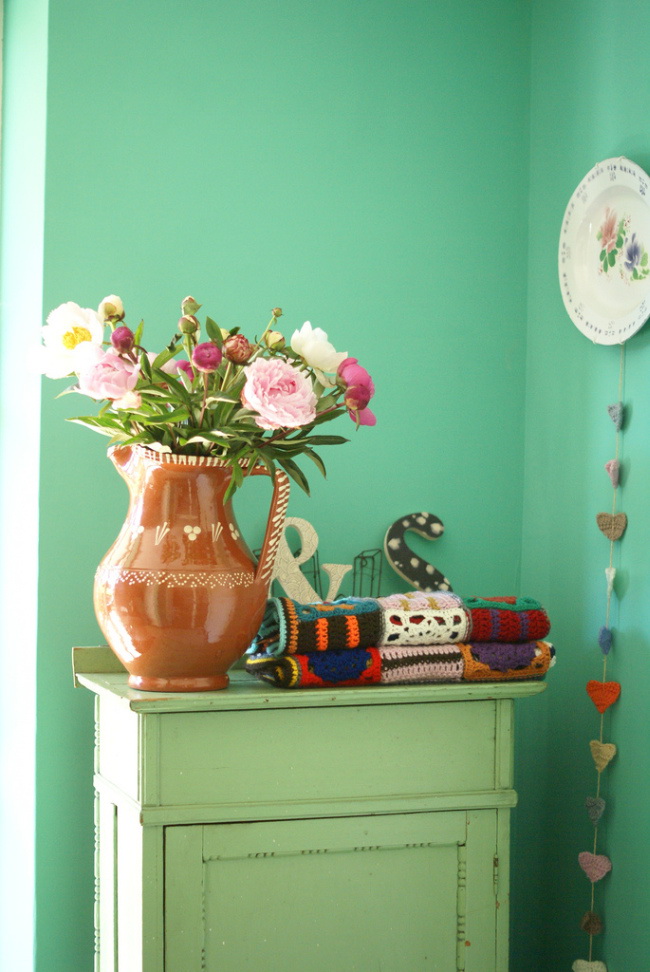
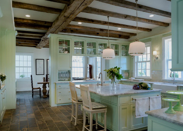
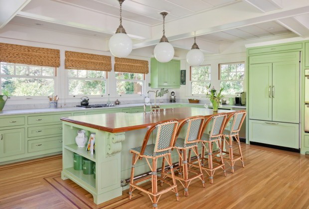
First of all you can choose it for walls and cabinets in the kitchen, especially for vintage, rustic home interiors. It is easily integrated into different places of your decor, for example, in textiles. Mint greens are also suitable for a romantic setting.
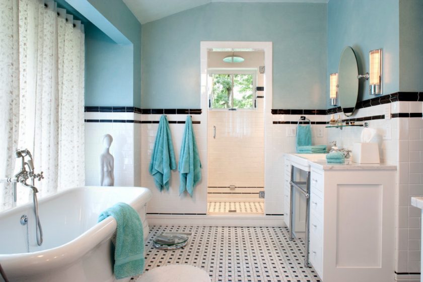
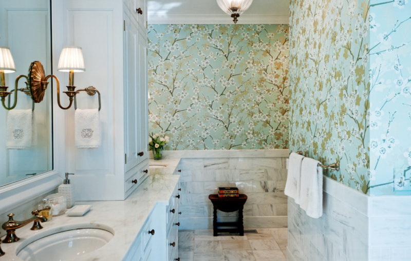
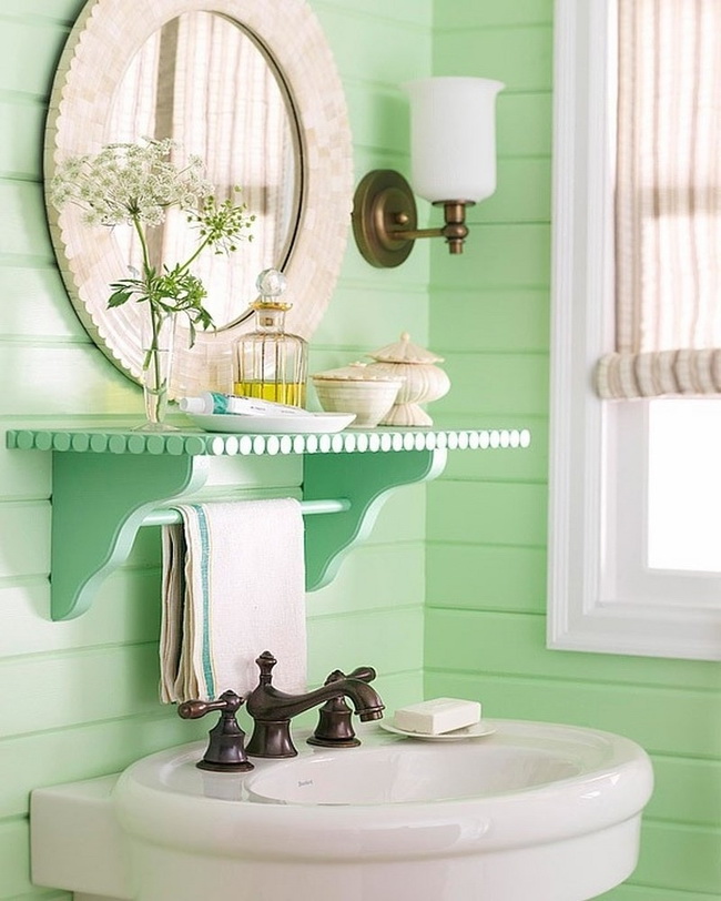
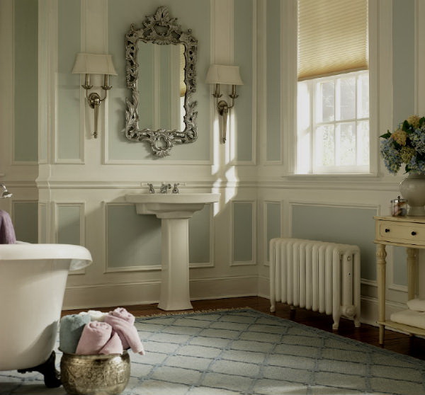
return to menu ↑Bathroom
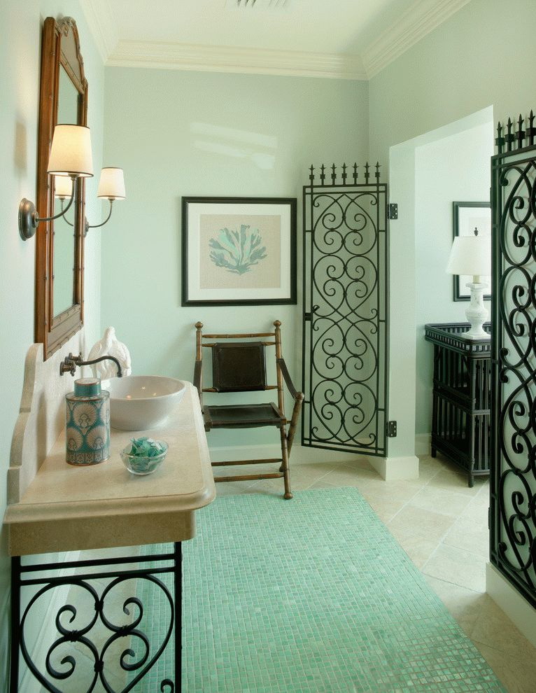
If you want to use it in bathroom room, in front of you many different options. Use it for wall, floor tiles, shower curtains or select mint greens for decorative bathroom accessories. In the bathroom, you can use mint green towels or romantic details to create retro-style.
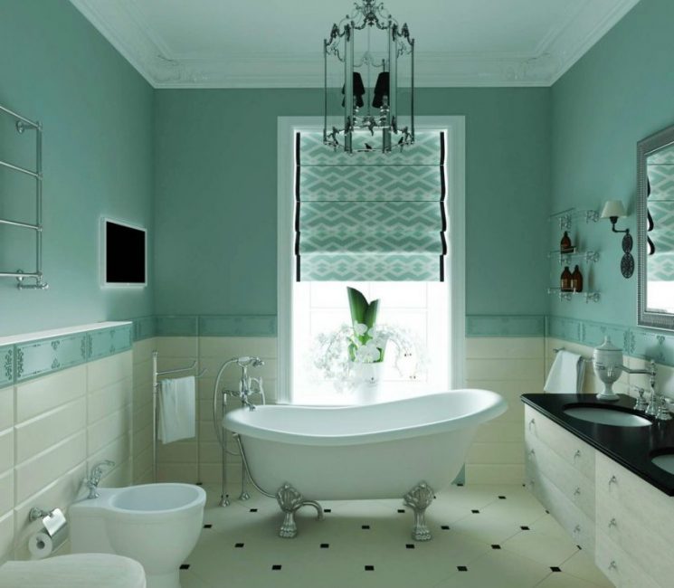
In the interior of the bathroom
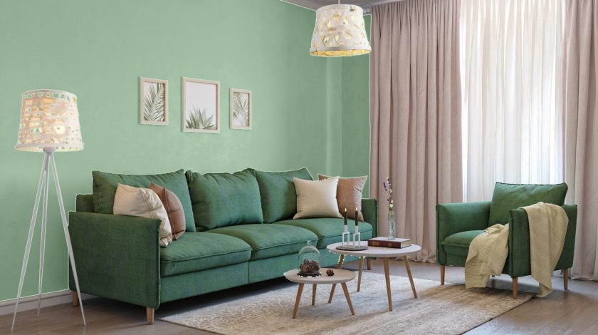
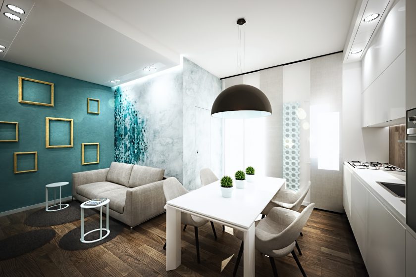
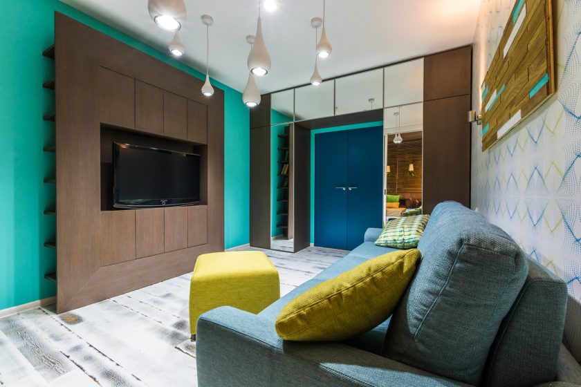
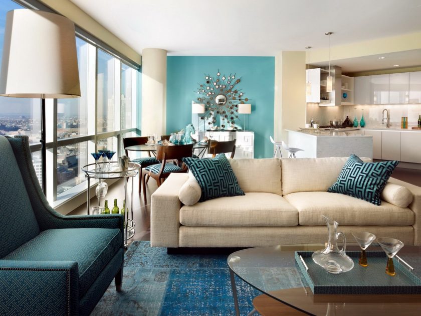
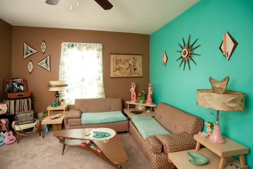
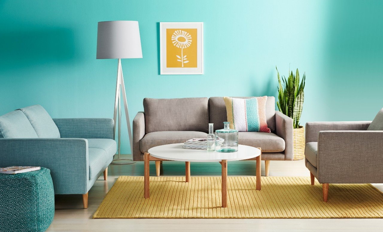
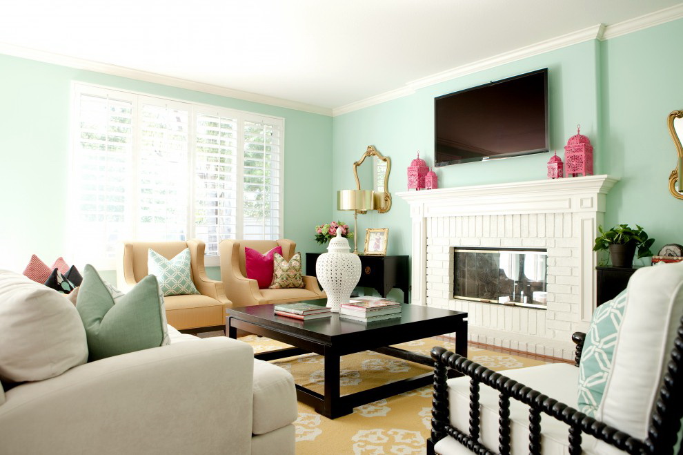
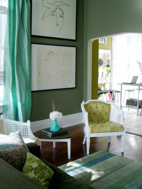
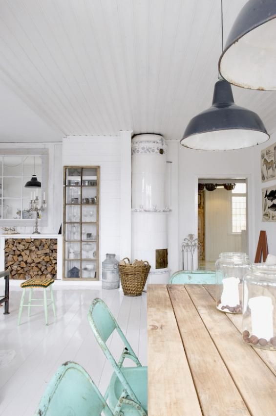
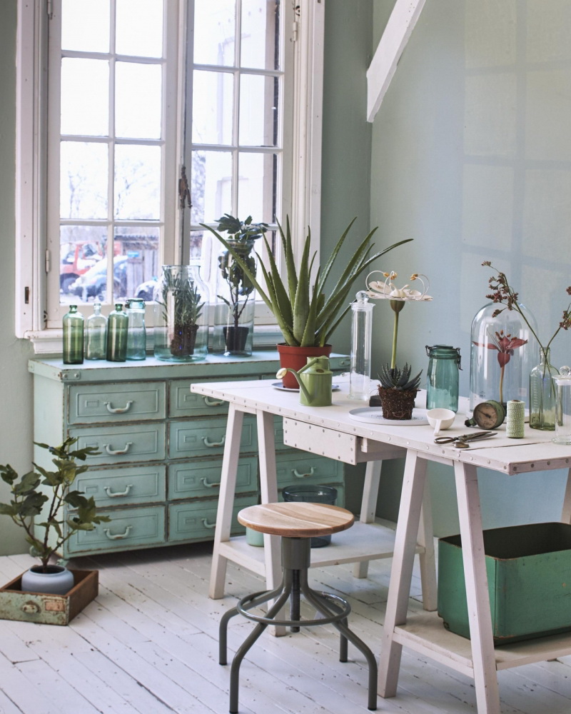
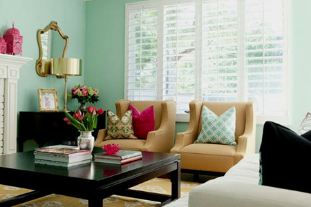
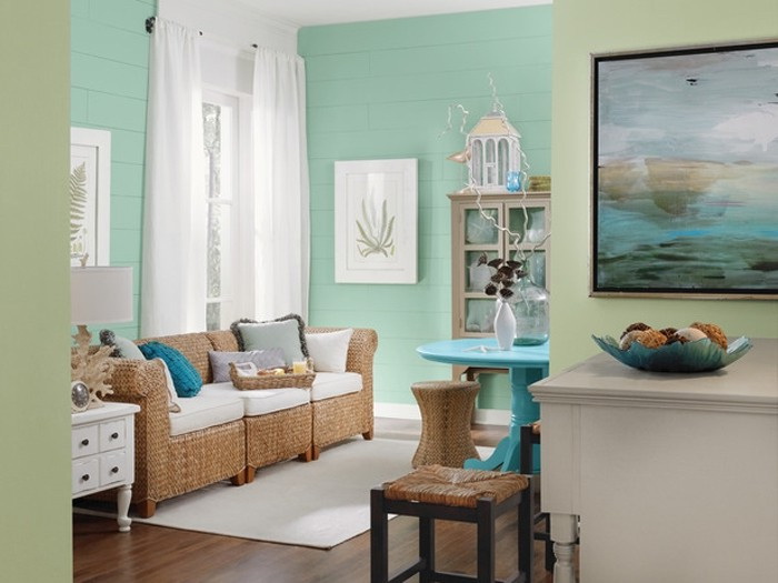
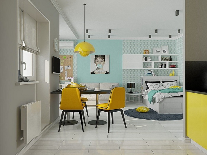
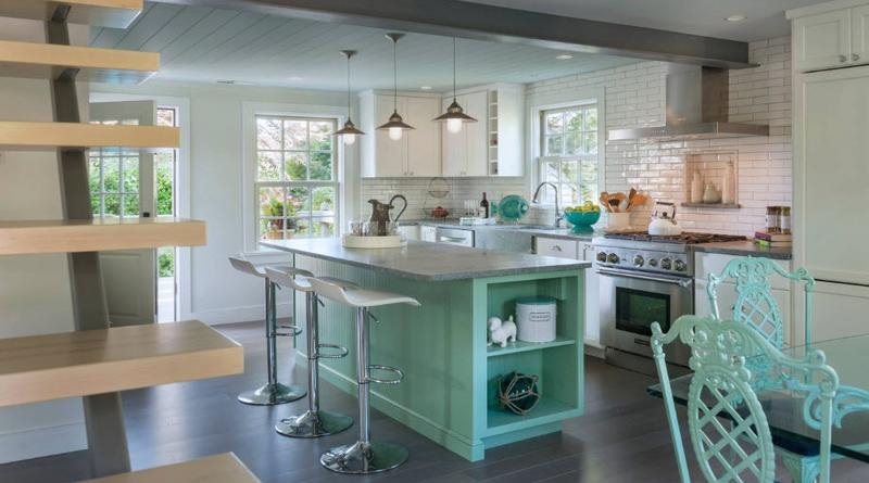
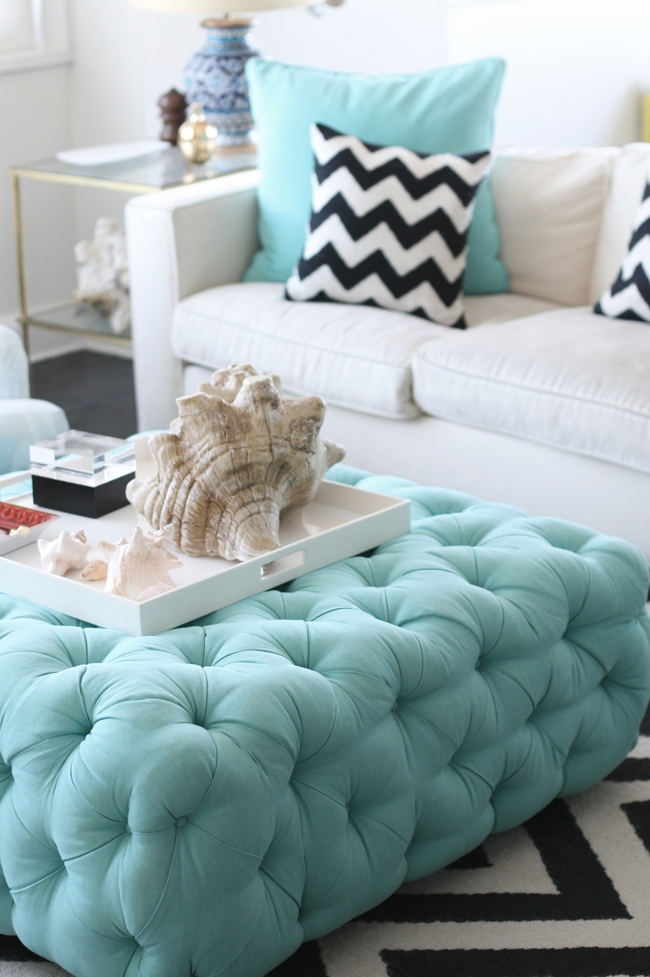
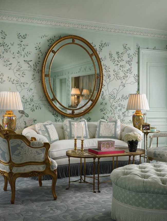
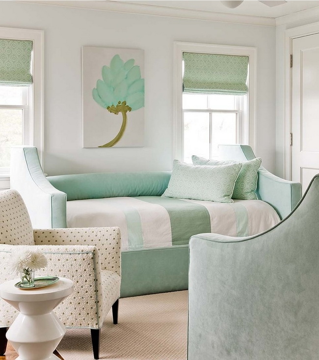
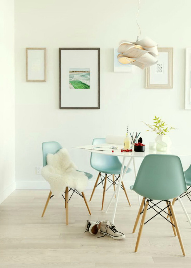
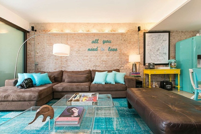
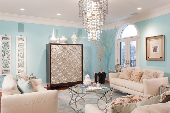
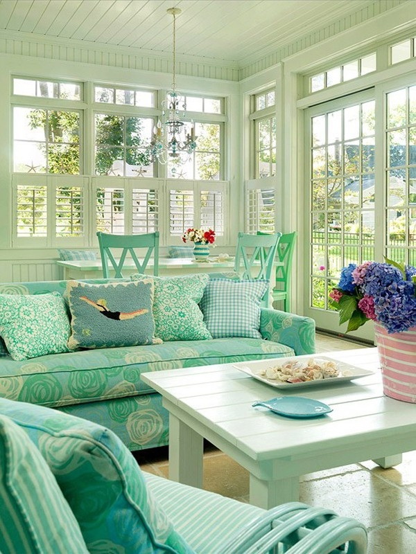
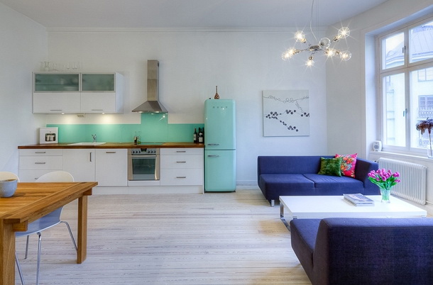
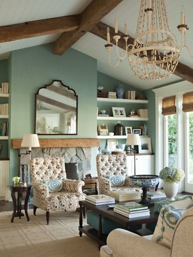
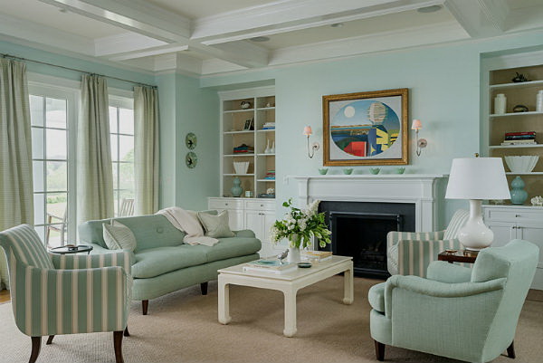
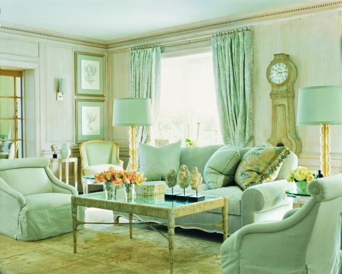
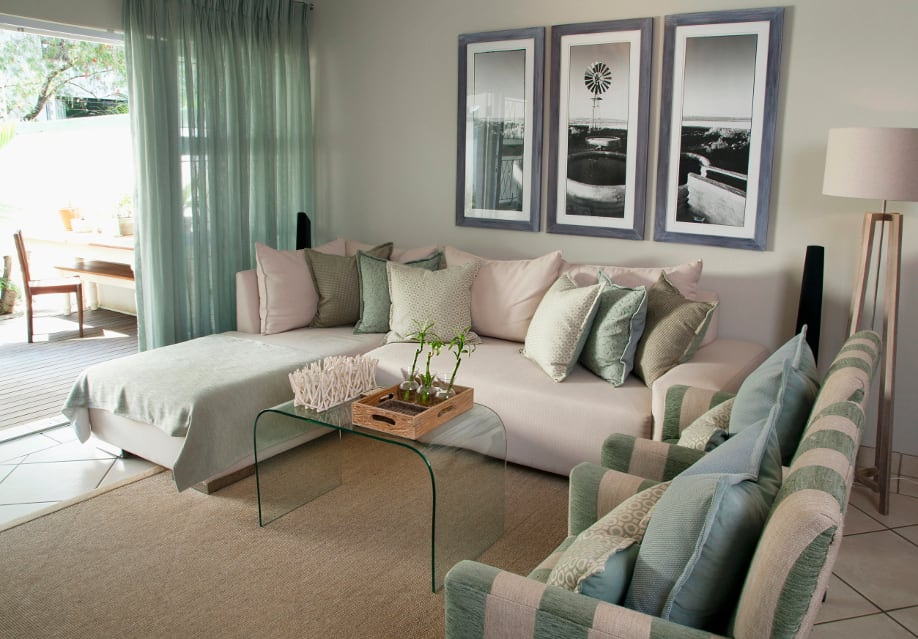
Living room
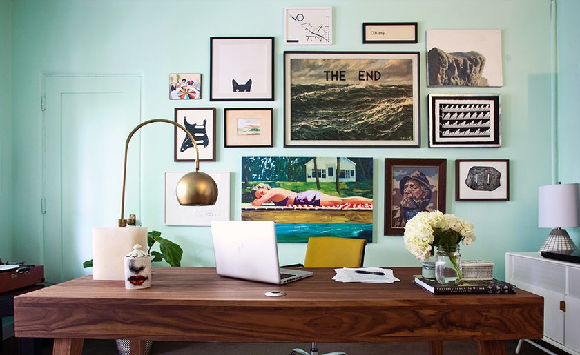
In the living room you have the opportunity to use it everywhere, starting with decorating the sofa with the help of menthol green pillows, choosing mint accessories, using mint greens on the curtains to change the atmosphere of the room. Or feel the feeling of freshness, choosing greenery for the walls.
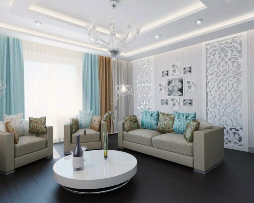
In the interior of the living room
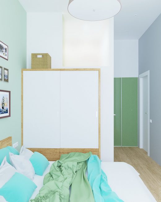
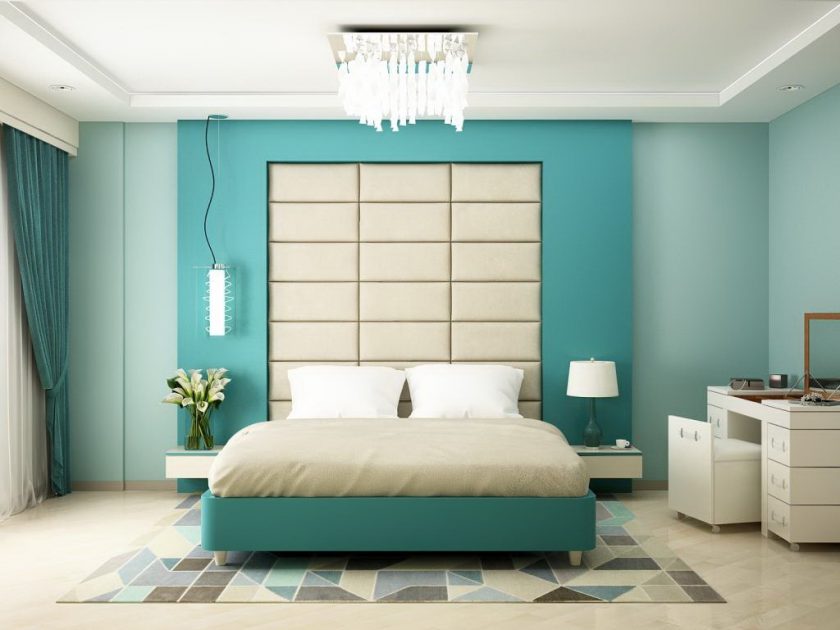
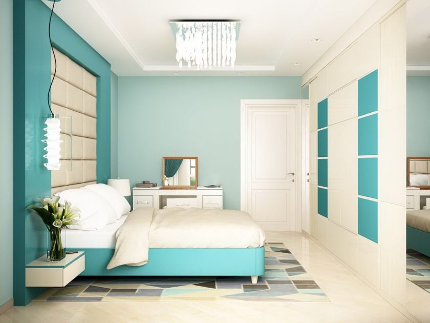
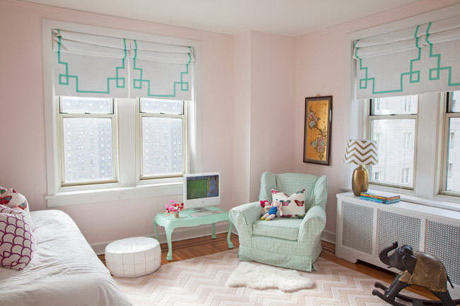
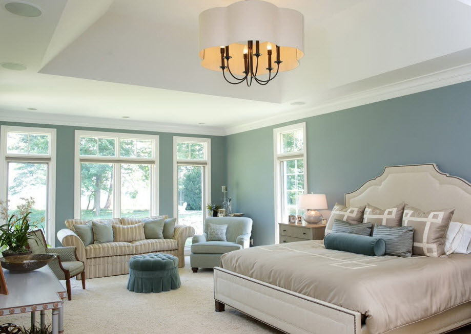
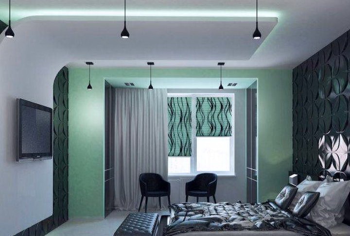
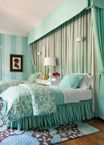
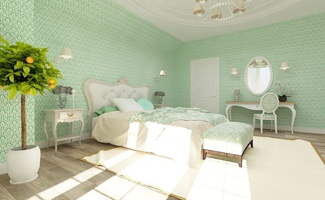
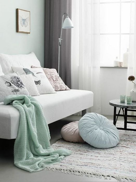
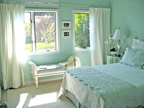
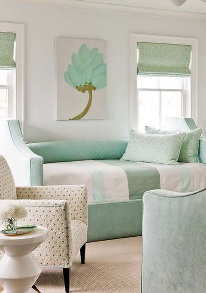
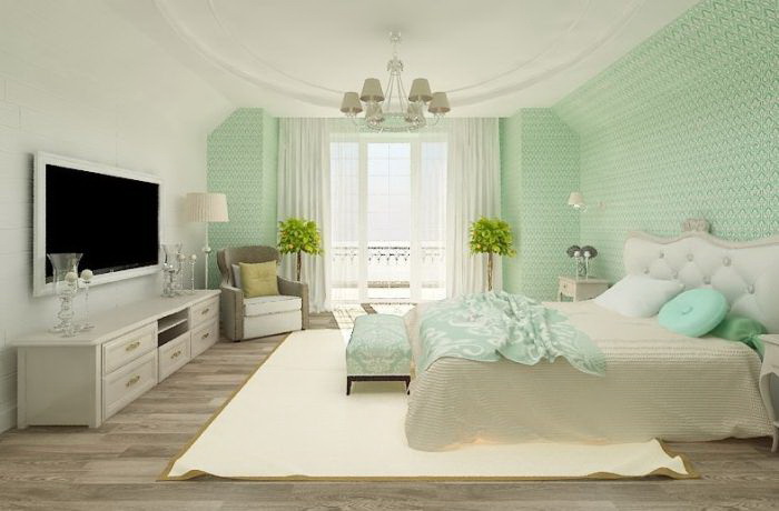
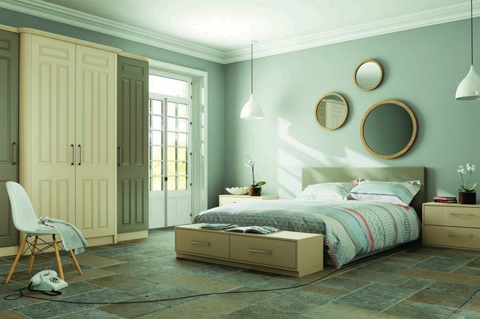
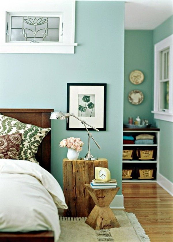
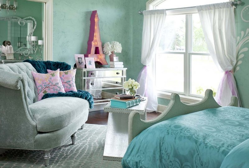
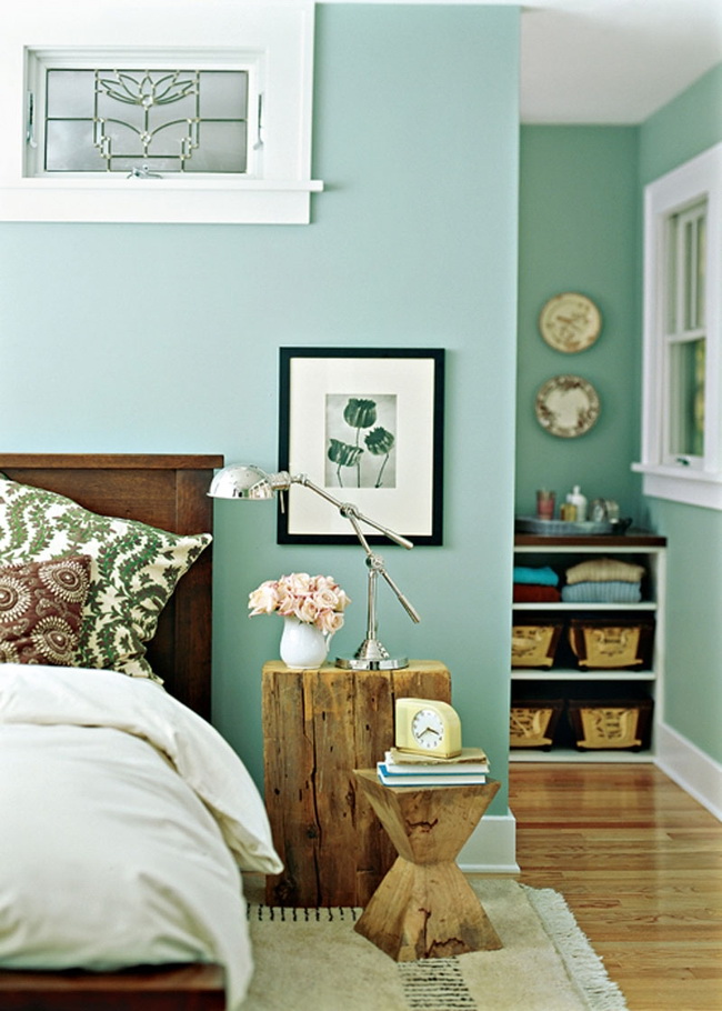
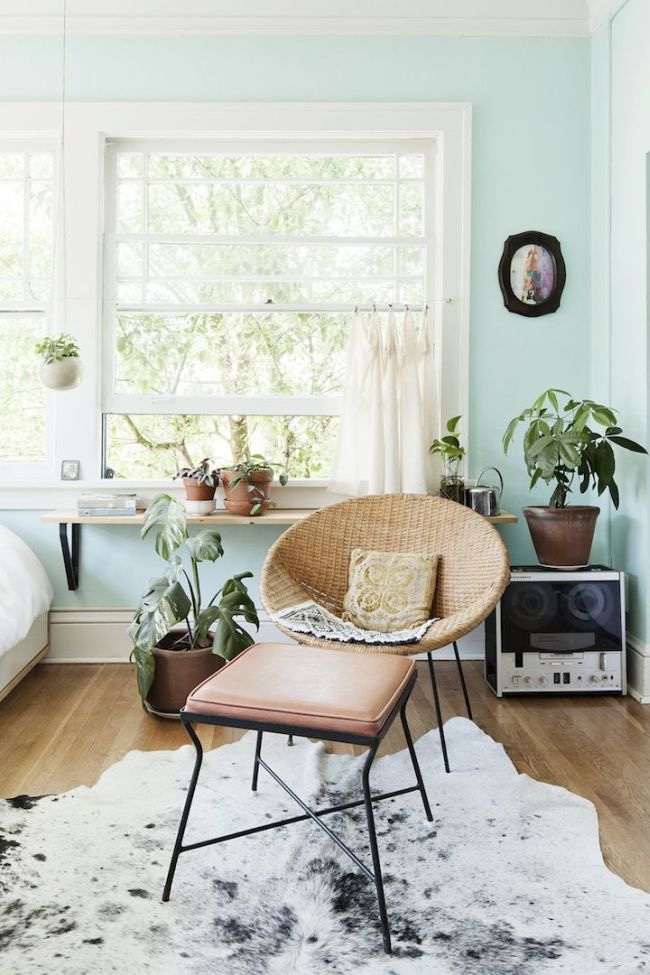
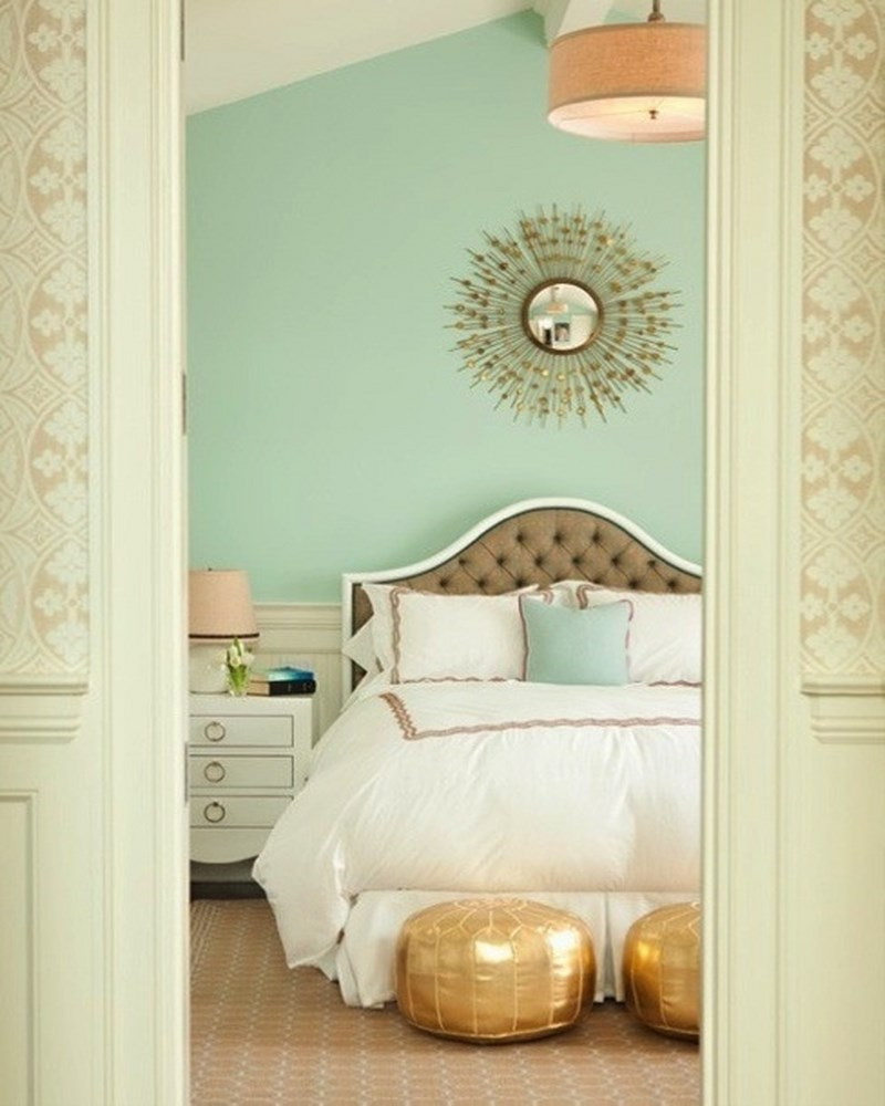
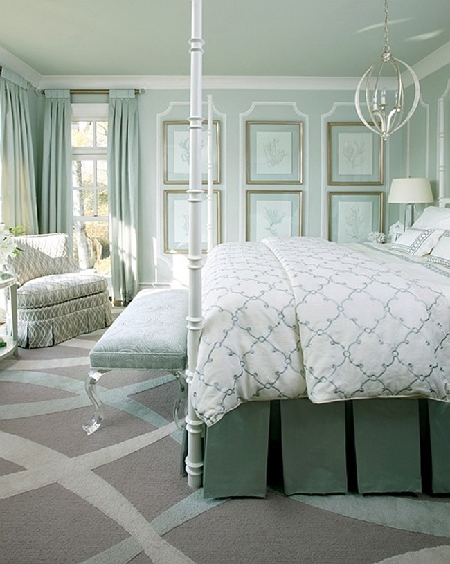
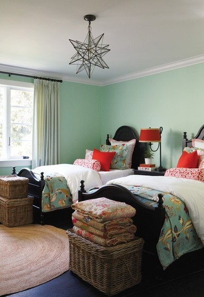
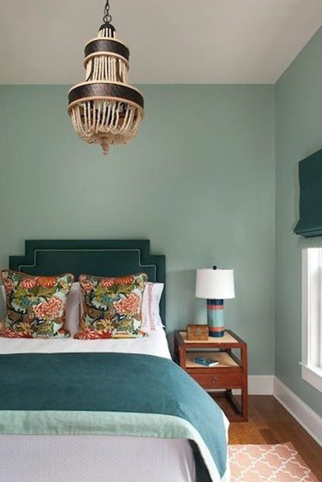
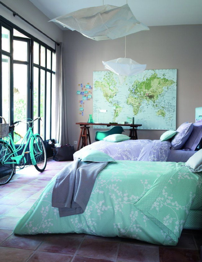
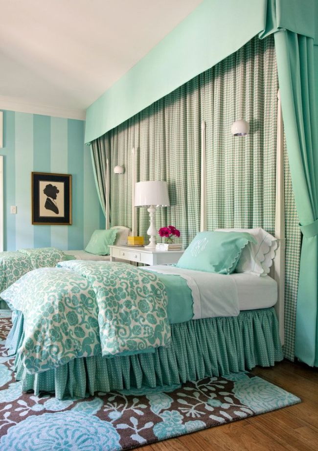
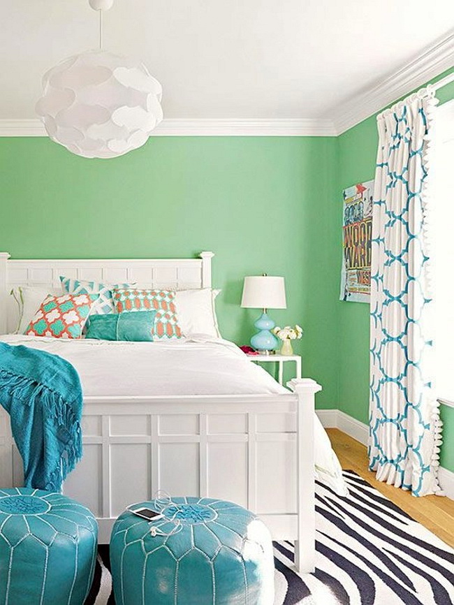
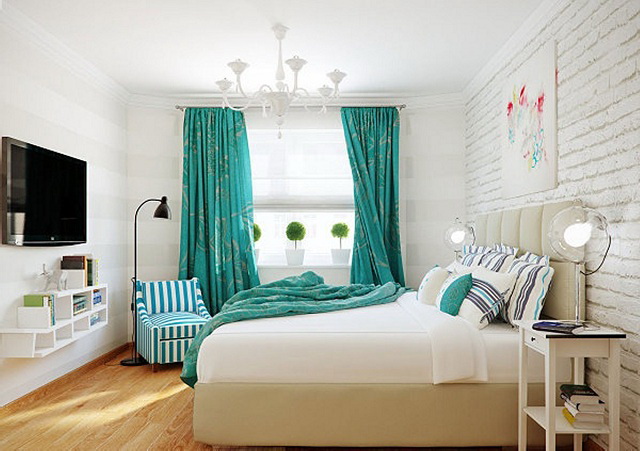
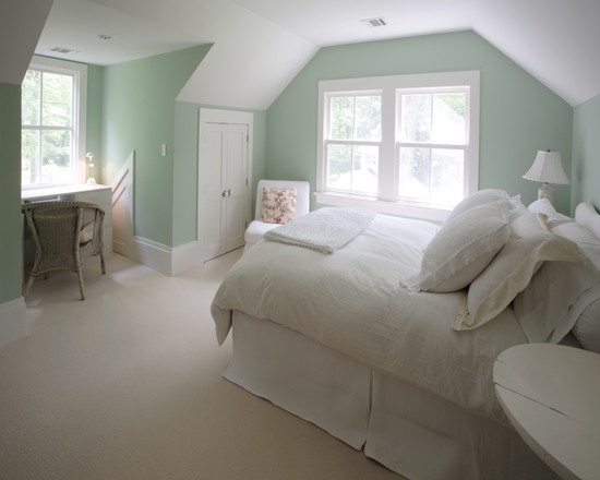
Bedroom
AT the bedroom You can say hello to the sun by choosing mint greens for textiles. It is useful to try it with a relaxing effect for bedspreads, bed linen, curtains, pillows. When it comes to the bedroom, vintage or country style makeup will not be bad.
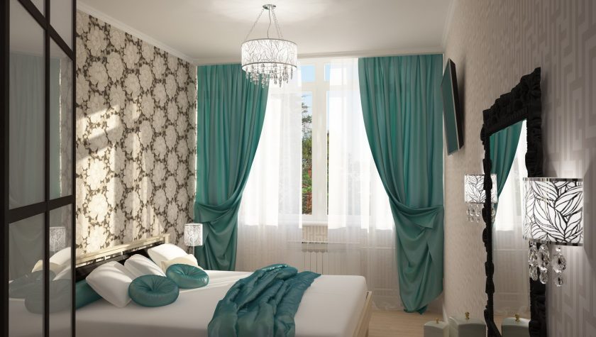
In the interior of the bedroom
Mint combo: combine colors
It is best to think about the mood you want to create, and then just trust your own look. The result will always depend on the amount of natural light in your space, so check the combination of hues already in your room before making a final decision.
Menthol is associated with freshness, energy, vigor
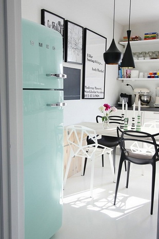
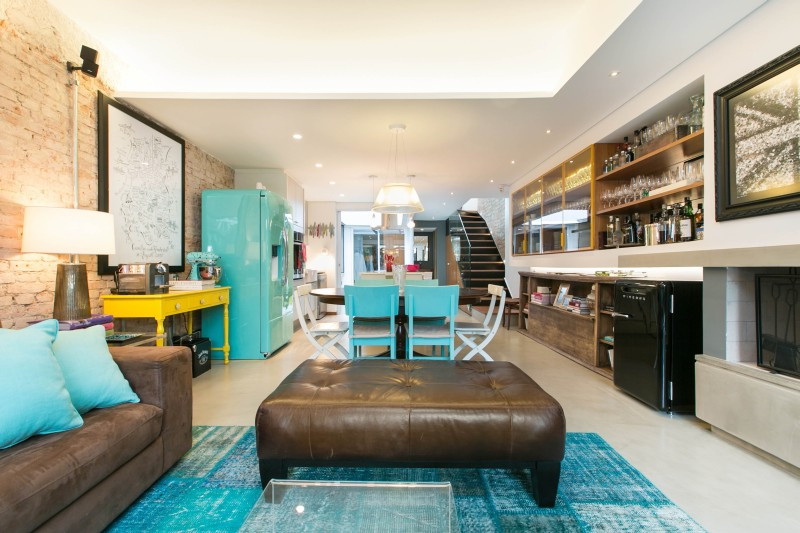
Mint and Metallic
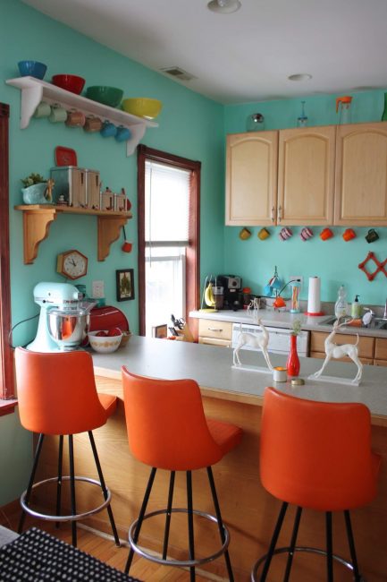
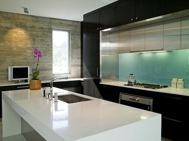
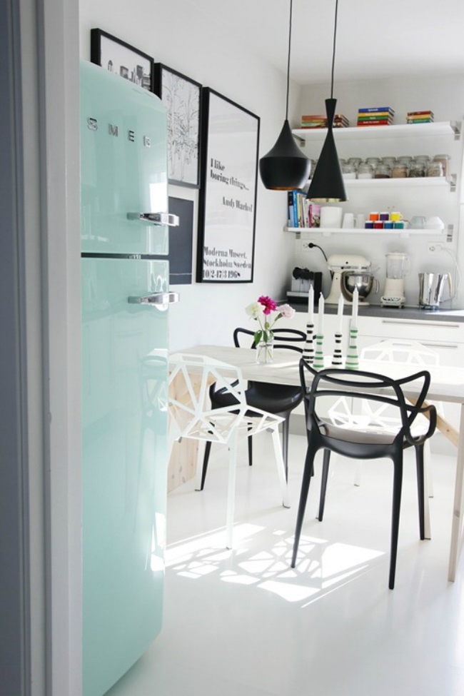
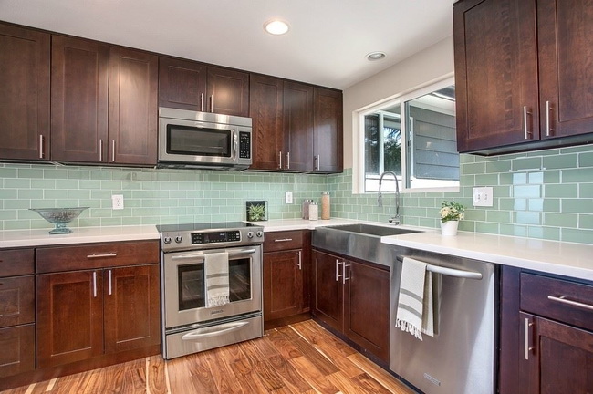
Create a bright and bold effect by combining metal with mint, especially this combination is important for the kitchen, where you can place a lot of metal appliances.In combination with metal shiny elements in the kitchen, mint looks cool, fresh. Combine brass with mint for an elegant, luxurious look or with matt nickel lampsto create a decidedly cool space.
In combination with gray and white
Combining with white
To use menthol's relaxing properties in the most efficient way, you can combine it with white. A combo with white is a clean, clear pattern. Here you can safely experiment using white walls with menthol furniture, or vice versa. White finish with this contrast always adds architectural interest.
Mint-white striped wallpaper will perfectly fit into the image. And in combination with red, yellowYou can add energy to the surrounding space.
. The combination of colors that you did not expect")
. The combination of colors that you did not expect")
. The combination of colors that you did not expect")
. The combination of colors that you did not expect")
. The combination of colors that you did not expect")
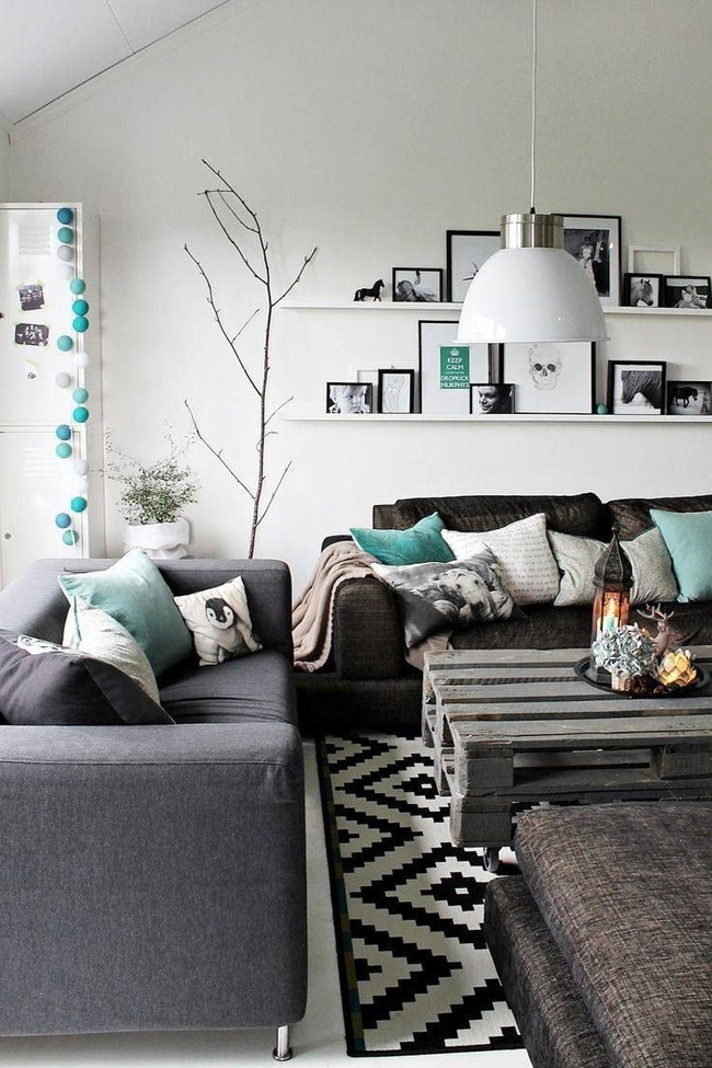
Combination with black
This is a radical, but very effective way to decorate. A pair of mint with black lacquered furniture or molding - one of those ways that will leave a vivid impression.
return to menu ↑Combination with lavender
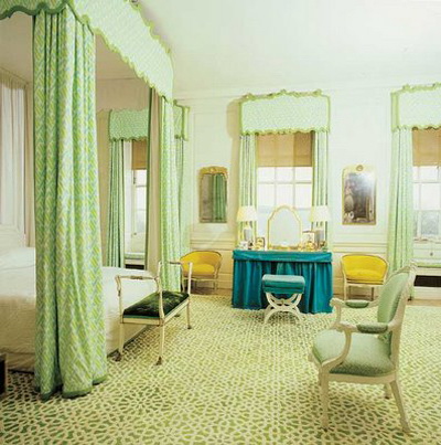
Pastel shades always look good together, have a very feminine and “cute” shade. Lavender is a great alternative to pink if you want something soft, but not too girly.
return to menu ↑Gray
Gray calms, mutes the natural energy of mint. To keep a soft palette, try adding light gray, pastel colors.
In the interior of the nursery
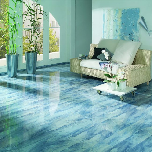
Aquamarine
Combined with each other, these two colors create a real concentrated retro-atmosphere of the era of its heyday. Add red to complete this image.
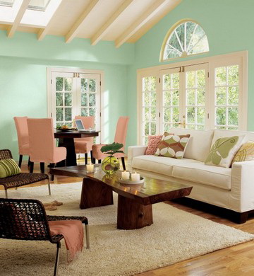
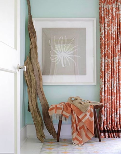
return to menu ↑A stunning combination of peach and mint
Both of these colors are modern and sophisticated. But when they go together, miracles happen. Designers draw their best ideas from natural inspiration. Both of these colors are very appetizing, causing associations of a juicy and light dessert. The mint-peach interiors look just as appetizing.
Kitchen in a light, delicate color
Rose mint color
This combination is also suggested by nature - we see it in all beautiful flowers and, first of all, roses. Pink and mint are located at opposite ends of the color spectrum. Therefore, this beautiful combination creates a dynamic aspect that is rich in contrast, it can be combined in different ways during installation.Use mint for wall color or simply select furniture and accessories.
In the style of minimalism
Salmon and Mint
If menthol can contain different intensity from green to bluethen salmon is a gap from coral to pink. This is quite a dynamic, tropical combination that will not go unnoticed and suggests association with exotic fruits - mango, guava.
return to menu ↑Mint and brown
Rich chocolate brown The color of the duet with mint is a timeless color combination that always looks fresh (and is associated with chocolate mint ice cream). And a classic black and white combo with mint can give any room a classically sophisticated, bright look.
In combination with beige
It will be interesting to you:
Interior Beige: 220+ Combination Combination Photos (in Living Room, Bedroom, Kitchen)
150+ Photos of Modern Interiors in Gray color. The advantages that gives gray design
Psychology of contrasts: 105+ Photos of combinations of yellow in the interior. All pros and cons
220+ Photo Combinations of colors in the interior: Choosing win-win options
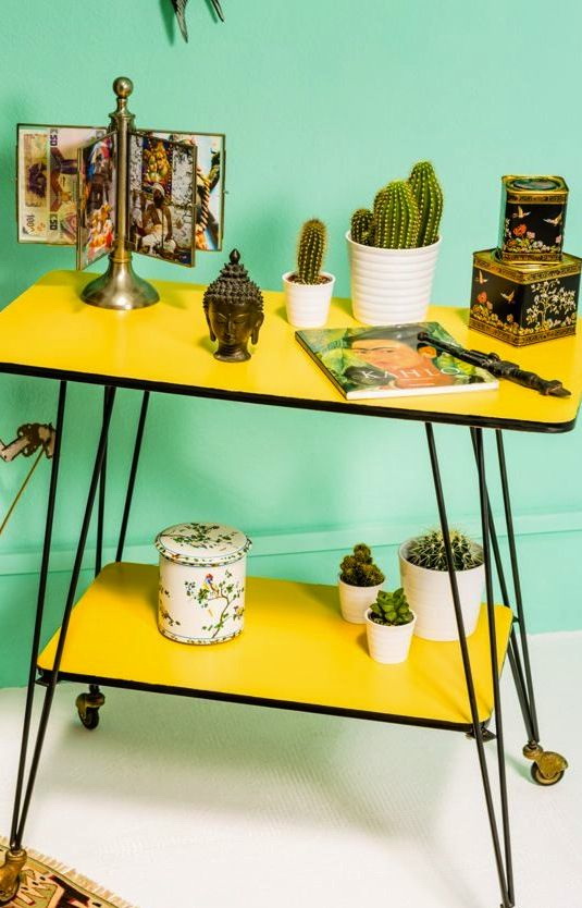
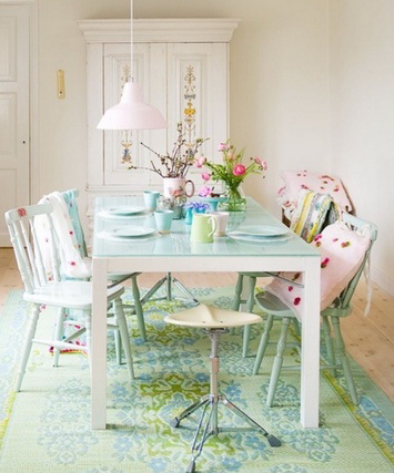
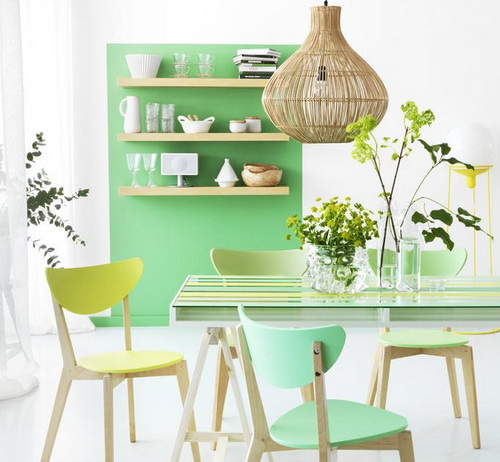
Mojito in the interior: mint with lemon
The theme of mojito is already pretty beaten, but its taste does not bother, as well as its color combination, giving the effect of double freshness.

Kitchen combined with living room
Such an interior will be happy, cheerful and optimistic. Inspired by lemons, light yellow is associated with brightness and sunlight. This is a warm color, so it should be used to bring comfort to the interior.
Blue, pink or purple hues, all brown colors are great for accentuating the design of the interior "mojito". They can be used when you need to add interest, unique character, colorful ideas to decorate the house.
Bright and cozy bedroom
Lemon lime mint
Yellow creates an expressive bow with black color that can be added to lampshades or furniture. Strong contrasts will make the room modern, for this you can also use white color. Light yellow and black and white color schemes give a feeling of joy, creating balanced and bright interiors.
You can also add brown here, but in combination with light yellow details. Brown accents will add a sense of stability and security to the rather frivolous interior of the main scheme.
Playful and light, mint color
Yellow green brown color scheme
Light yellow color goes well with darker colors and all saturated color shades. Brown colors create almost neutral backgrounds for yellow walls, furniture, and decorations. Brown, yellow and green combos are a harmonious and balanced color scheme that seems natural and organic.
Mint is quite fashionable, which means that it will be popular for quite some time. Peppermint energy will always be popular, so don't worry that your mint green furniture will go out of style.
Peppermint energy will always be popular.
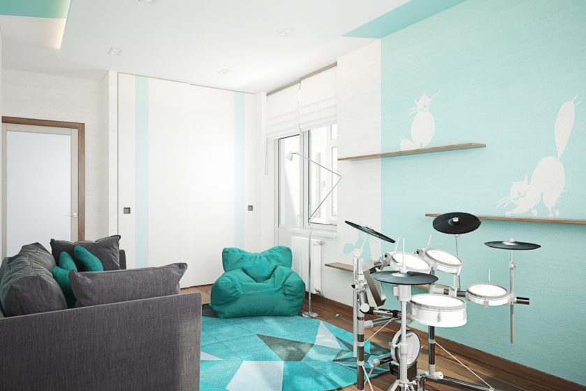
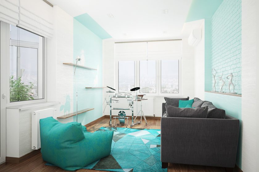
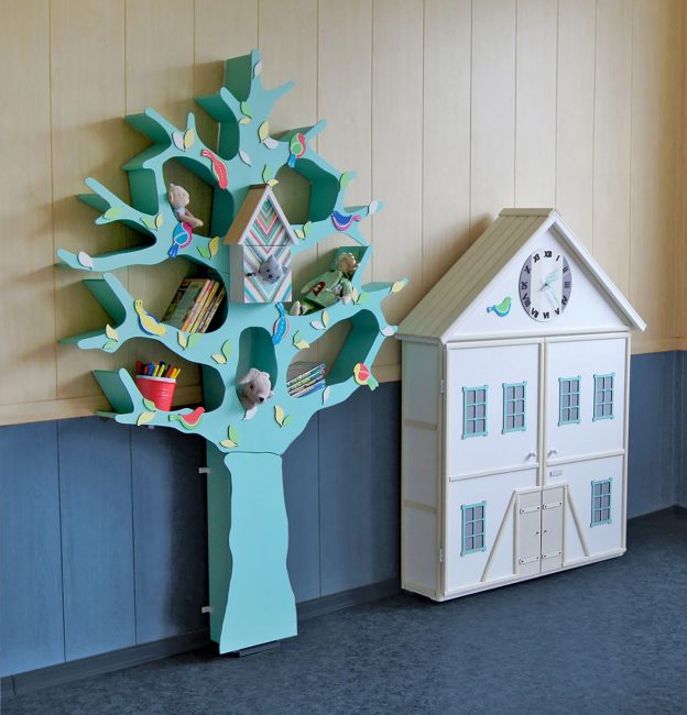
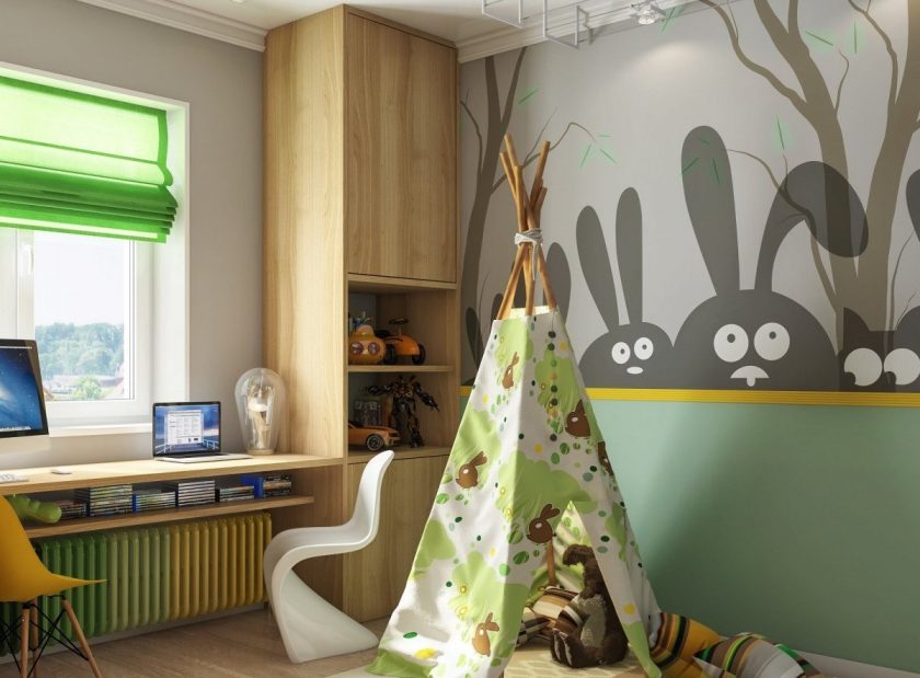
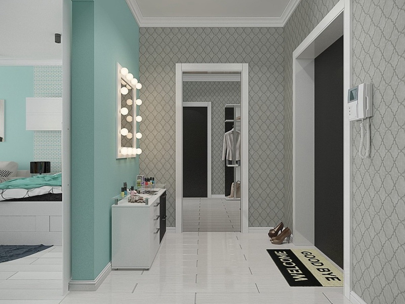
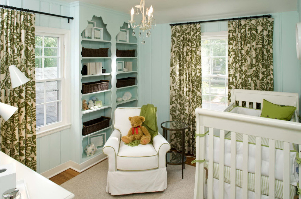
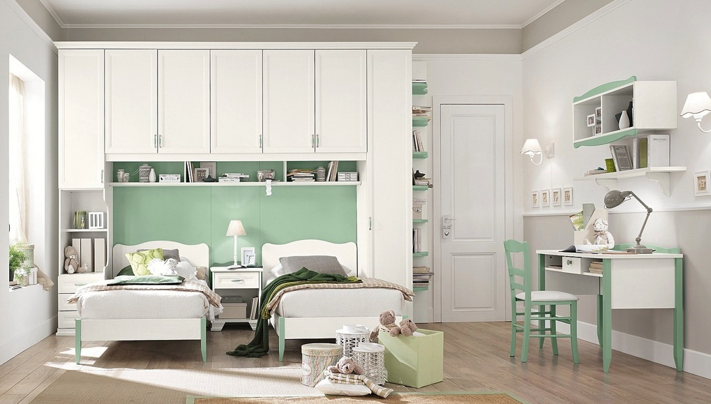
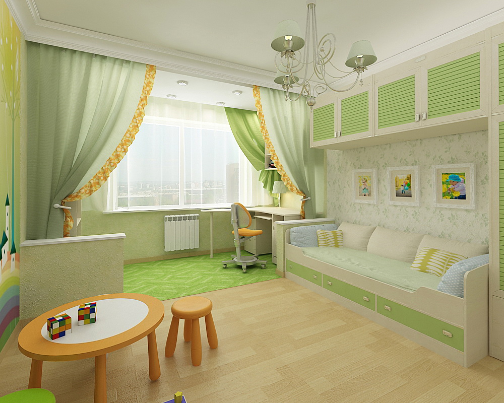
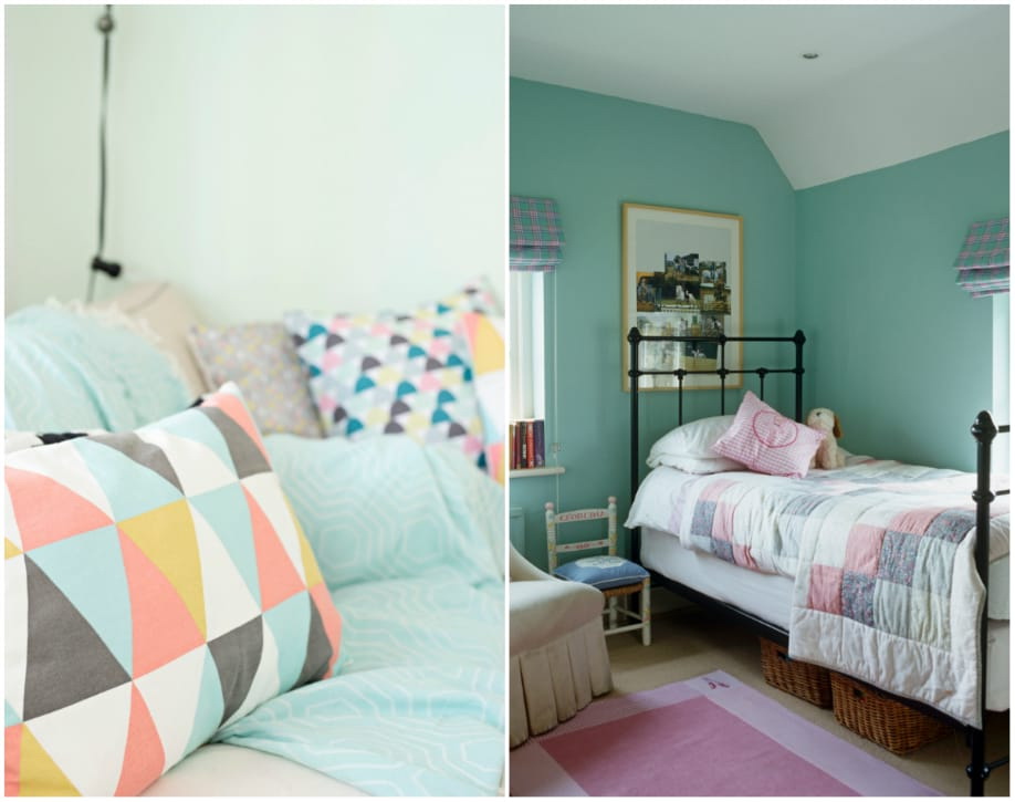
We use mints in the nursery
The mint color combines the soothing power of blue with the nutritional power of green, so the symbiosis of both colors makes a serene shade that is optimal for the nursery. A green tone will reduce the child’s anxiety, providing a deep instinctive sense of physical well-being. Blue tones relax both the mind and body, and its effect on the physical reduction of blood pressure, heart rate and respiration has been proven All this is necessary to ensure a good and healthy sleep for the child..
Combines the soothing power of blue with the nourishing power of green
Green has a reputation for being universal, as it is the most natural, natural color. This means that it comes with almost everything. However, when choosing colors it is necessary to take into account that mint falls into the family of pastels, that is, shades that are diluted with white.
Combination with gold
I want to draw your attention to another curious property of any cold pastels, and minty in particular, combined with shiny metallic. A touch of shimmering gold to add warmth and richness to a pastel palette will add visual interest..
A glam metal trend can be created with an accent wall, which not only creates a stunning focus, but a sense of cohesion, highlighting gold or silver accessories and tying them to the decor.
Looks pretty with almost any color.
You can use glossy gold (or silver) stickers for this purpose, as an option. This is a good alternative or addition to wallpaper that will provide decorative flexibility.
Infants spend a lot of time looking at the ceiling. This can be used so that he can contemplate something brilliant. Add a brass or gold chandelier to your menthol interior. Make a standard mobile out of a standard chandelier. It is easy to make it yourself from scrap materials.
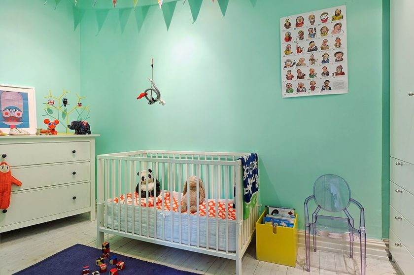
Suitable for boy or girl
Brass items are also great and complement menthol tones. Choose a brass lamp on the leg, and next to put a brass table for small things - these two objects will make a real designer room from a standard children's room.
return to menu ↑Decorating tips

Add decorative elements
Remarkable energy appears in rooms in which there are combinations with red shades - coral, red, orange. Use this effect for your own purposes.

In tone with the sea wave
What should not do?
Less is more than more. If it seems to you that saturated mint walls or furniture will be superfluous, start your acquaintance with the color first with small.
Try to get acquainted with the color in spring, when nature wakes up and the freshness is felt especially keenly.

Use pastel in the given style.
. The combination of colors that you did not expect")
. The combination of colors that you did not expect")
. The combination of colors that you did not expect")
. The combination of colors that you did not expect")
. The combination of colors that you did not expect")
. The combination of colors that you did not expect")
. The combination of colors that you did not expect")
. The combination of colors that you did not expect")
. The combination of colors that you did not expect")
The combination of colors in the interior
Perfect color combinations


. How to make the interior really French?")