The combination of light green color in modern fashionable interiors: 185+ (Photo) Design for Kitchen, Living Room, Bedroom
 Design for Kitchen, Living Room, Bedroom")
Lime color in the interior is popular among decorators, as it is suitable for decoration of any premises. In the interior color plays an important role. It has a psychological effect on a person. It can change the mood, affect performance, relax or, on the contrary, create a very cheerful mood. Light green color is often used when decorating rooms.
Content of this article:
The psychological effect of green shades
Green has a rich palette, and its shades are combined with almost any other. It is the color of nature itself, and most people associate it with a long and happy life. No wonder, according to eastern beliefs, it brings health, prosperity and wealth. Shades of this color raise mood and save from excessive anxiety. A person free from anxiety feels better, and therefore more successful.

Positive effect on mood

The main thing is not to overdo it with color
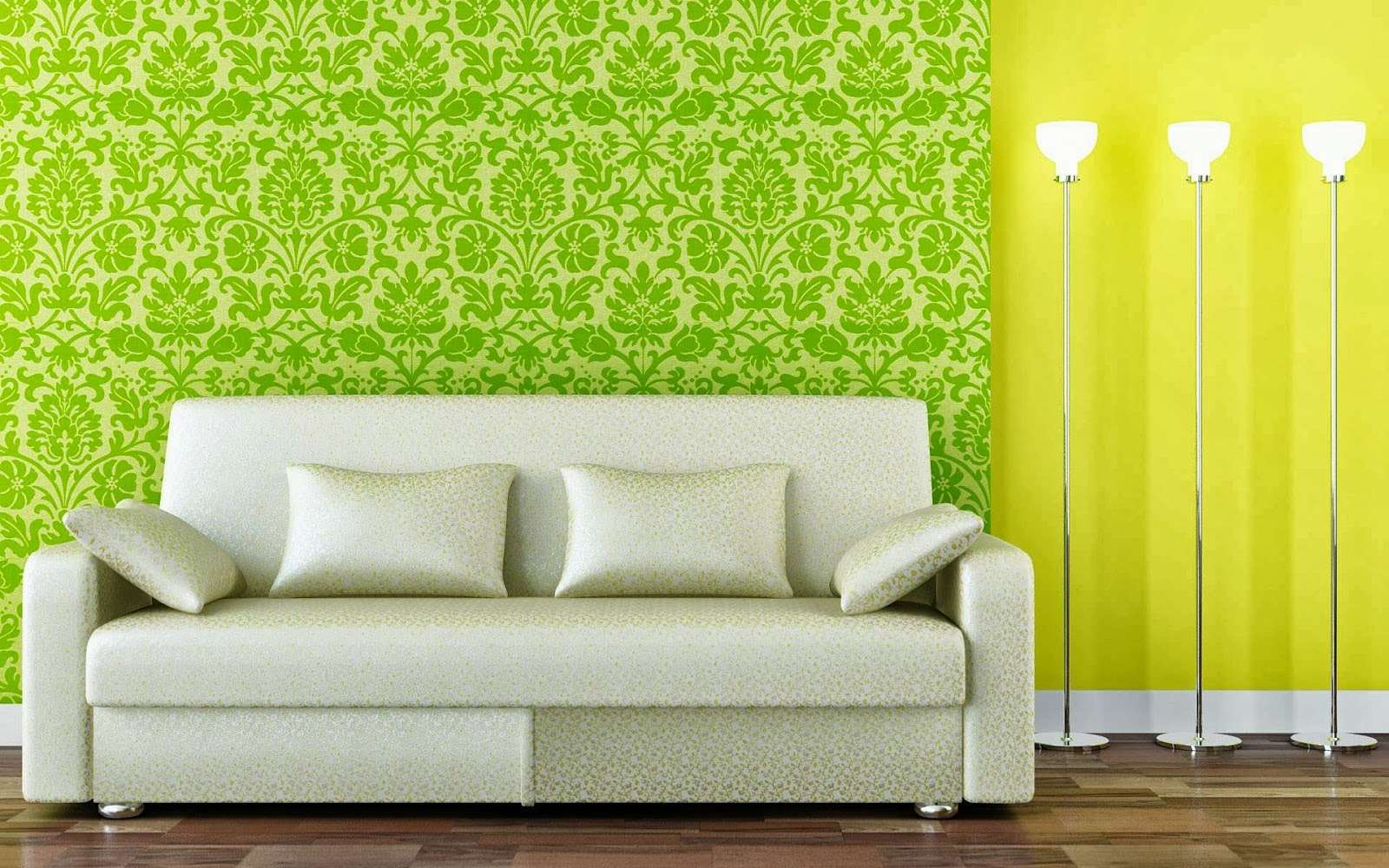
Combinations of light green
The lime color is very intense. In order for the eyes not to be tired, this shade must be “diluted” with other paints.
Combination with other colors
Create harmony with the consonance of colors
| matching shade | Effect | recommendation for use |
|---|---|---|
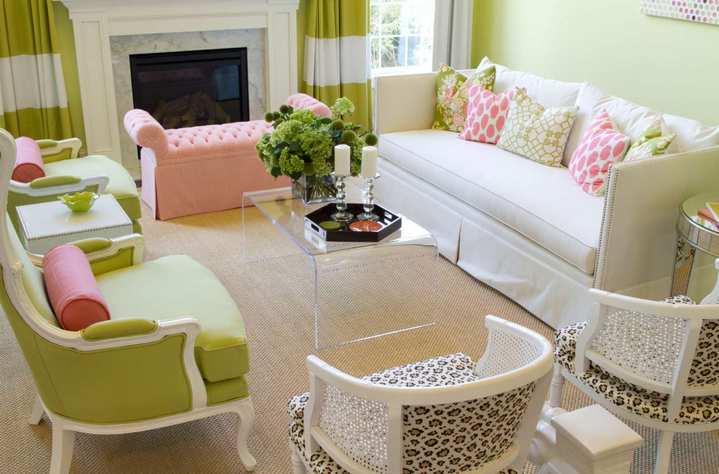
| pink | true natural combination, associated with young plants in spring, creating a fresh and positive mood | bedroom; room for girls |
| shades of white (beige, off-white, cream) | white tone softens and soothes the intensity of green, due to their use the room seems wider | children’s kitchen |
| gray tones | advantageously shade lime, give the room severity, reduce the brightness and intensity | study; kitchen, moving into the living room in studio apartments; bedroom |
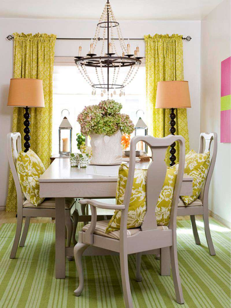
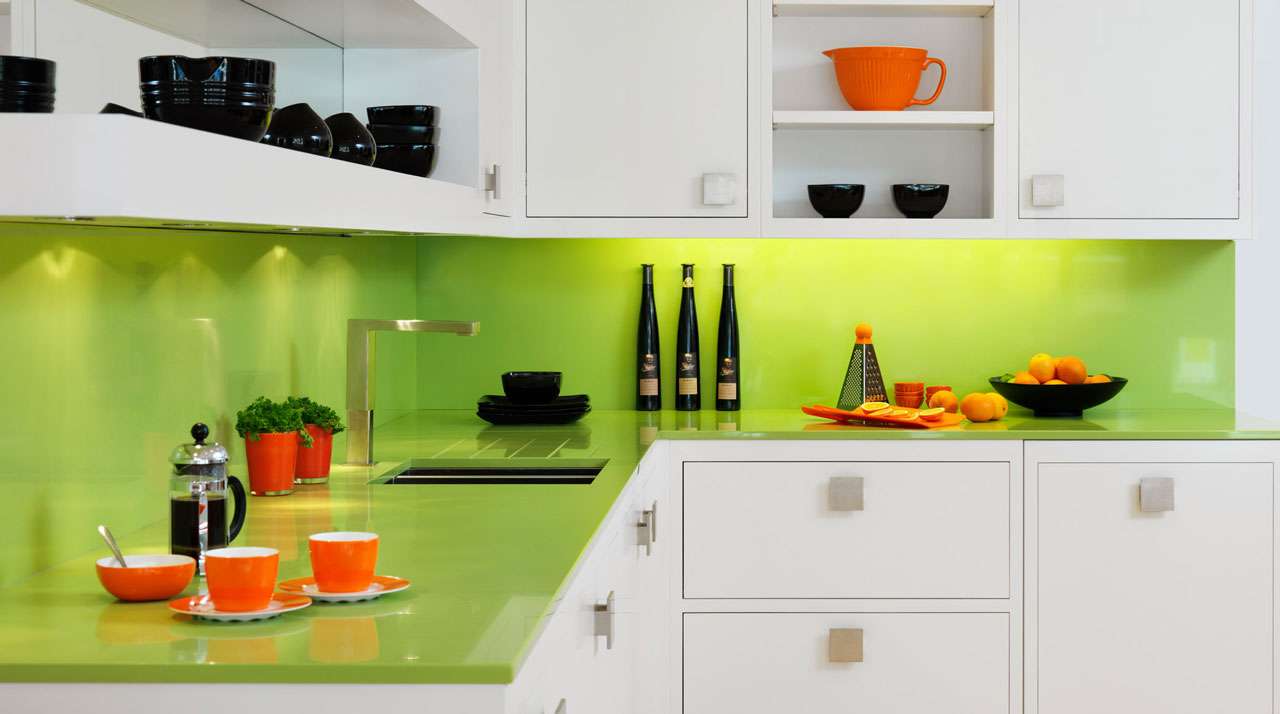
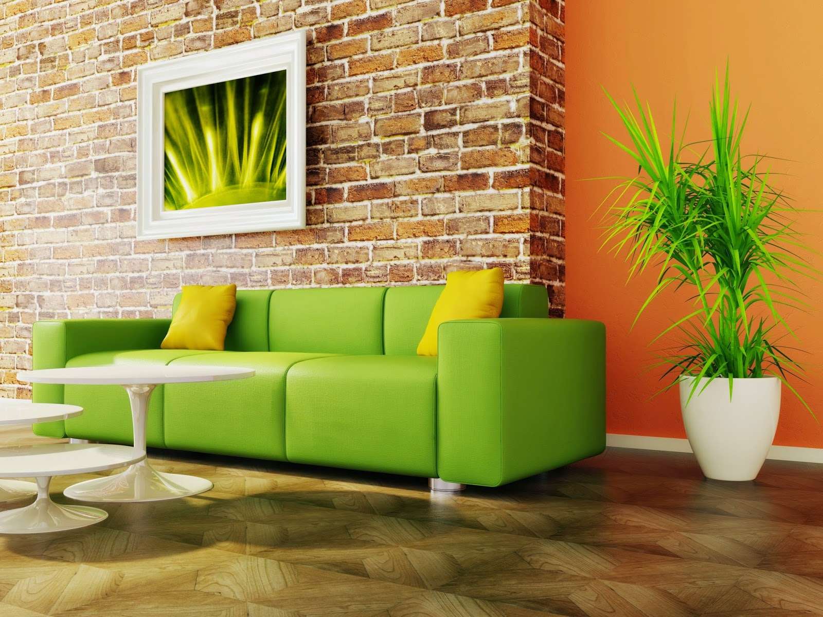
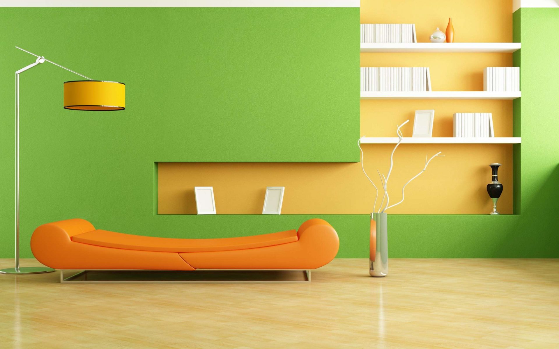
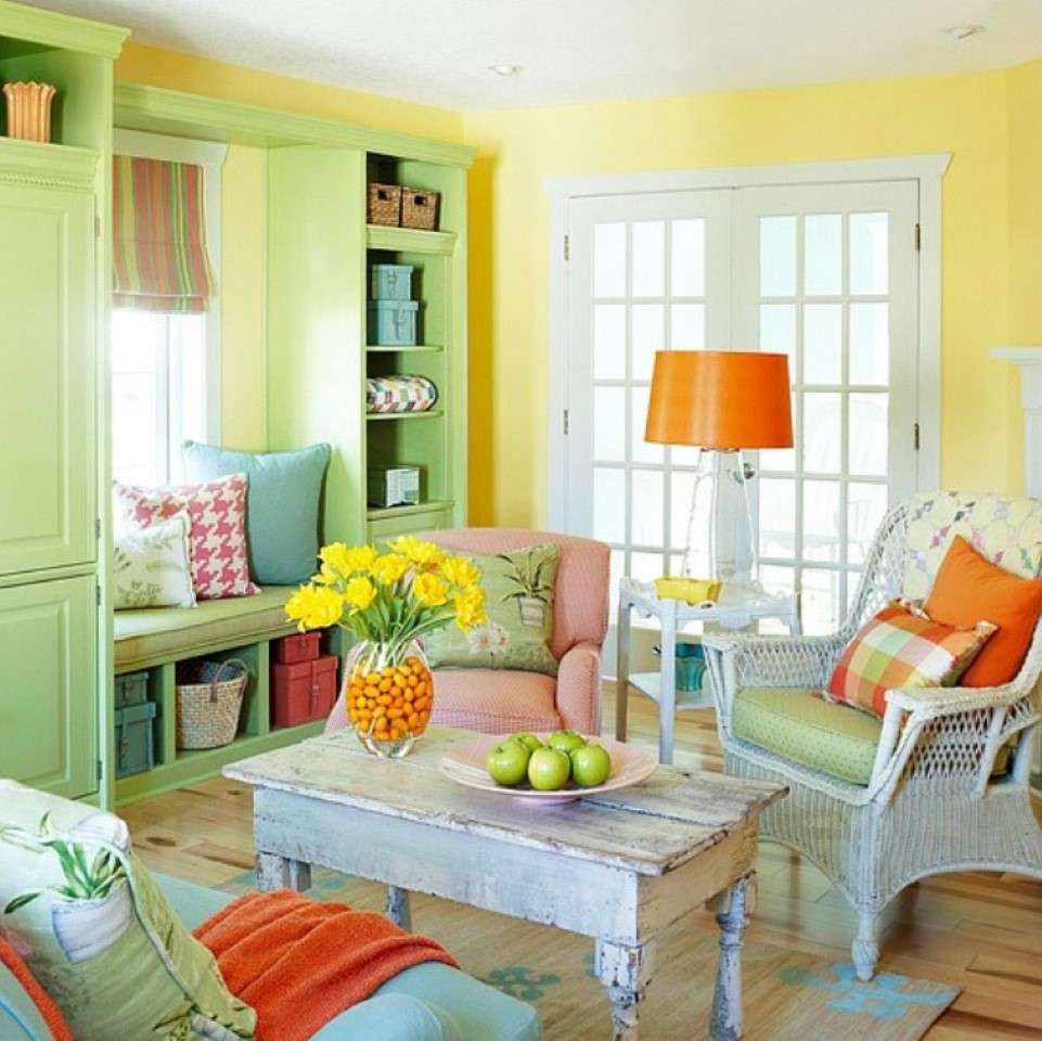
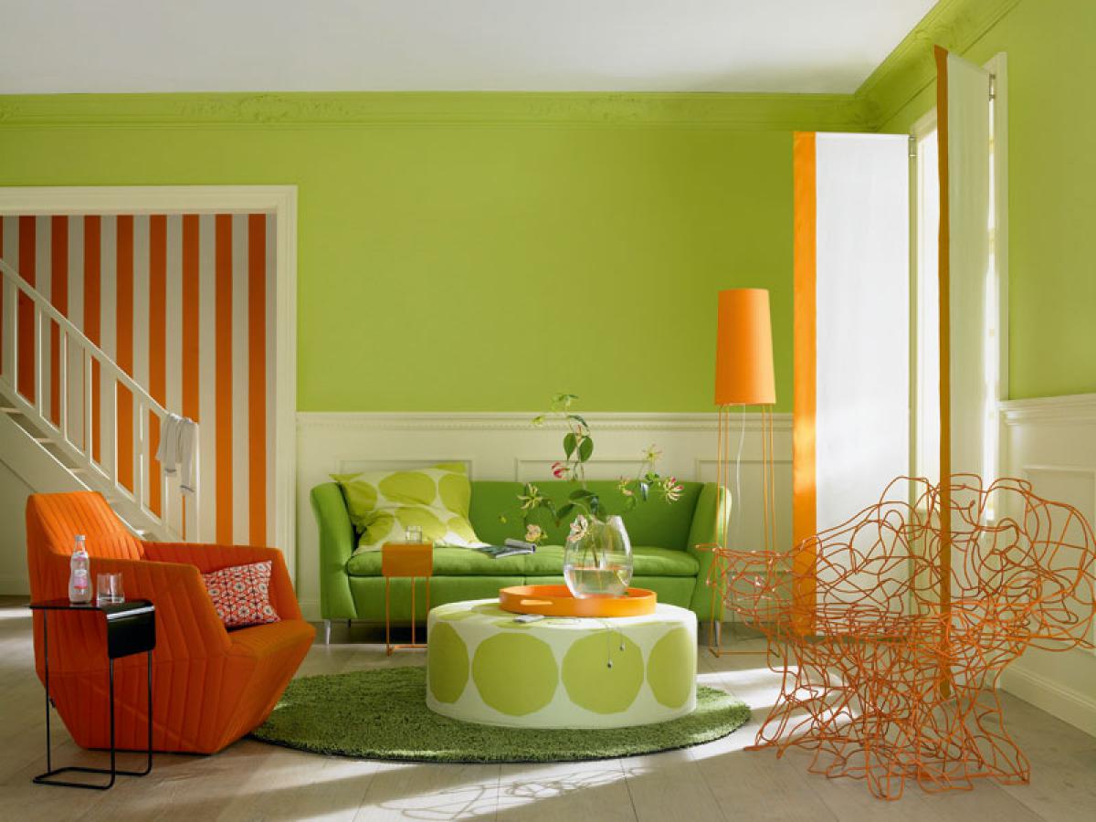
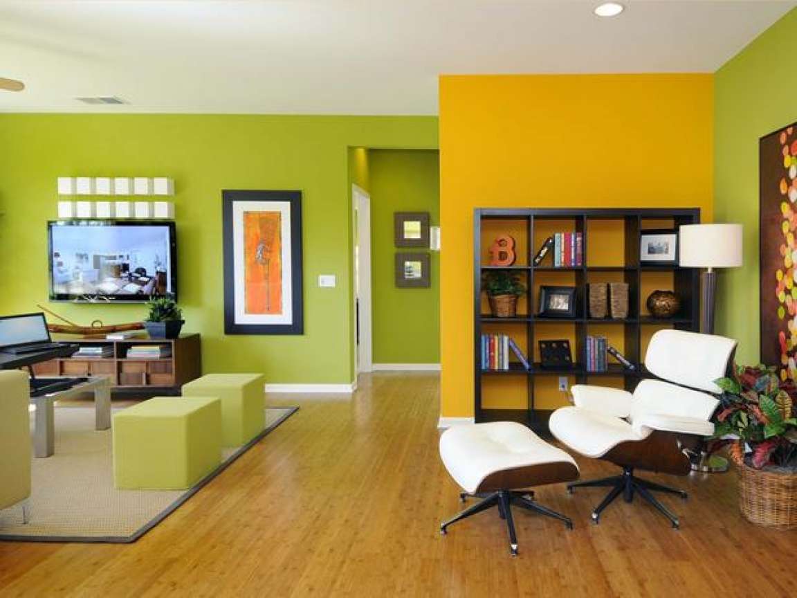
| Orange | the combination of warm (orange) and cold (green) creates an atmosphere of positive and at the same time calm | living room; kitchen; children's for the young man |
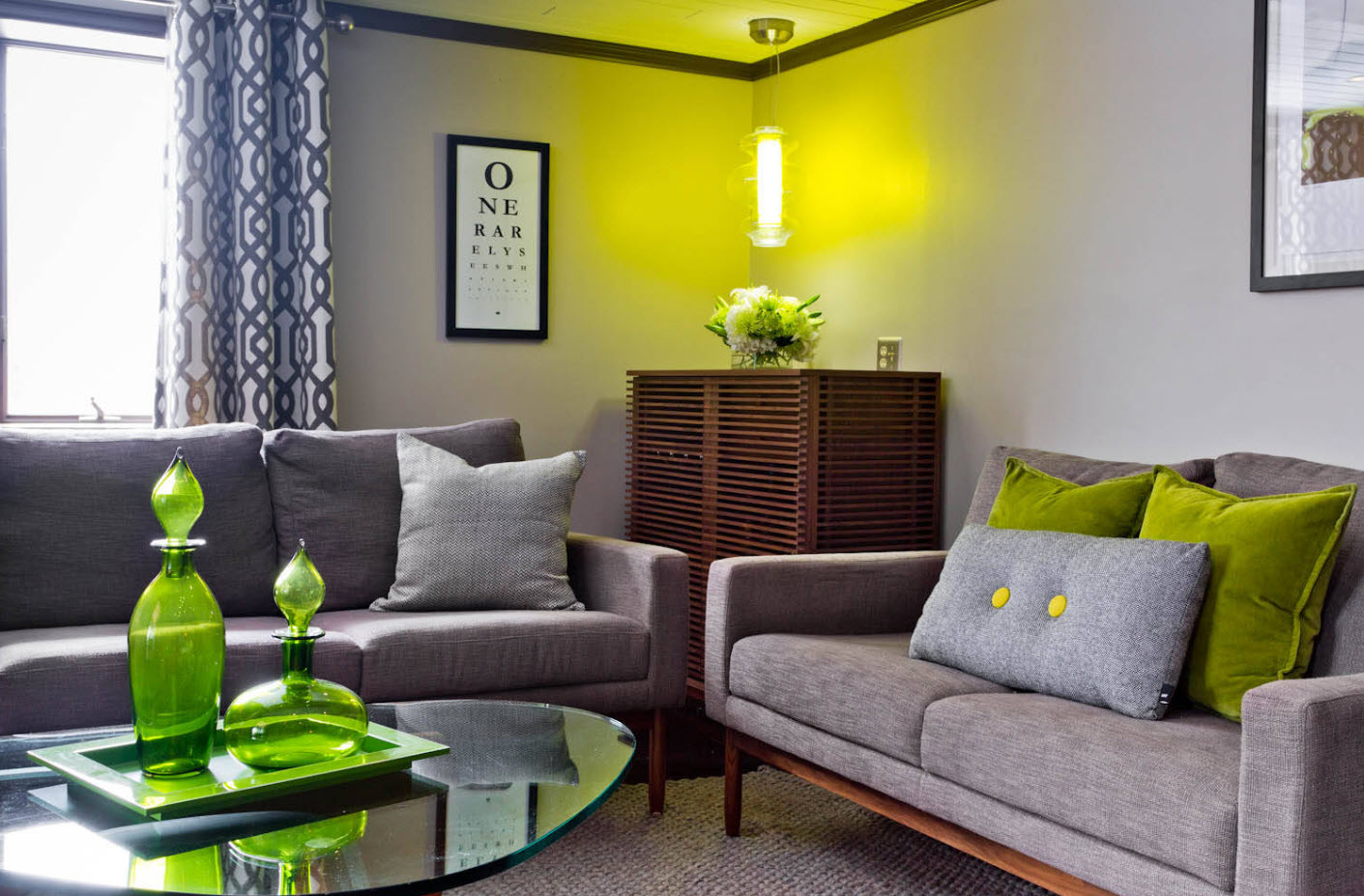
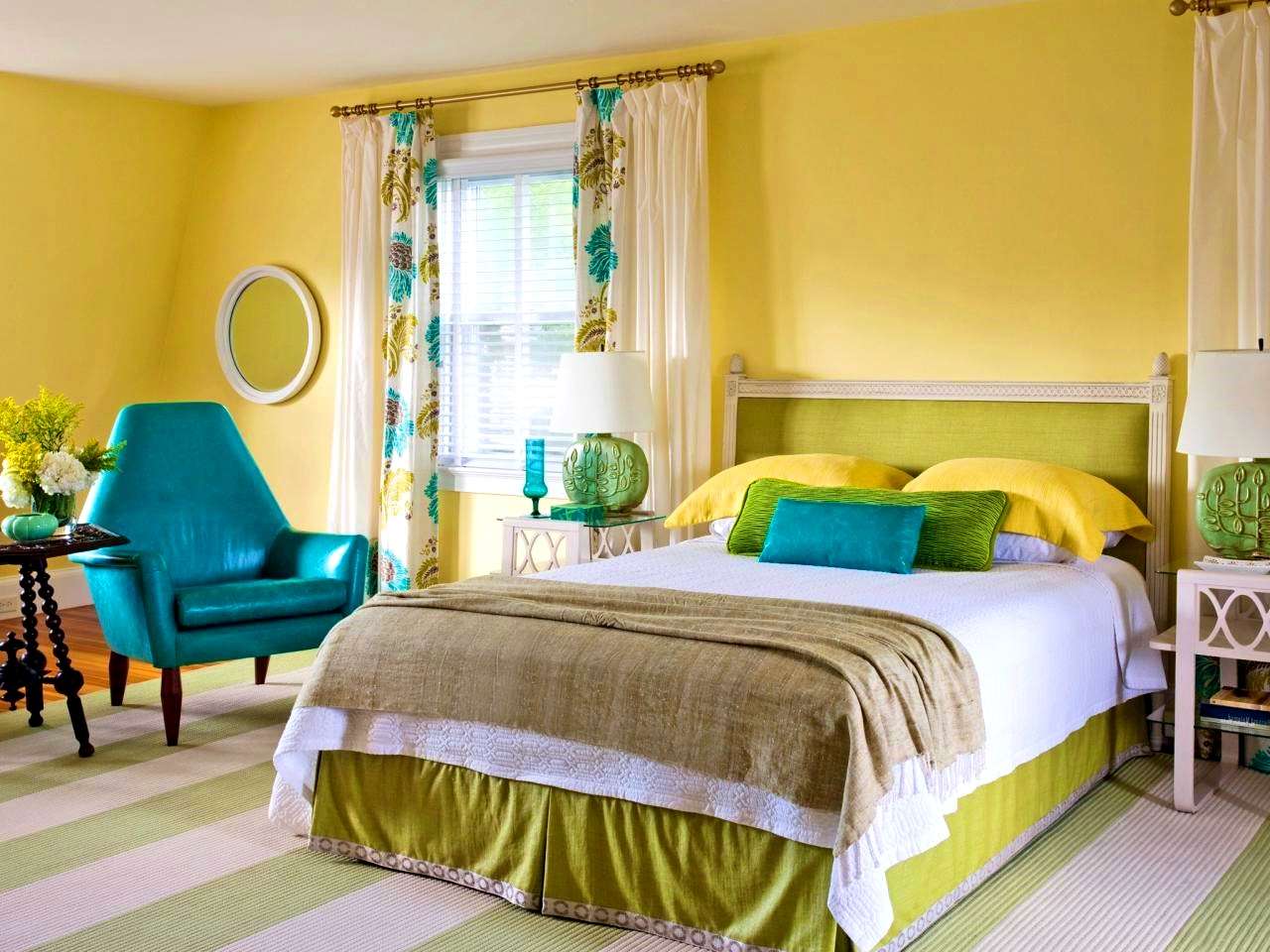
| yellow | morning combination, bright and warm, ideal for rooms with windows facing the north side; creates a positive attitude | children's for girls; study; kitchen |
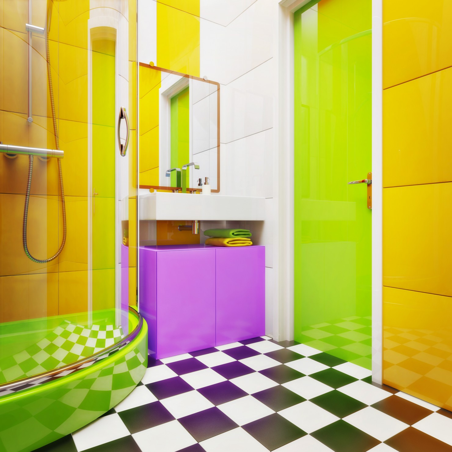
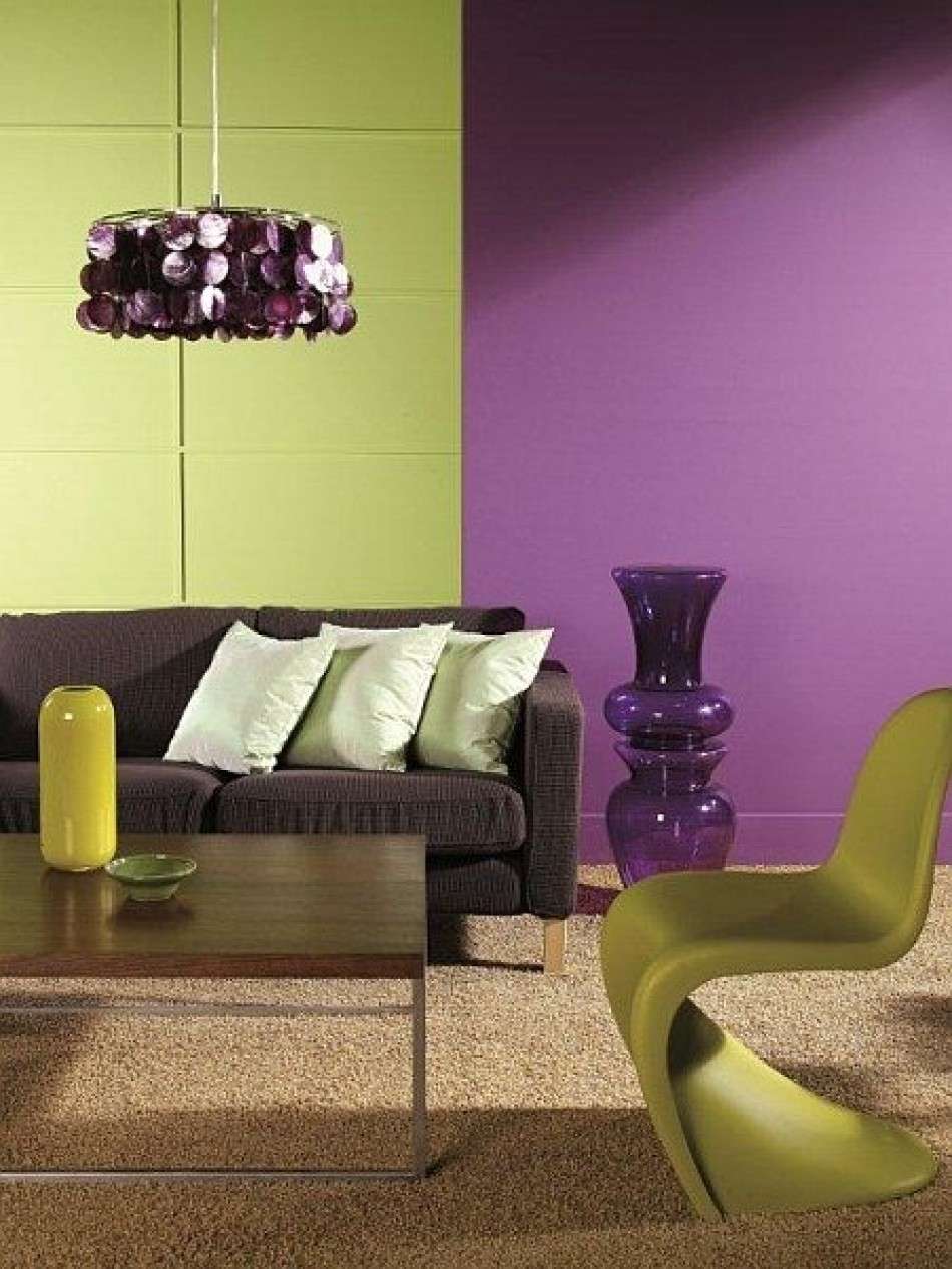
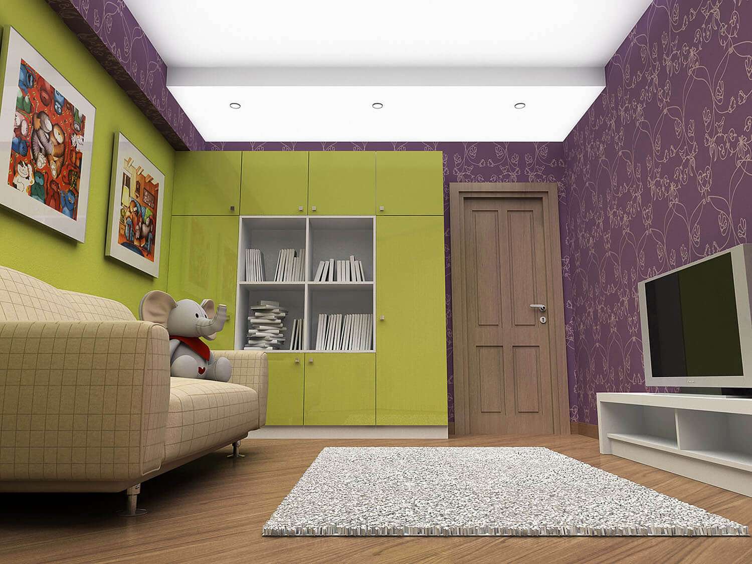
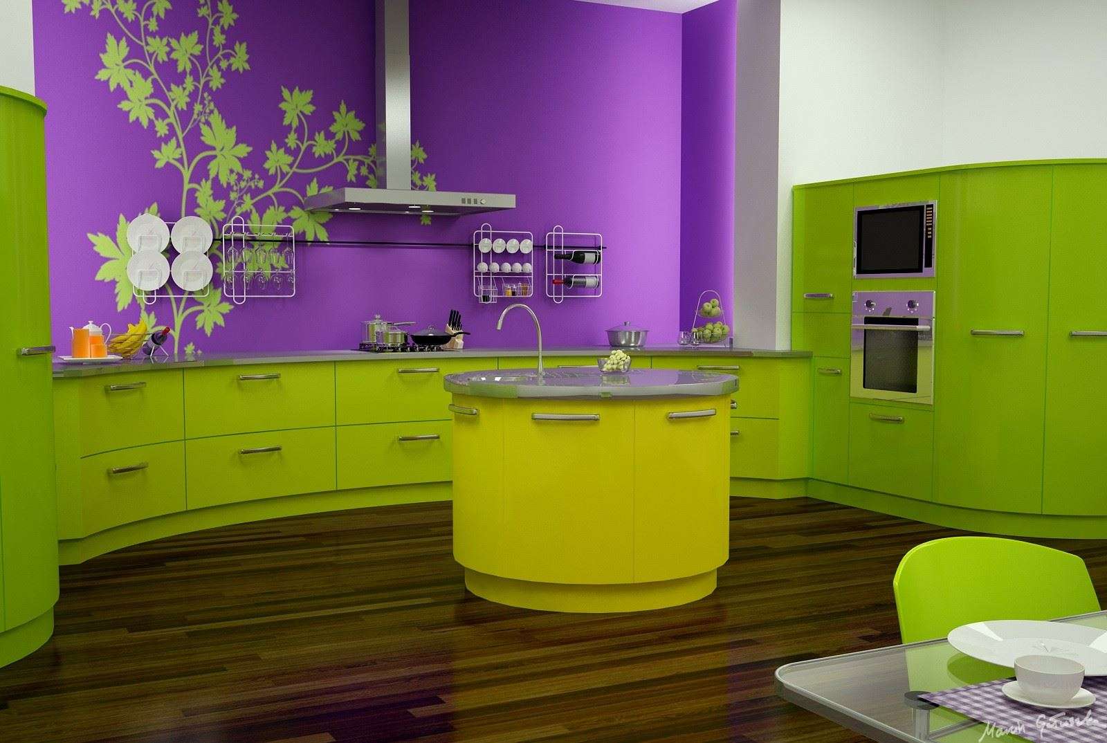
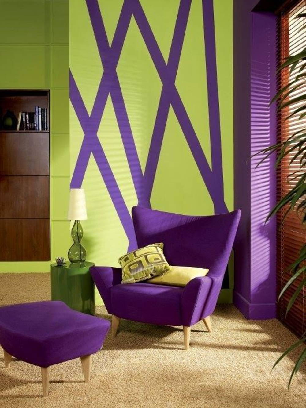
| lilac / purple | an exotic combination of tones, allowing you to perfectly divide the room into darker and lighter areas; noble dark shades of lilacs are refreshingly green | kitchen; bedroom; bath or shower room |
| fuchsia | an unusual combination in which fuchsia tones should be either muted or added in a minimal amount; creates a sense of cheerfulness and optimism | Vacation home; bedroom; kitchen |
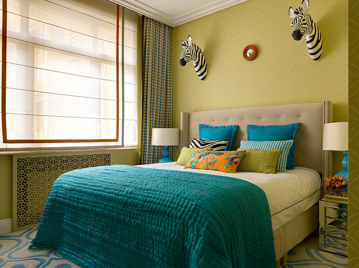
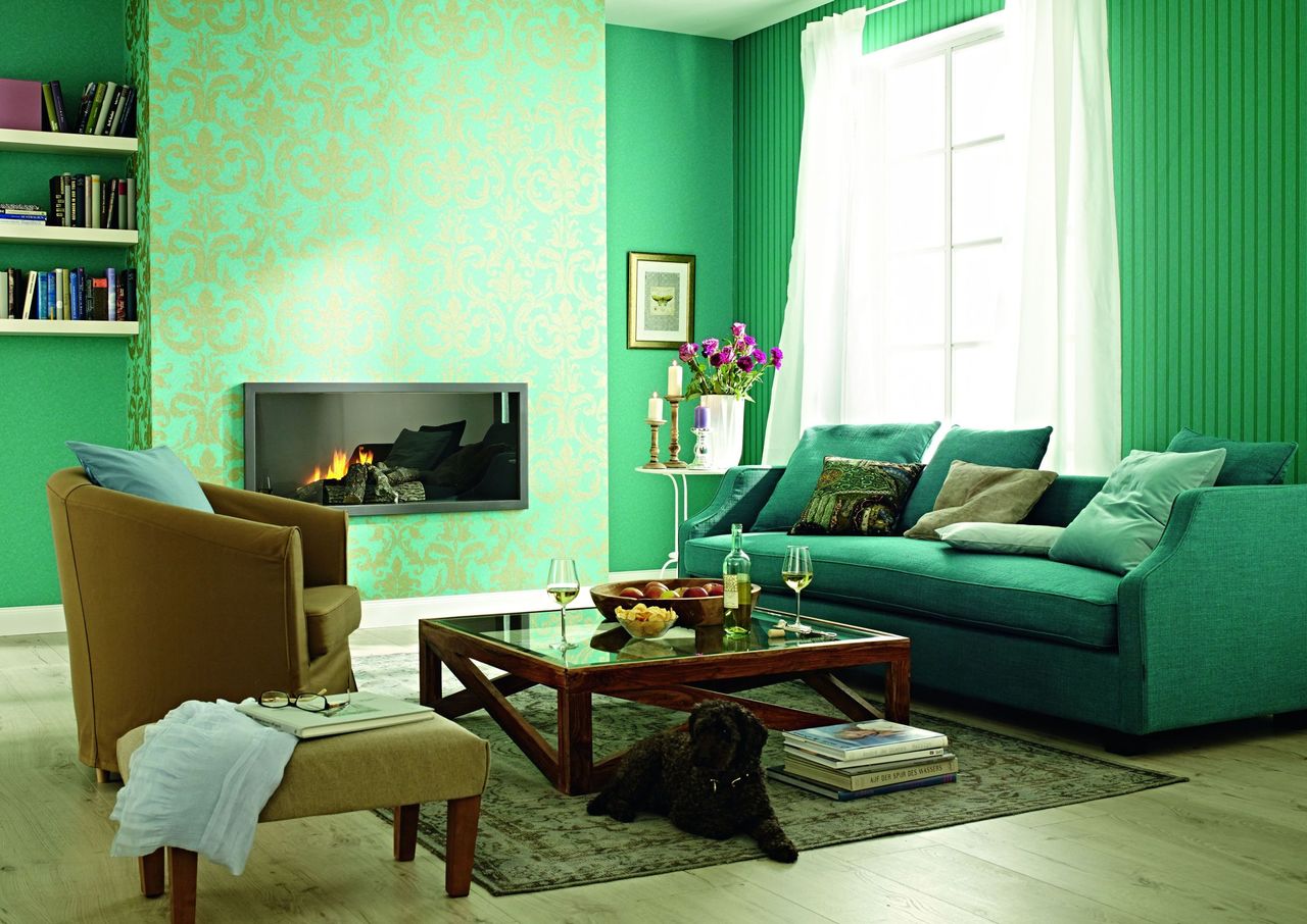
| turquoise / blue | a fresh combination of shades, giving a feeling of joy and tranquility, ideal for rooms with a marine theme | nursery for a boy or girl; bedroom in a country cottage; bathroom; kitchen |
| brown | a combination borrowed from nature, soothing, ideal for relaxation and successful mental work | study; bedroom; room for a young man |
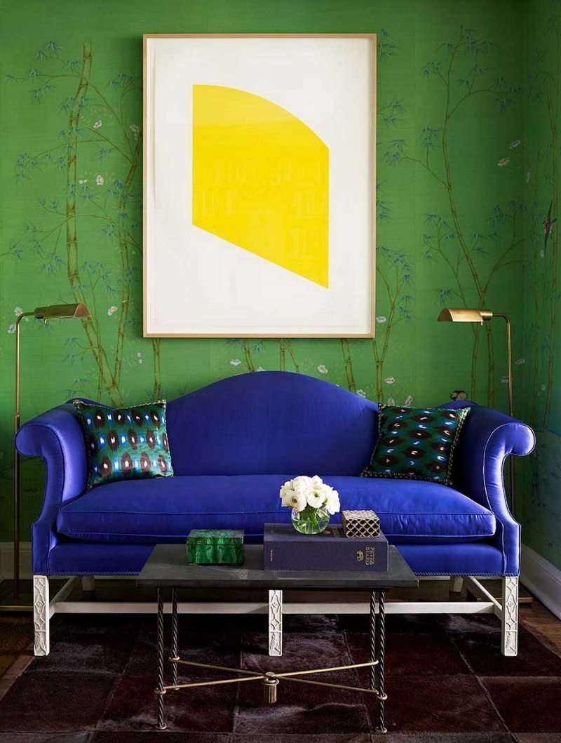
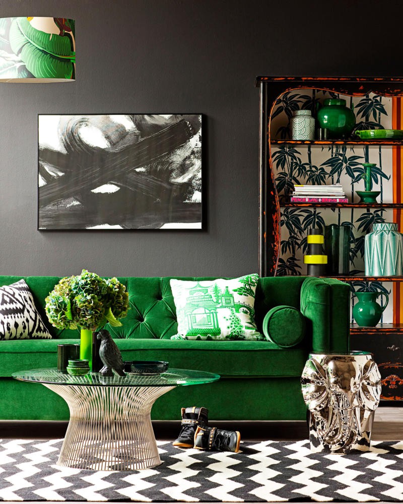
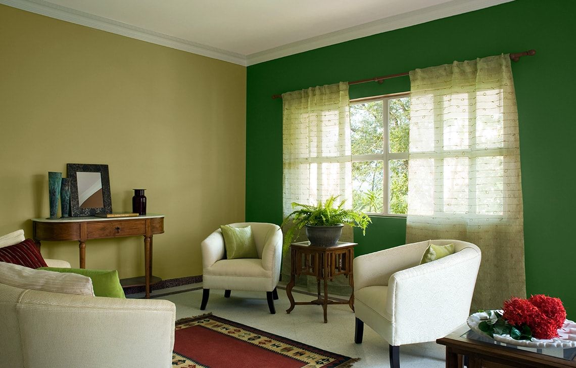
| blue | a strict combination in which the frivolousness of light green is extinguished by a noble dark shade; perfectly allows you to divide the room into zones | living room; kitchen; bedroom |
| red | an unusual combination, in which a green one should prevail, and red should only create the necessary accent (for example, edging walls or furniture) | kitchen; the kitchen in the studio apartment, combined with the living room, in which the red tones are enhanced; rooms in a country house. |
The combinations presented in the table give only a general idea of how the shades of lime with other colors “work”. When choosing a decor it is necessary to take into account such nuances as the intensity of the shade.

We take into account all the nuances
In order not to visually reduce the height of the ceiling, it is worth adhering to the principle “the higher, the lighter”.
Only one wall can be made.
Contrast shades
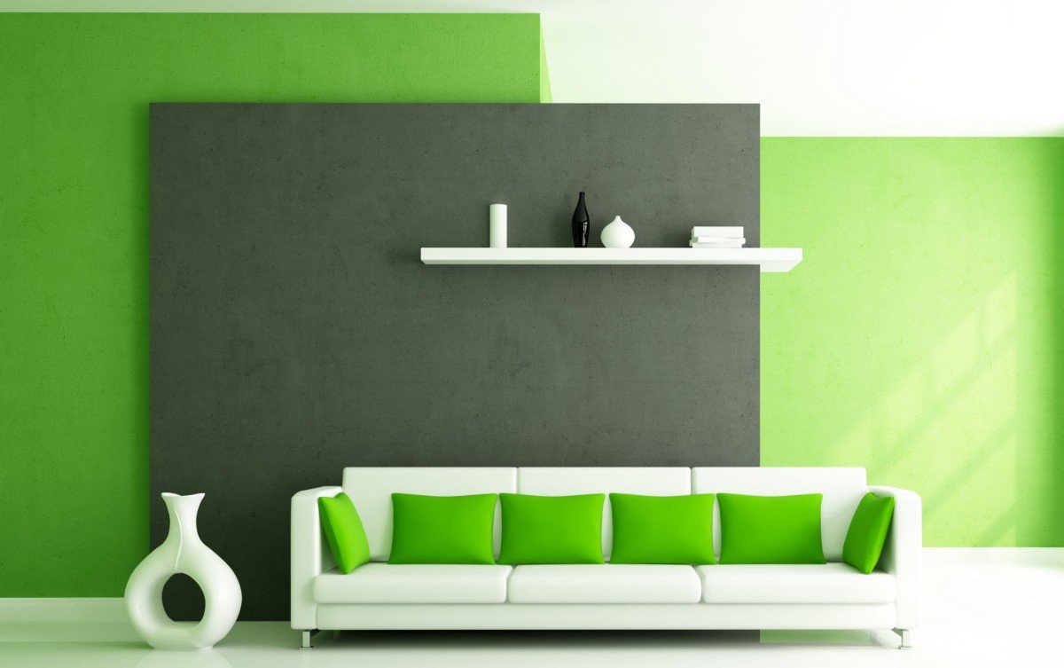
The decoration of the room, in which only two colors are applied, looks rather dull and monotonous. For the master it is very difficult to endure everything in only two colors. Therefore, to improve the style of the room, it is necessary to correctly place the color accents in it, choosing for this contrasting shades.
Correct color accents
The table gives shades that are successfully combined with a light green color. It also lists those colors that can serve as the perfect contrast for some combinations with light green.
| friendly tones | contrasting tones |
|---|---|
| yellow | golden, red, fuchsia, burgundy |
| blue | silver |
| Orange | mustard, brown, black |
| golden | turquoise, graphite |
| fuchsia | white, beige |
| pink | white, black, brown |
| brown | aquamarine |
| beige, cream | red, fuchsia, purple, brown |
| emerald / blue / turquoise | purple yellow |
| red | white, beige |
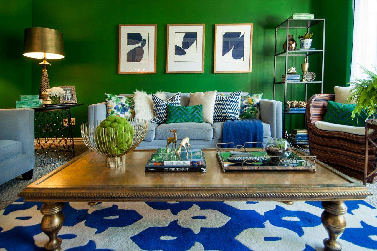
Successful contrasts in the living room
Proper combination of light green with friendly and contrasting tones will create a unique decor of the room, highlighting all the advantages of the room.
 Design for Kitchen, Living Room, Bedroom")
 Design for Kitchen, Living Room, Bedroom")
 Design for Kitchen, Living Room, Bedroom")
 Design for Kitchen, Living Room, Bedroom")
 Design for Kitchen, Living Room, Bedroom")
Style decisions
There are a variety of room decoration styles. For some of them are very suitable combination of light green color.
The table shows the styles of interior decoration. It also lists those combinations of colors that can be used to decorate the premises in a particular style.
Colonial style in the interior
| style | color combination | materials | additions |
|---|---|---|---|
| ecostyle | combination of natural colors - brown, dark gray, terracotta, chocolate | cork wallpaper, wood, natural stone, bamboo, marbled tile, rattan canvas | large-leaved indoor plants, landscapes with images of natural landscapes, bamboo mats |
| Japanese minimalism | white, pink, fuchsia, dark gray | laminate, porcelain, painted wallpaper, bamboo | pictures of hieroglyphs, edged weapons on the wall, bamboo stalks, dead wood ikebana, floor vases |
| romanticism, retro, country | yellow, orange, red, blue, celadon, pink | wallpaper with stripes or small flowers, laminate, granite, wood | wood furniture, pillows with embroidery, handmade imitation, curtains with ties, patchwork bedspreads, soft fabric toys, removable furniture covers |
| eclectic, avant-garde, futuristic | white, lemon, blue, fuchsia, golden; the richer the color, the smaller it is in the composition | ceilings, perhaps with a shiny surface, laminate, granite, wallpaper of different but related colors | furniture of the original form, built-in lights |
These styles include:
- baroque;
- Empire;
- Renaissance.
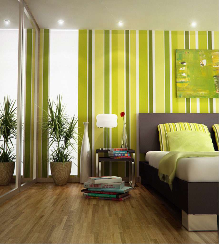
Bright design of your interior
Lettuce apron in the kitchen
Rooms, decorated in light green color
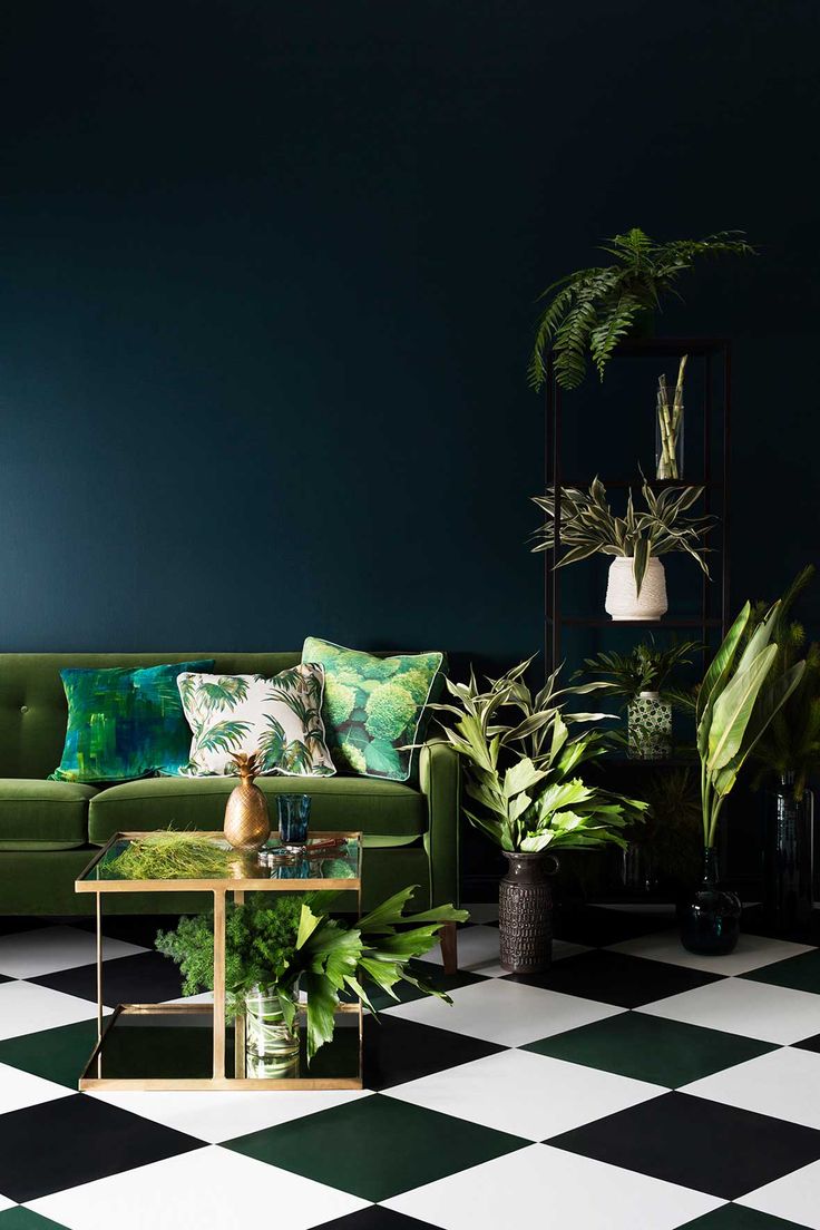
This color is suitable for almost any room. He is able to revive any room and give it a new, completely unrecognizable view.
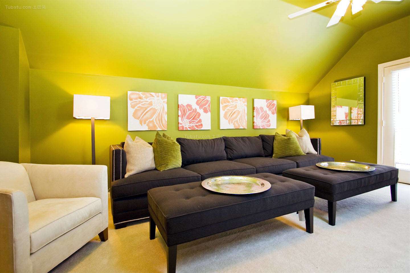
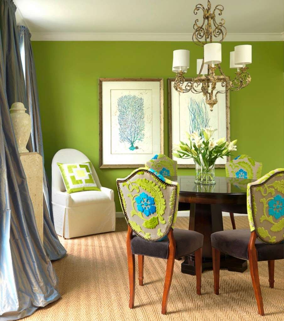
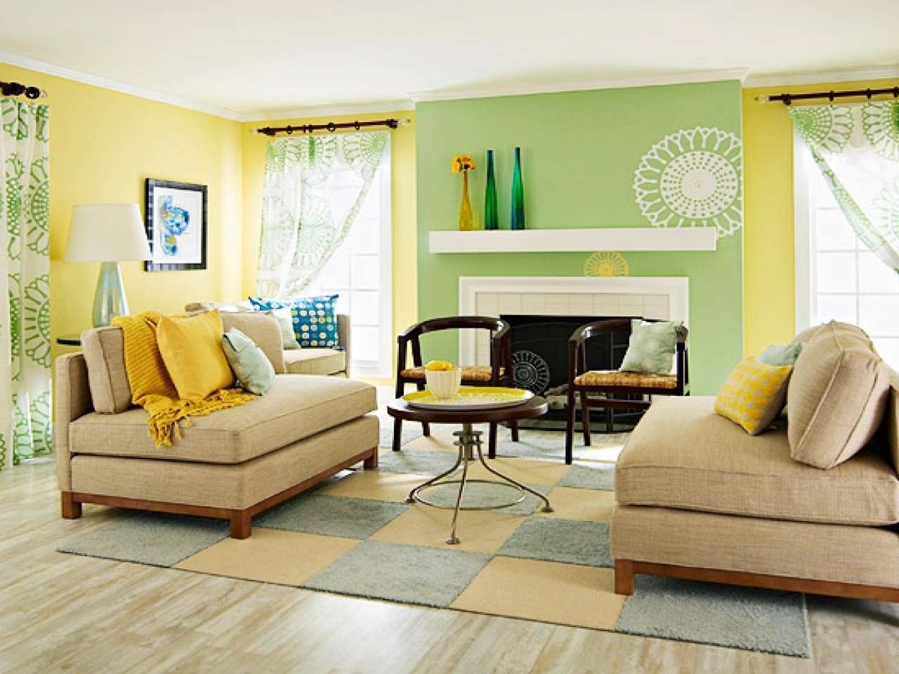
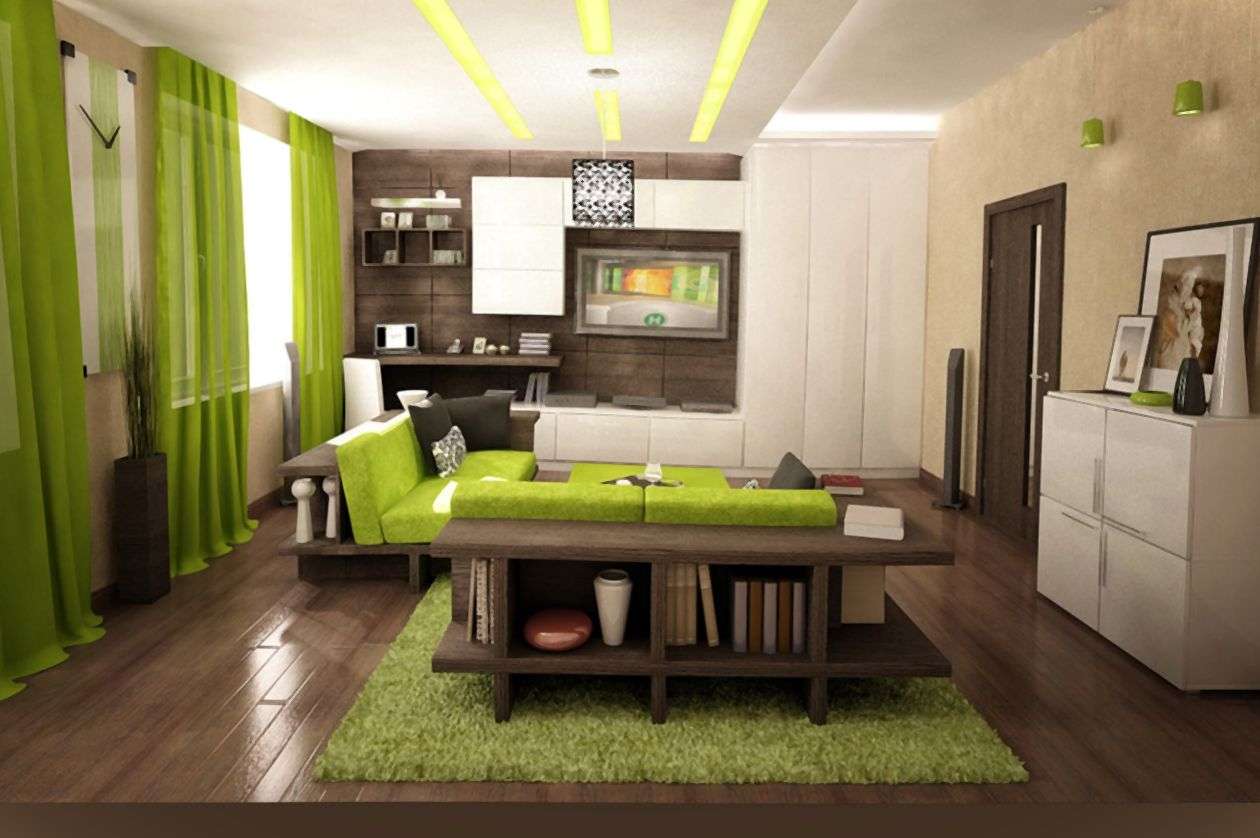
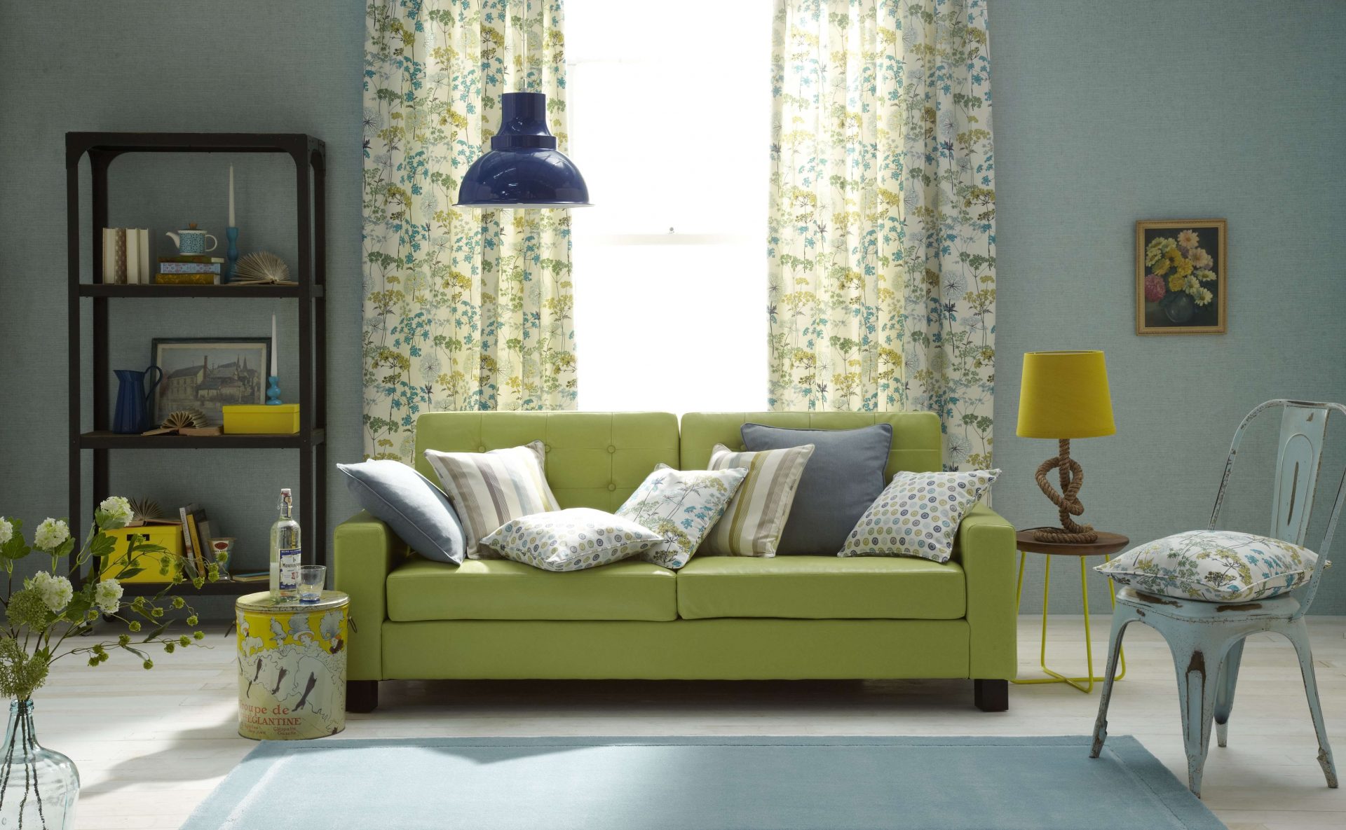
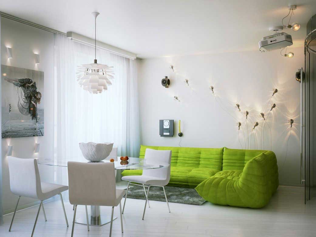
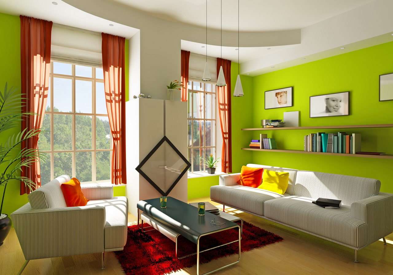
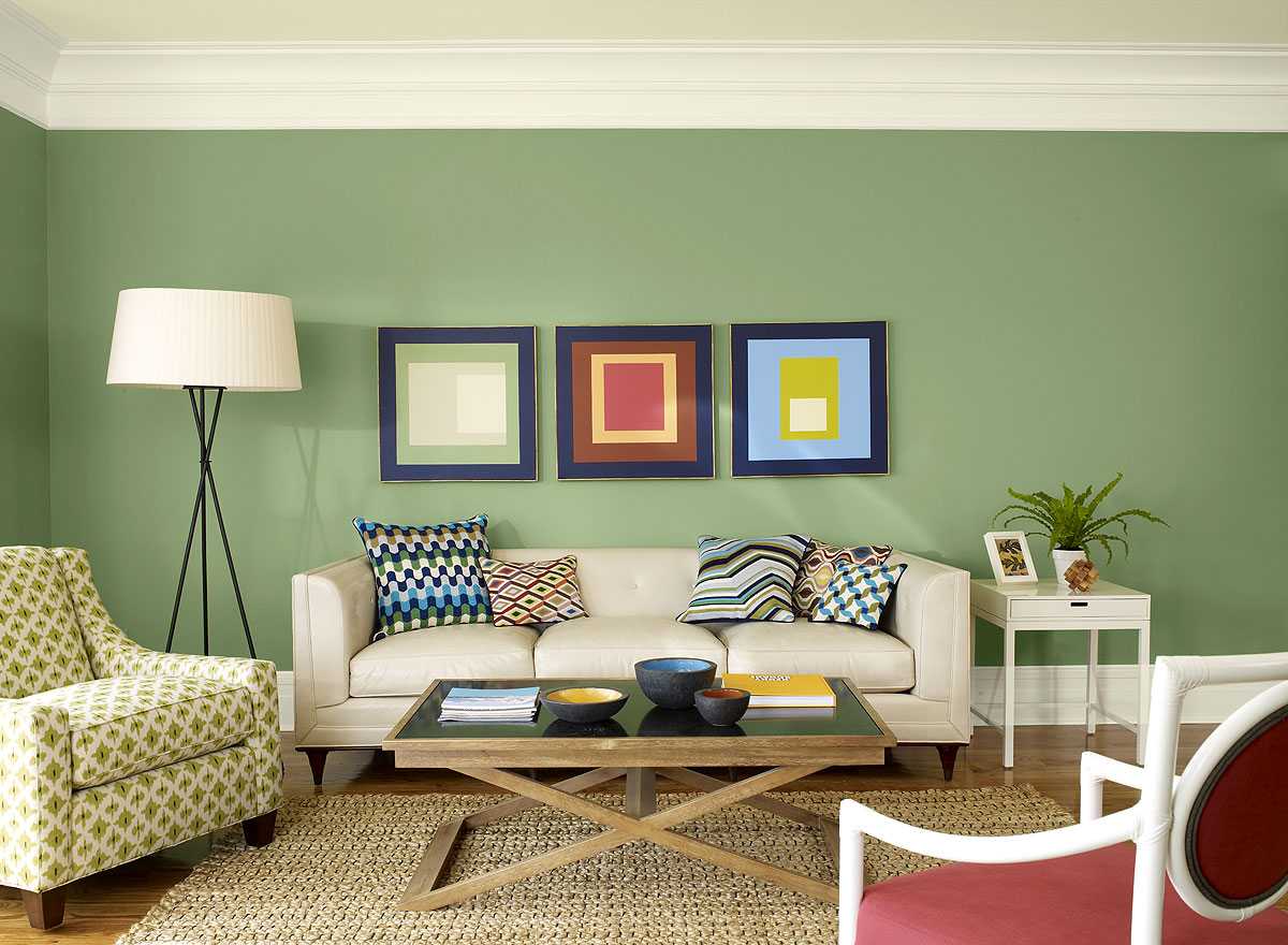
return to menu ↑Living room
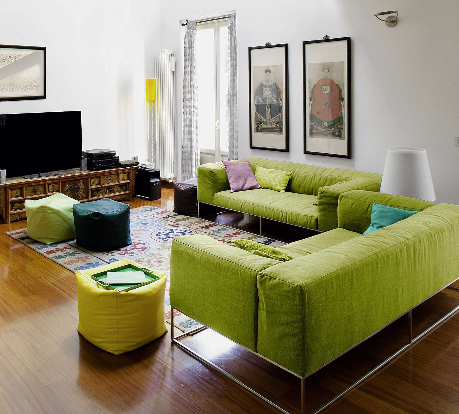
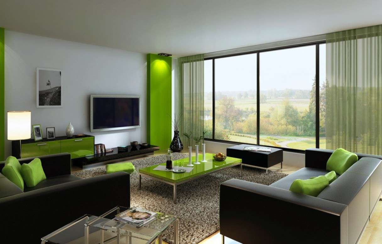
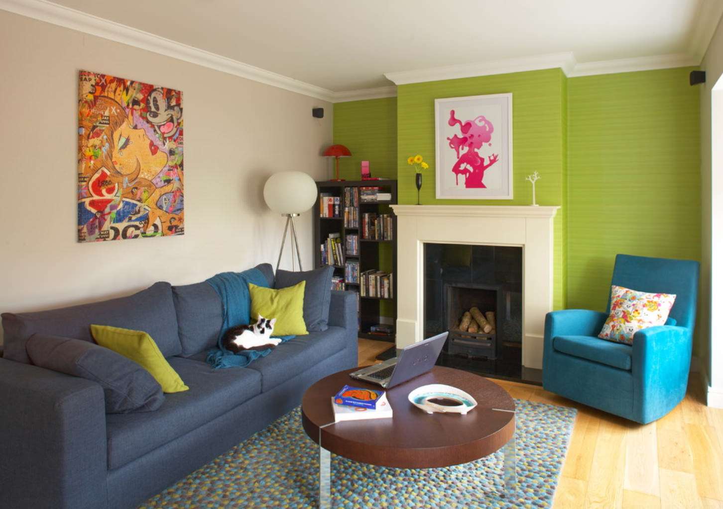
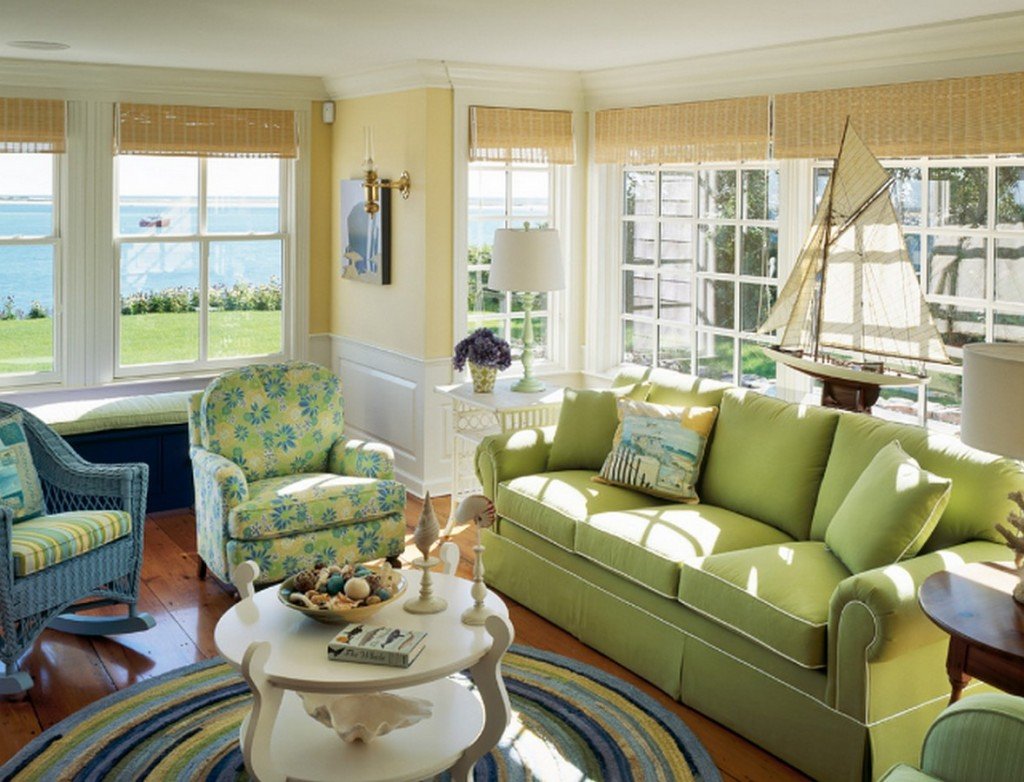
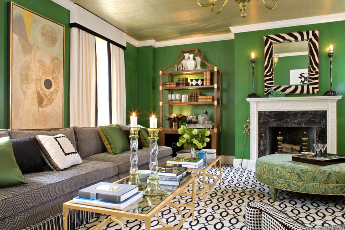
Insofar as living room is a place where the whole family gathers in the evening, and on holidays they receive guests, it should be spacious and at the same time cozy.
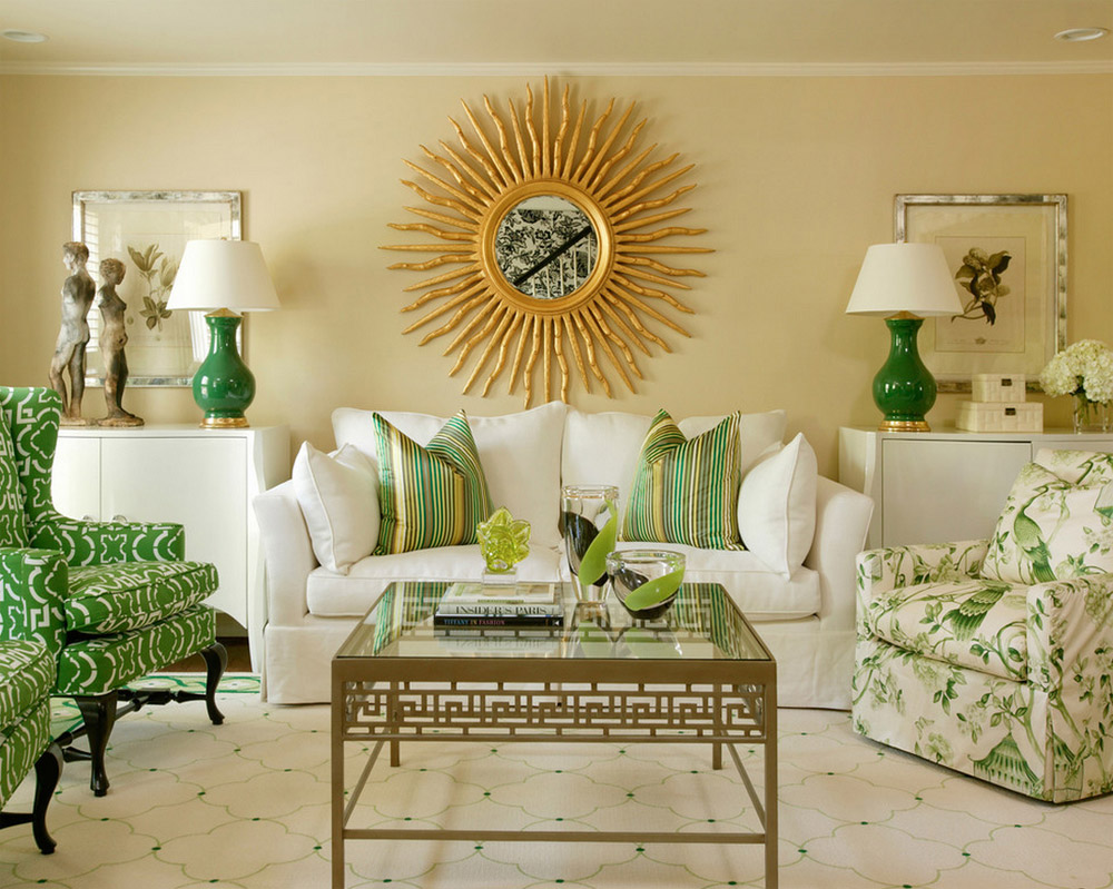
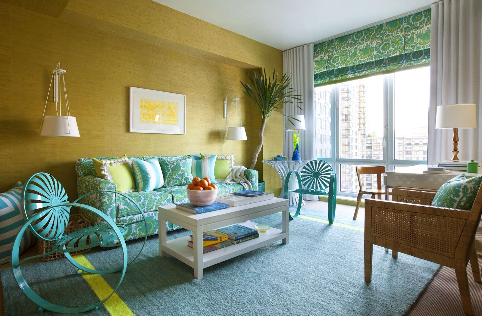
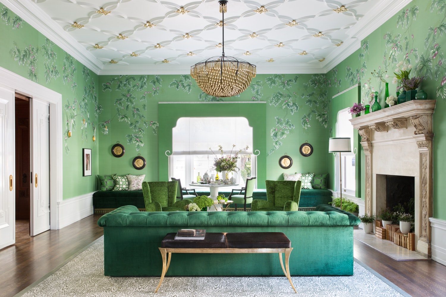
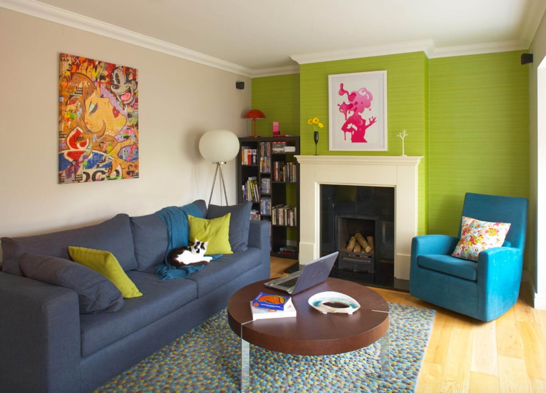
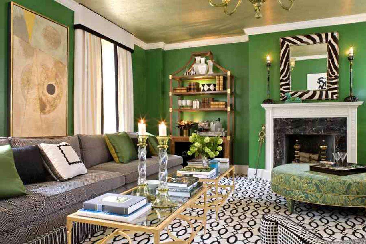
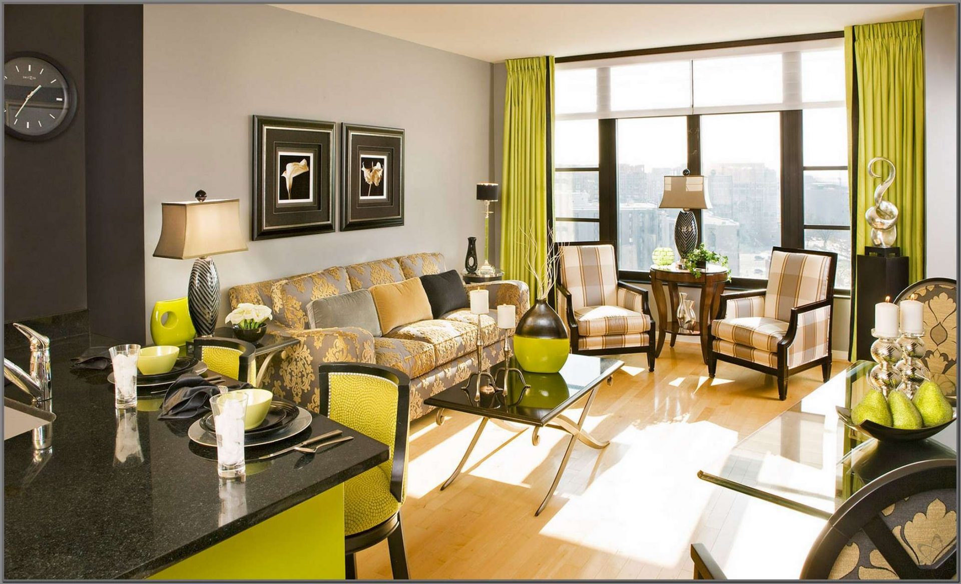
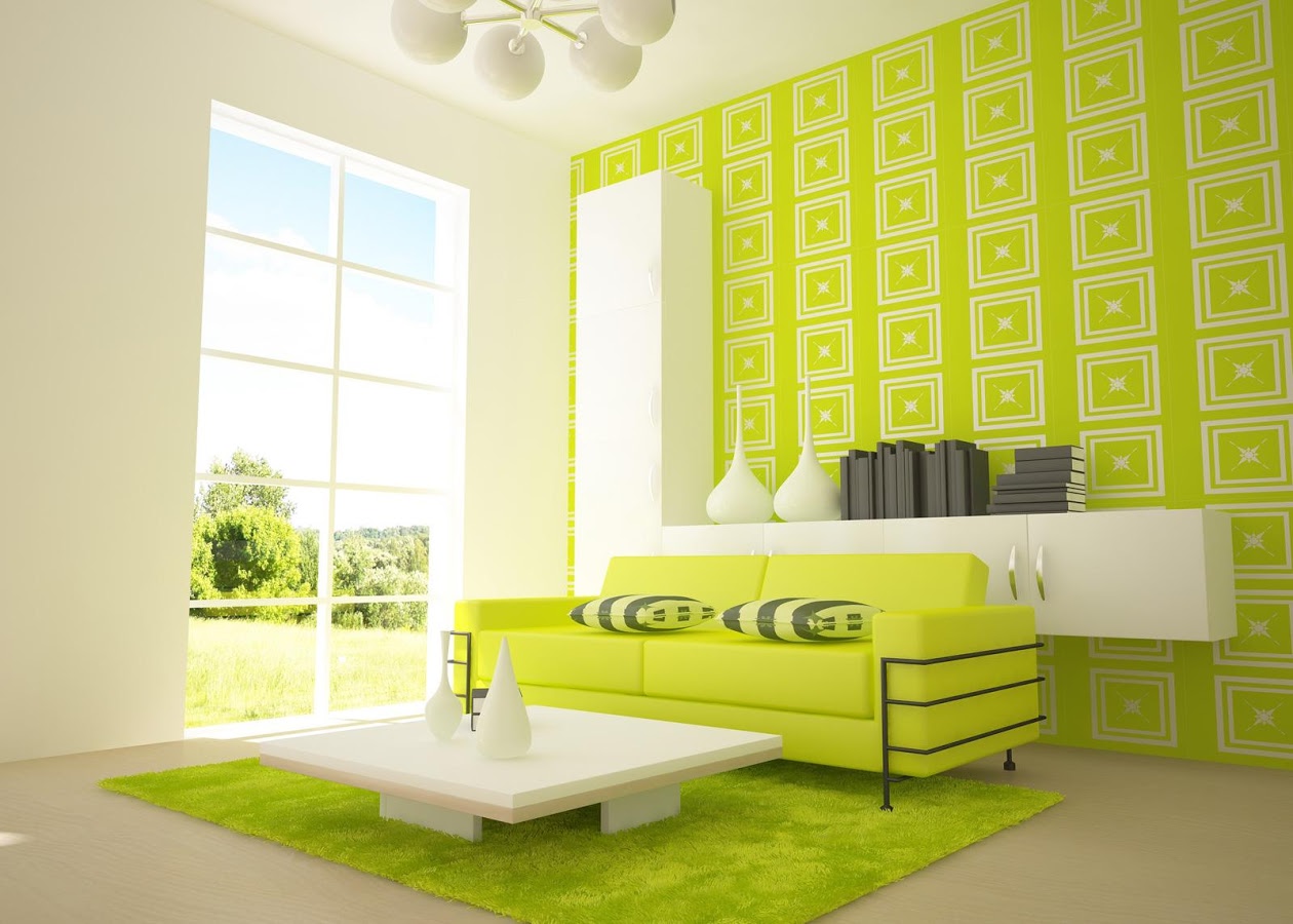
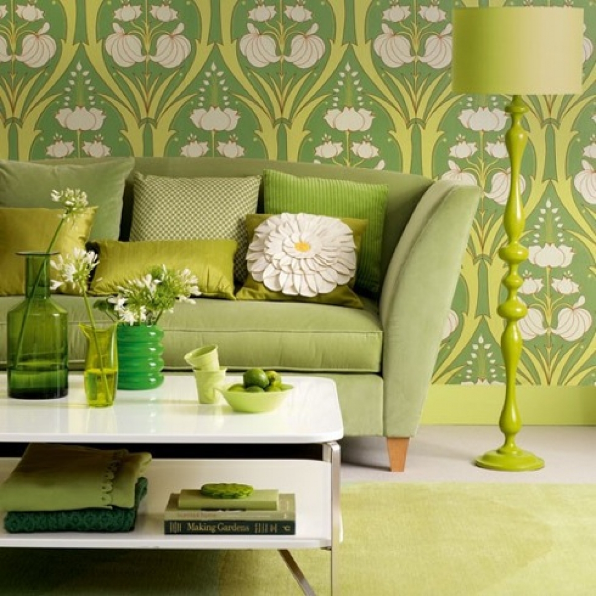
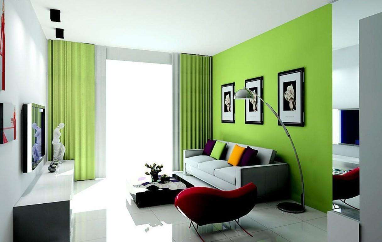
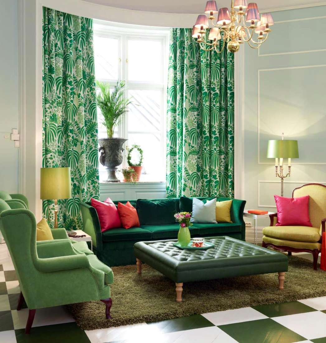
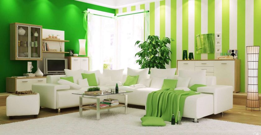
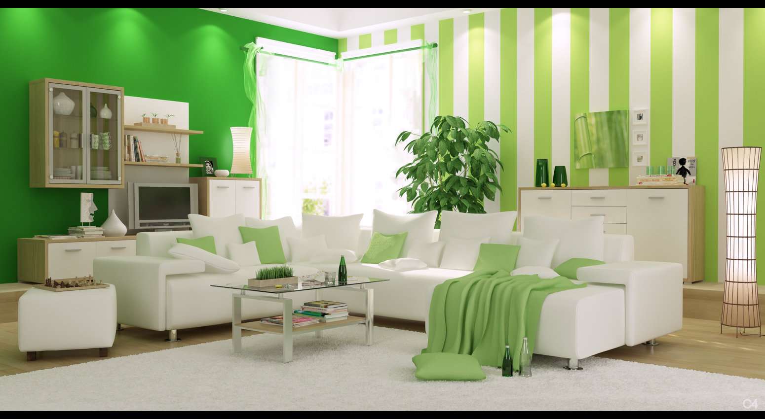
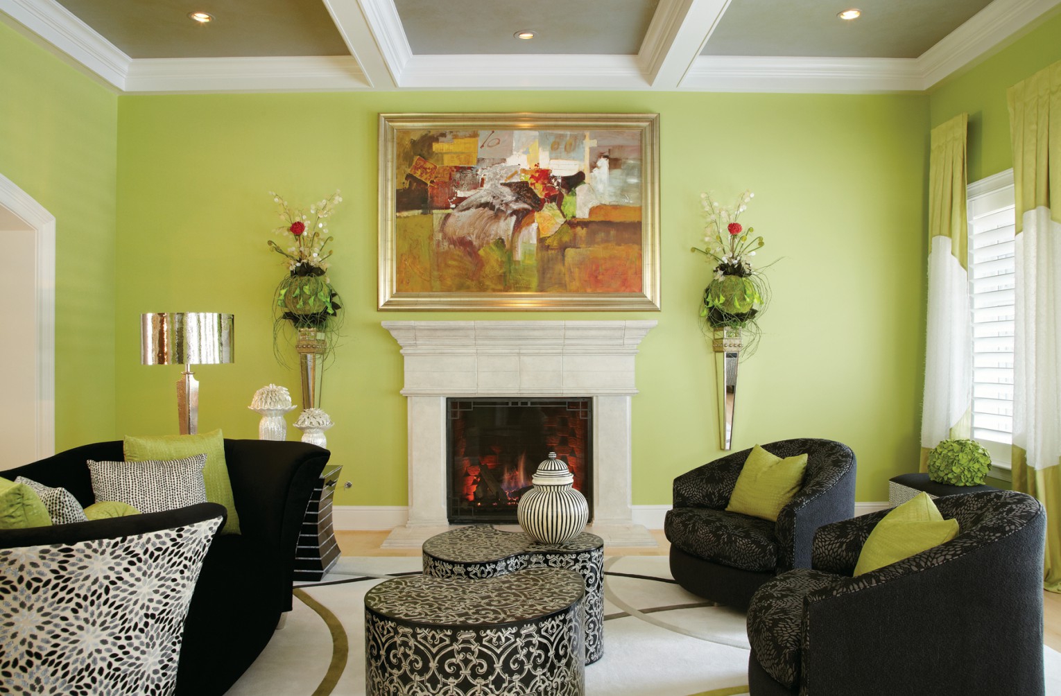
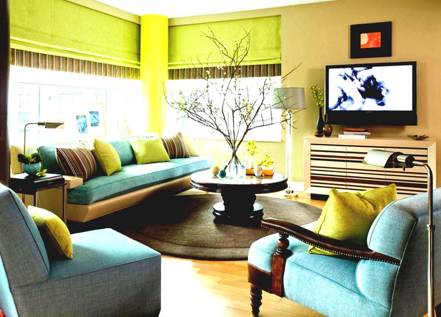
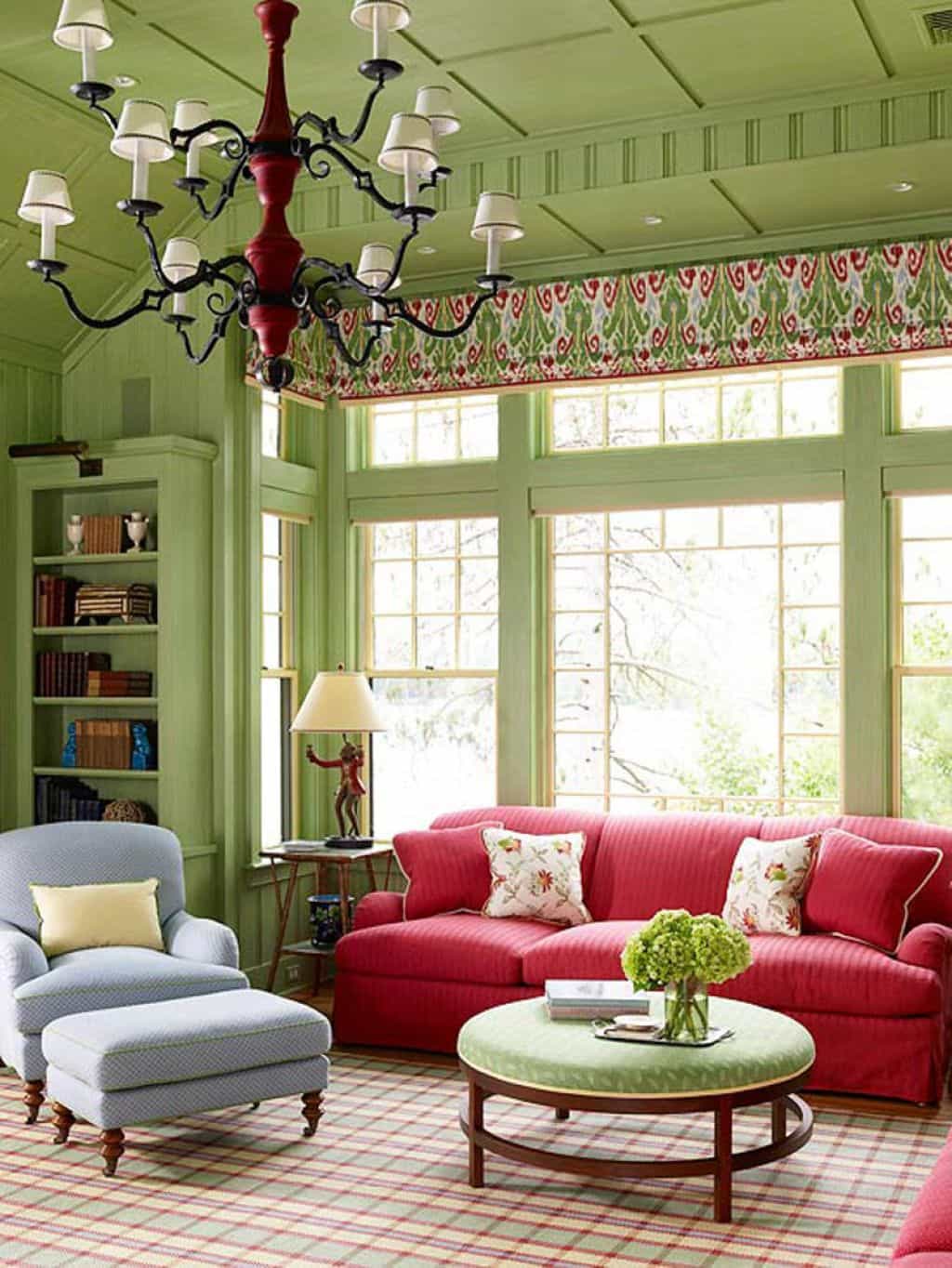
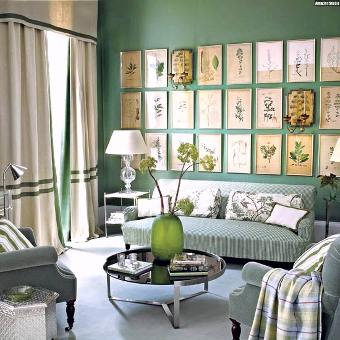
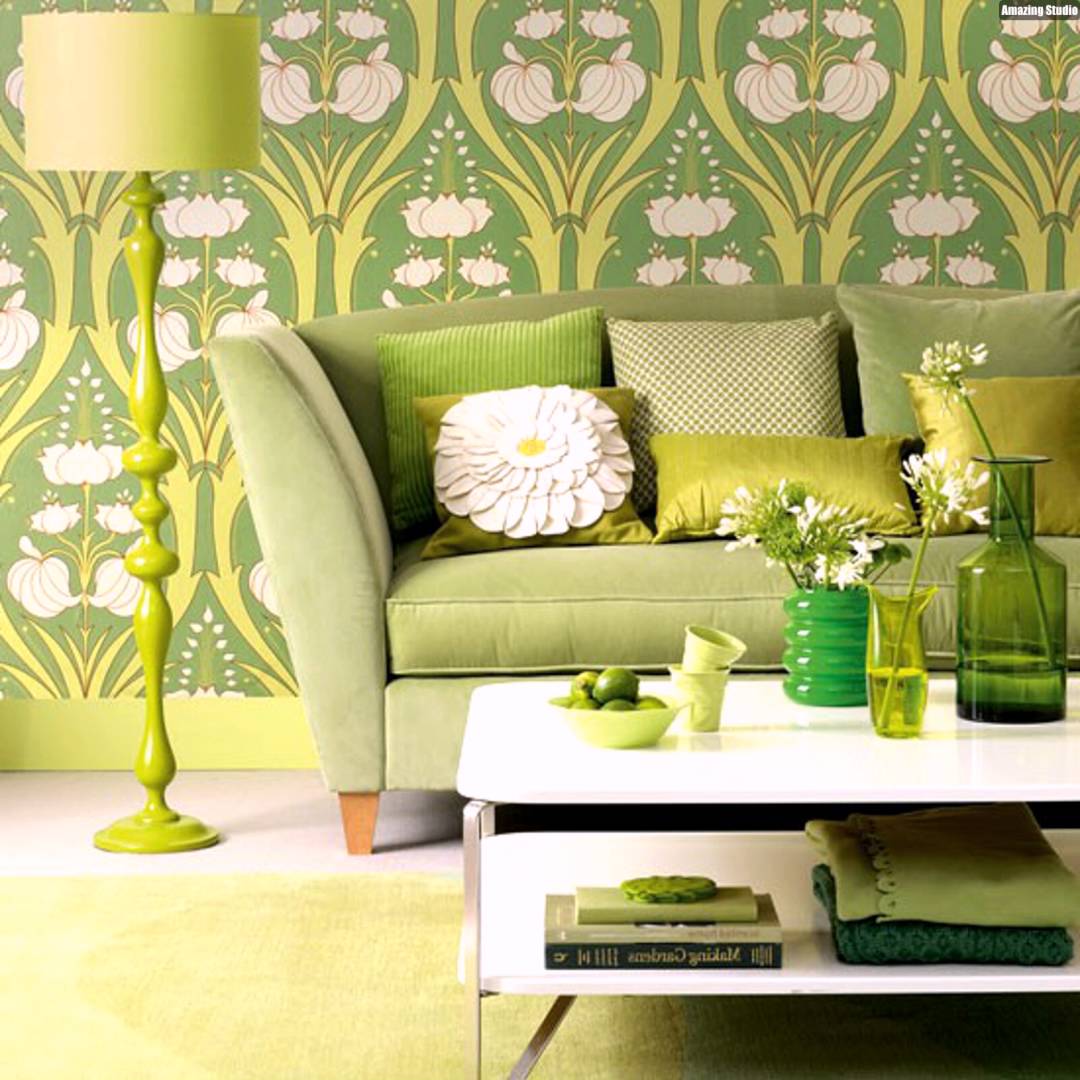
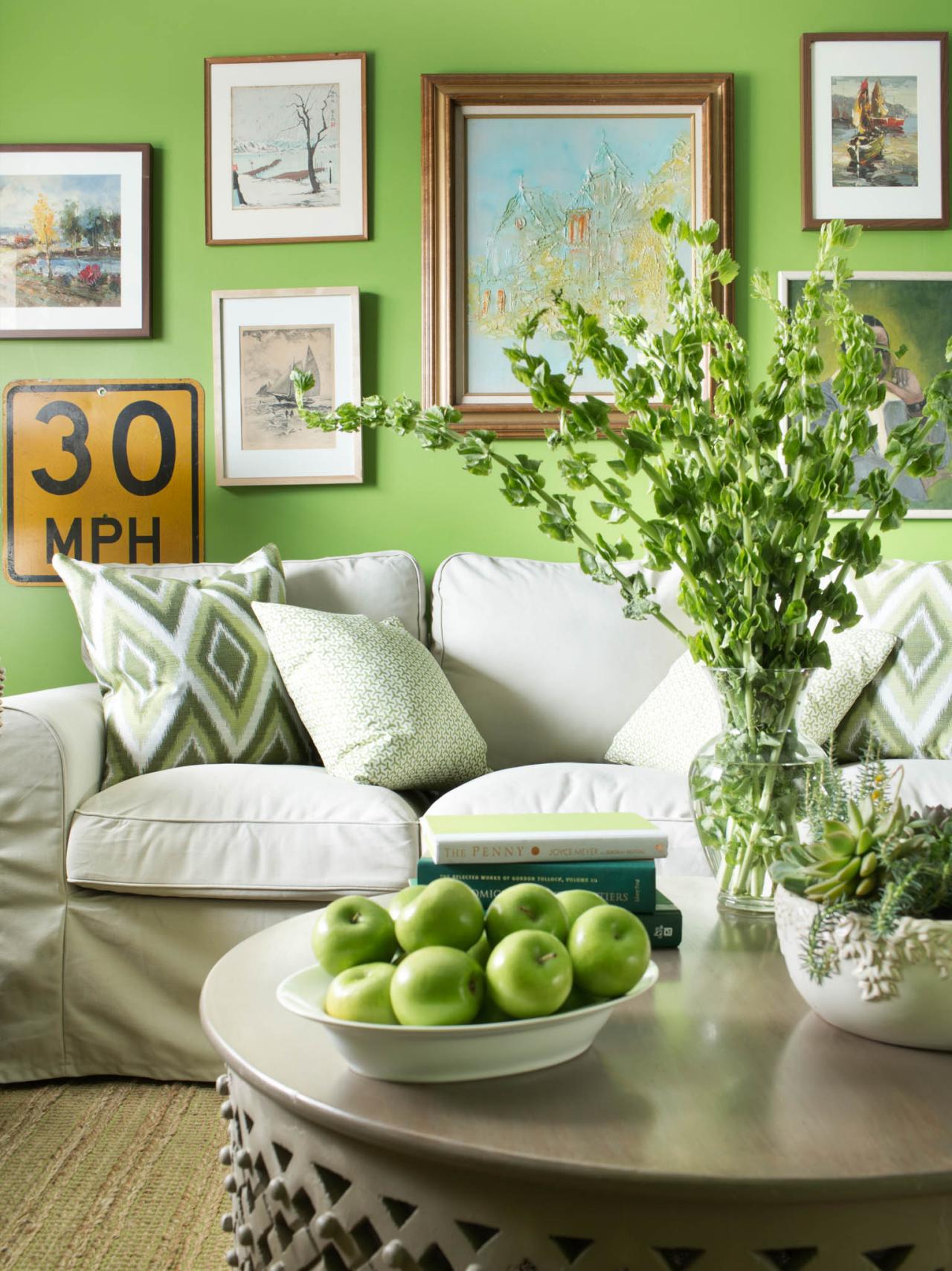
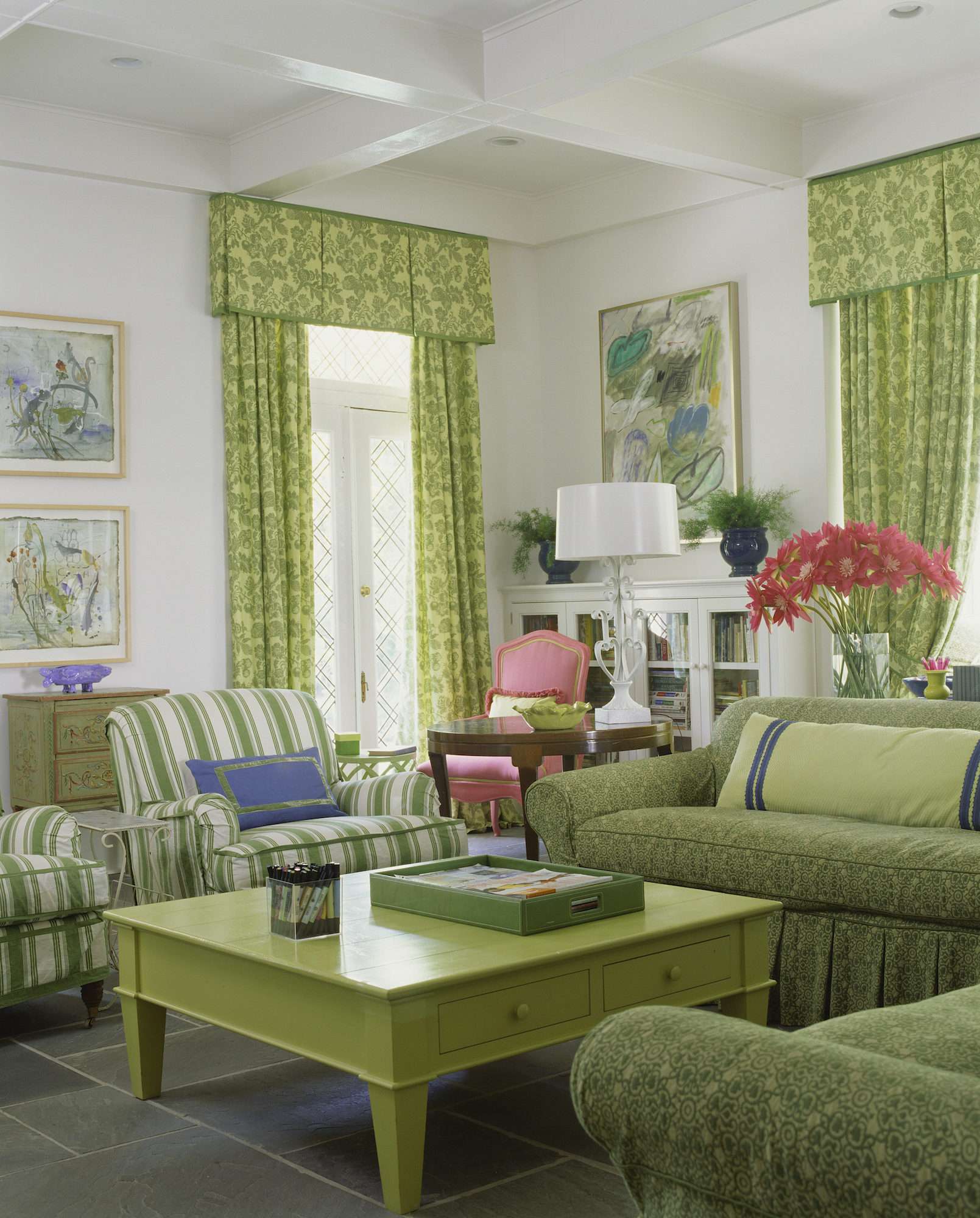
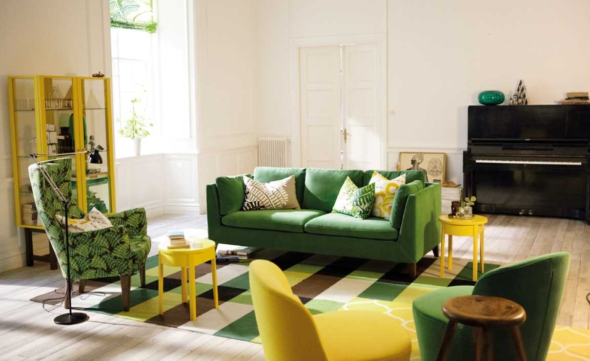
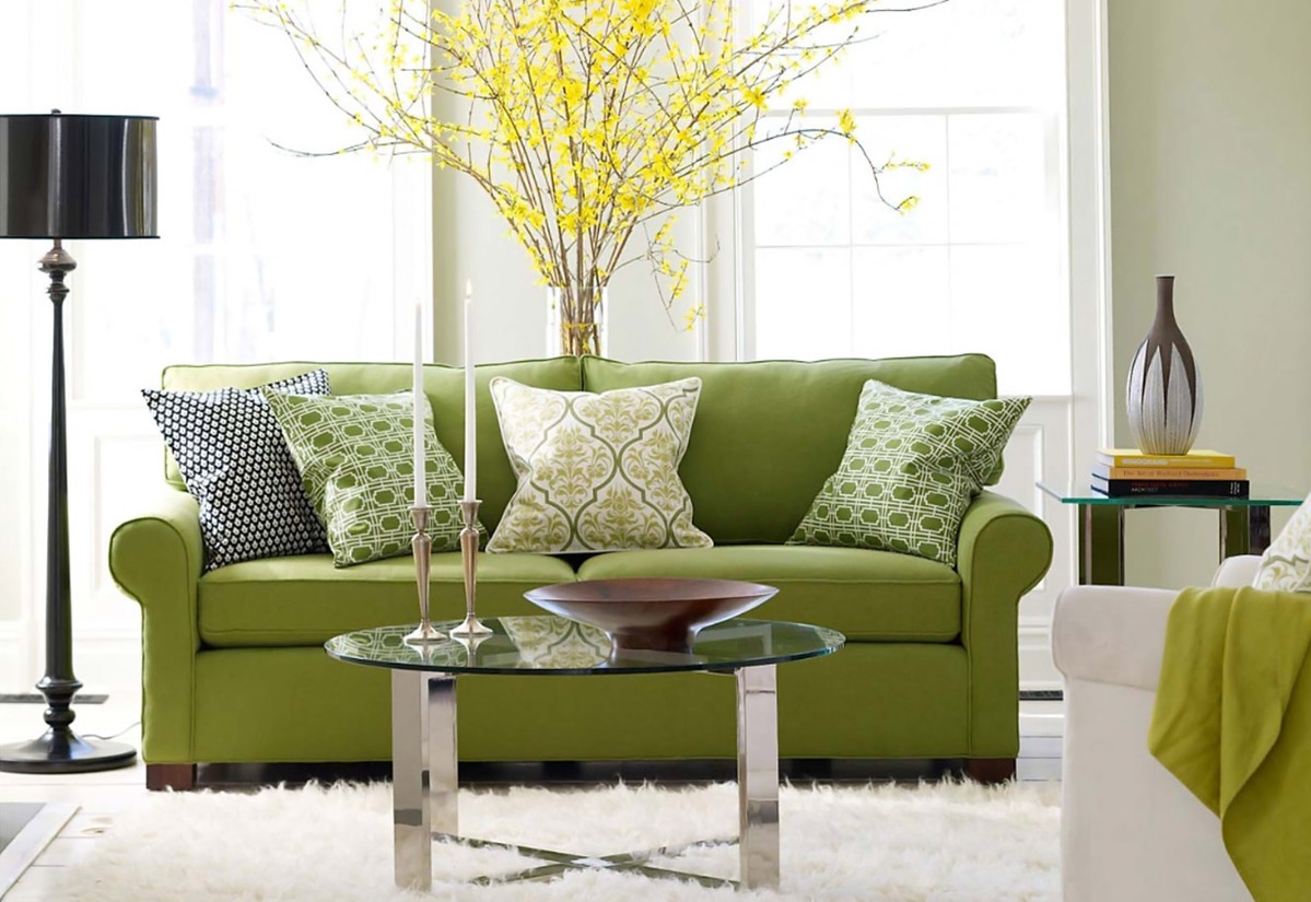
Lime shades are great for living room design. They are combined with almost all colors. Now it is very fashionable to decorate living rooms in light green tones.
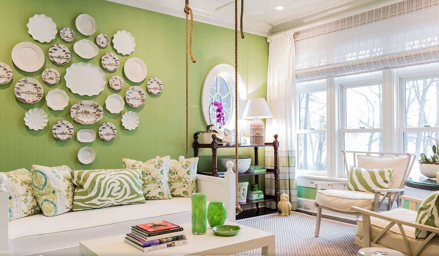
Cozy living room in bright colors
They perfectly refresh the room:
Light green
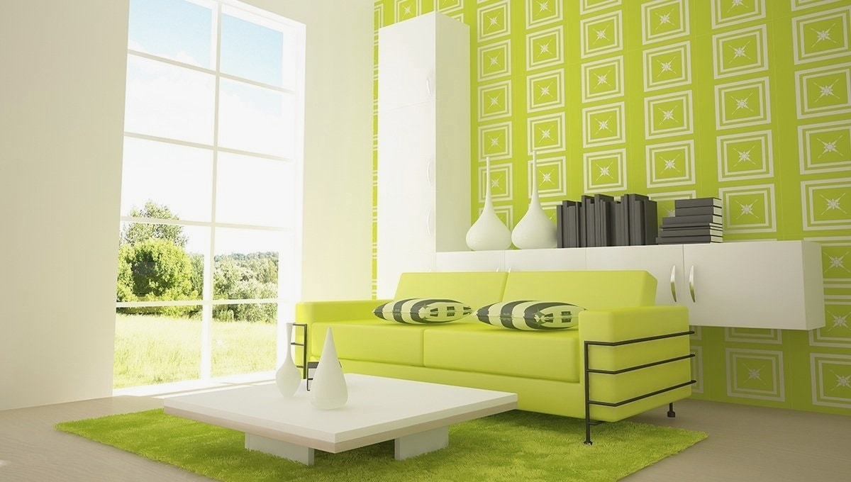
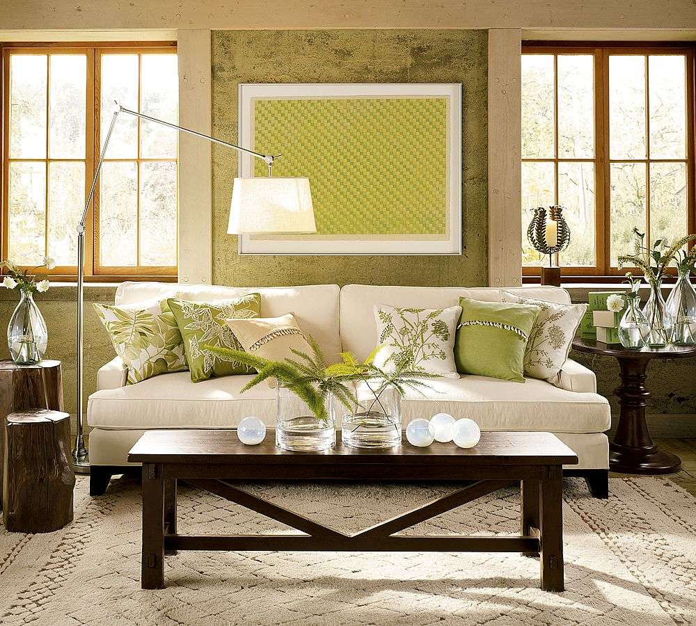
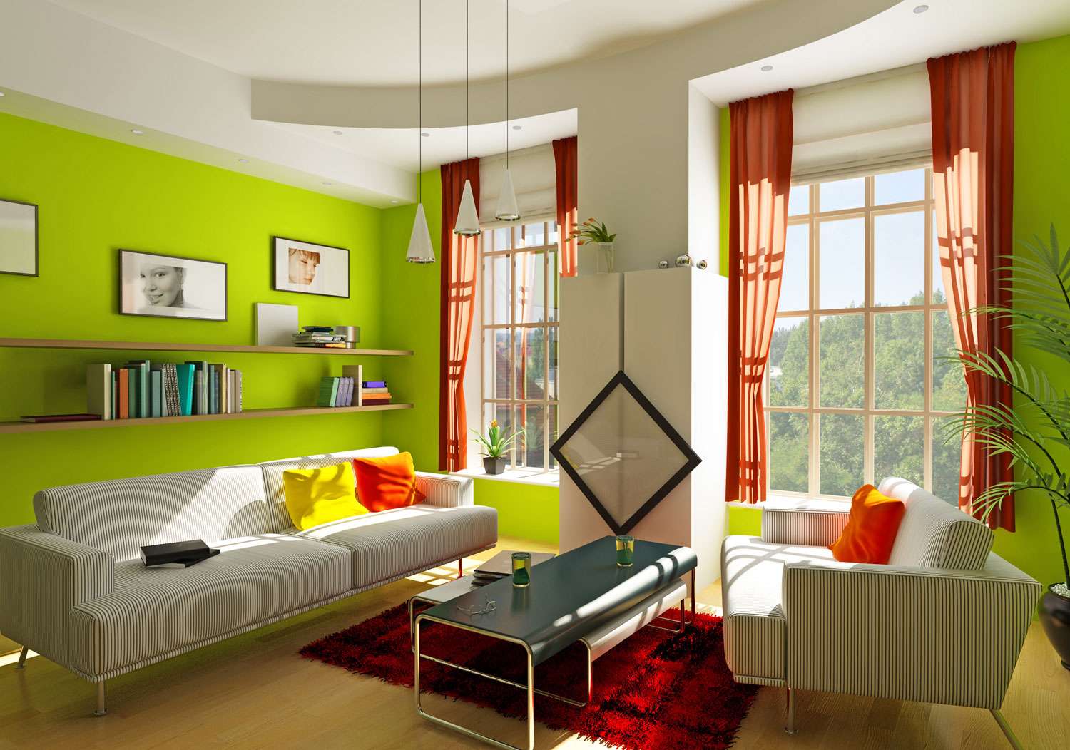
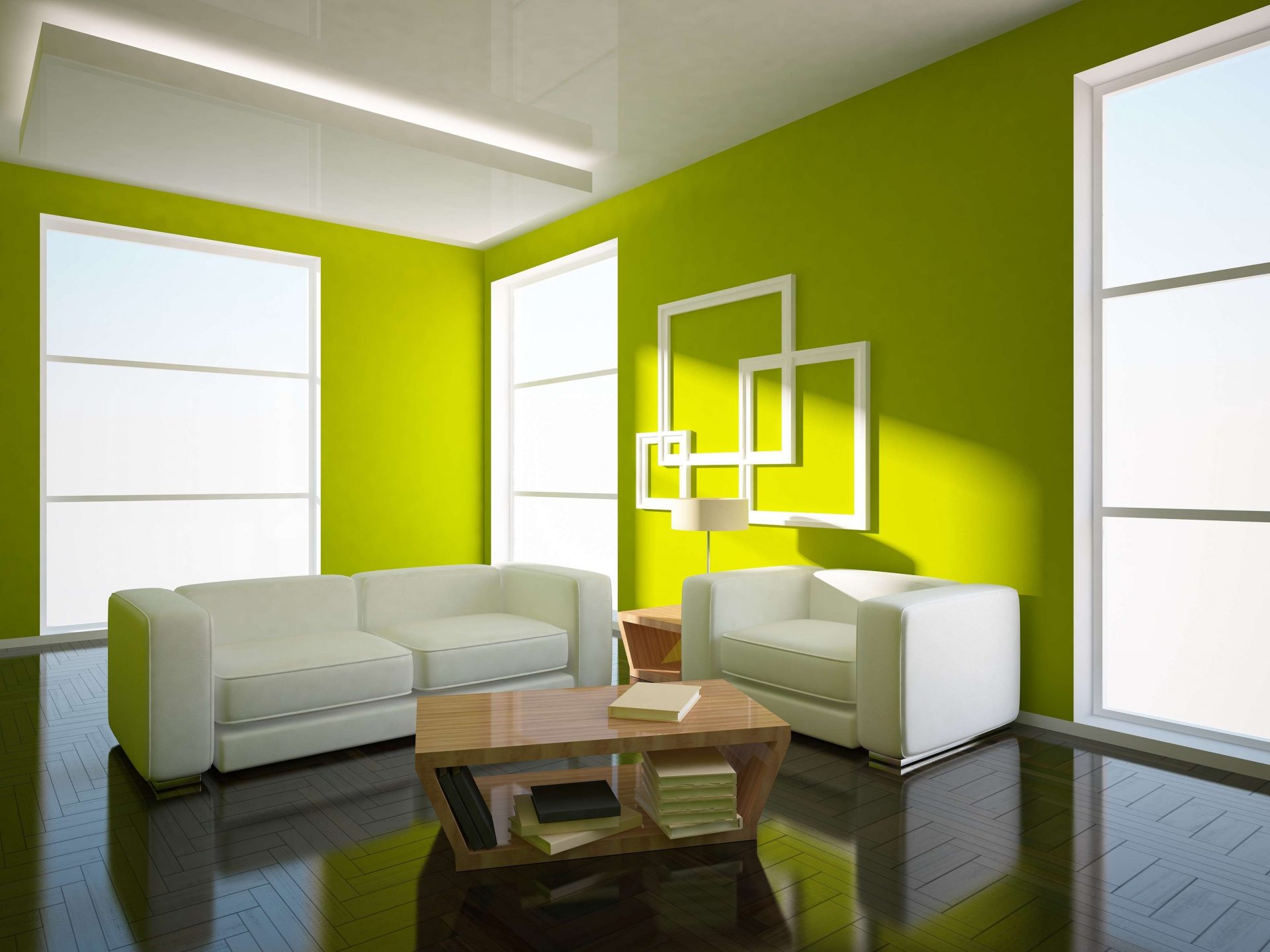
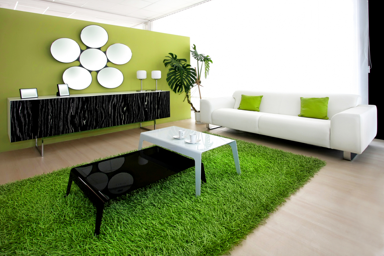
Since the light green color is cold, in the living room interior a matte, warm milky shade of white is more suitable. Brilliant and cool white surfaces will give the room a somewhat official appearance. Since the contrast of white and light green is very strong, it must be “diluted” with softer tones, for example, light brown furniture or sofa cushions. To soften such a sharp combination, it is possible to decorate one of the walls with flowers, in case the other walls are monotonous. Curtains are also allowed in the middle flower, which will enliven the interior.

The combination of white and light green
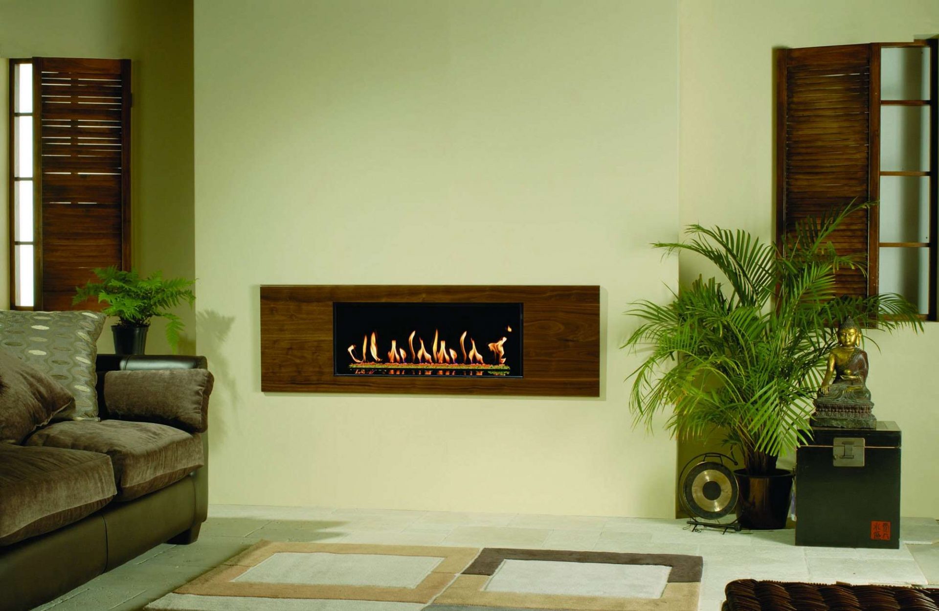
Light green
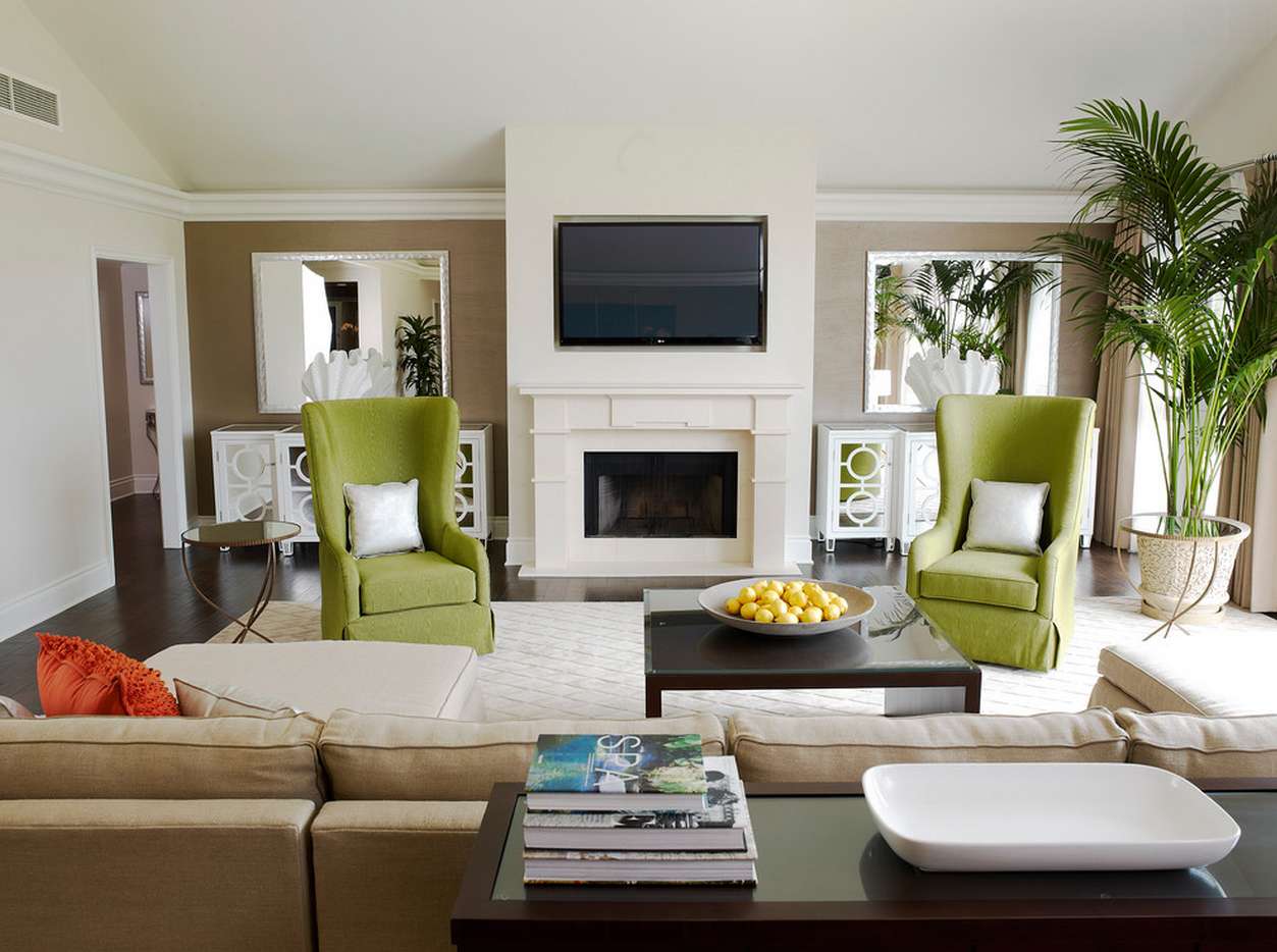
This combination of shades will look great lightweight cabinet furniture brown shades. From the excesses of the decor in the form of drawings or flowers should be abandoned in favor of striped wallpaper. It looks very good in this version of the living room electric fire near one of the walls, around which will be created an artificial niche, trimmed with natural stone. You should choose plain accessories and household items. A large indoor plant will look great.
Chic tandem light green with brown
Salad Pastel Classic
This option is perfect for living rooms that are on the shady side and are distinguished by insufficient lighting. Light green color in combination with milk and beige tones will create a feeling of lightness. A crystal chandelier with candlesticks that will give the room an atmosphere of antiquity will be useful in this interior. Wallpaper for such an interior is possible as a light green, and pastel colors. If the choice is made in favor of the first, it makes sense to pick up light curtains to balance the base tones. Furniture for this interior is better to choose a light, with cushions to match the tone, but more saturated colors.
Light combination of shades
Salad Pastel in Rustic Style
For this living room option, it is necessary to choose the appropriate furniture, for example, unpolished from wood, imitating rough handicraft work. In this case, in the decoration of curtains and sofa cushions, you can use fabrics in a small flower.
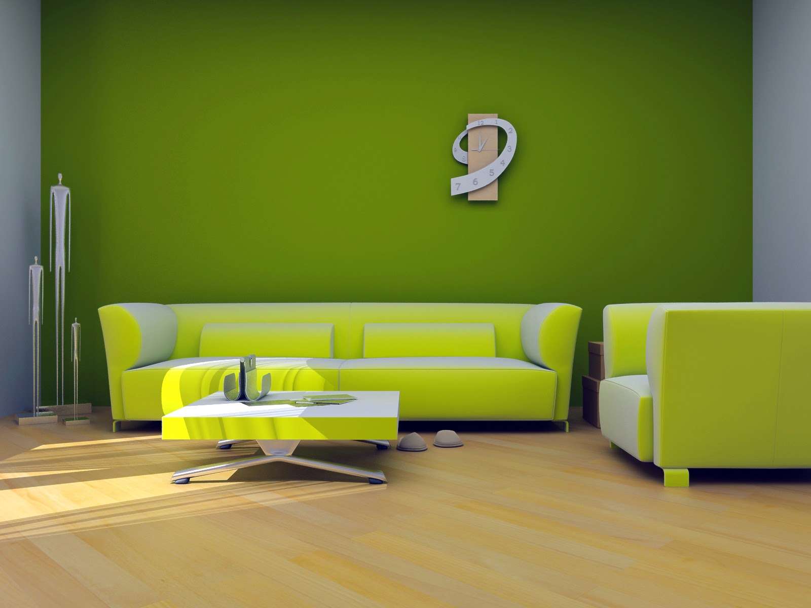
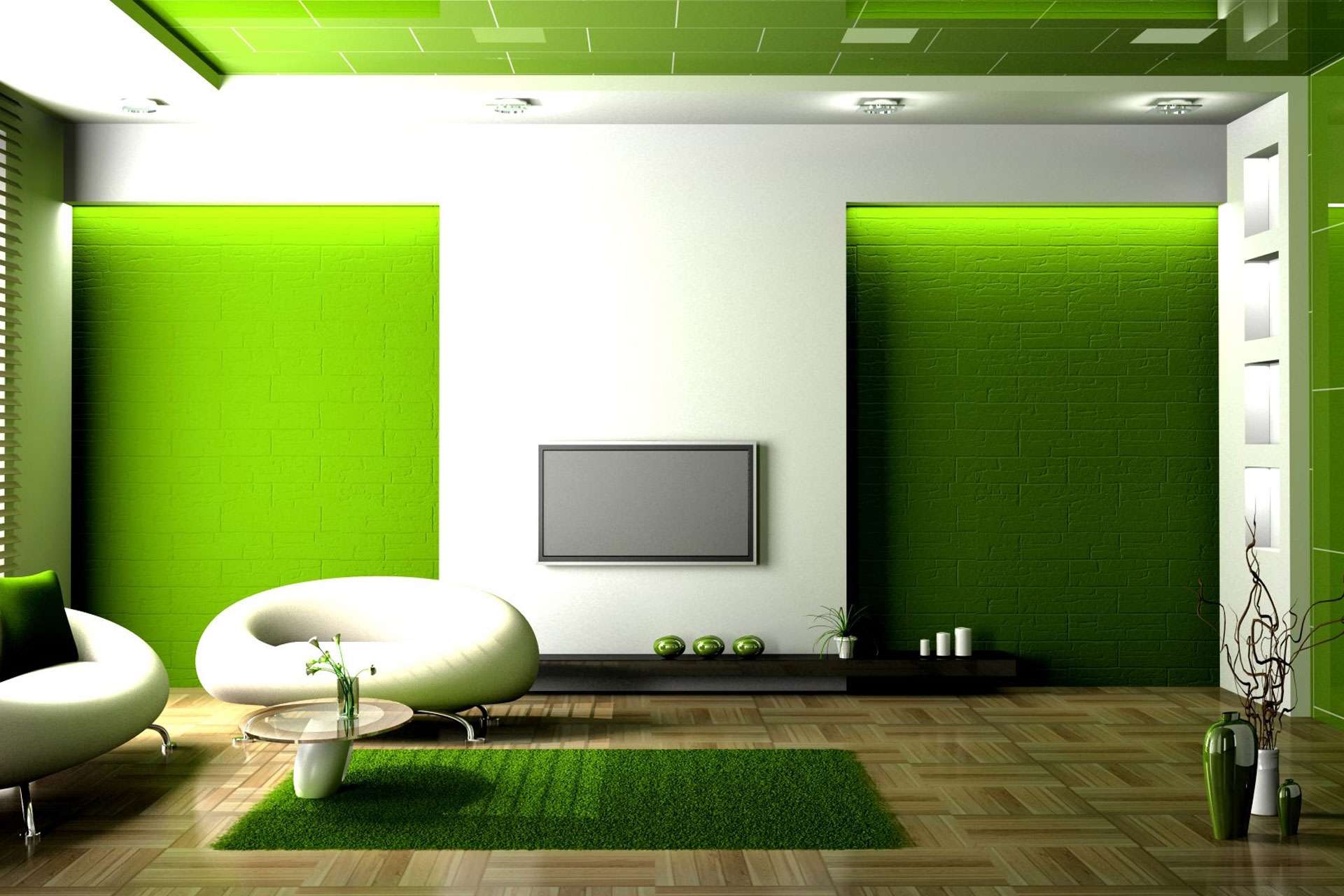
Light green
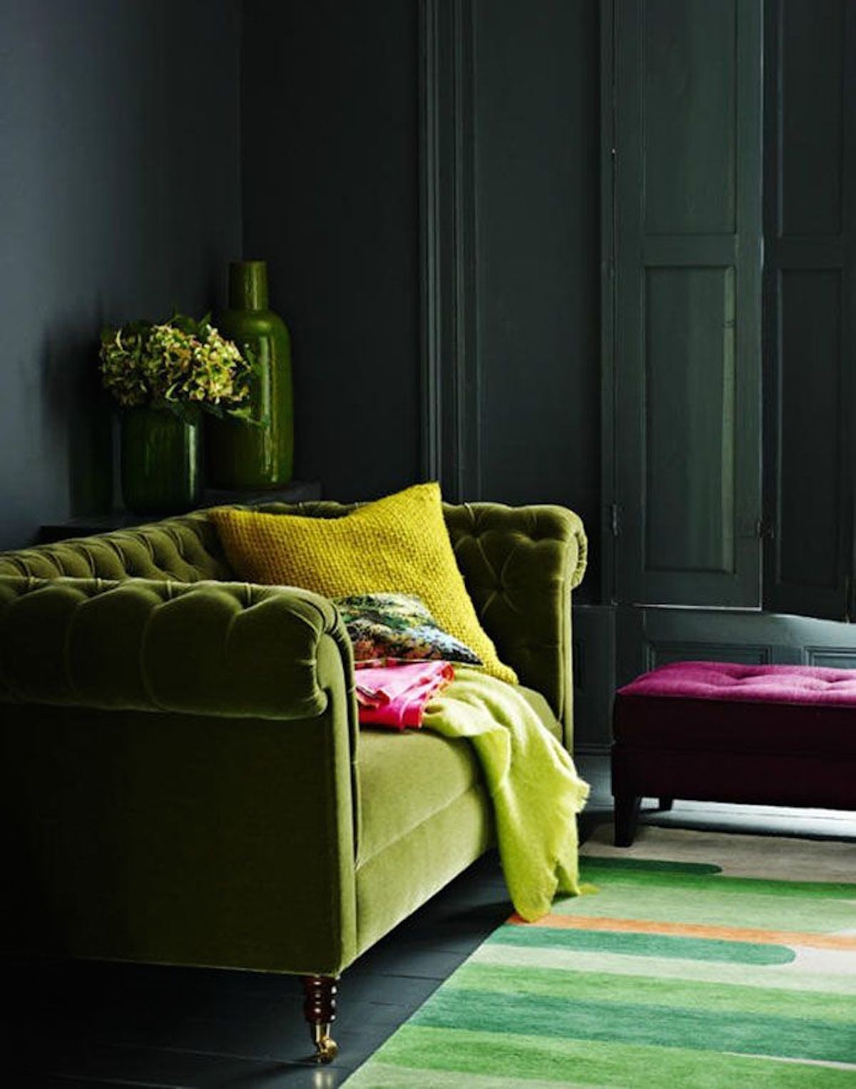
This option of the living room decor is very strict and excludes the use of unnecessary decorations and accessories. Black color, as a rule, is used in a limited way so as not to make the room dark. Basically, for such options choose black furniture in a minimalist style. Curtains, upholstered sofas and chairs, cushions - everything has a single shade.
Choosing black in a minimalist style.
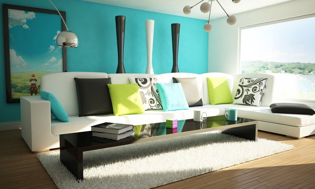
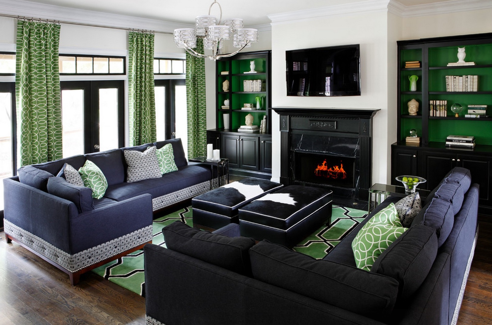
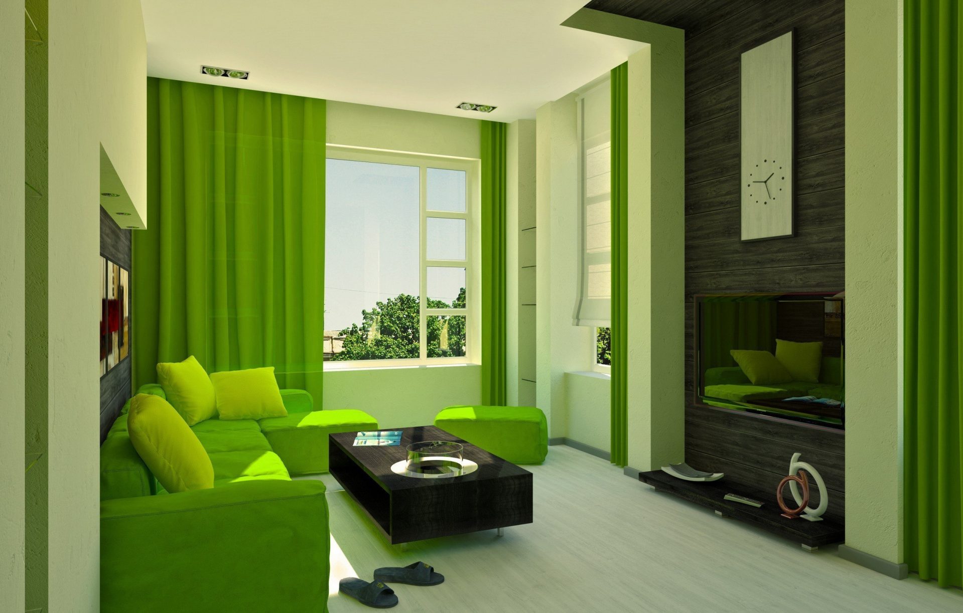
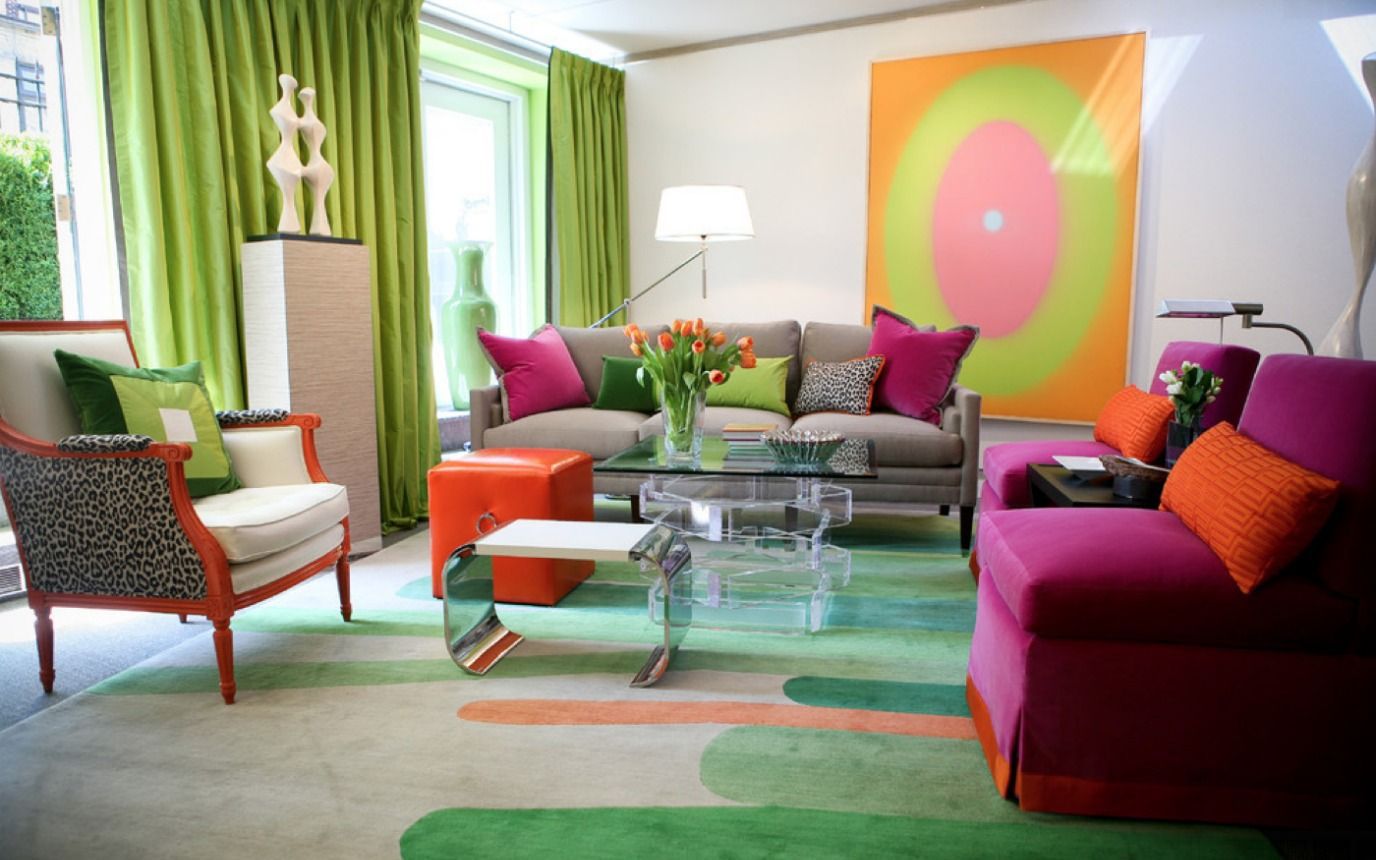
Salat Blue
This is a very bold combination of colors for the living room decor. By choosing it, you must clearly decide which of these cold colors will dominate and which one will remain muted. Equal in intensity, blue and light green colors are too tiring. The ideal would be a combination of muted blue furniture and a small amount of bright lime. In this case, dark brown furniture will serve as a good contrast.Such a strict combination of tones eliminates frivolous patterns in the interior. In this case, textiles with a geometric pattern will look good.
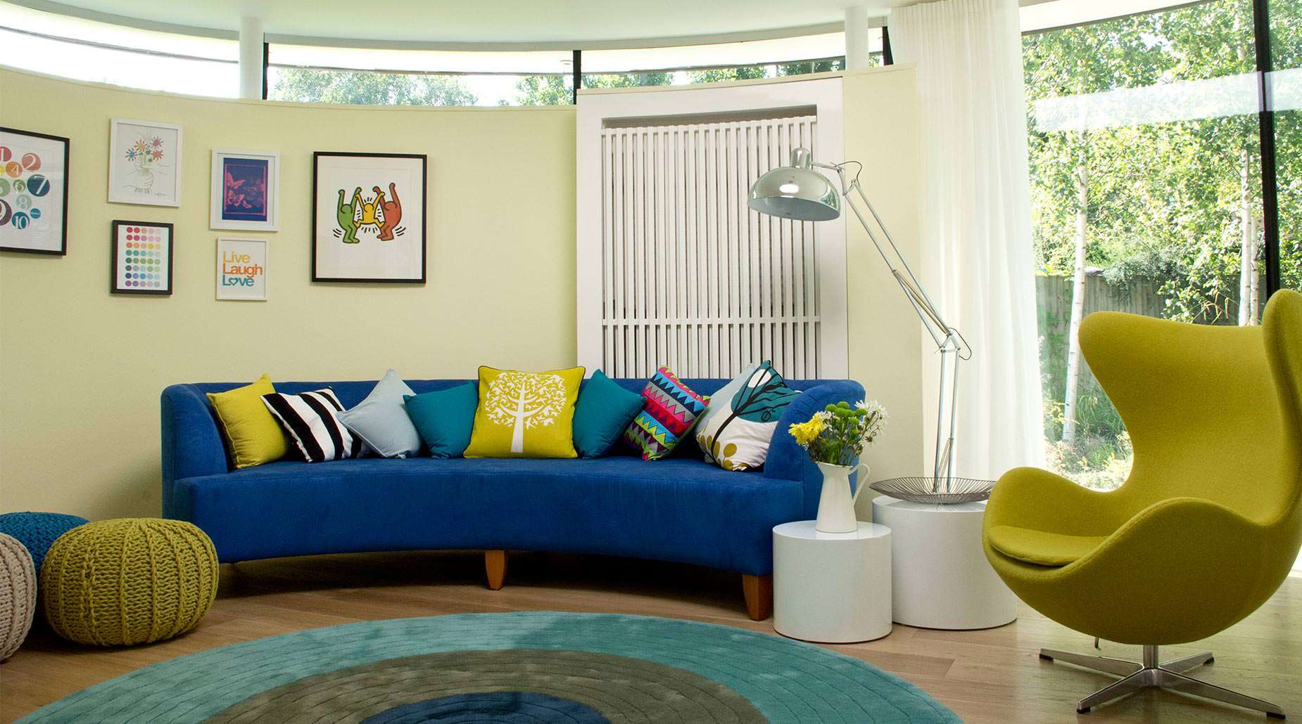
Good contrast in the living room
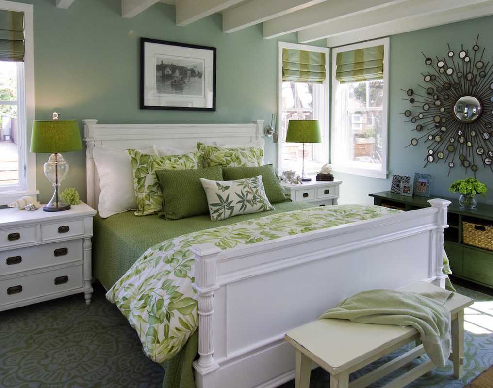
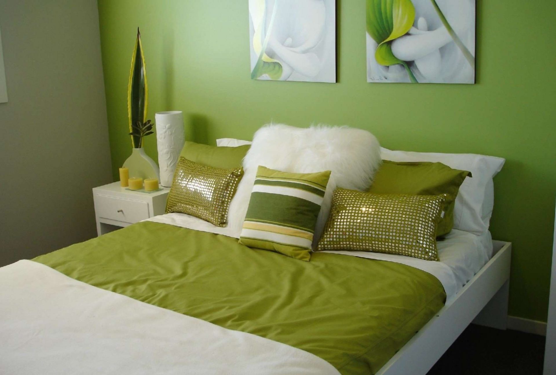
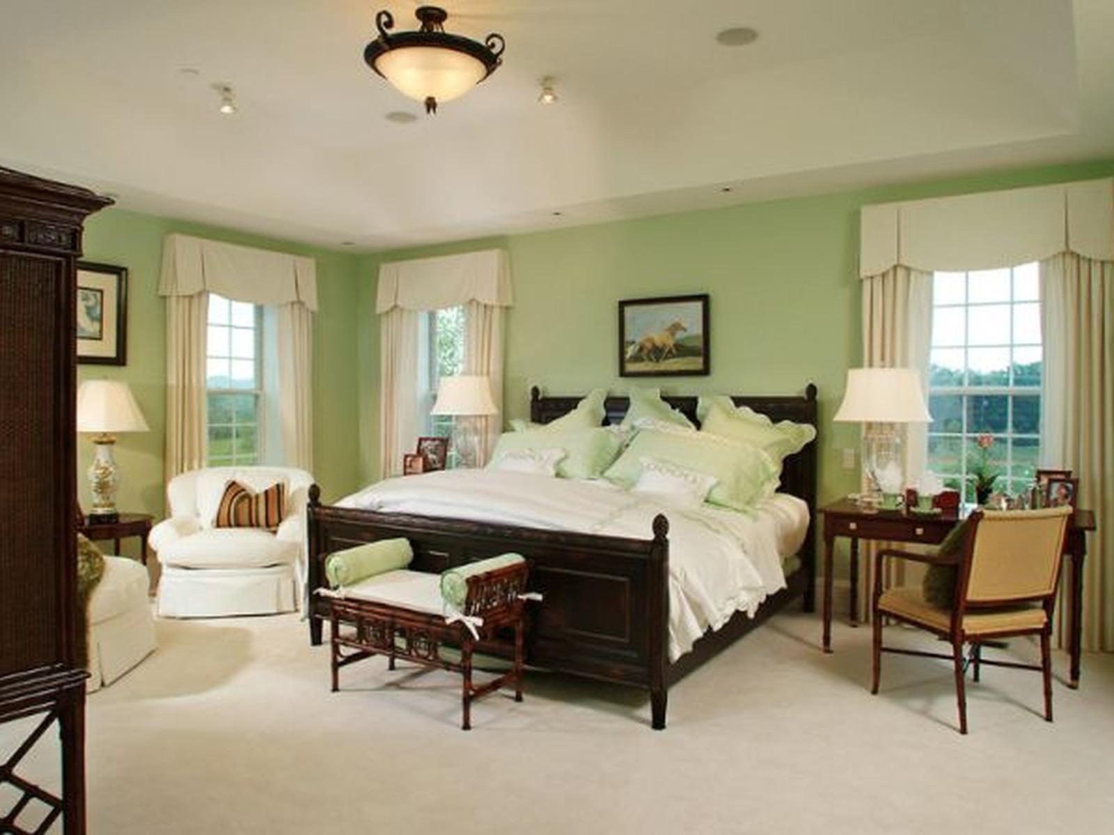
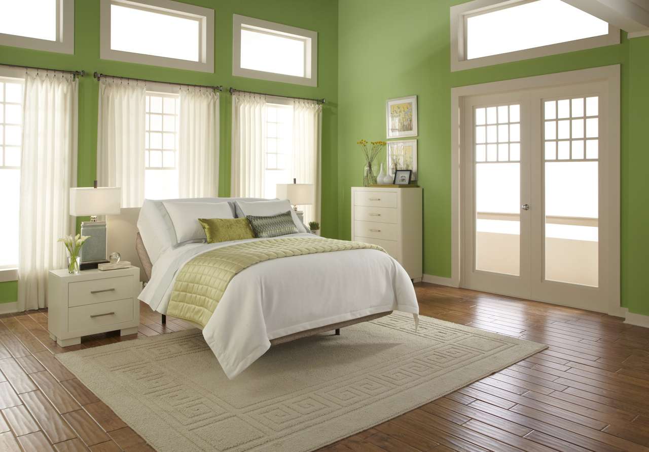
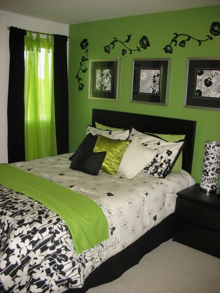
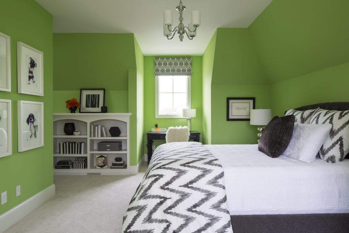
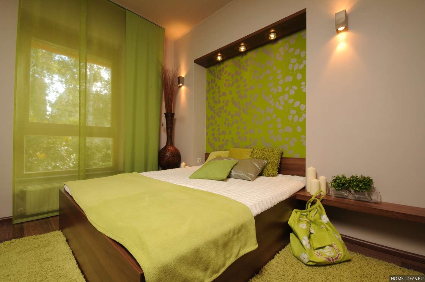
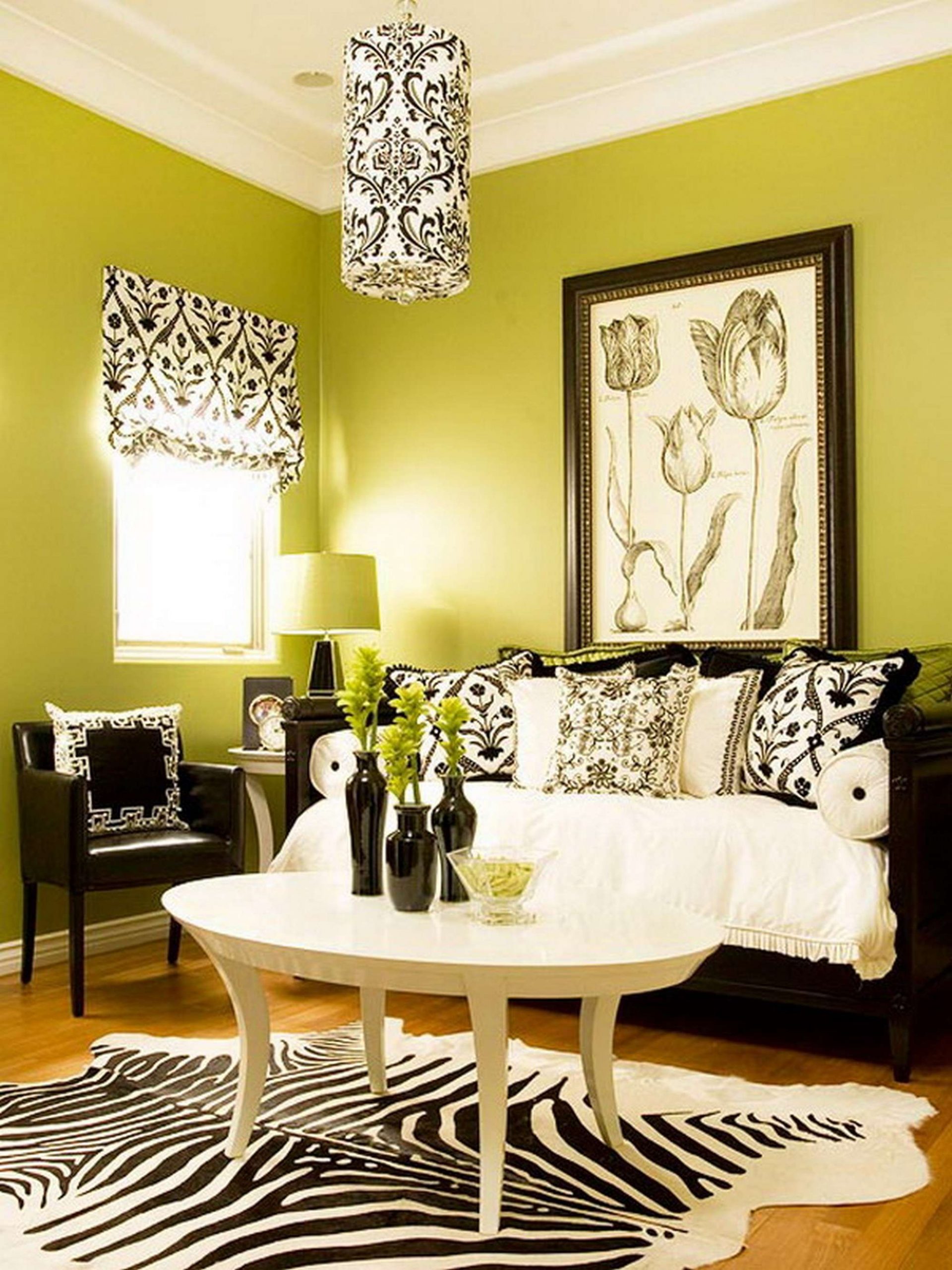
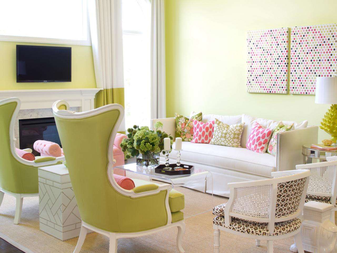
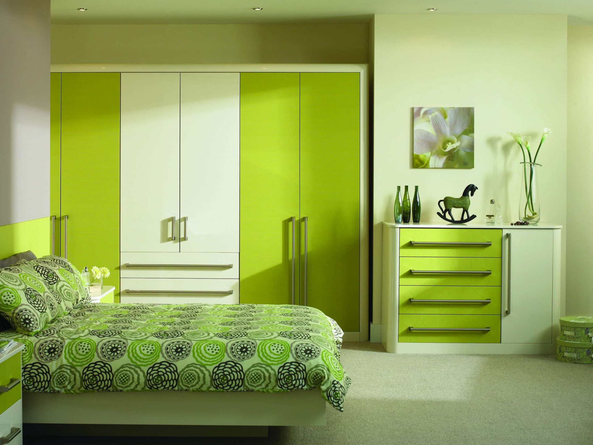
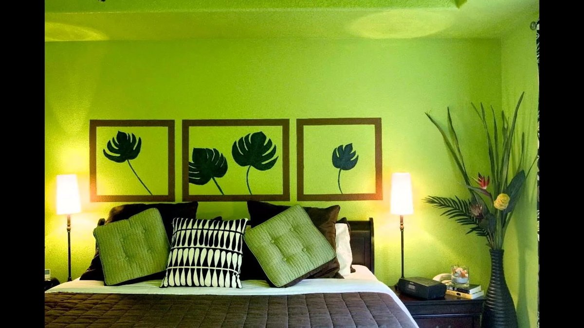
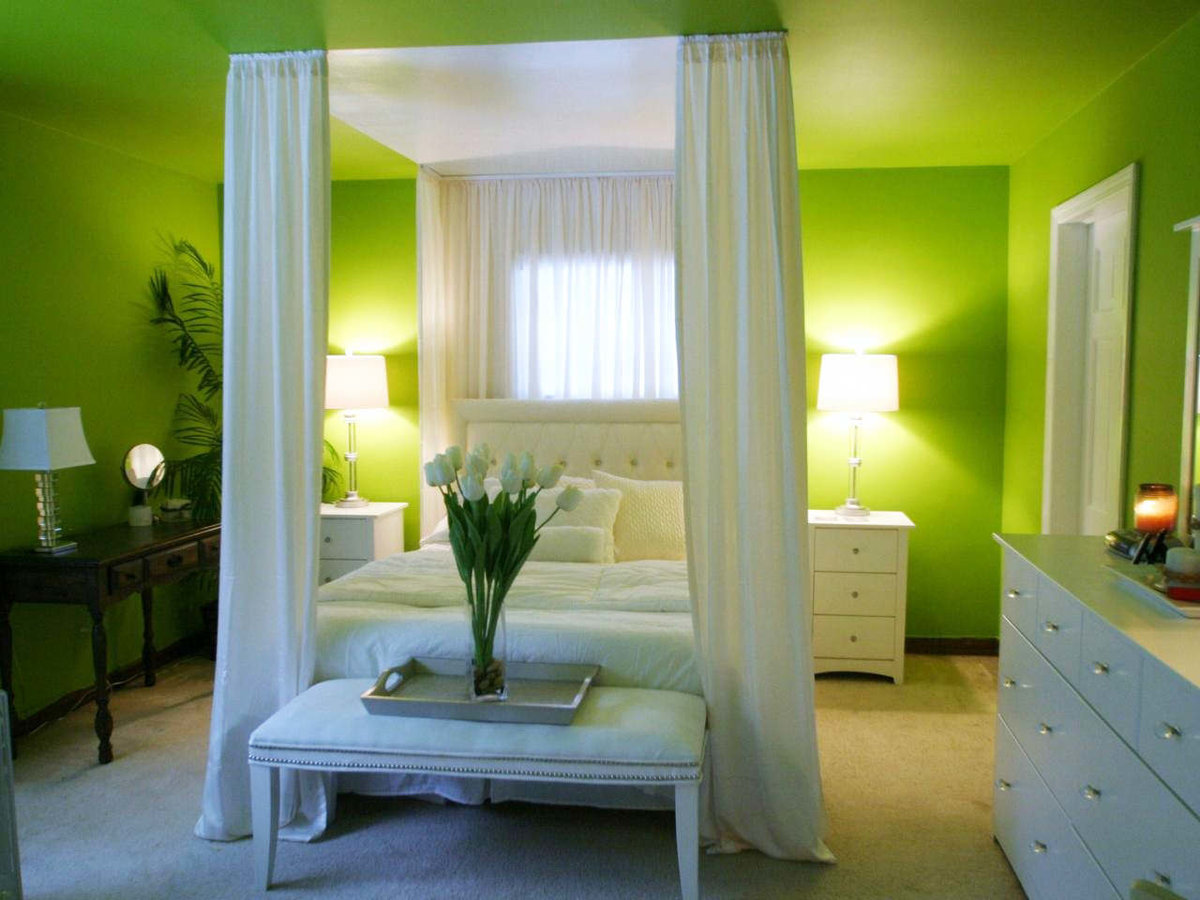
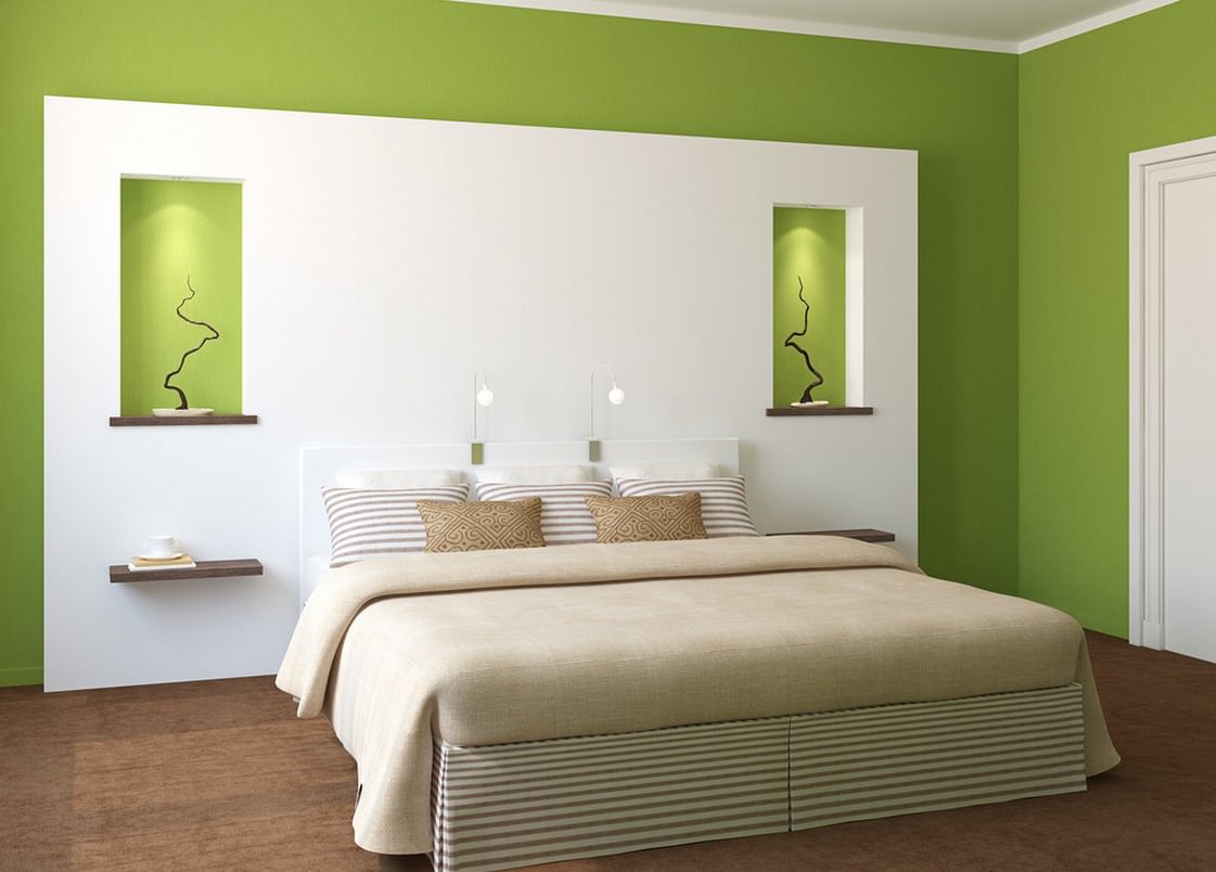
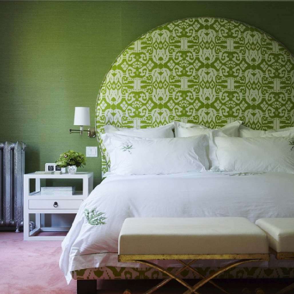
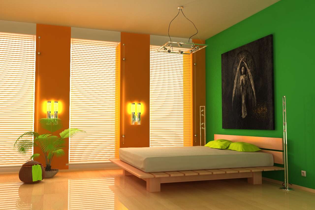
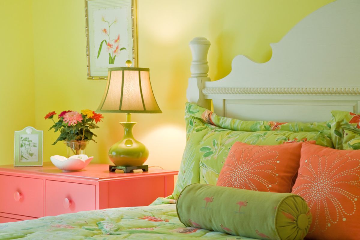
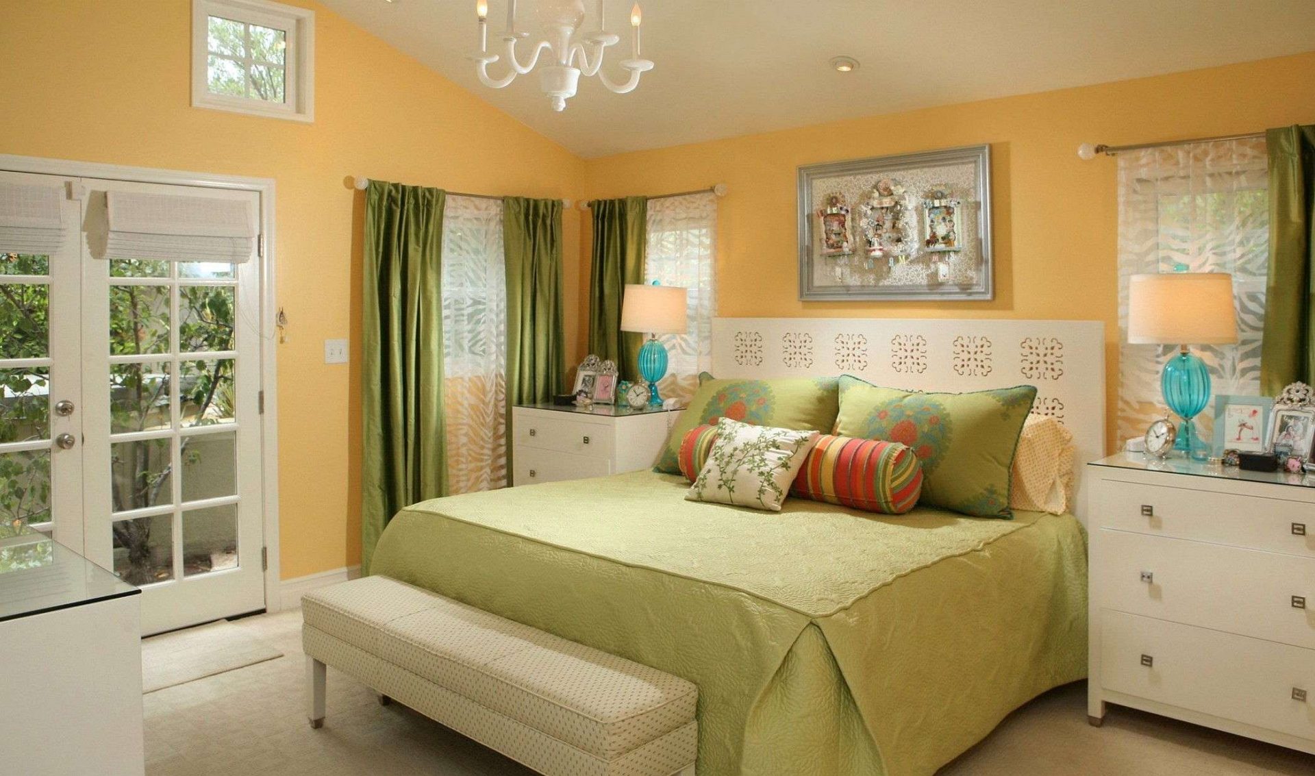
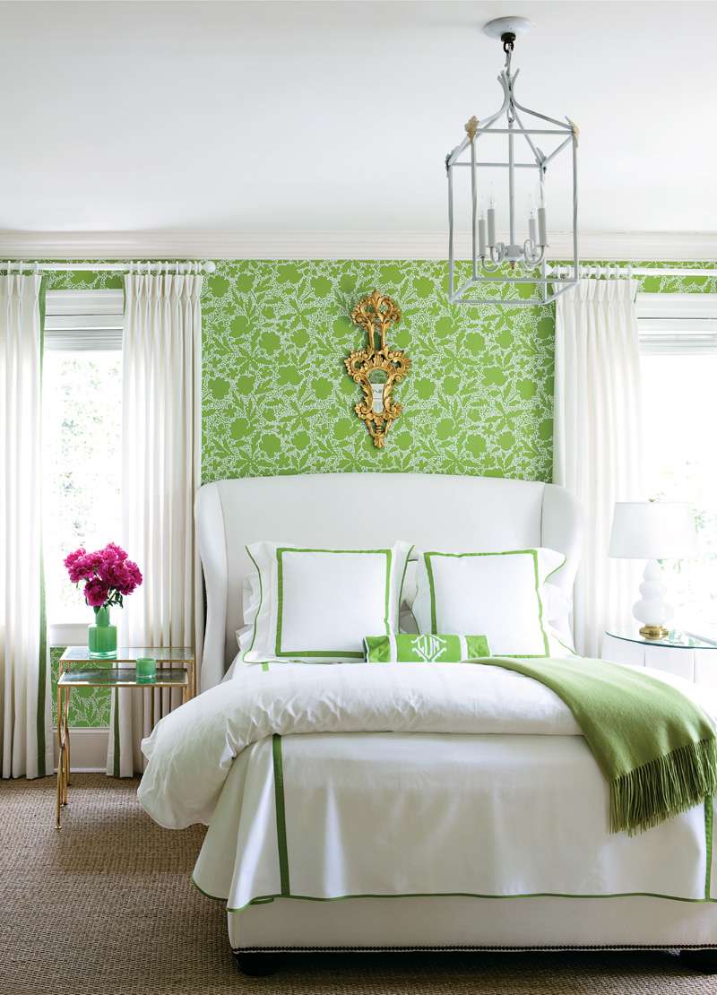
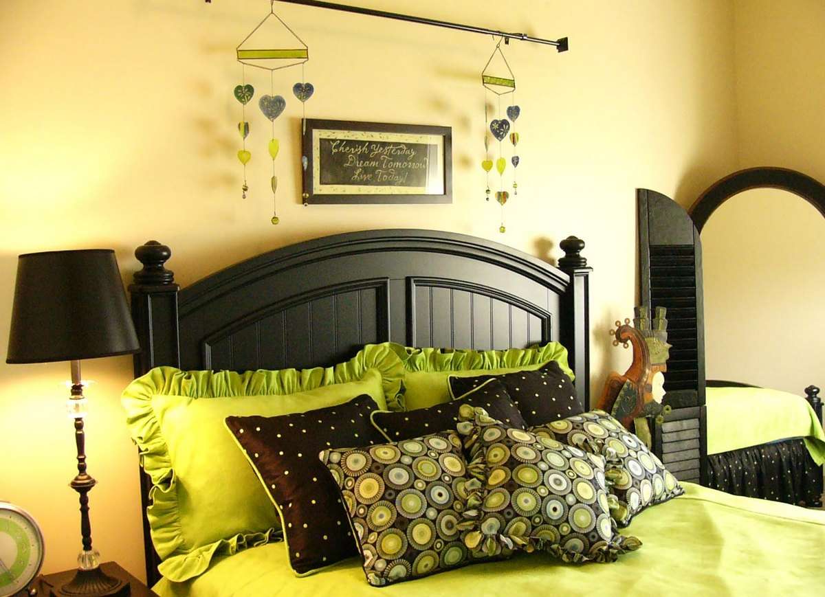
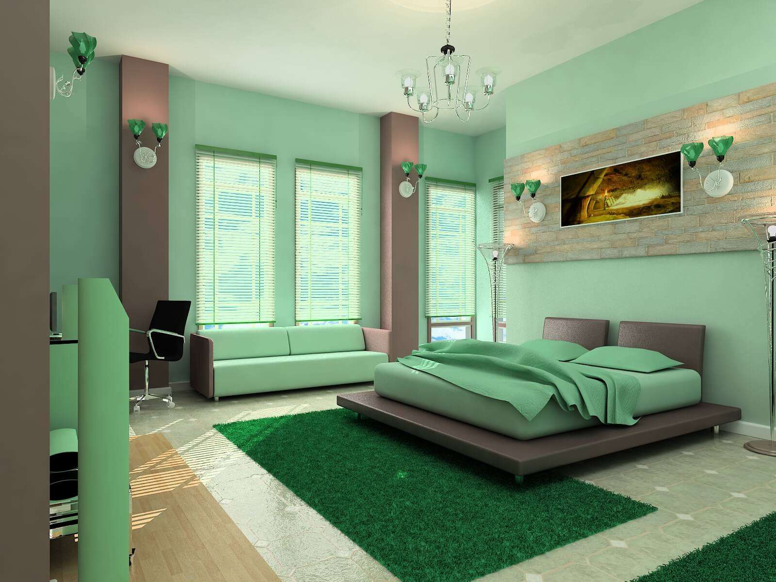
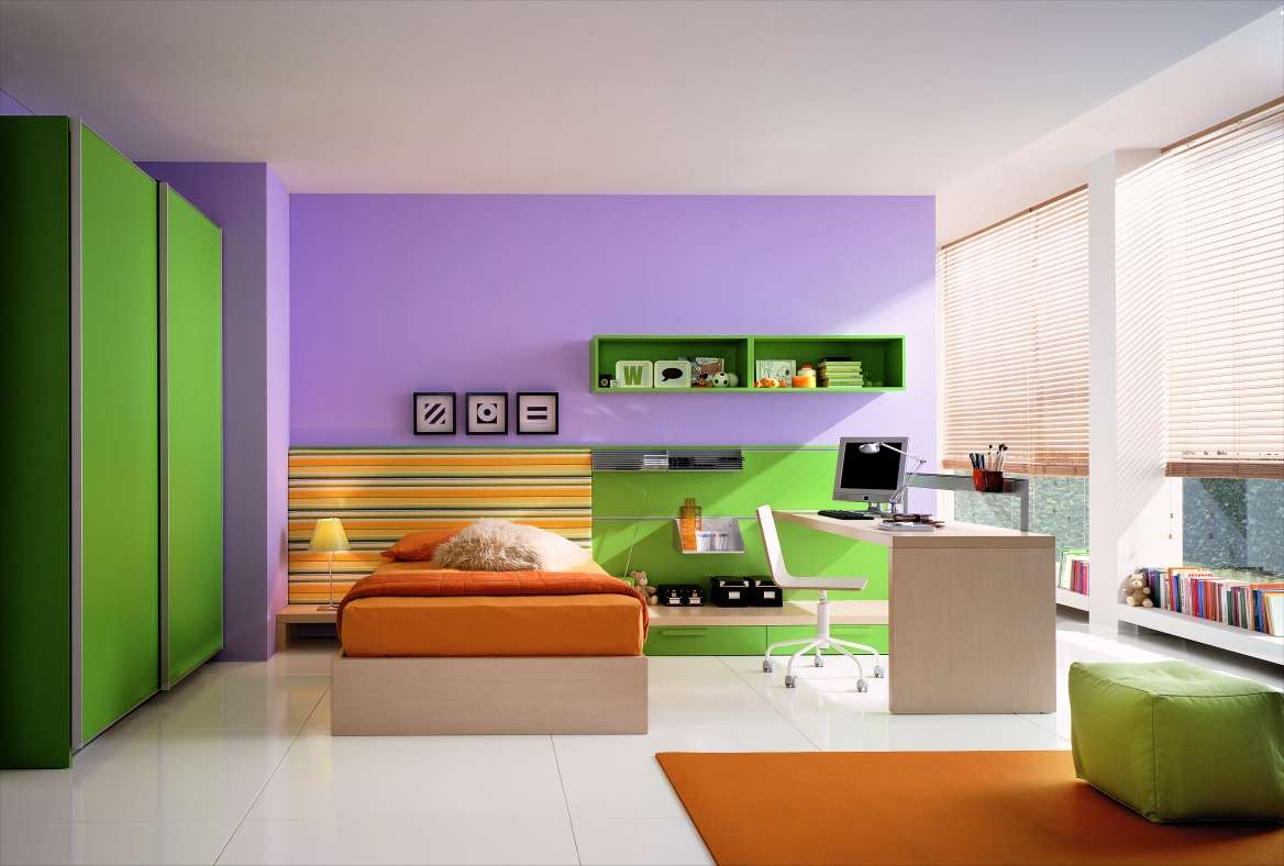
Bedroom
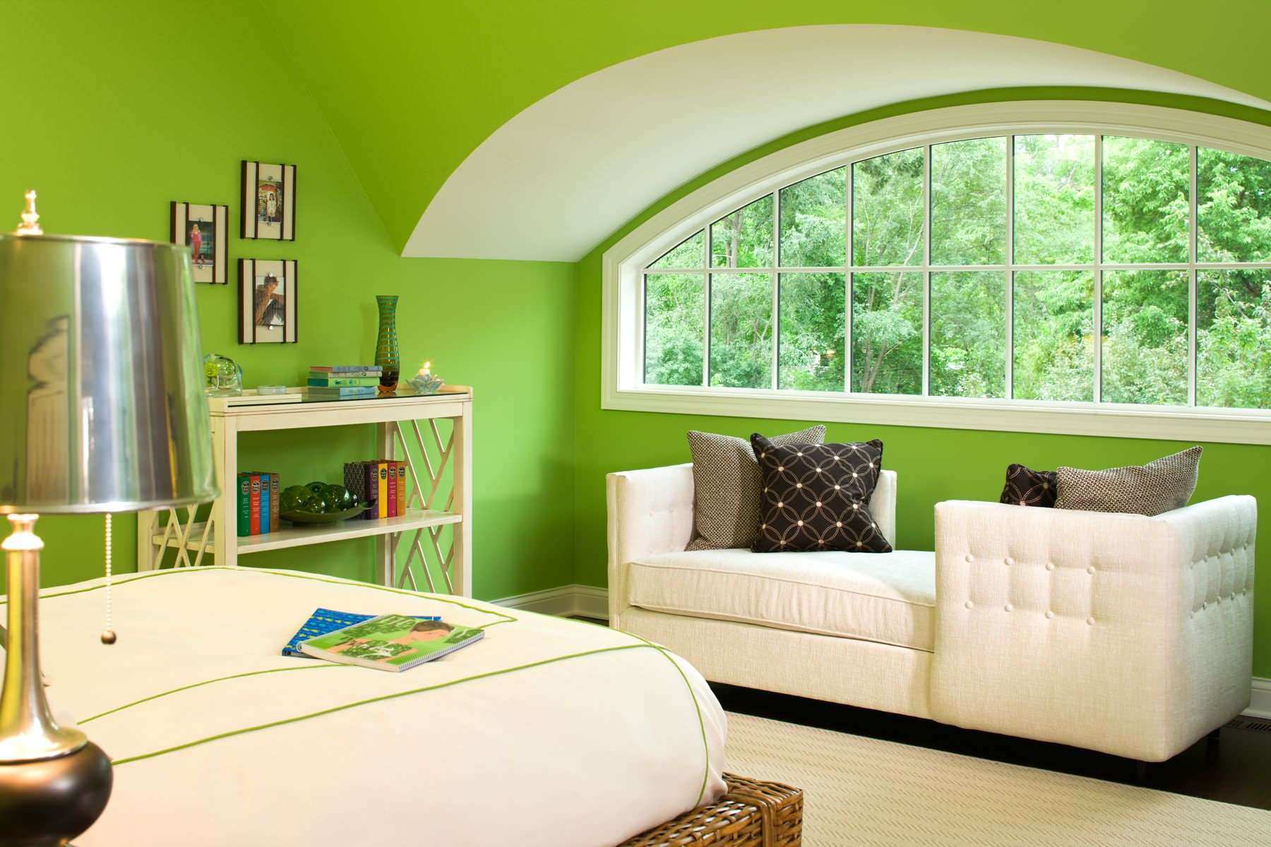
At registration of the room bedrooms it must be remembered that the room is designed for relaxation, therefore, the use of too bright, “acidic” shades is unacceptable. It is necessary to choose such shades, looking at which, a person will relax and adjust to a healthy sleep.
The use of bright colors is unacceptable
For the decor of the green bedroom there are various options and approaches:
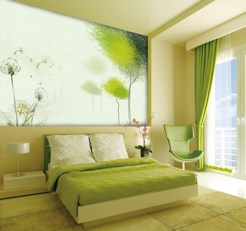
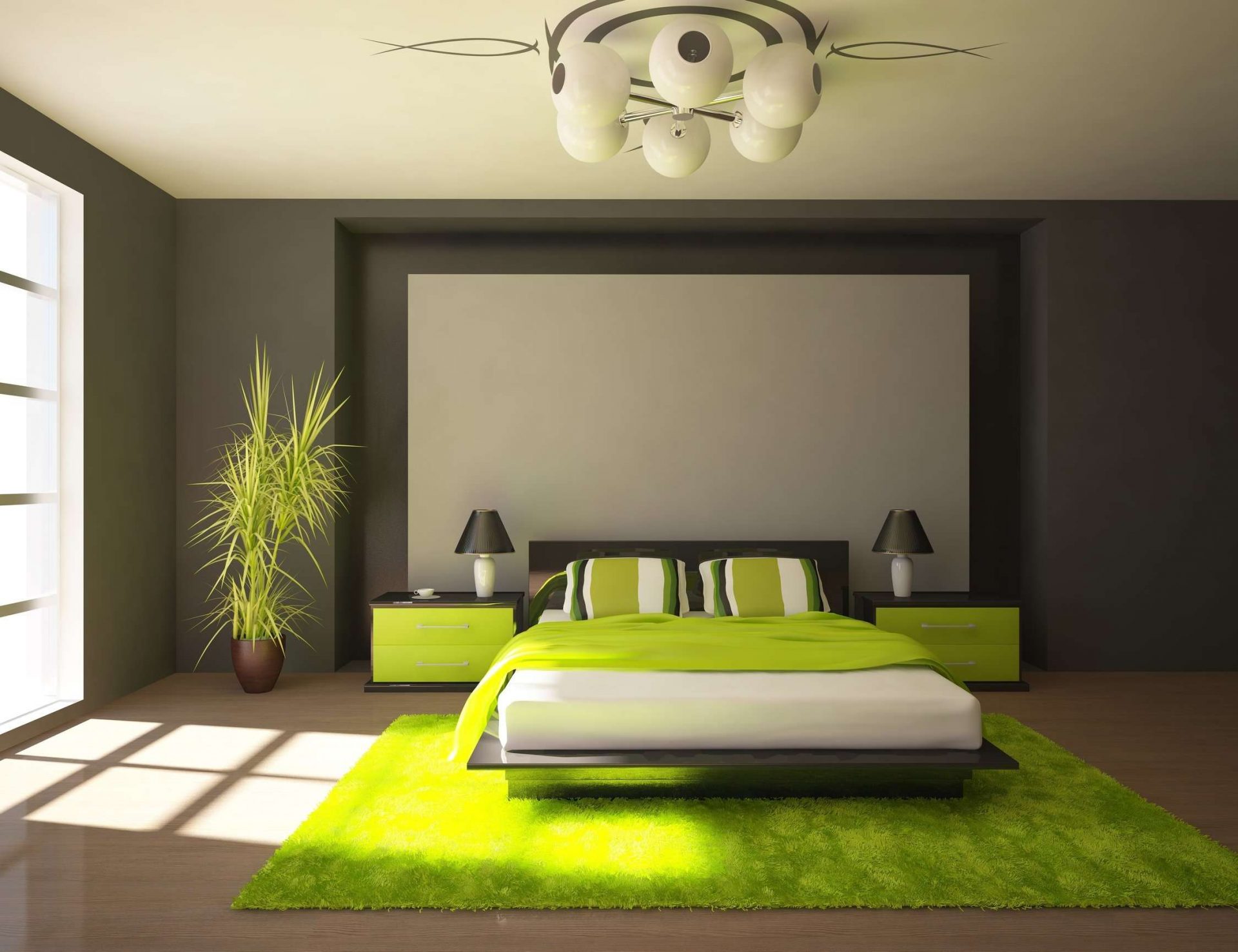
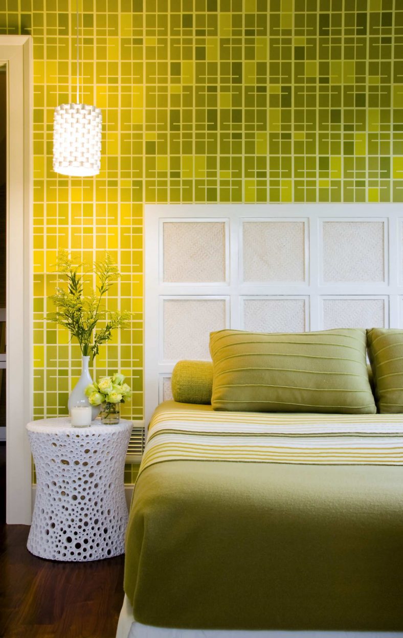
- Light green. This combination allows you to create a very delicate and light decor. The ideal solution in this case would be the choice of white furniture, covered and pillows in pastel colors and light green wallpapers with golden accents. Beige wallpaper with beige and mustard stripes will look very advantageous.
- Light green. A very delicate combination of shades can create a beautiful design for the bedroom of a young girl. In this case, allowed color ornaments on wallpaper or textiles. In a bedroom with a similar design, it is recommended to choose dark pink curtains, and some accessories - cream.
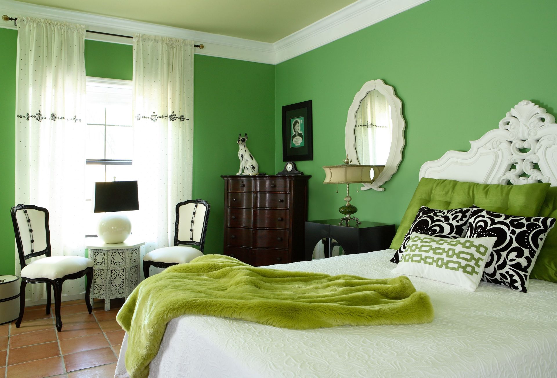
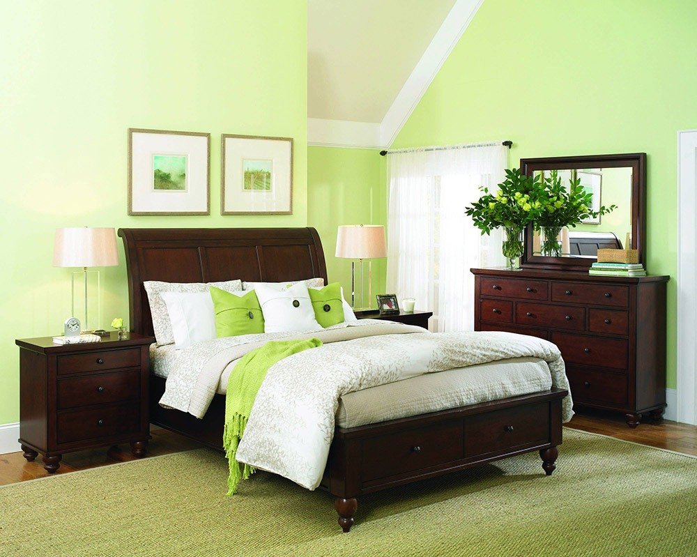
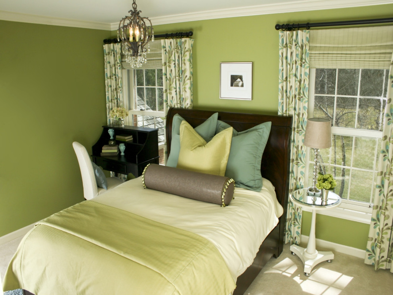
- Light green. This is a more strict bedroom option. It is appropriate combination of brown furniture, light green wallpaper, perhaps with floral ornaments, and brown curtains. This solution is suitable for rooms with windows facing south.
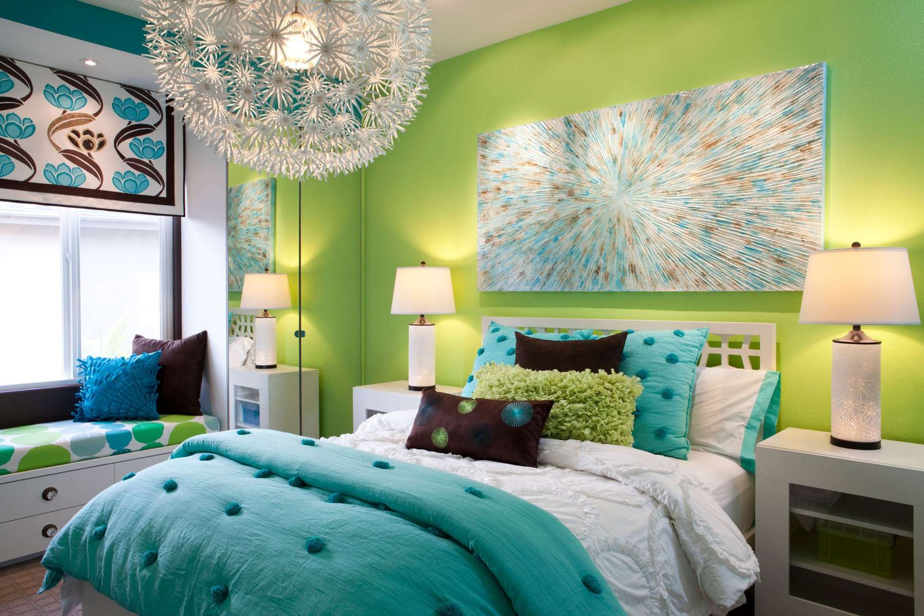
- Salat Blue. For the bedroom, blue should be selected in a more "sea" version. The color of the sea wave will greatly refresh the bedroom, and accents of yellow will help to create an optimistic atmosphere. In this case, the shade of the sea wave should be more intense than the light green one.
- Light green. Anthracite tones could not be more suitable for the decoration of a large area with high ceilings. Salad in this case is only an accent, occasionally “appearing” in a geometric pattern on a bedspread, pillows. It makes sense to choose a lime-tone tulle and combine it with gray jacquard curtains. In a similar design, one of the walls can be green, in case the color of the other walls is gray.
Green bedroom, in terms of psychology, a good option
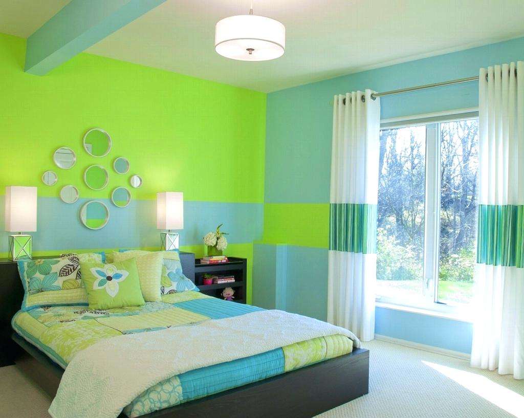
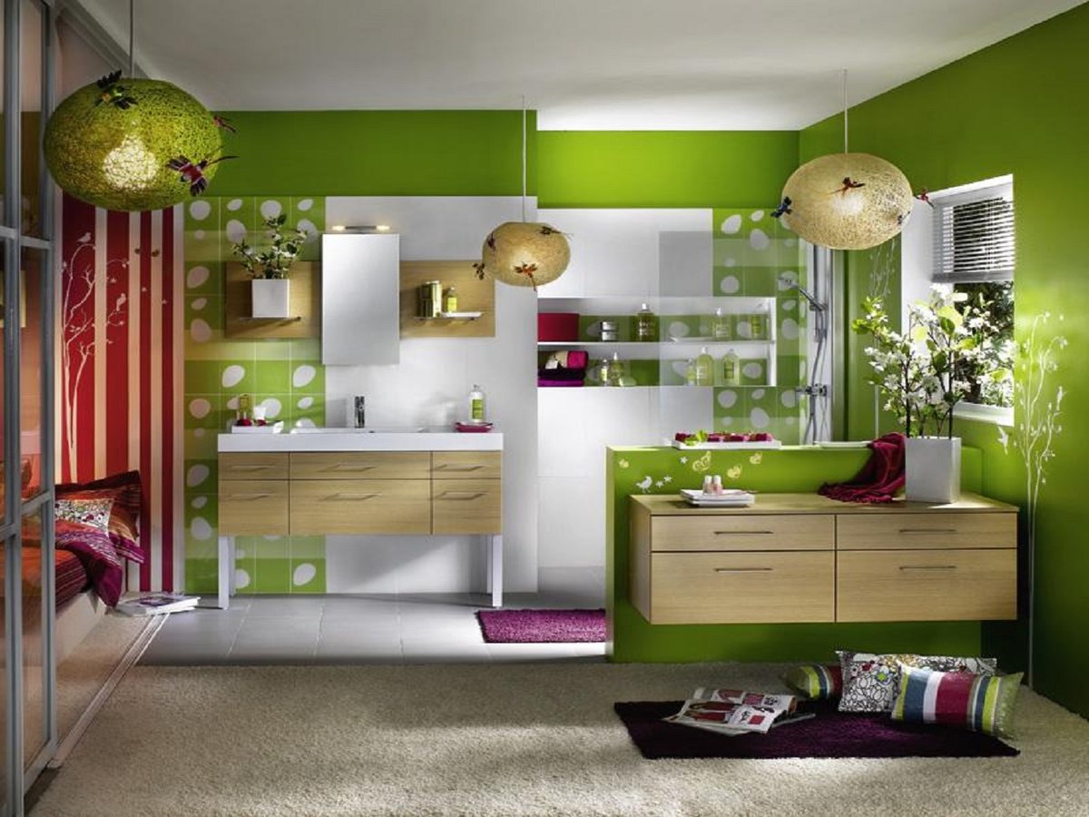
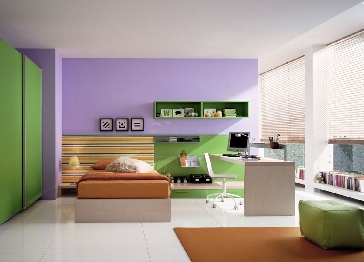
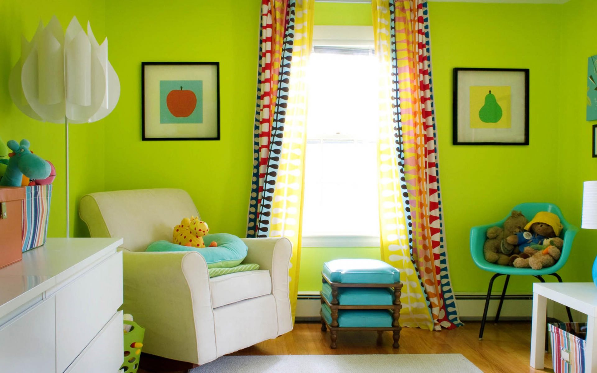
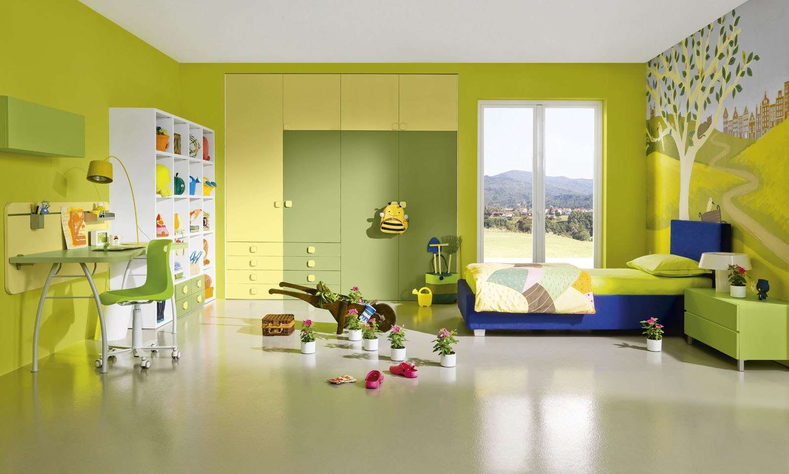
Children's
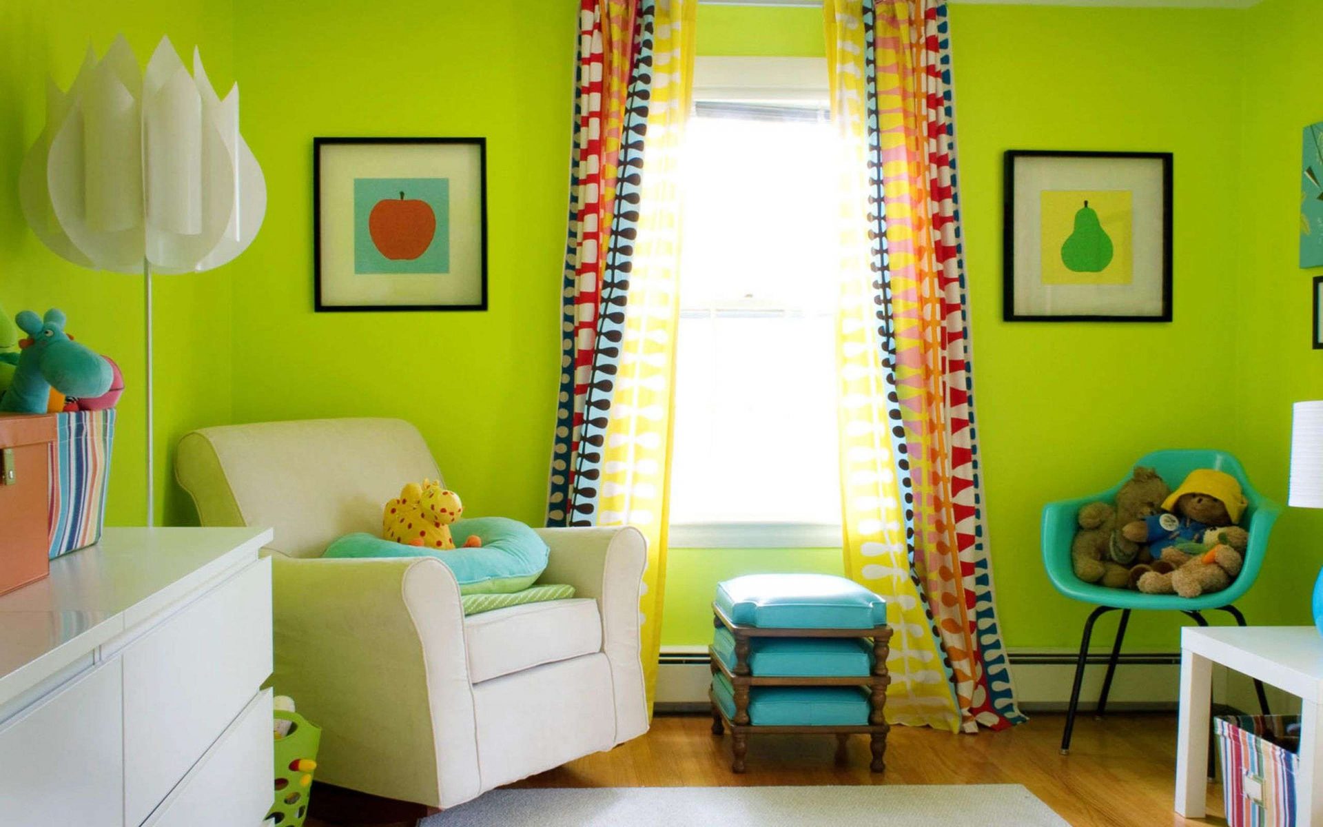
Registration children's rooms requires creativity. You need to carefully select color combinations for the design of children, as the color affects the psychological state of the child.
Carefully select the color combinations for the nursery.
For the design of children's rooms, different options and approaches are possible:
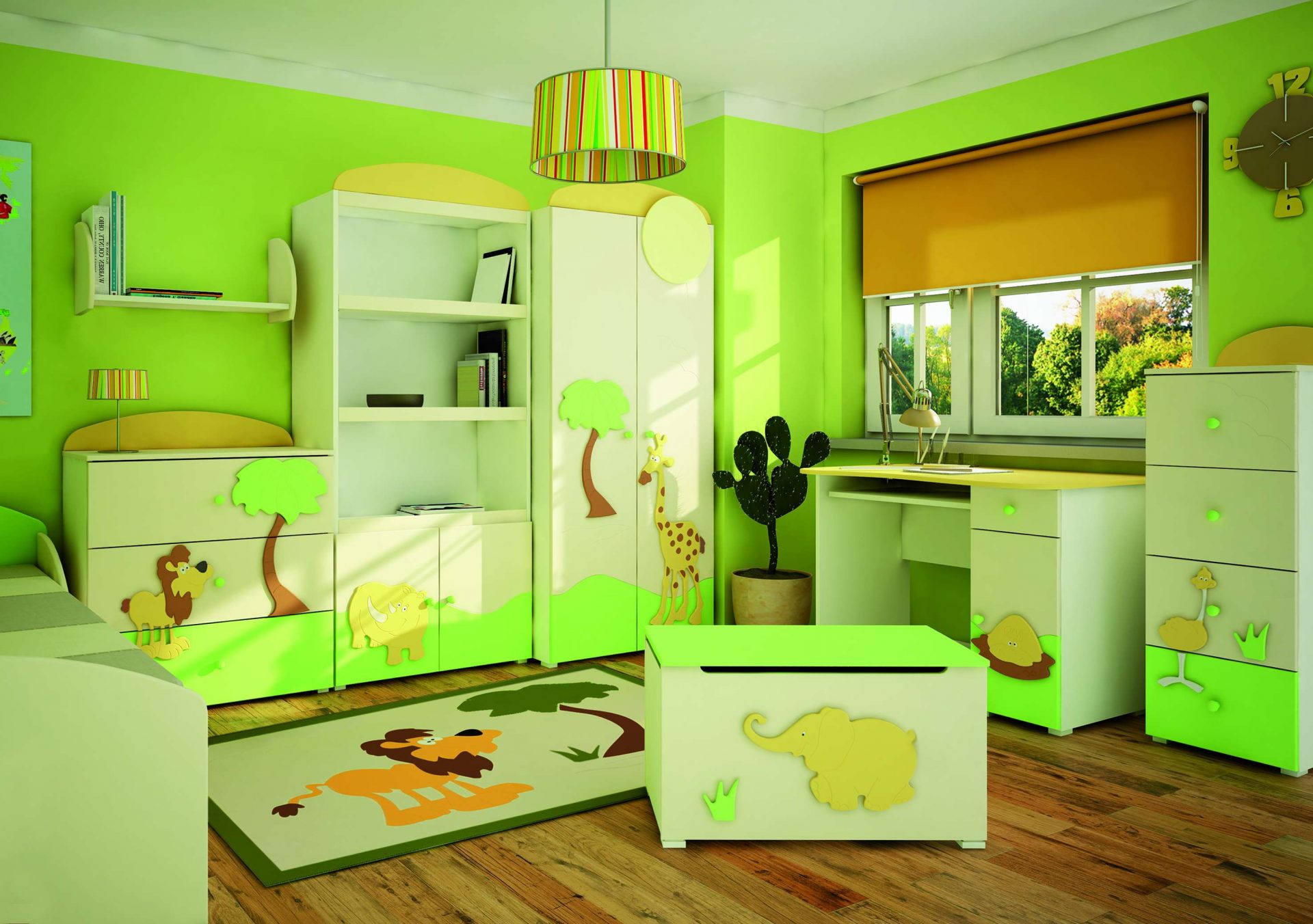
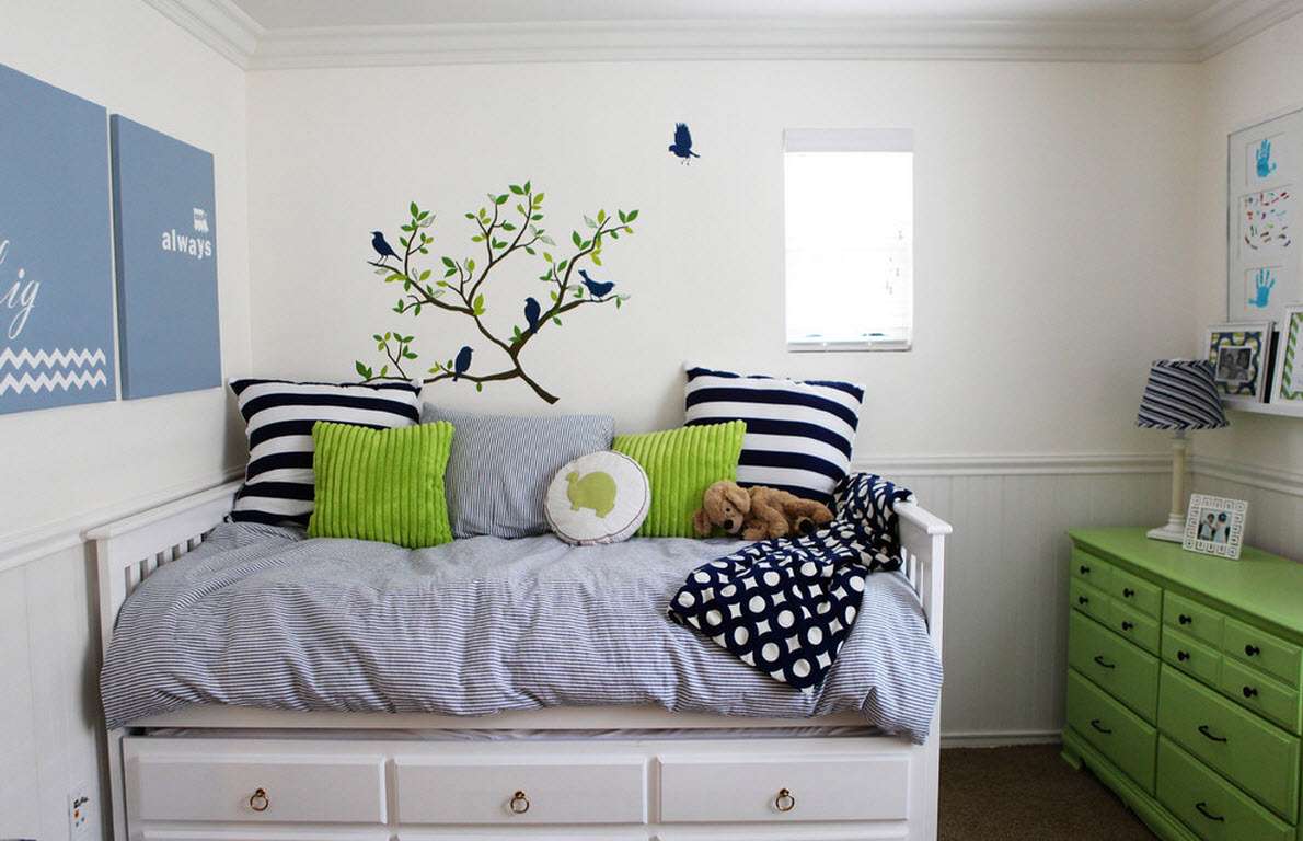
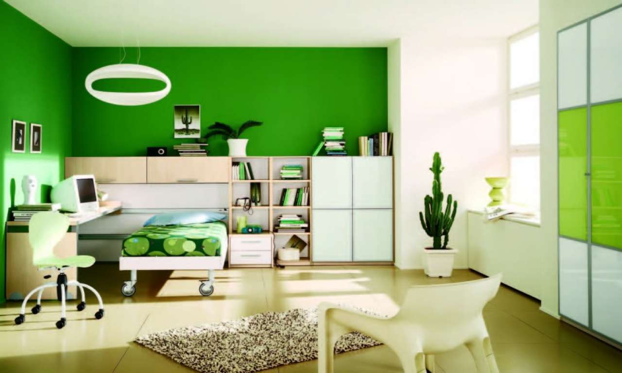
- Light green. This option is preferred because it allows you to combine almost any furniture and floor covering with a basic shade. For one of the walls, you can choose a plot drawing depicting, for example, a jungle or a map of the world. As an accent, a milky white color is perfect, tulle, chairs and bedspreads on the bed.
- Light green. Choosing this combination, you should avoid banality. Pink and light green should be “diluted” with beige shades, while avoiding screaming, acid tones and floral patterns on wallpaper or textiles. The stripes on the bedspread or curtains will be appropriate, while the walls should be made plain. You need to choose muted shades of pink. It will be fine to be combined with light green color of the stuck rose. For the design of children's rooms can not use flashy tones.
- Light green and turquoise. This combination looks advantageous in the nursery.If you combine lime green with yellow, orange or mustard tones, you can create a unique interior in a nautical style.
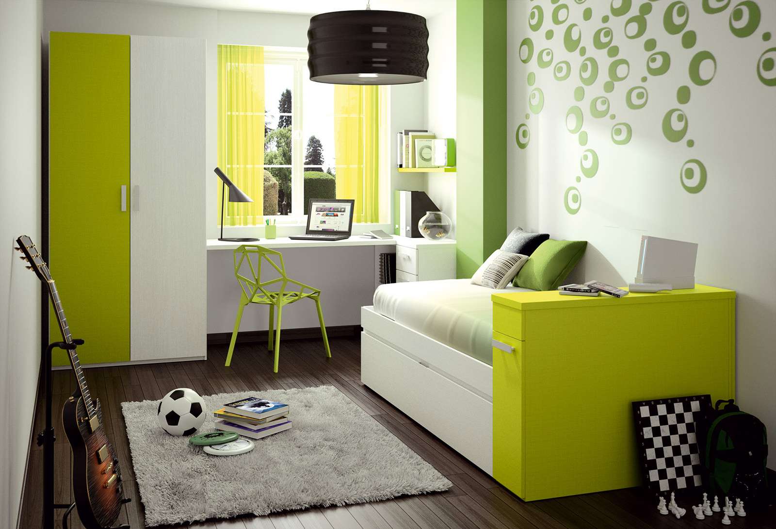
Cannot use flashy tones only.
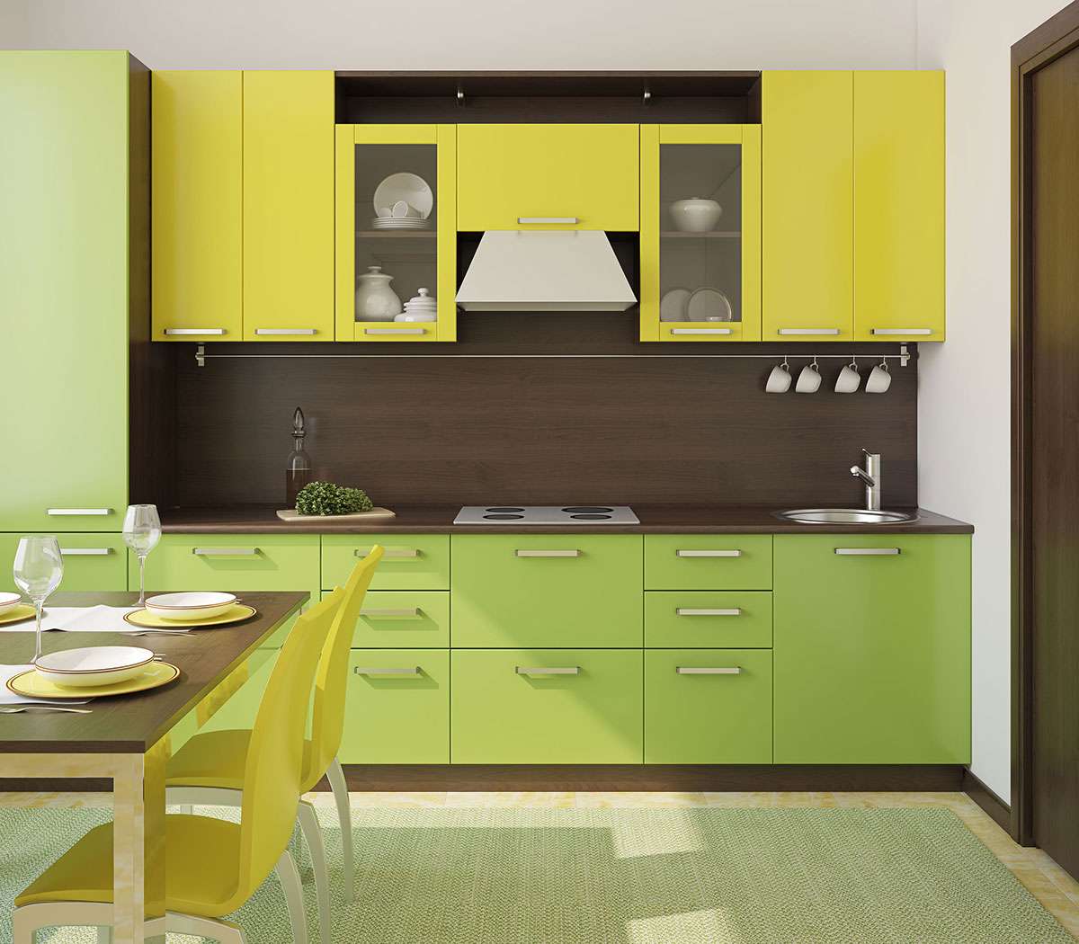
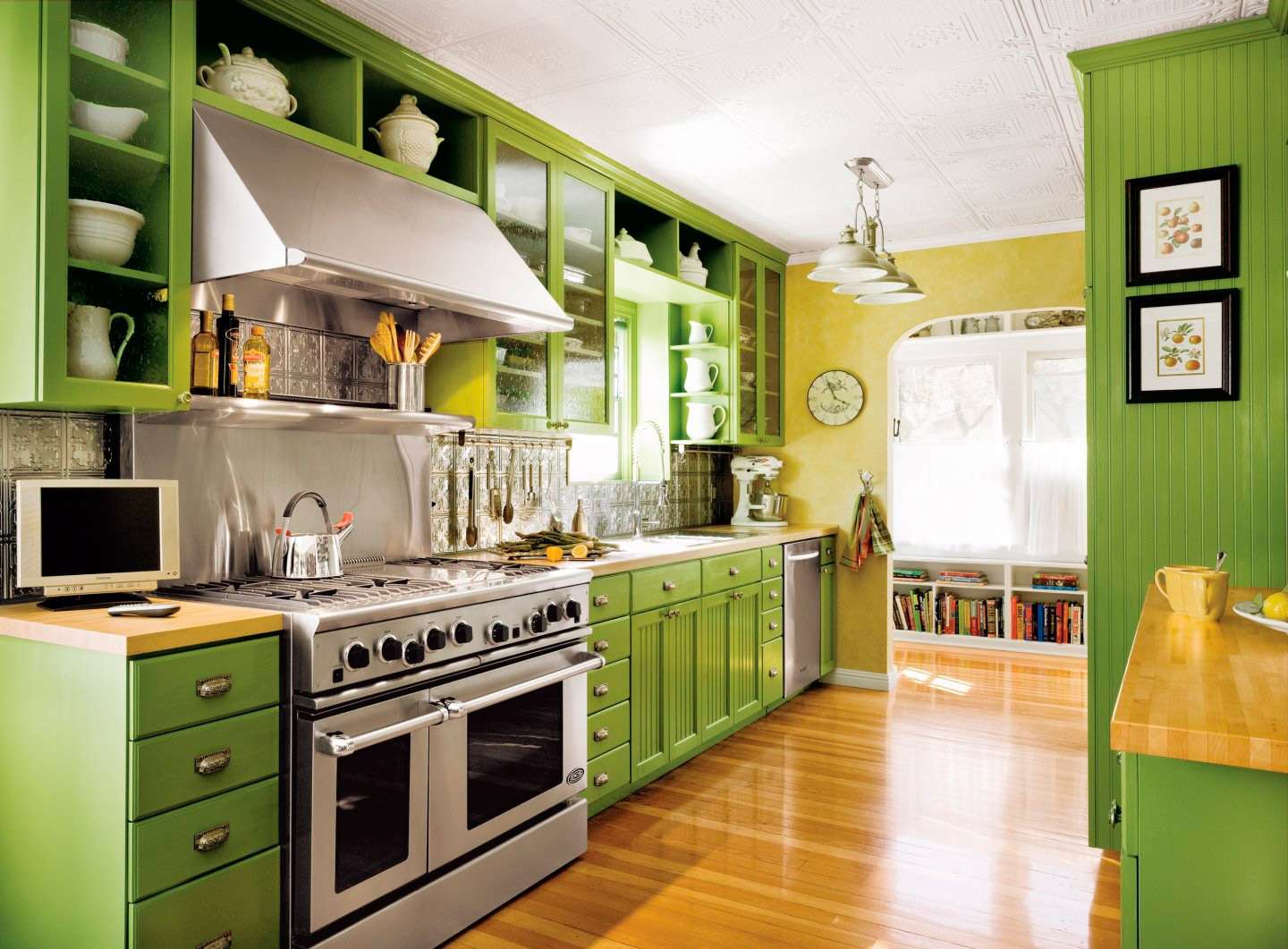
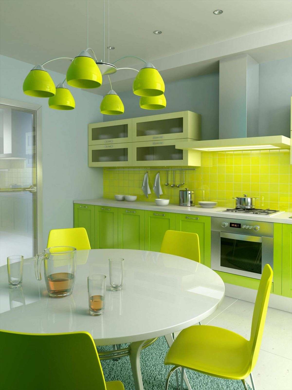
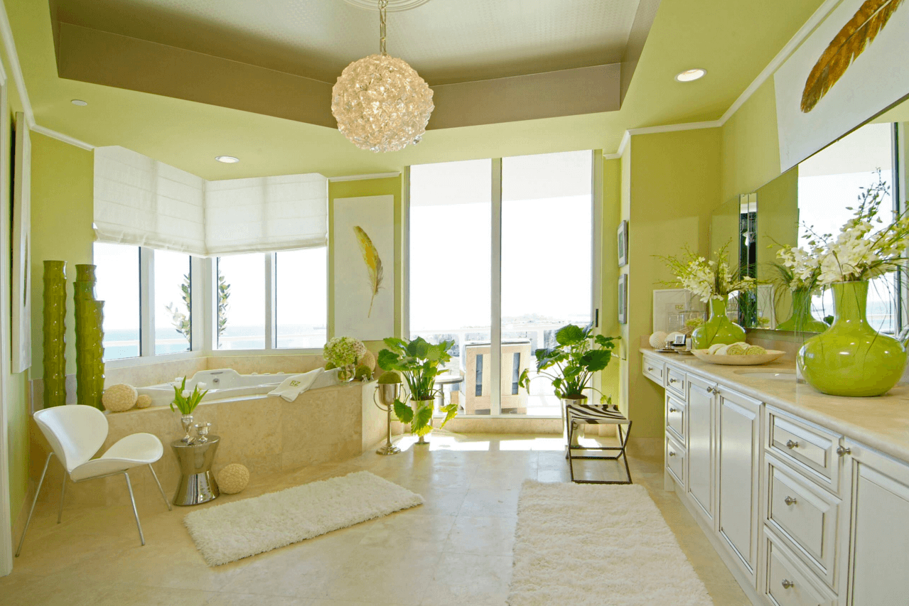
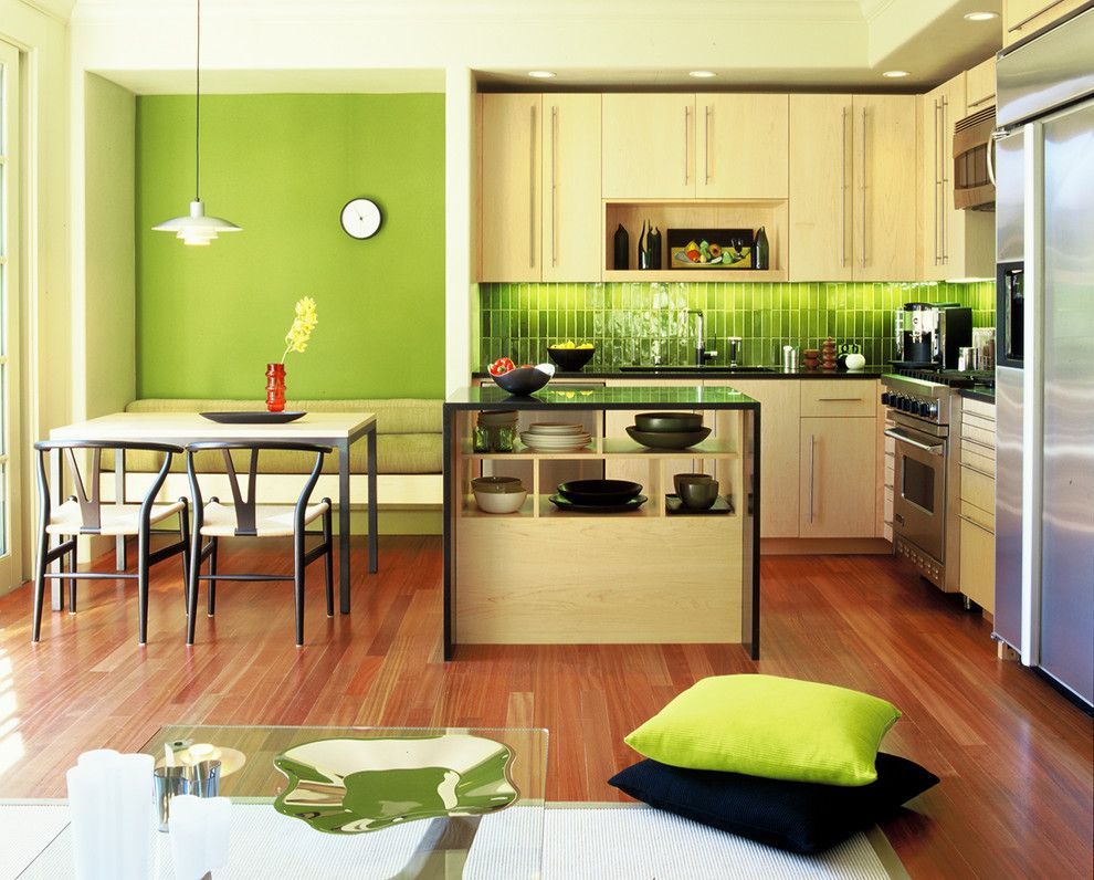
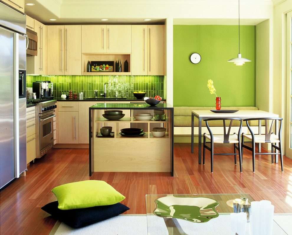
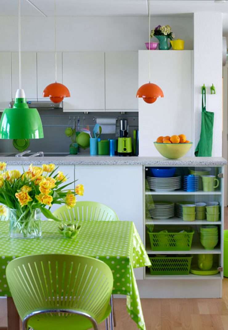
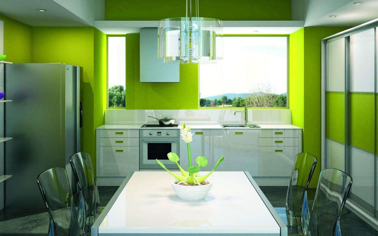
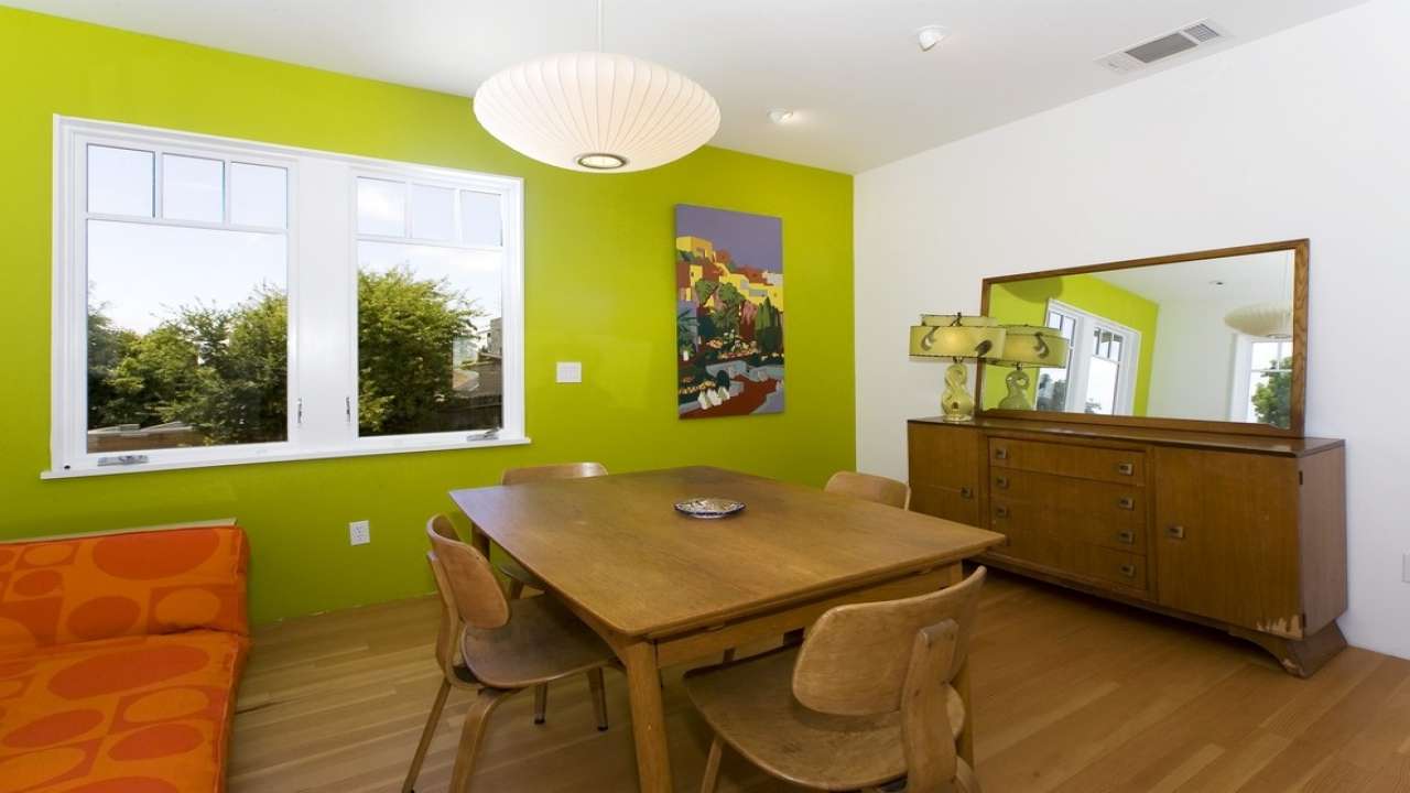
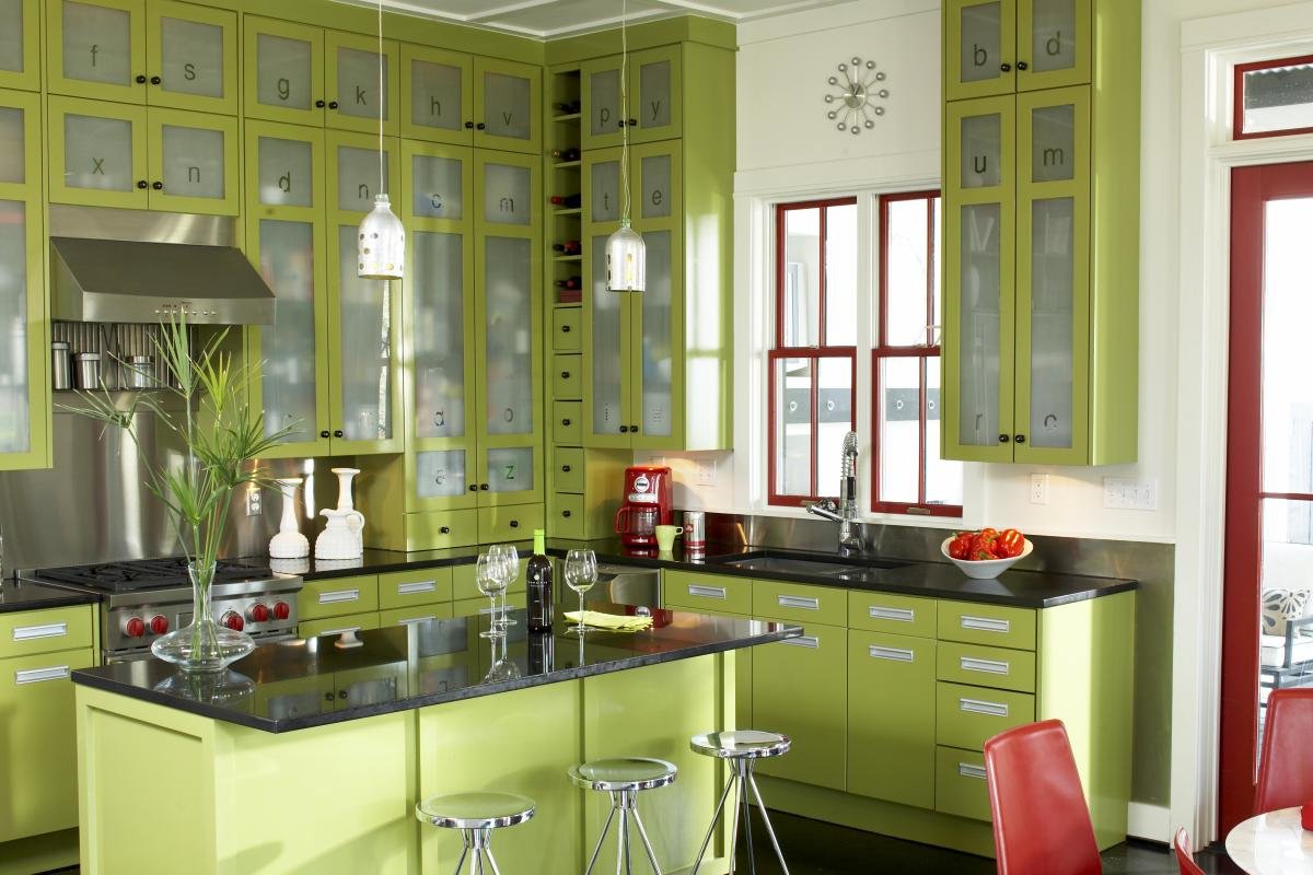
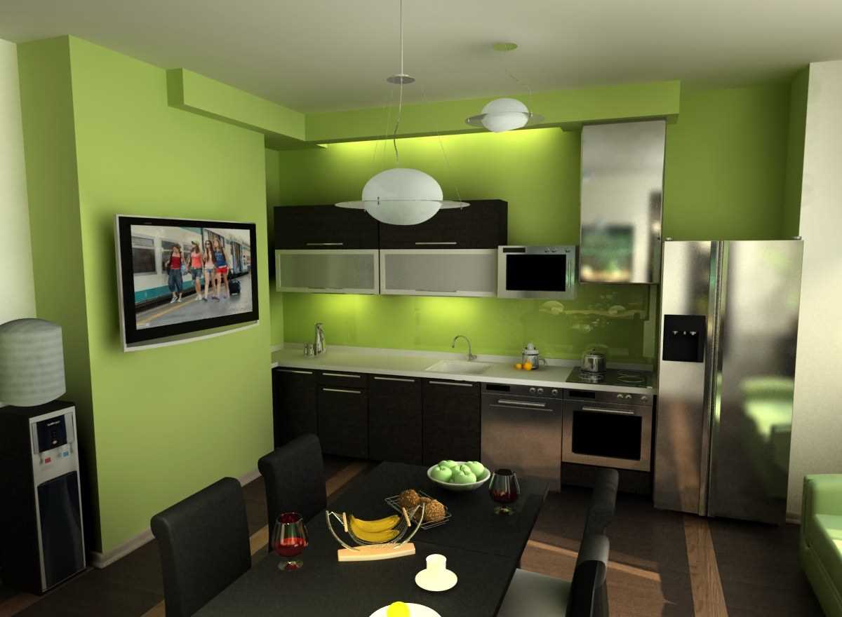
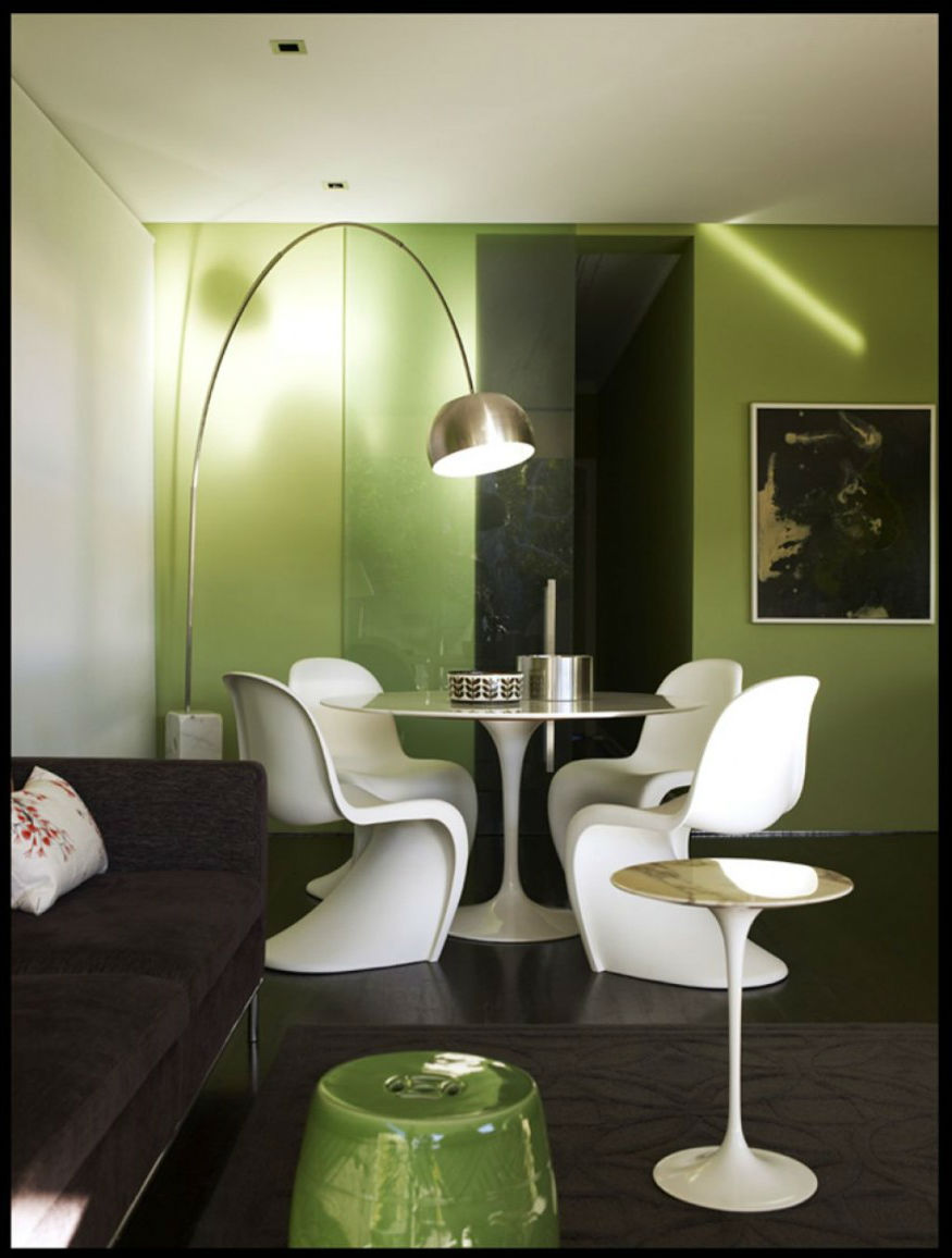
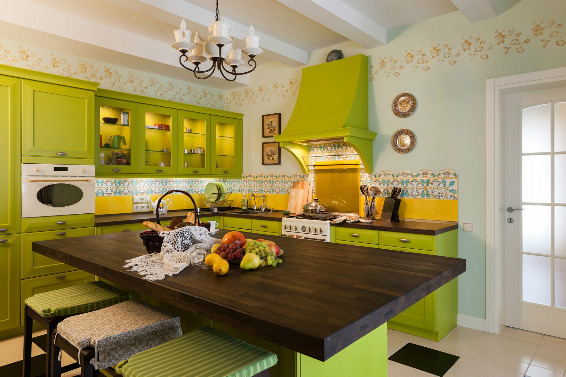
Kitchen
Lime becomes an incredibly fashionable shade when interior design kitchens. Lime color can give the kitchen both a strict and frivolous appearance. It enlivens the interior, visually expands the space.
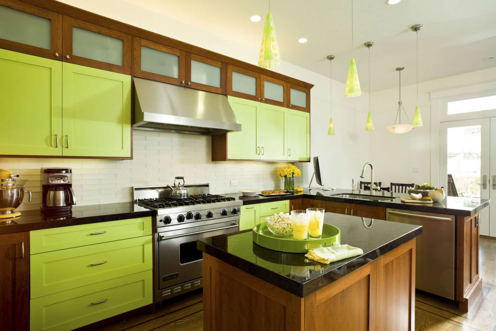
Kitchen in light green color
Lime has many combinations with other colors that are appropriate for the interior of the kitchen:
- Light green. This decor option is very calm and discreet. It allows you to choose a few bright colors, which will undoubtedly become the “highlight” of the design, for example, tiles with bright ethnic patterns, an unusual chandelier, an interesting pattern on the ceiling or curtains. The combination of light green, milky and beige colors is suitable for kitchen decoration in vintage, rural or even ultra modern style.
- Light green. Noble brown tones are able to somewhat muffle the lime shade. White strict furniture, for example, from eco-leather, will look great in this combination.
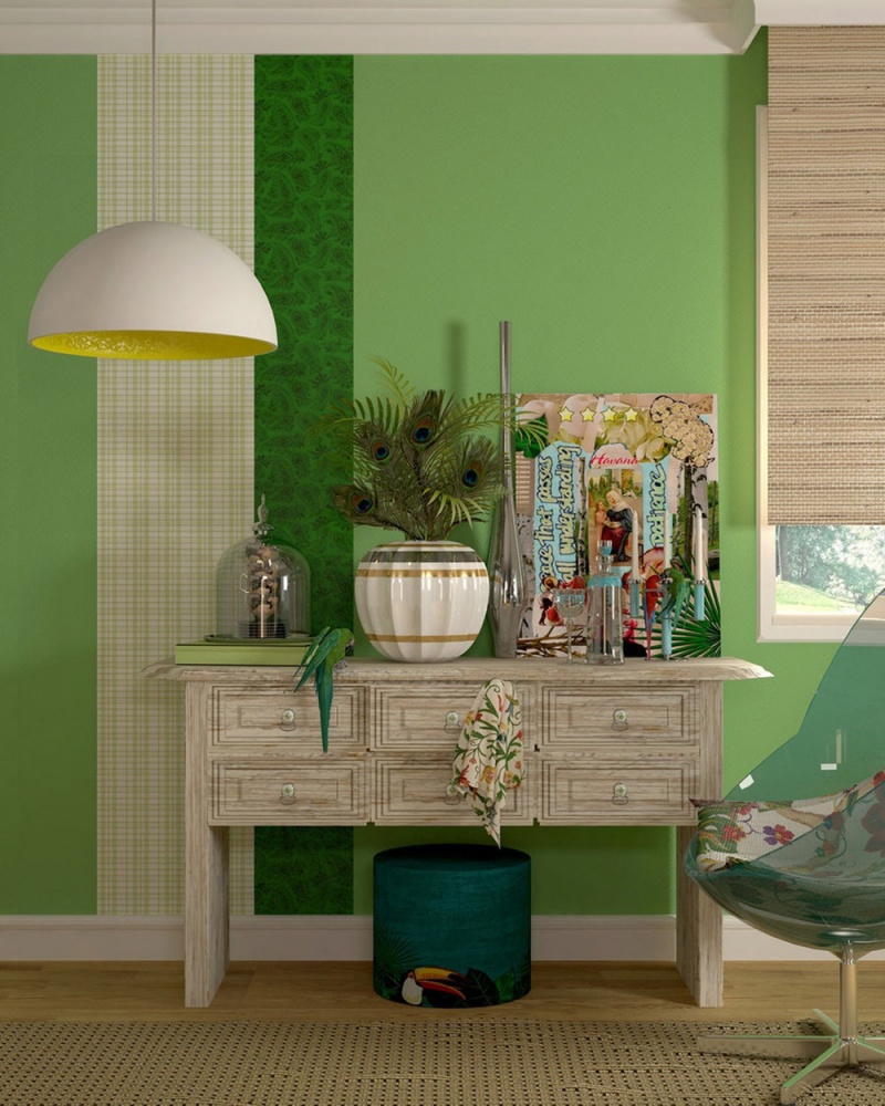
- Salad-Turquoise. This version of the design of the kitchen looks very advantageous. You can decorate the kitchen in the colonial style. For this style, you must choose cork wallpaper, curtains made of bamboo or other natural materials. In such an interior, wicker rattan furniture looks great.
Think through every detail.
It must be remembered that the light green color does not fit all styles. Such classical styles as Rococo, Baroque and Empire, exclude the use of light green. When decorating rooms in these styles, lime can be used only as a color accent.
 Design for Kitchen, Living Room, Bedroom")
 Design for Kitchen, Living Room, Bedroom")
 Design for Kitchen, Living Room, Bedroom")
 Design for Kitchen, Living Room, Bedroom")
 Design for Kitchen, Living Room, Bedroom")
VIDEO: Fill the interior with a variety of colors
Lime in the interior
The combination of colors and shades


 Interiors with finishing")
")