Terracotta Color in the Interior - From the beginnings to the present day. 195+ (Photos) Compatibility of bright colors
 Compatibility of bright colors")
Authentic terracotta is known to everyone as part of the Spanish culture that makes our homes Mediterranean bungalows. But there are other facets of this color in the interior. What could be more beautiful than terracotta for those who grew up on adventure books and films glorifying the Wild West?
Content:
Terracotta is an earthly hue that brings a feeling of warmth to any space it touches. It has a long and rich history with many forms since its discovery, including sculpture, ceramics and building materials.
Terracotta in the interior
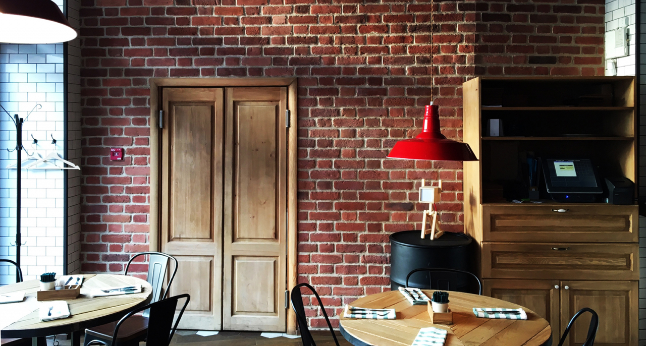
Whether it is a muted shade of clay or orange rust, this color can match different styles and tastes. In Latin, the word "terracotta" consists of two roots: "terra" (earth) and "cat" (cooked or baked) and is translated as "clay". It creates comfort and comforting warmth in space. As well as red color, orange base stimulates appetite. Therefore, this shade is suitable for use in canteens and restaurants.
Terracotta recently in fashion
Here are some design and terracotta design tips for this season:
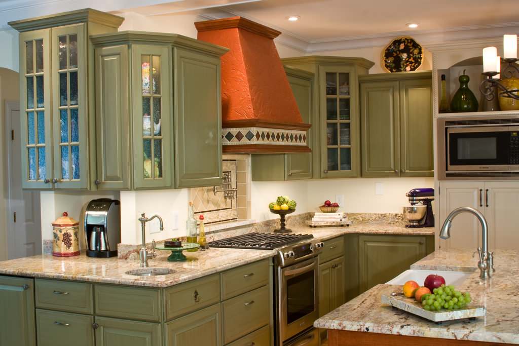
- Use it in new ways. Terracotta is traditionally considered the color of tiles or potted plants. Instead, consider adding color to your kitchen. cabinets in combination with any color pop art.
- Luxurious warm ceiling. Painting the ceiling with terracotta will make him feel warm and comfortable. Colored ceiling adds interest where there is nothing bright. If you are going to darken the walls, try also to darken the ceiling.
- Terracotta tile as your awesome kitchen feature. Warm glowing colors and rustic notes: this is what can be achieved when on the floor installed terracotta tiles. It may be appropriate as a new assembly, and in the traditional interior.
- Using terracotta as a base color for of furnitureContrary to popular belief, terracotta does not always have to be a color accent.Used as upholstery fabric, it can be integrated directly into blue and white shades. Orange and blue They are also complementary colors and work confidently almost anywhere.
- Plants in pots and succulents. You can paint terracotta pots, make a stencilled pattern on them, wrap something or turn it into any kind so that they look different. But terracotta is a classic and in the new season you can safely pull out your clay pots to get a trendy accent.
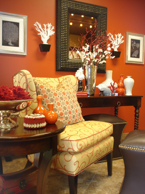
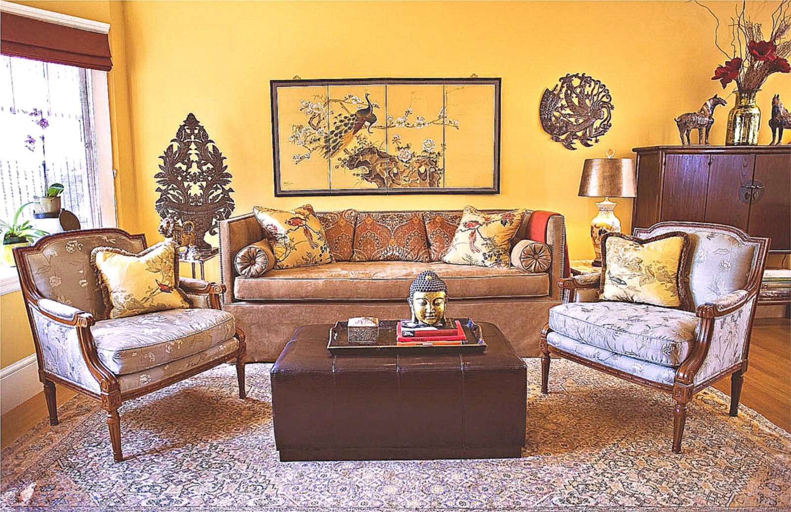
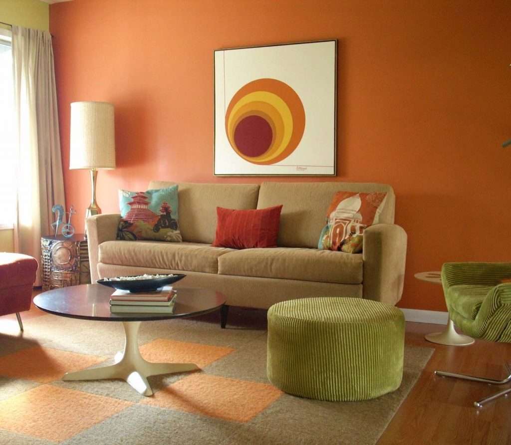
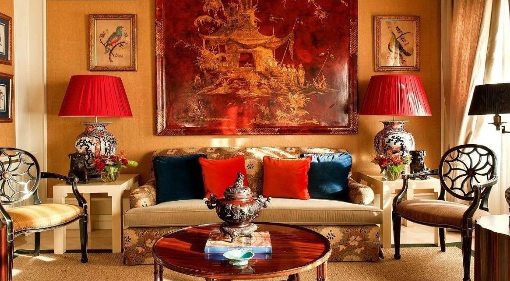
Bright accent terracotta in classic interior
There are many amazing shades and options for terracotta. Decorating your space with this color can create mood and expressiveness and can be associated with more neutral accents.
return to menu ↑Ways to translate
It is clear why terracotta is developing and why she returned with such a strong presence. Its special color and heat is suitable for creating beautiful decorative elements. In addition, its flexibility involves the use of a variety of forms. The terracotta trend has been popular in Europe for the last 3-4 years since the summer of 2014.
Look at the beautiful villages around Siena in Tuscany (Italy) that use this traditional material. It is durable and can be molded into any shape, which also explains its widespread use in pottery and sculptures. Fire-resistant in nature, it has long been used to design the floor, making it earthenware.

We complement the interior with accessories
In fact, we currently see that it is used in the design of various products, such as small pieces of furniture, large furniture and accessories. Terracotta flower pots are also coming back.
Accessories
There are a number of advantages of terracotta in accessories, one of which is that it is a natural earth tone. Products from it are often glazed before firing, which creates a brighter finish and increases the durability of the material.

Bright finish in design
The material is inherently refractory and can be molded into any shape. However, ready-made crafts quickly lose their appearance over time, especially after too close interaction with a person.
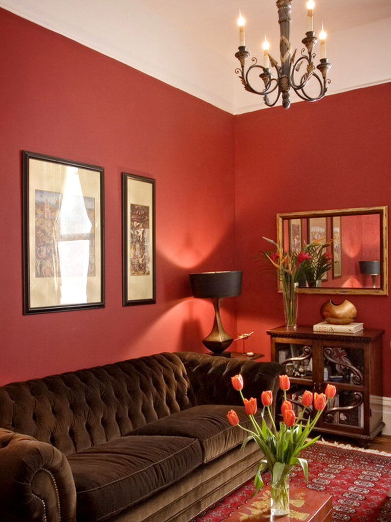
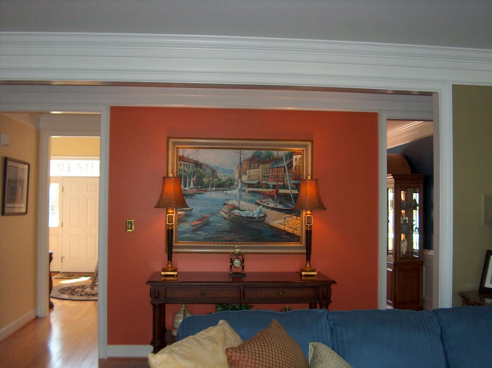
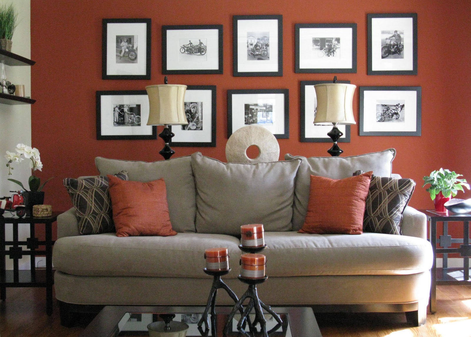
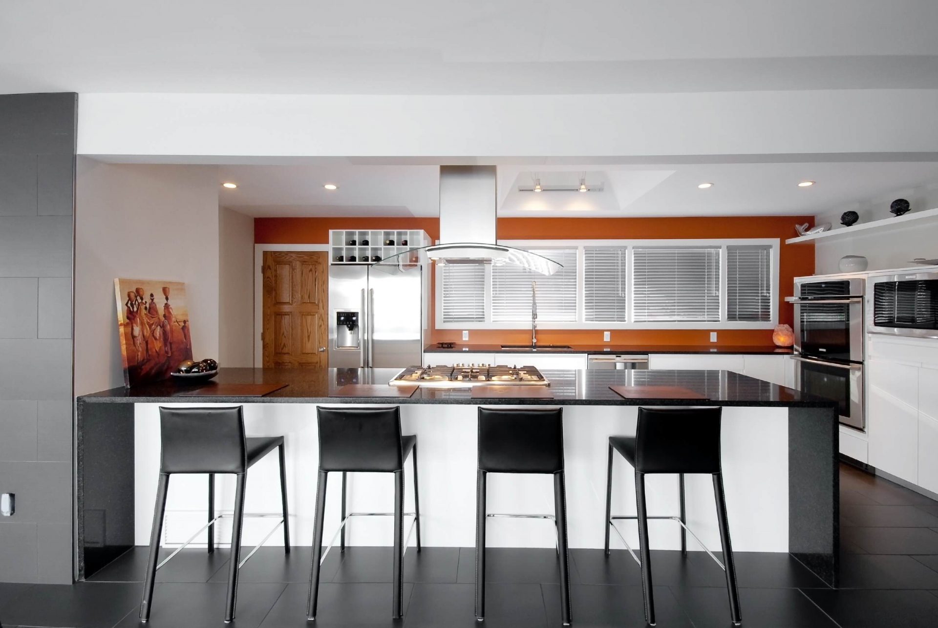
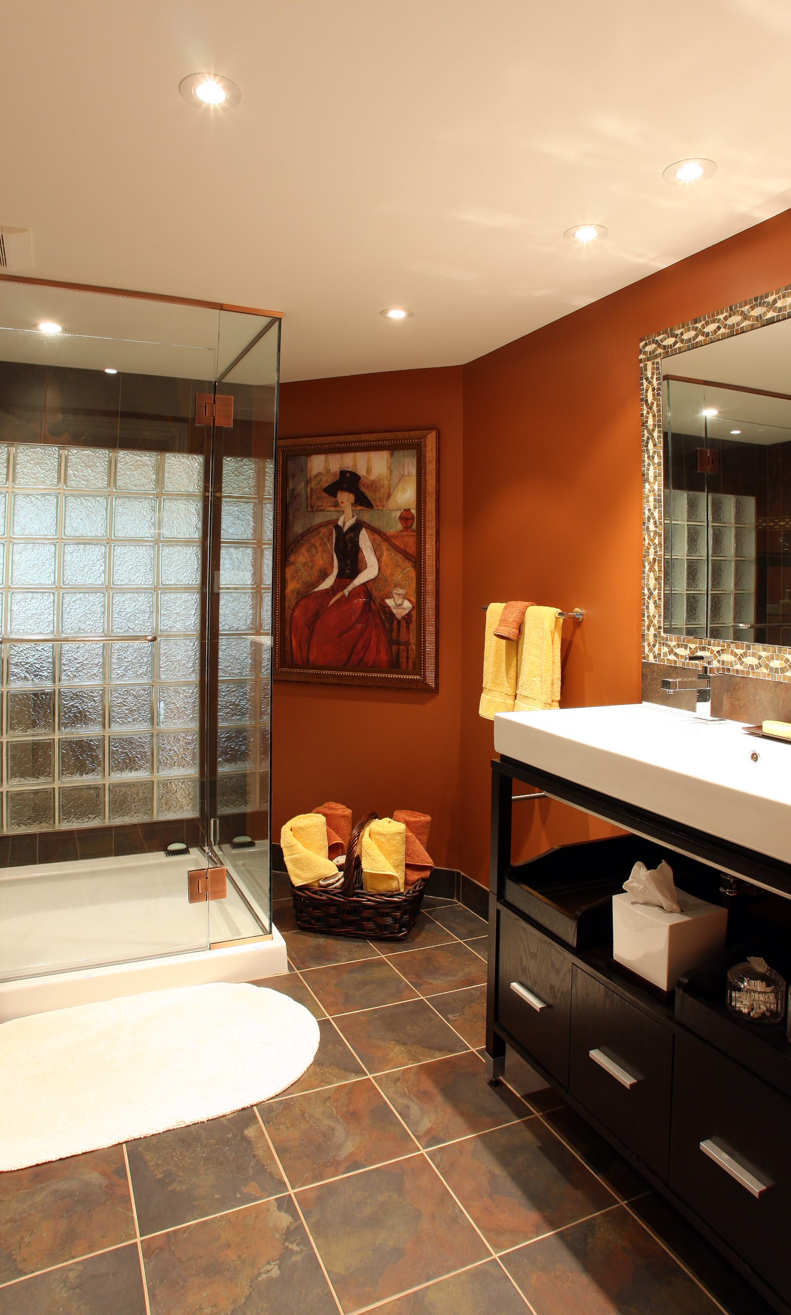
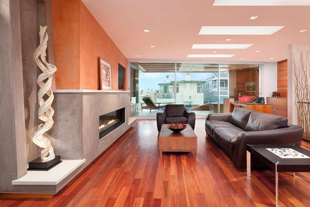
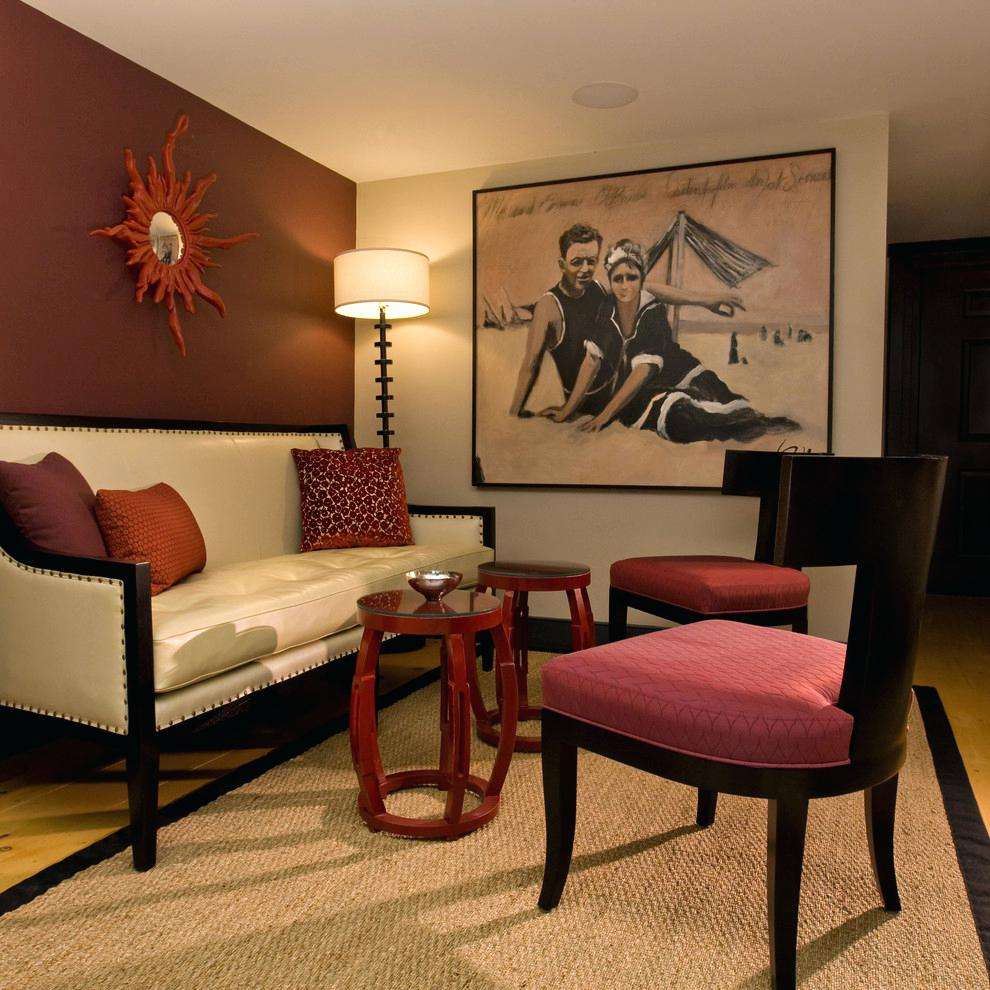
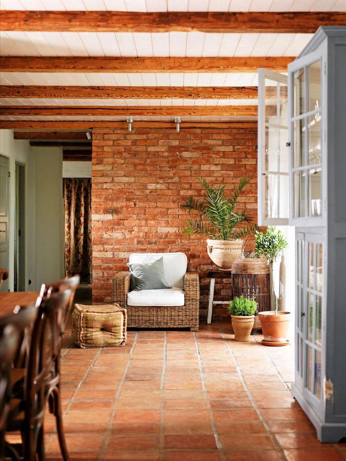
Walls
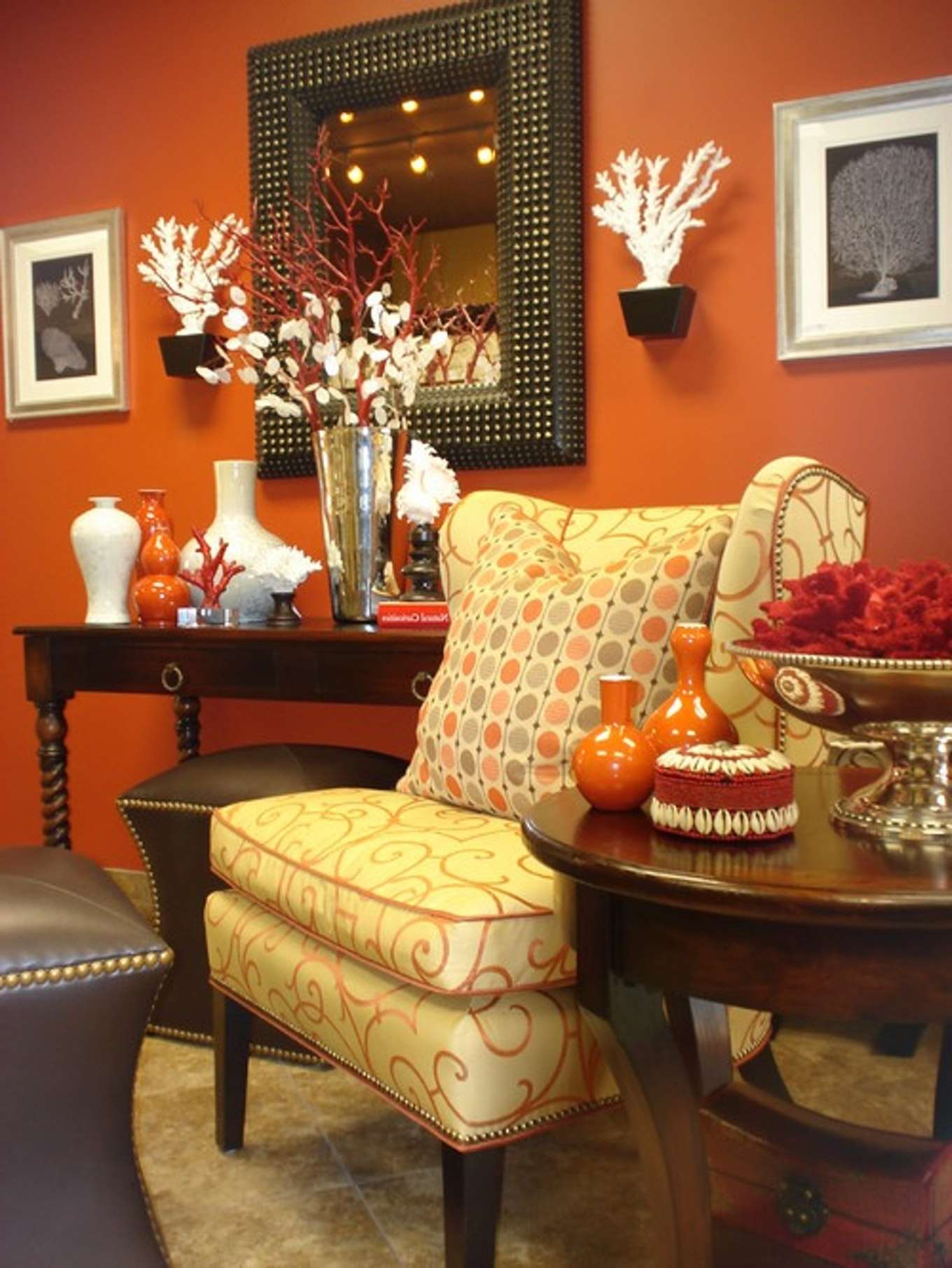
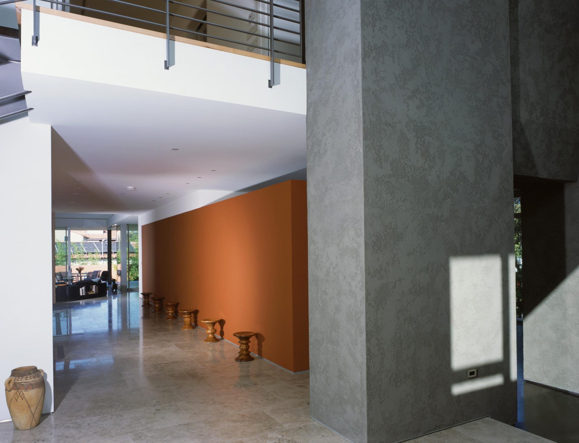
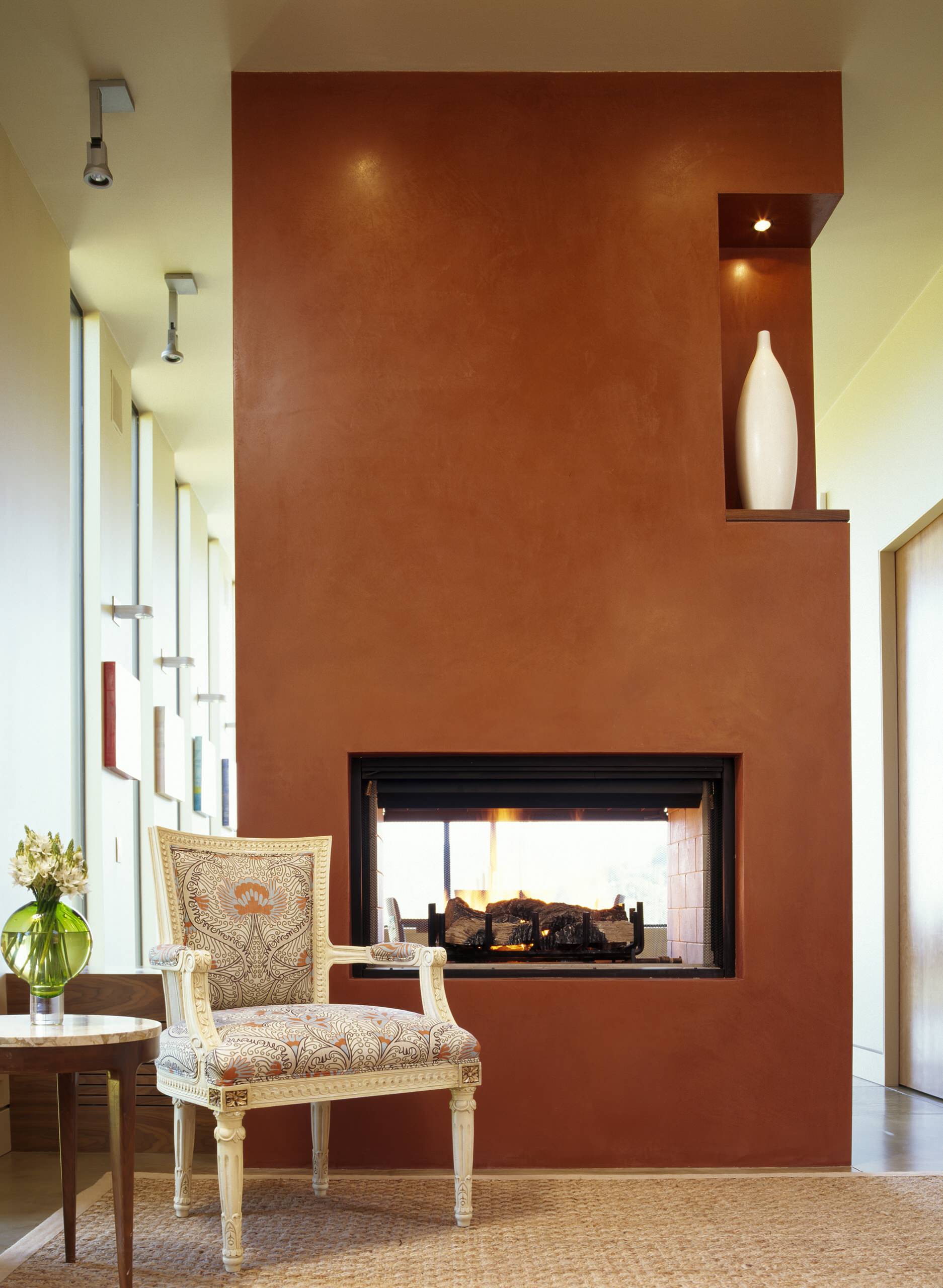
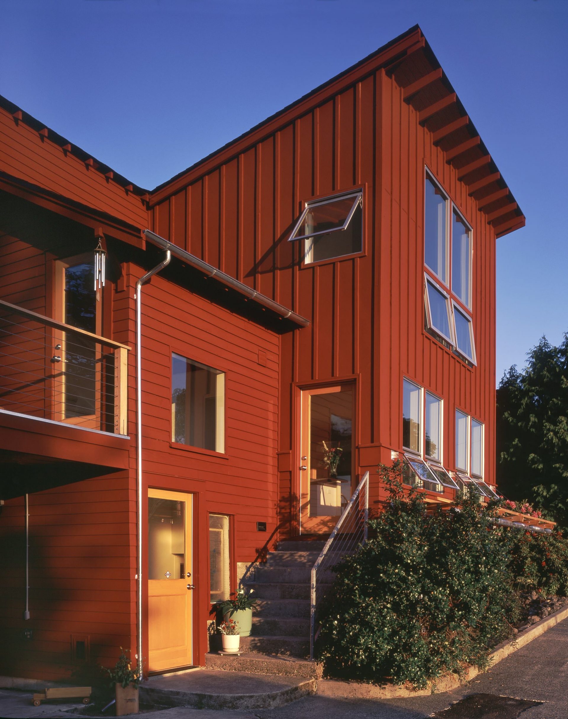
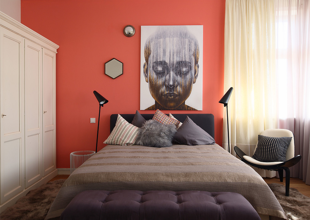
The deep tone of terracotta is a great choice for rustic walls. houses. Choose a shade that is closer to bronze or brownso that it does not overwhelm the room, and then accentuate the area with the raw a tree, a stone, gold-plated objects or accessories in the south-western style.
The main thing that the color does not suppress the room
For a modern home, do not be afraid to use more saturated, energetic shades of orange rust to add visual interest and warm in the room. Regardless of whether they are part of the geometry of the room, applied on an accent wall or a key part of the furniture, this shade is a great way to experiment with rich colors.

Do not be afraid to experiment with shades.
Furniture
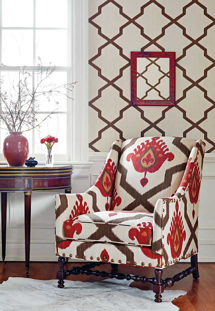
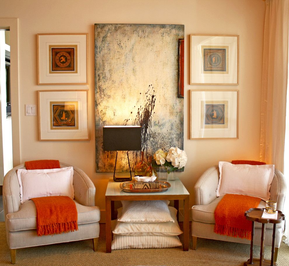
If you are not ready to change the color of the walls, select artistic paintings in dusty pink and red tones of terracotta.Or accent one piece of furniture - for example, a chair made in a rusty orange shade.
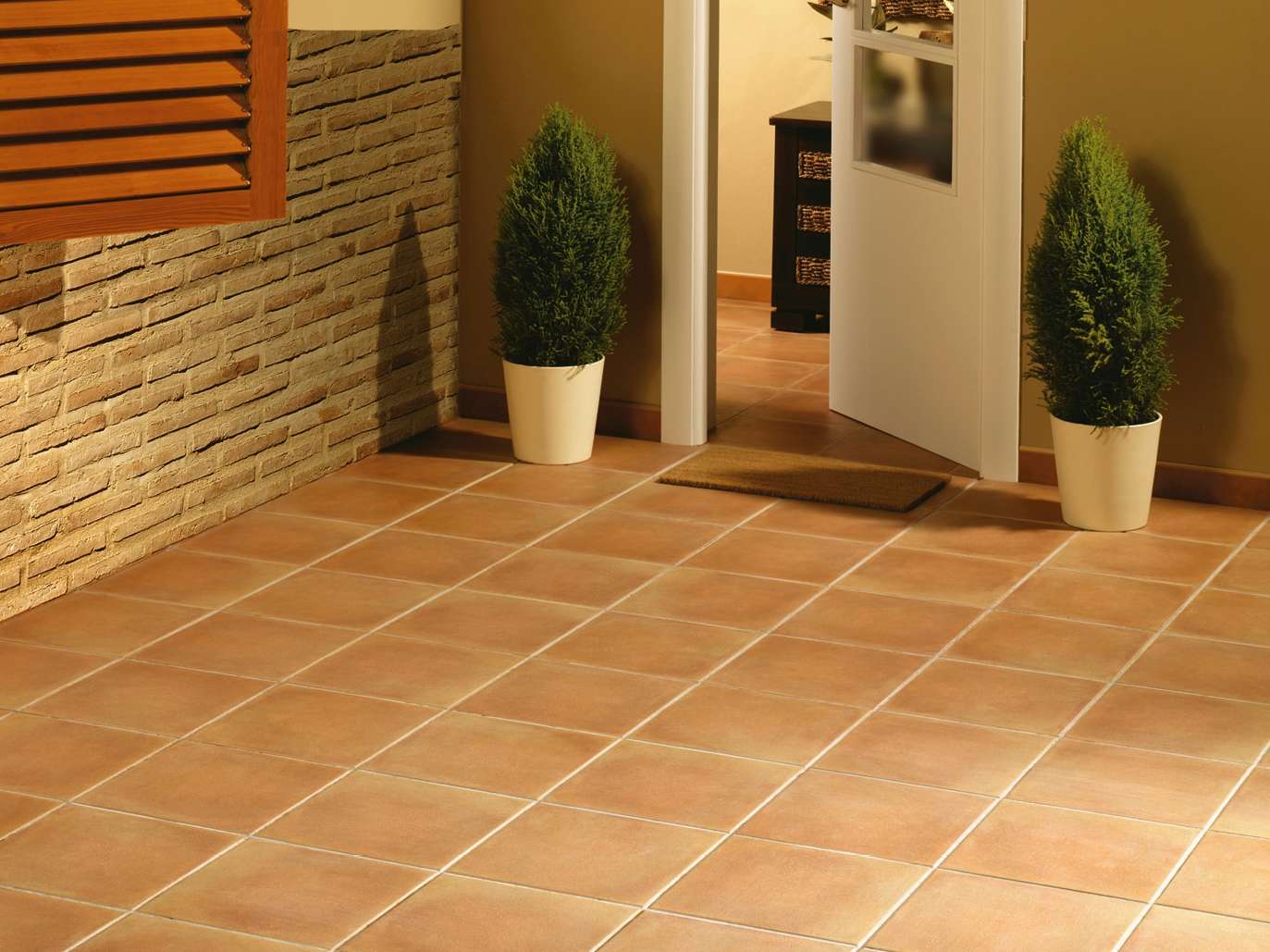
Tile
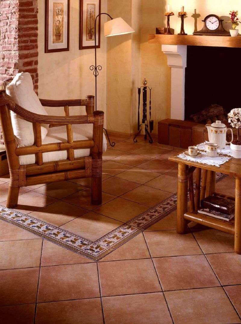
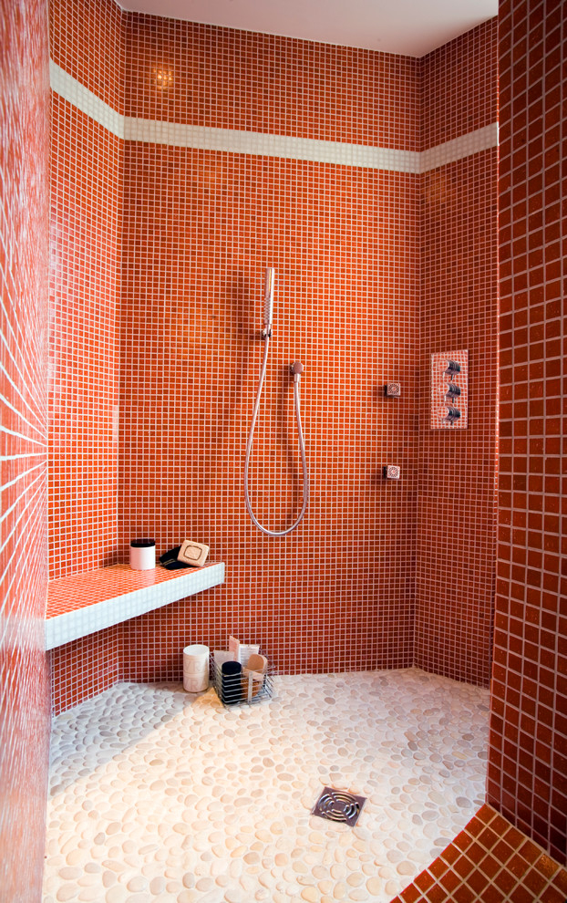
Terracotta tiles, along with wooden and stone floors, are timeless classics typical of Mediterranean-style interiors. The main advantage of such a tile is its natural origin.
Using tiles in the kitchen
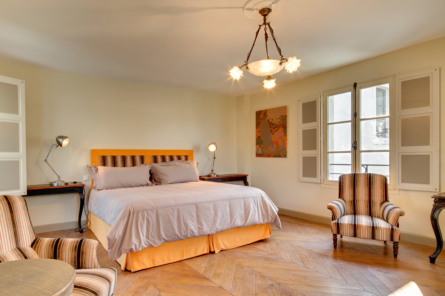
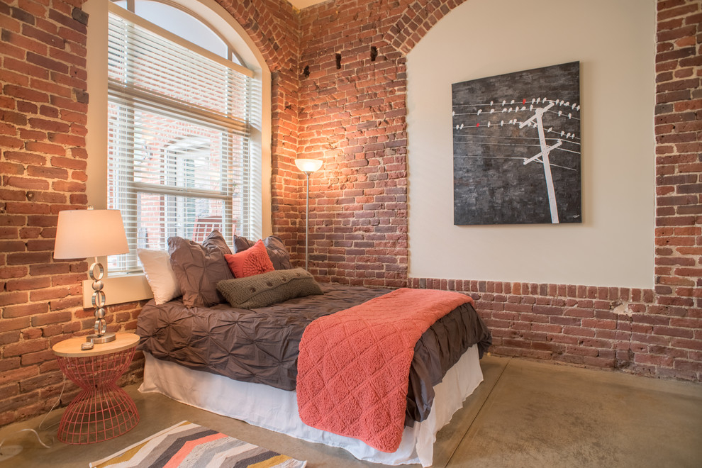
Most often terracotta tiles are used either in classic kitchens, or in the yard in open areas, to give them a more attractive look. But you can also use it for bedroomsto add warm comfort to it. Terracotta finishes can vary considerably and this quality can be used for a combined floor.
We reach the maximum effect
Texture
Today, terracotta has a more natural matte finish than the ever-popular granite tiles, often used in the 1980s. But even if your tile retains its former appearance, it will feel fresh if it is mixed with other earthly tones and materials.
The form
Square tiles will always be a classic option, but new shapes, such as matt-red hexagons, add a splash of warmth and modern style to space.Especially this effect is pleasant when combined with other patterns and colors.Traditional glazed terracotta tiles also still have a place in design and the latest collections of fashion designers confirm this - this season terracotta is again at the peak of popularity.
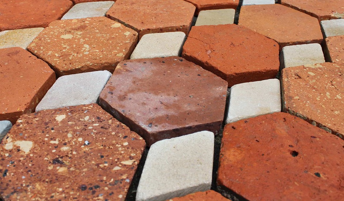
Tiles differ in shape and texture.
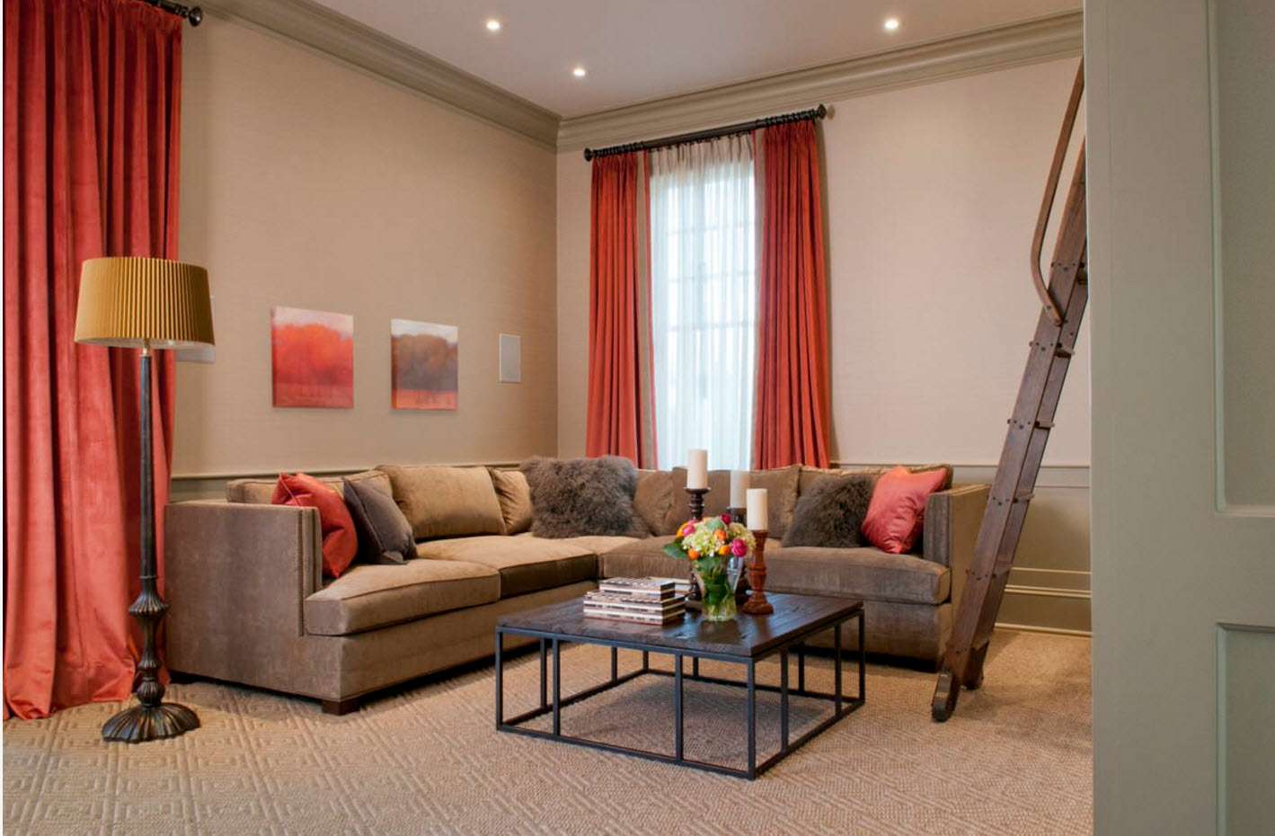
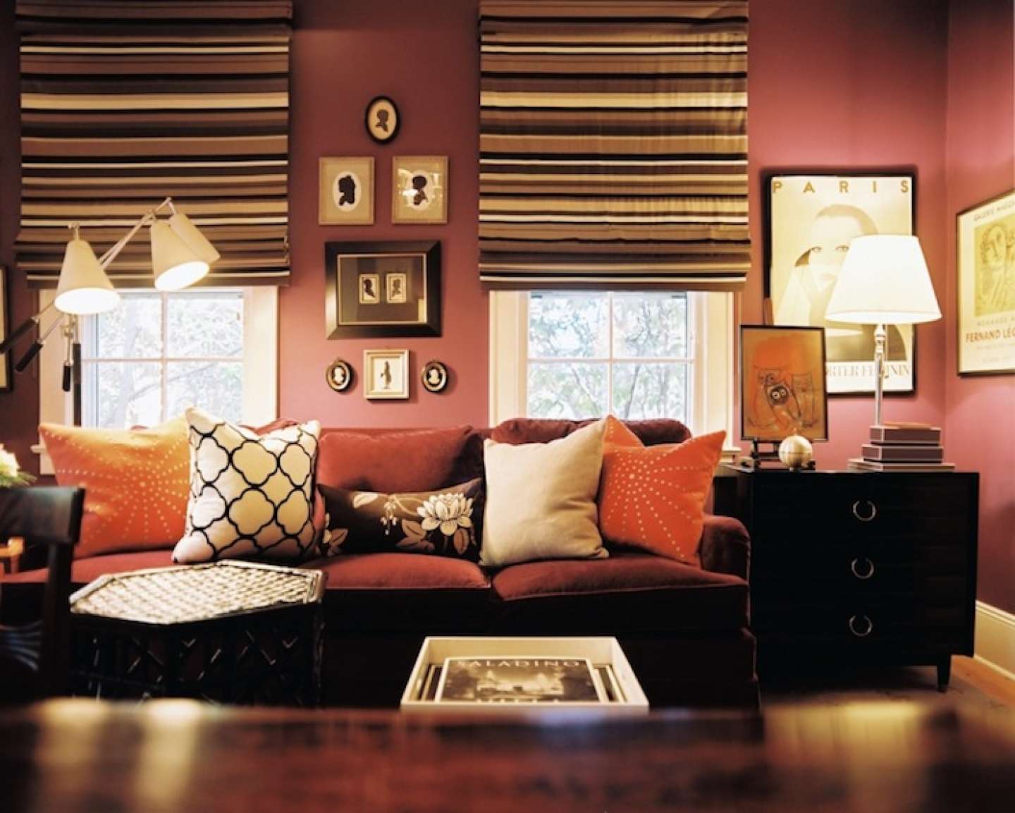
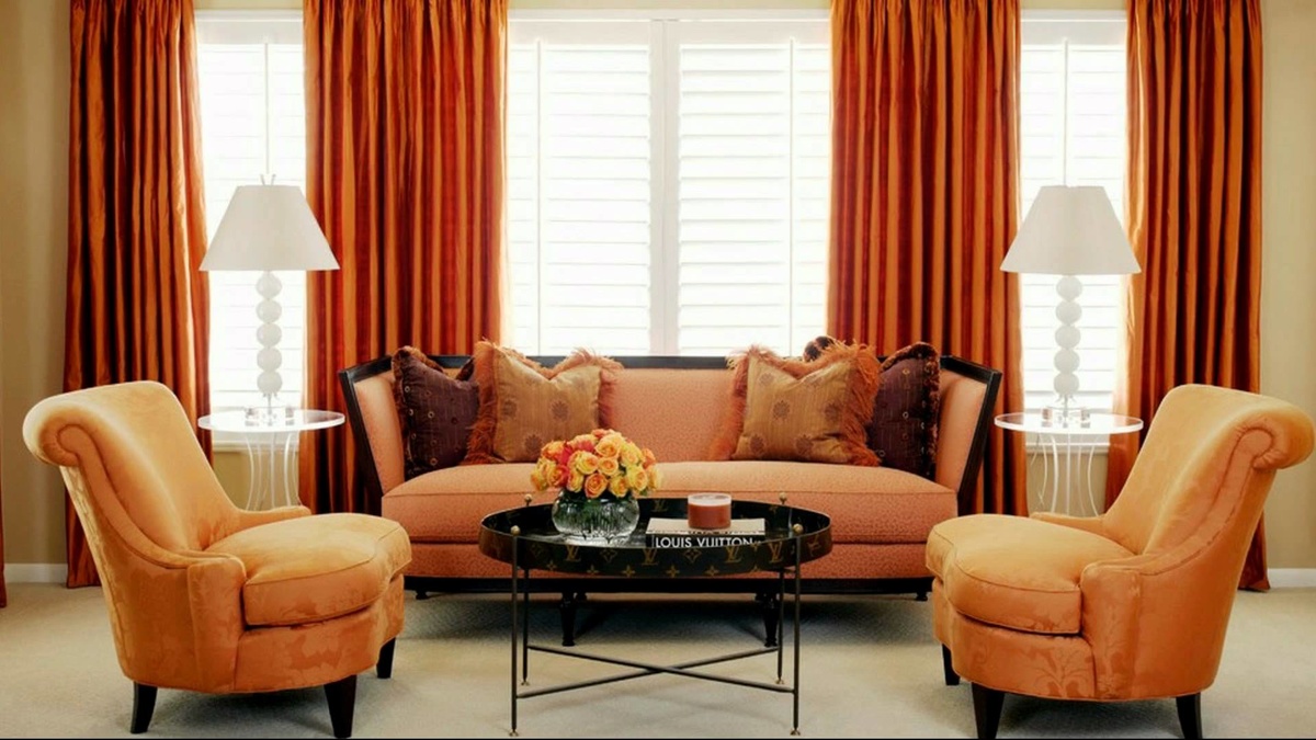
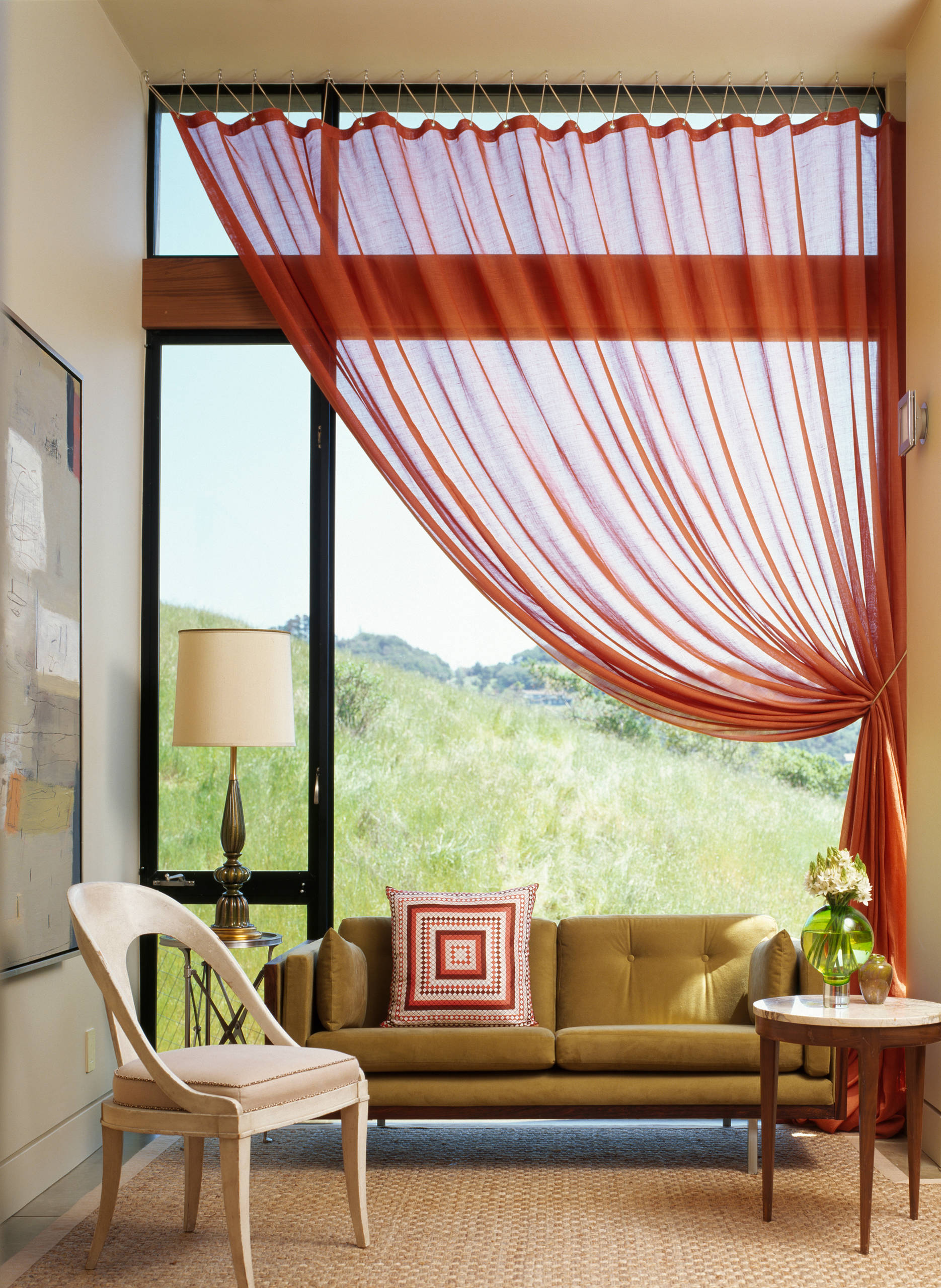
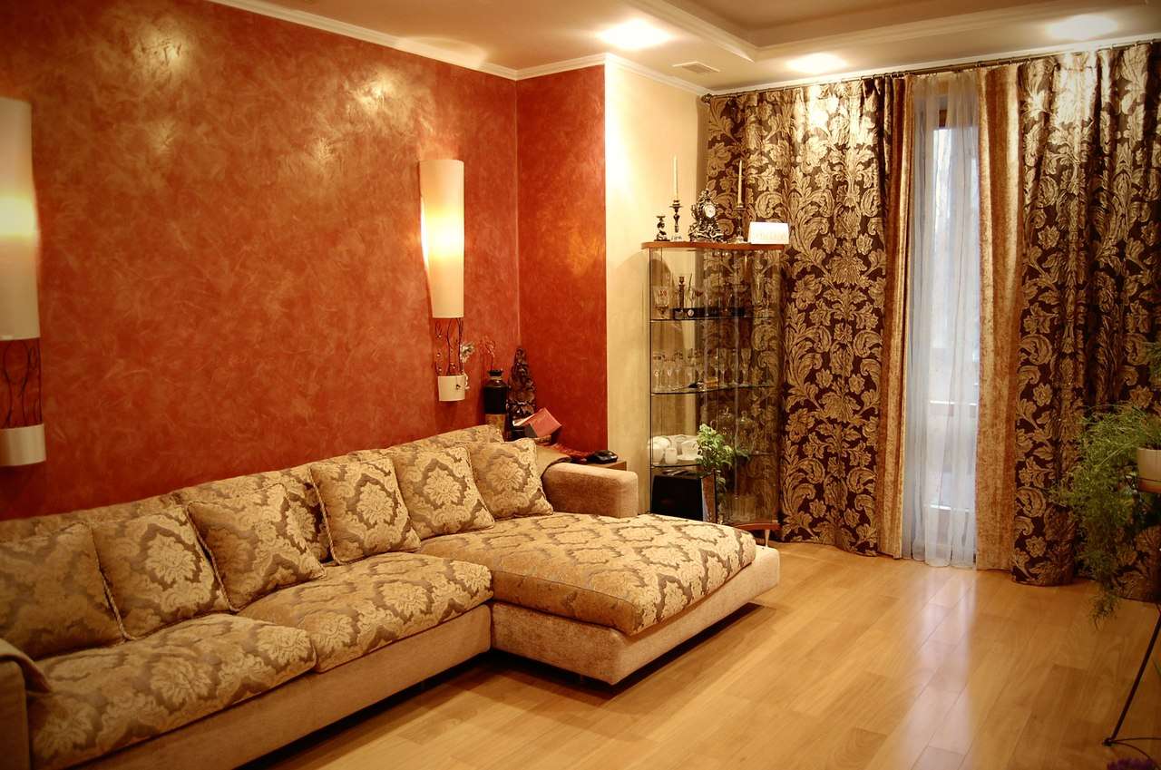
Curtains
Curtains in this shade are usually used to create a bright spot in the room. Contrast is appropriate with beige interior, dark brown upholstery and wooden decor. Patterns for such curtains are applied with golden or light yellow tones.
Some combinations with curtains include such schemes:
- terracotta + light beige + hot chocolate;
- light orange + beige + gold;
- carrot + beige + yellow;
- terracotta + white + dark chocolate;
- orange + beige + mahogany;
- dark terracotta + rosewood + ivory or beige;
- ash-orange + pastel brown + white.
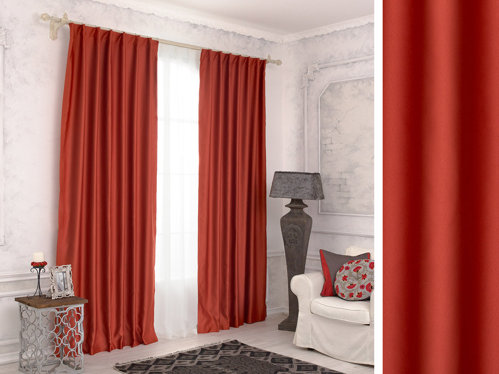
This is a bright spot in every room.
These are universal combinations that will suit even the design of the bedroom, but in softer, pastel colors.
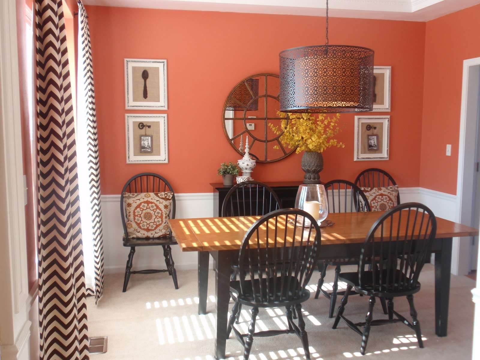
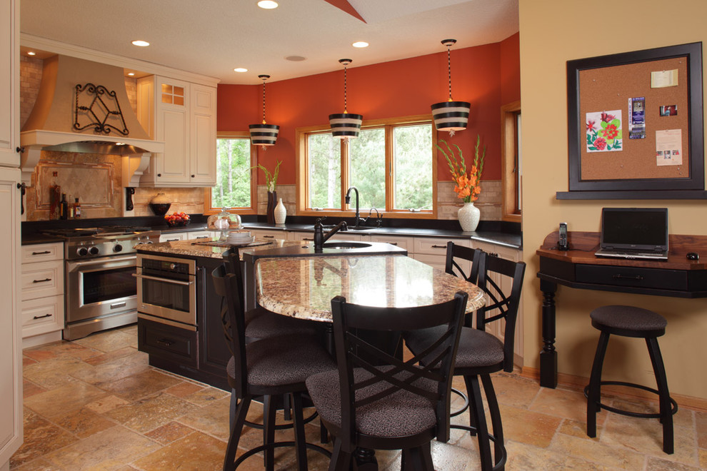
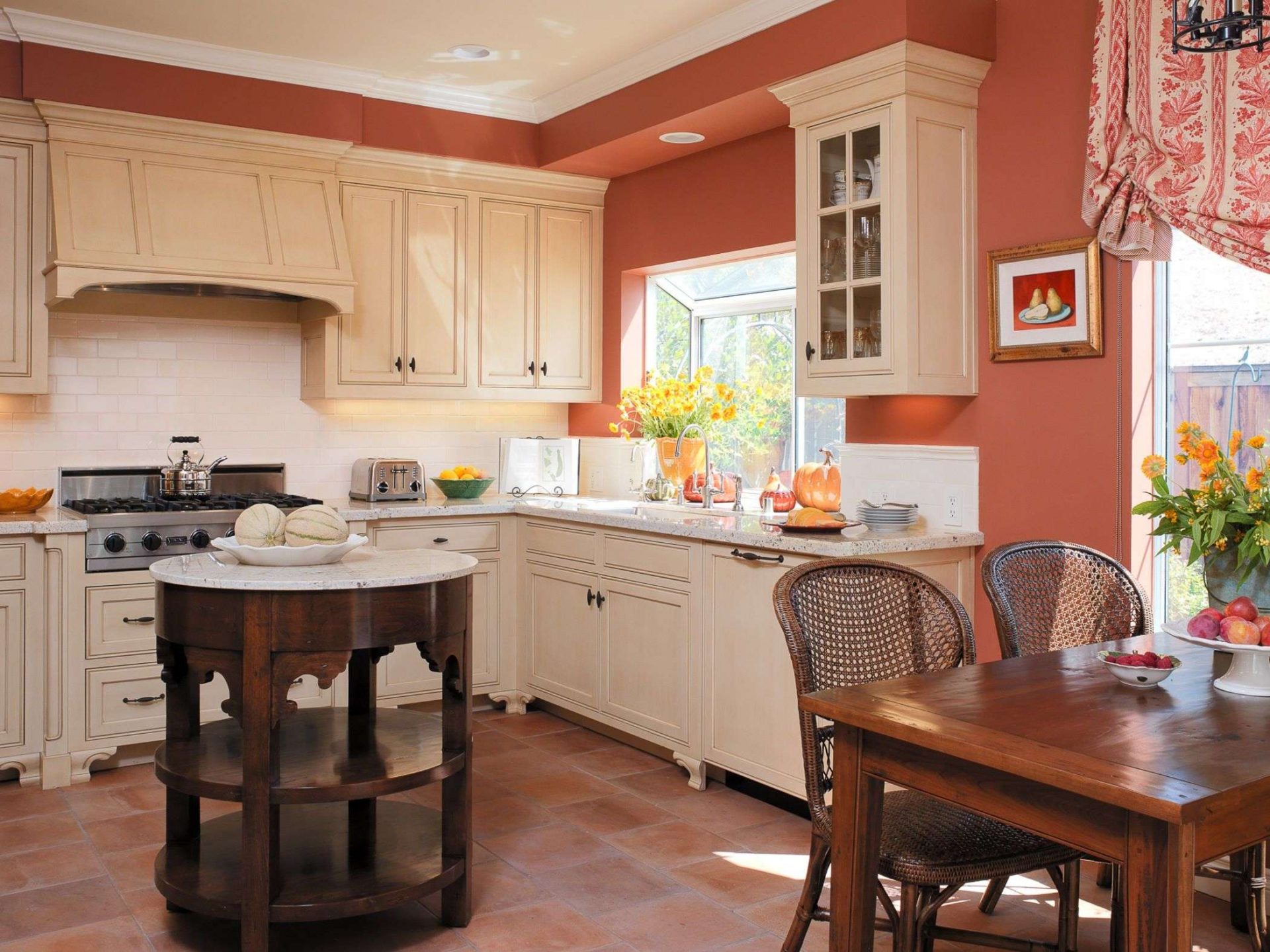
For kitchens and dining room are well suited brick shades. But any shade always exudes a lot of hot sun, when its rays will refract through this color in the windows.
return to menu ↑Terracotta combination
The most obvious combination is a minimalist white space with lots of green plants. But we are starting to see how heat penetrates these spaces through earth tones and new textures. Instead of white, which has dominated the interiors of the last couple of years, the clay chic of terracotta has become much more deep and expressive.Think about hot shades such as:
- cinnamon;
- rust;
- ocher;
- pale pink;
- burgundy.

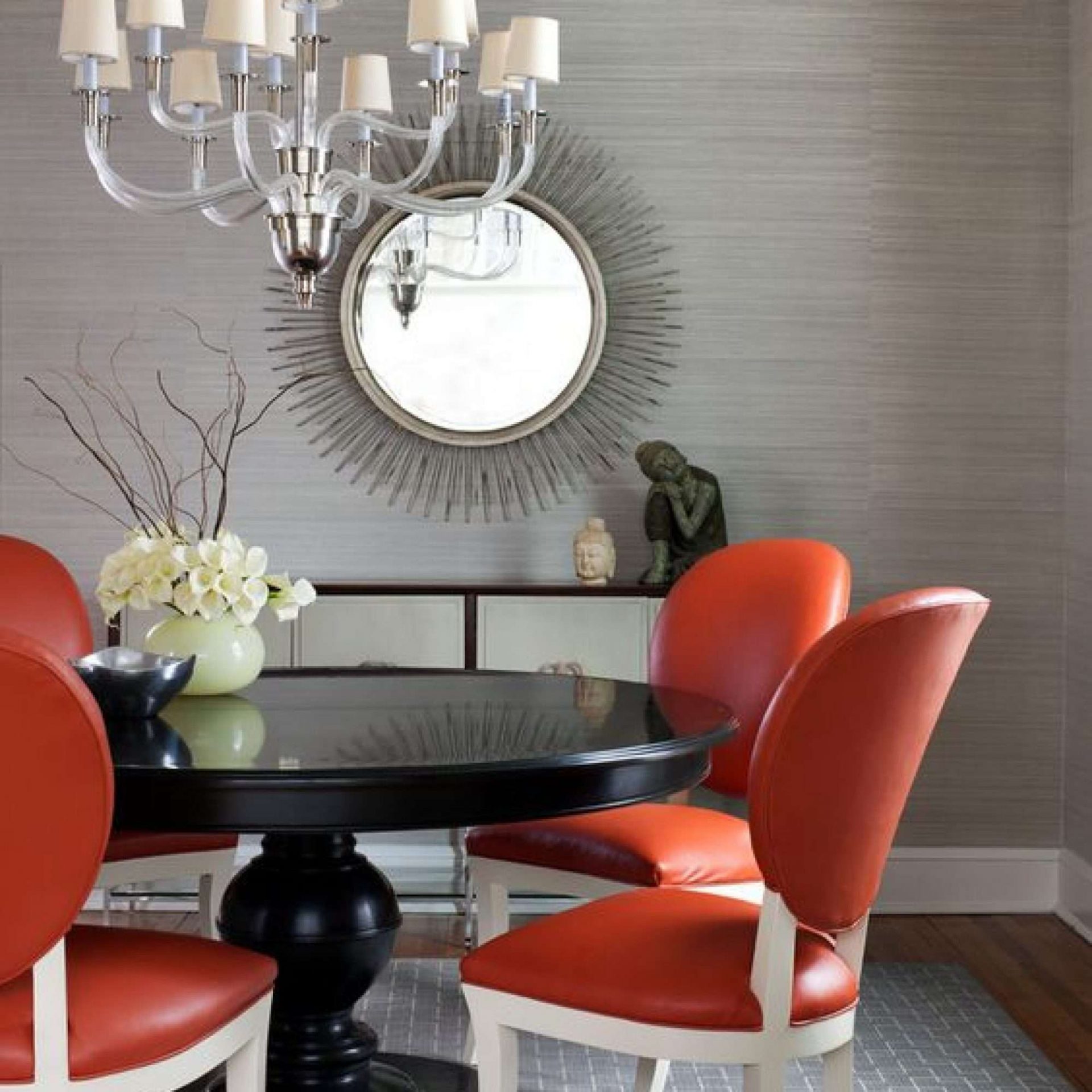
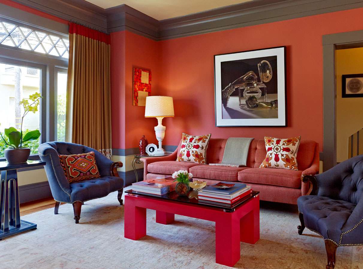
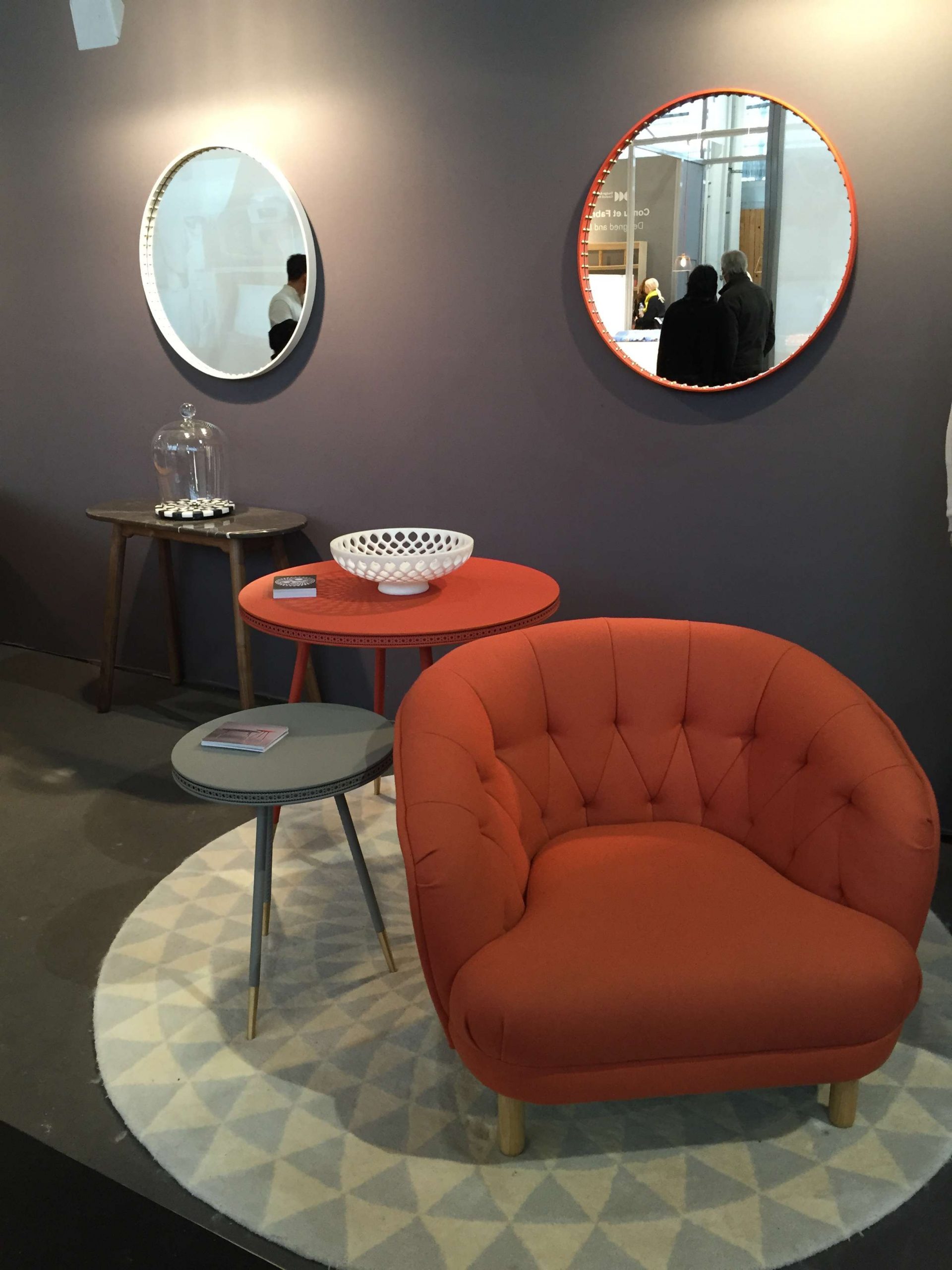
Combination with muted gray
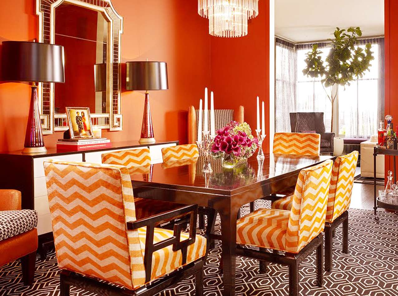
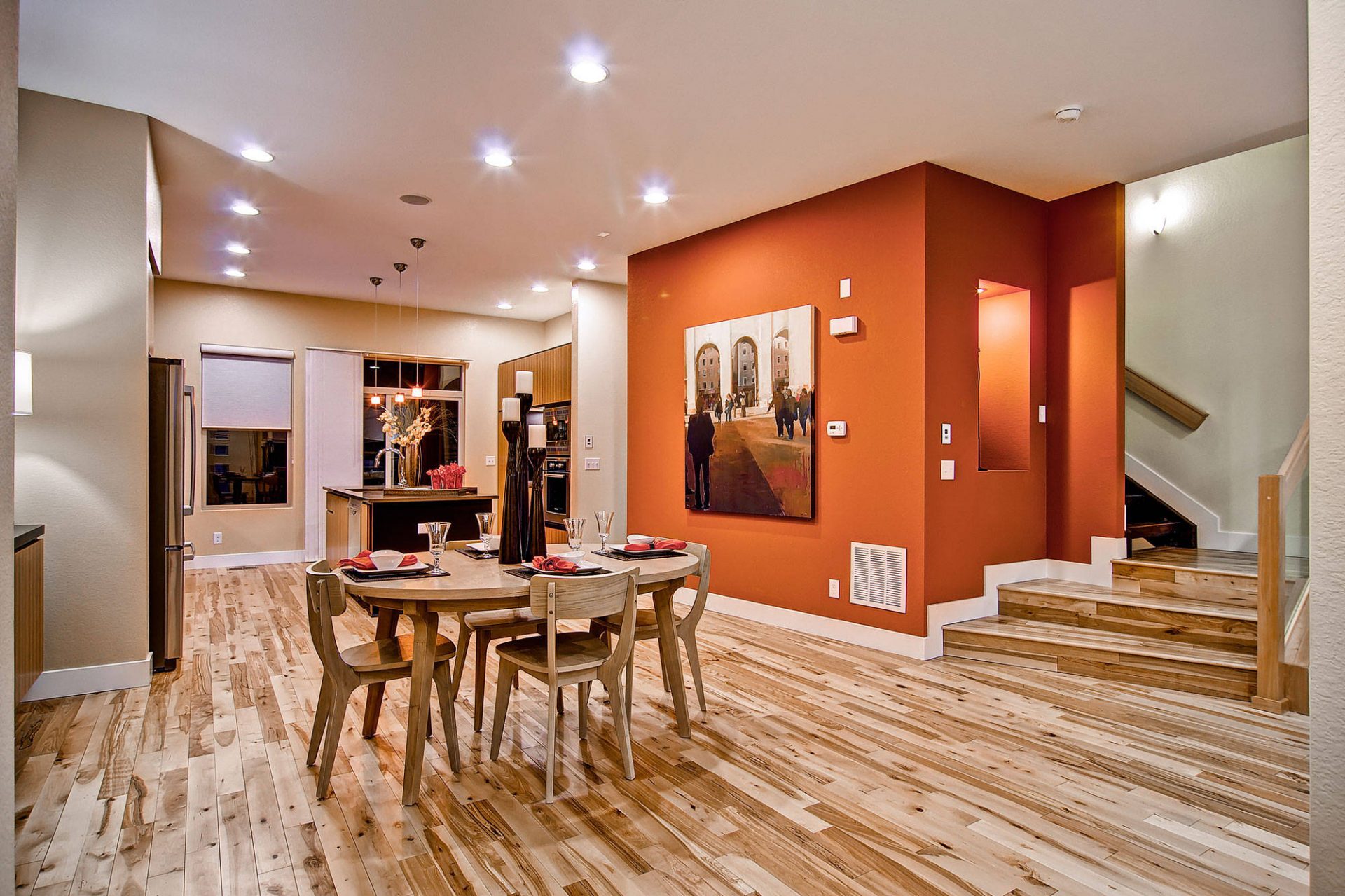
Appropriate interior design colors play a role in the development of harmonious room décor and creating a pleasant mood.Terracotta orange color makes the modern interior design sunny, happy and cozy, giving many possibilities for introducing appropriate color shades into the interior, which enrich the decor of the room.
Terracotta palette includes many shades, it is primarily:
- reddish brown;
- red;
- pinkish red;
- yellowish orange shade.
The color palette is very large
Terracotta orange colors can be bright, bringing rich hues to modern interior design with bold decorative accents. Subdued shades of orange create quieter and softer color schemes that blend well with light gray, white, beige, or milky white decorations.
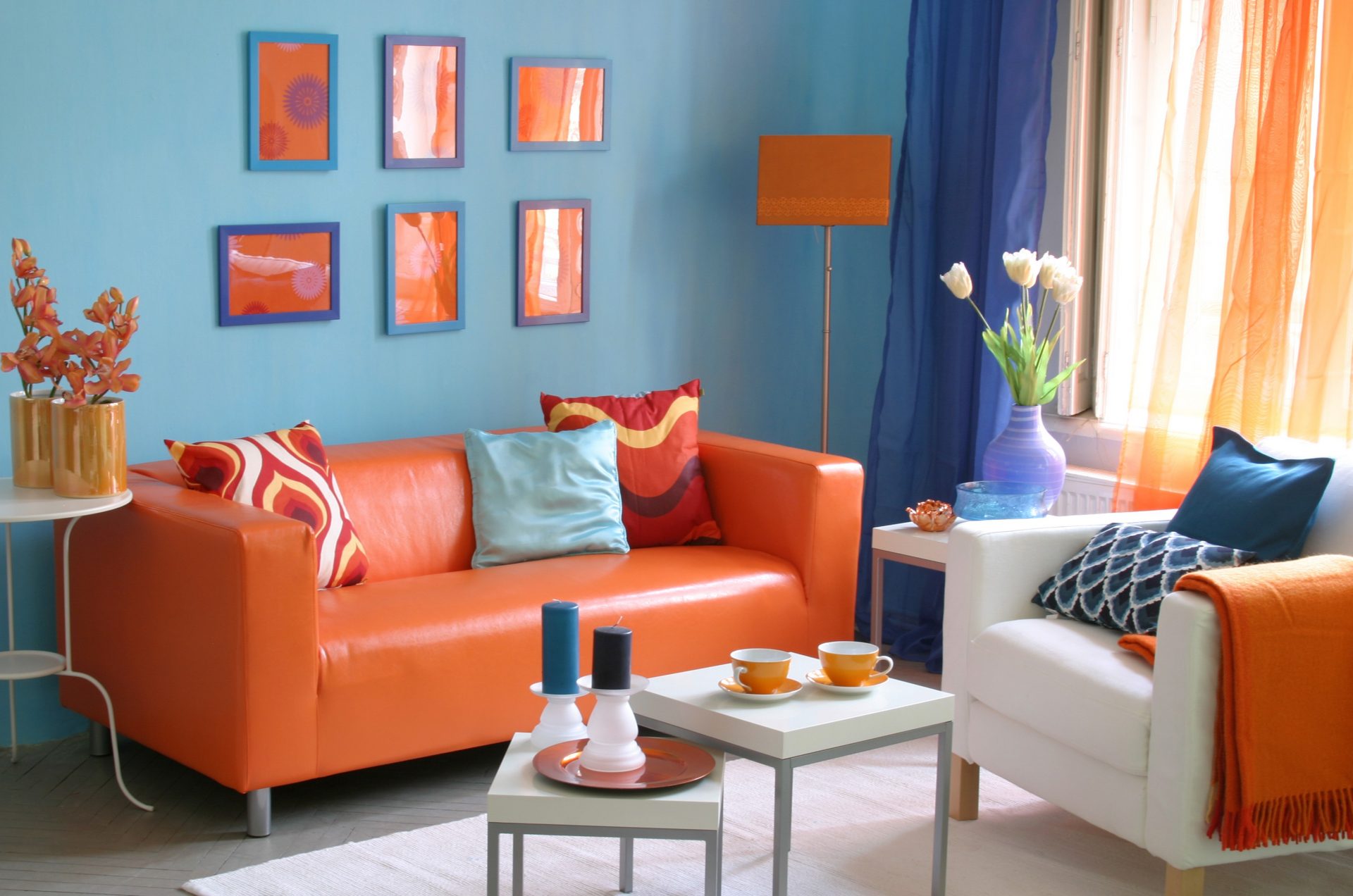
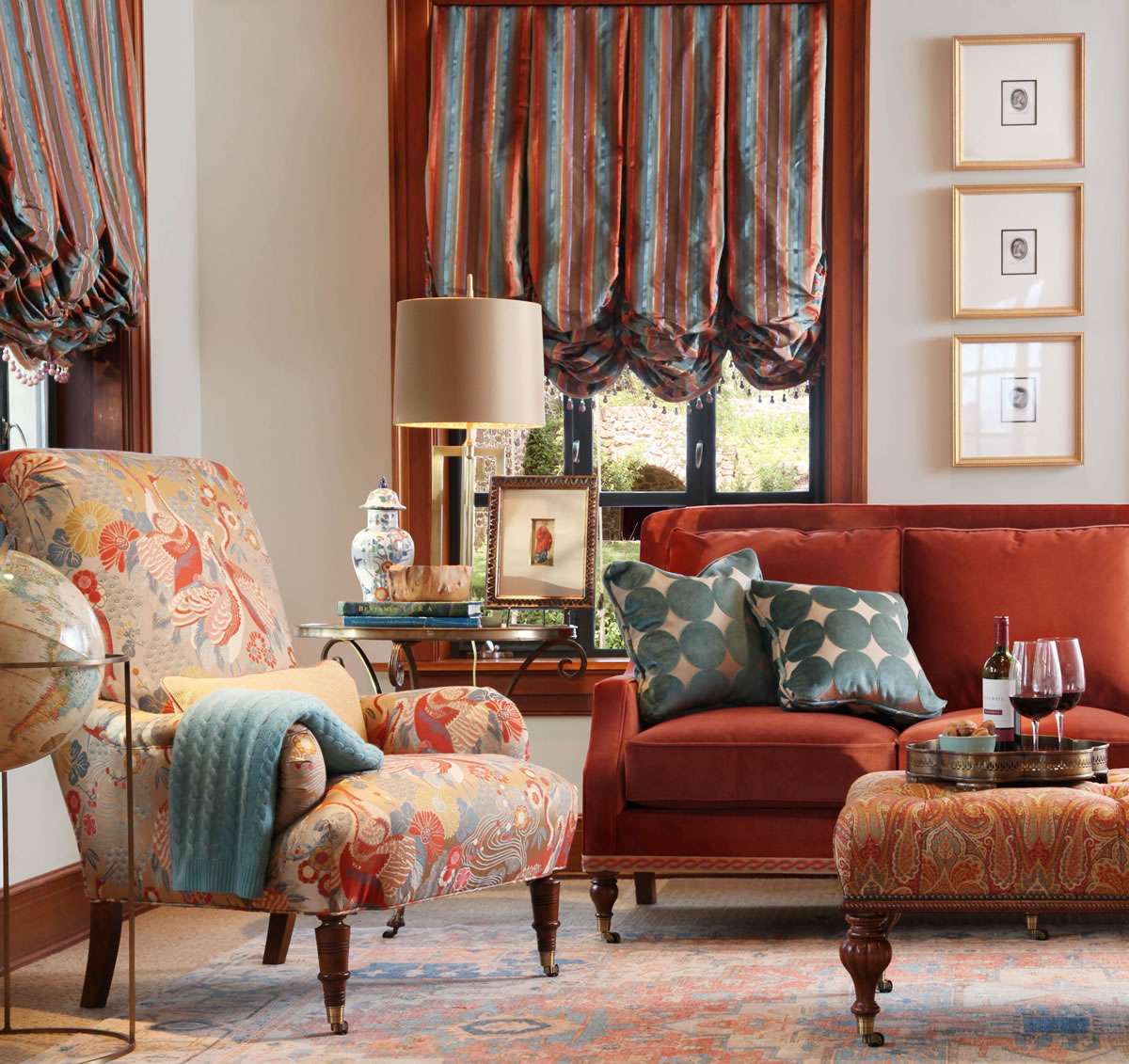
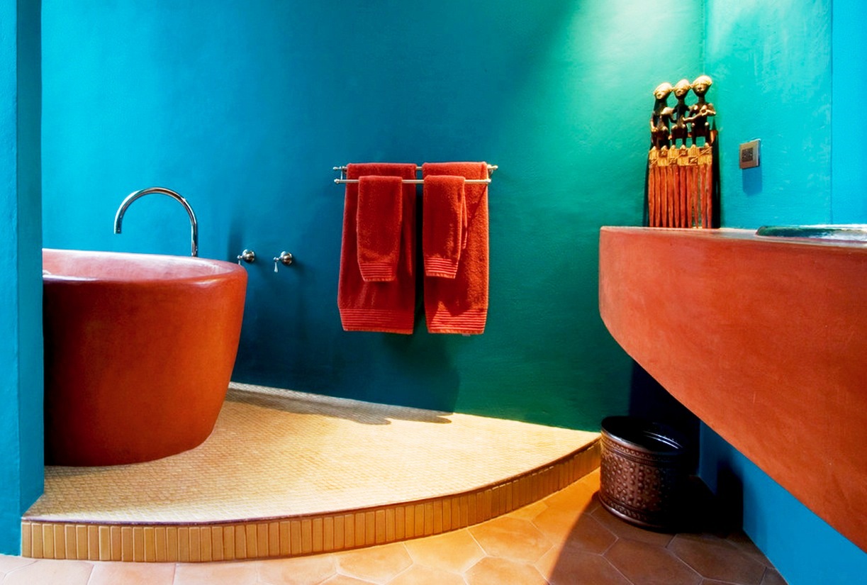
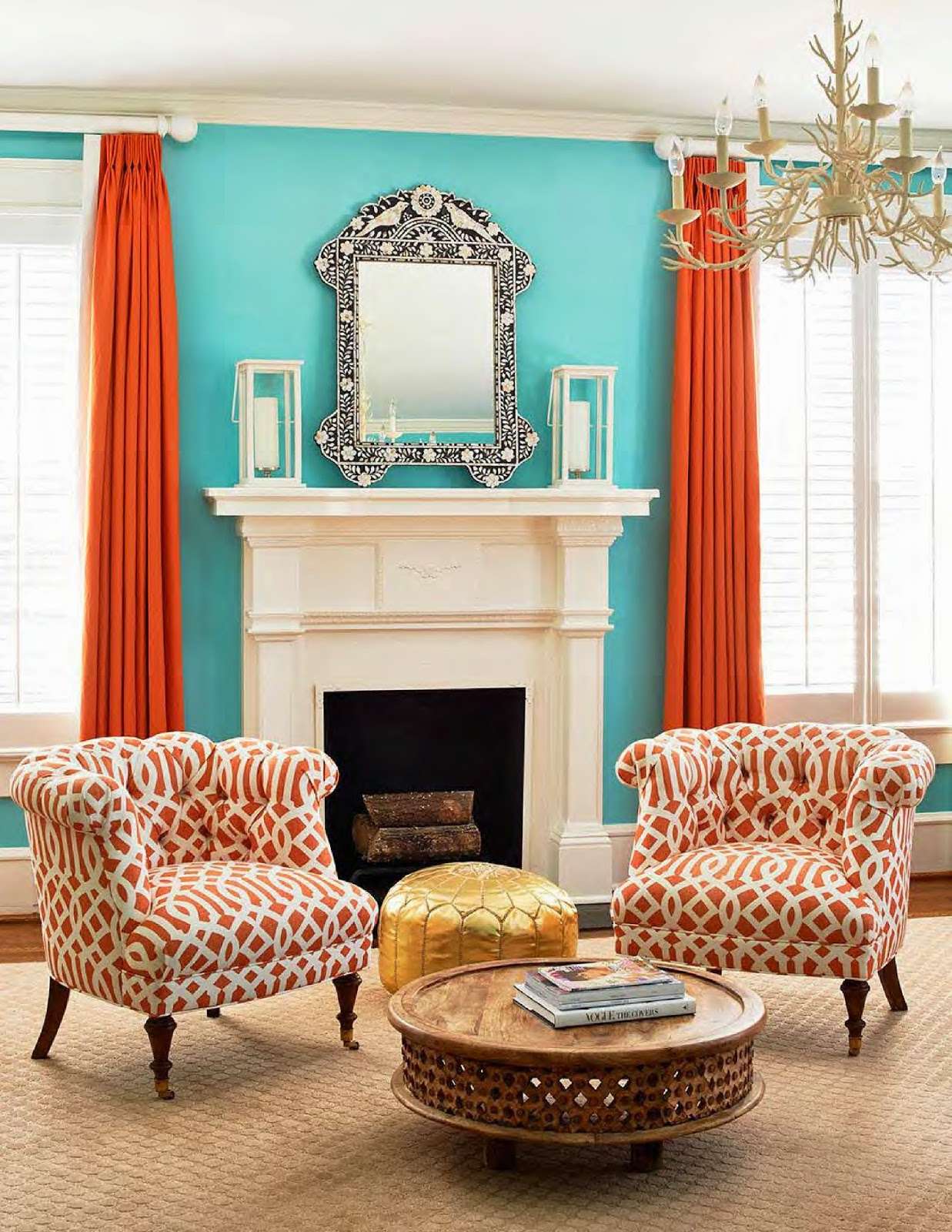
Anyone who has traveled southwest knows that terracotta and turquoise make up a bright combination that resembles the earth and the sky in the desert. This is a combination where two colors complement each other.
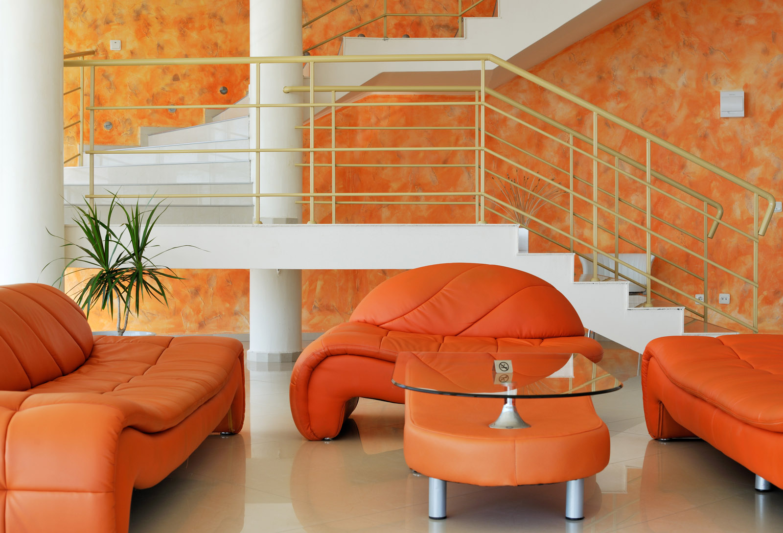
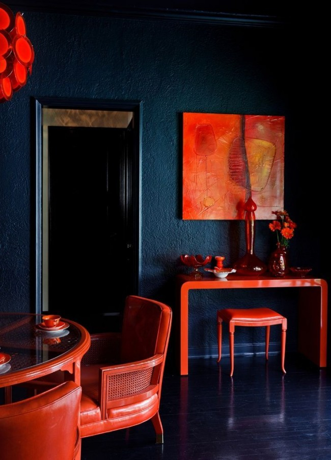
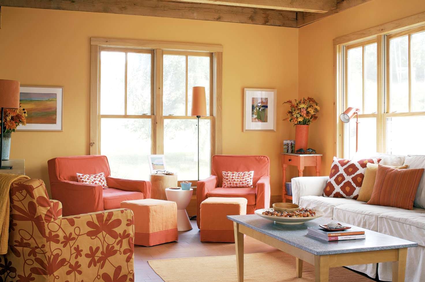
Terracotta and orange - bright, warm and cozy
Orange
Orange is the primary color of terracotta, and you deepen it with brown or black.
If you prefer the sun-soaked color, which is brighter and will be more to the pink, make the orange light yellow to create the color of the early sunset. Then use brown to add color to the earth and make balance.
Orange is the primary color of terracotta.
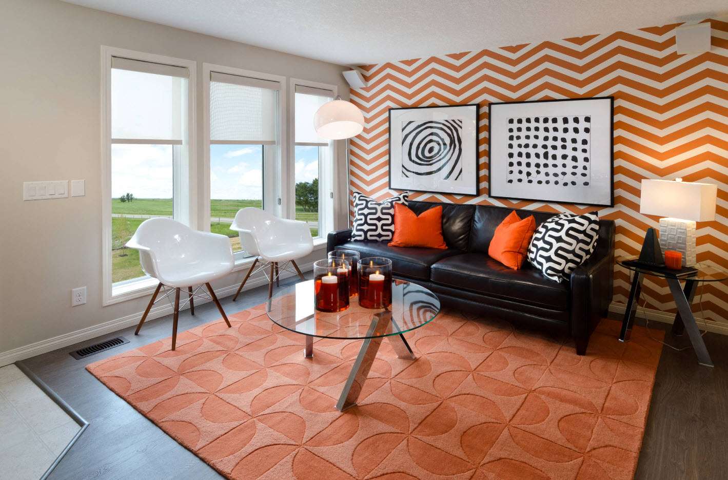
Contrast color schemes with orange and blue, all brown or black tones create an original and bold interior design that makes a statement. Dark yellow, reddish brown and orange colors of autumn leaves combined with light blue, turquoise and green colors add a fresh and young look to modern interior design ideas.
Colonial style furniture - looks beautiful and presentable
African motifs and South European designs, walls with accents in golden yellow and reddish brown, brick walls and wooden wall panels, ceramic table lamps and home decorations, plastic or clay pots and orange vases are suitable for terracotta design.
return to menu ↑With green
Warm greens always blend well with ocher earth tones. For terracotta perfect shade sage. From this combination it turns out a muffled calm atmosphere. An additional shade of color in the green range will be purple, which can be found in pillows or other details.
Add some greens for freshness.
With gray
With an excess of white and gray things start to look harsh and not at all warm. The problem will be solved by adding heat to the terracotta floor, kitchen apron or decorations - all these details will make the room not so sterile.
This combination will make the house modern, but warm. The palette goes well with a matte metallic and weathered gray finish. Haute couture also adopted this palette by applying funny geometric shapes to classic silhouettes in neutral gray and adding bursts of color. The red carpet of the Golden Globe has seen many orange and pink shades with metallic elements.
Classic combination in design
The gray and orange palette also works in an Art Nouveau setting, where minimal lines and the open concept of the house allow you to enter the scene of bold furniture.
return to menu ↑Spaces and styles
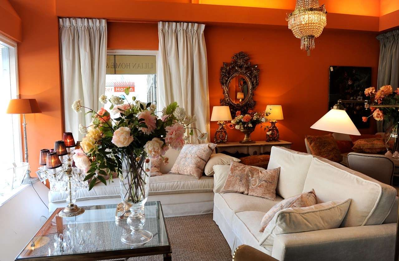
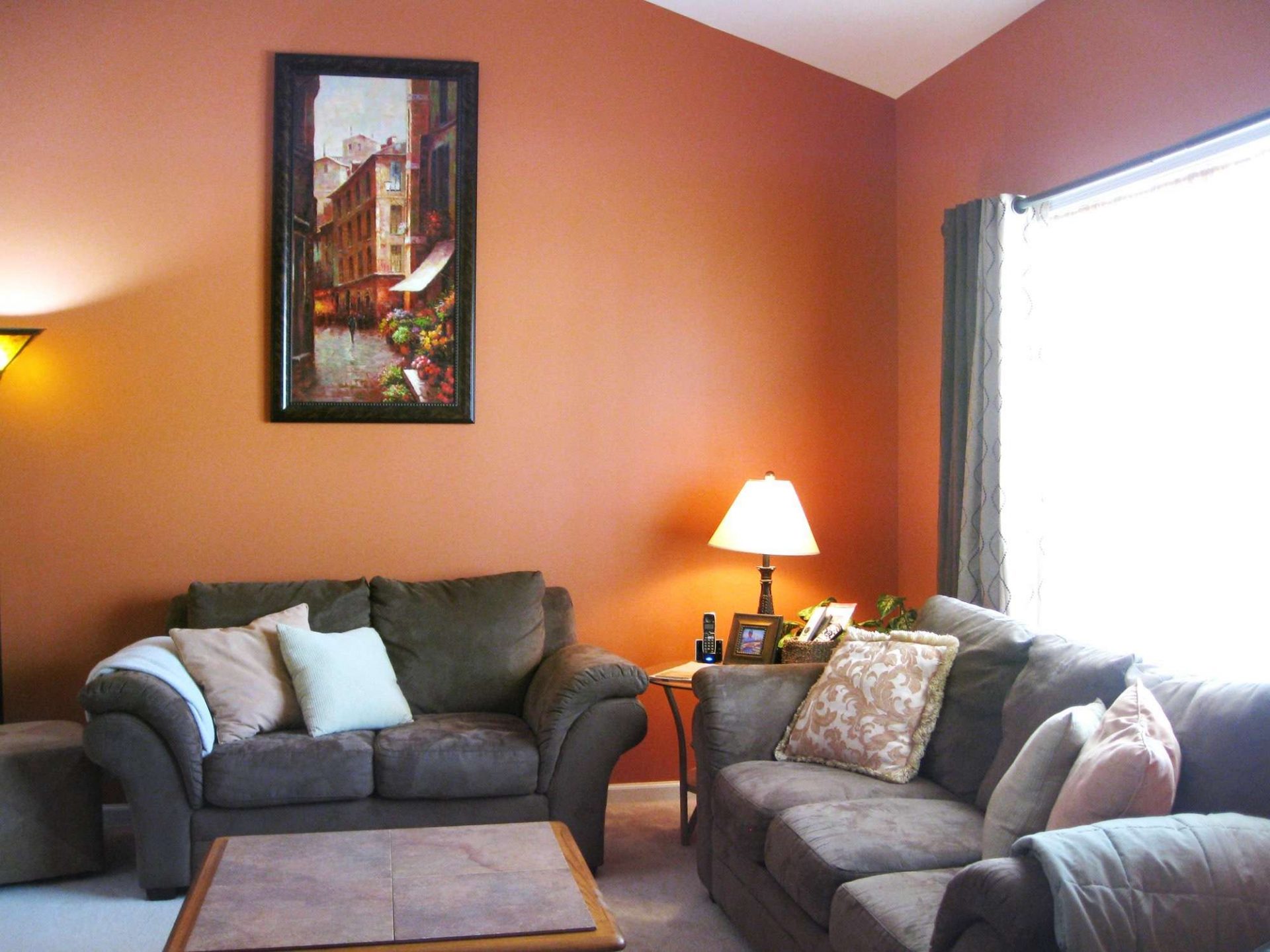
Today there is a need to return to nature and environmental materials. This desire returns the natural tones to the decor. The monochrome atmosphere gives way to warm colors that remind us of the rich hues of the earth.The terracotta has a pronounced color, featuring a soft mixture of reddish ocher and brown color of a very natural look.. Inspired by the mineral pigment of the same name, this earthy color refreshes and enlivens the interior, creating an intimate and friendly atmosphere.
 Compatibility of bright colors")
 Compatibility of bright colors")
 Compatibility of bright colors")
 Compatibility of bright colors")
 Compatibility of bright colors")
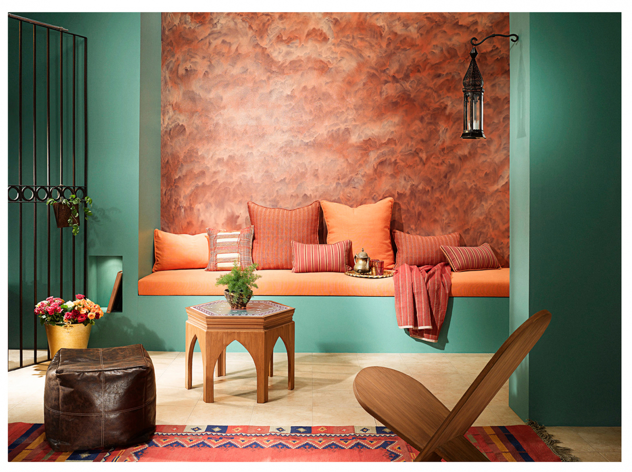
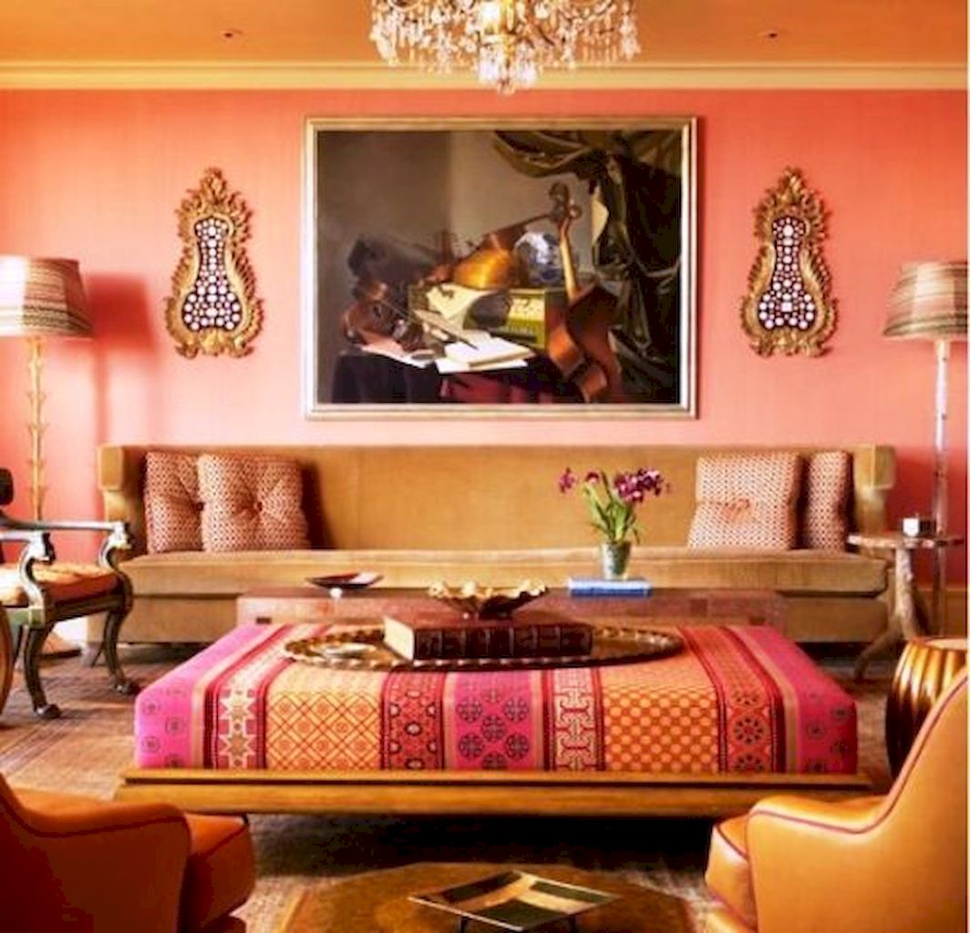
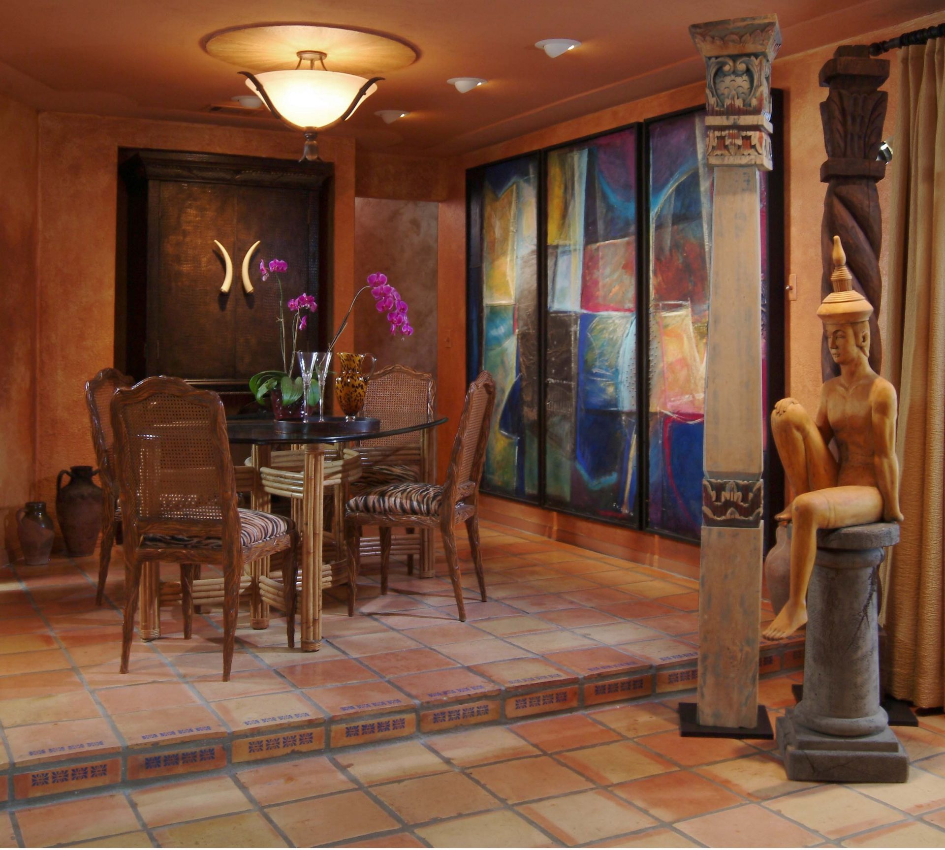
Although terracotta can be combined with any style of space, this baked clay is indeed a desert material. A bohemian abode with a multitude of textures and eclectic, desert tribal patterns is the right place to put the terracotta trend in full force.
Used on furniture and objects, as well as on light fabrics, this color at the same time adds elegance and warmth. The orange tone of terracotta gives a friendly atmosphere when used in dining rooms that look like cozy houses on the Mediterranean coast.
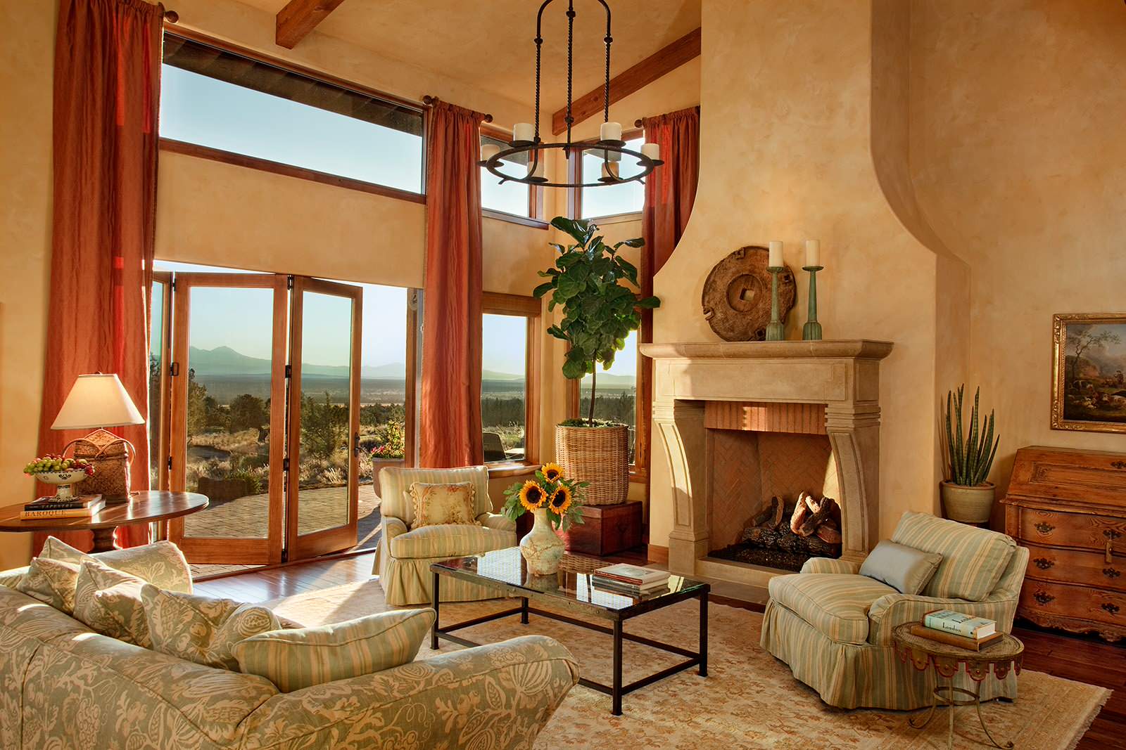
return to menu ↑Sunny Tuscan style
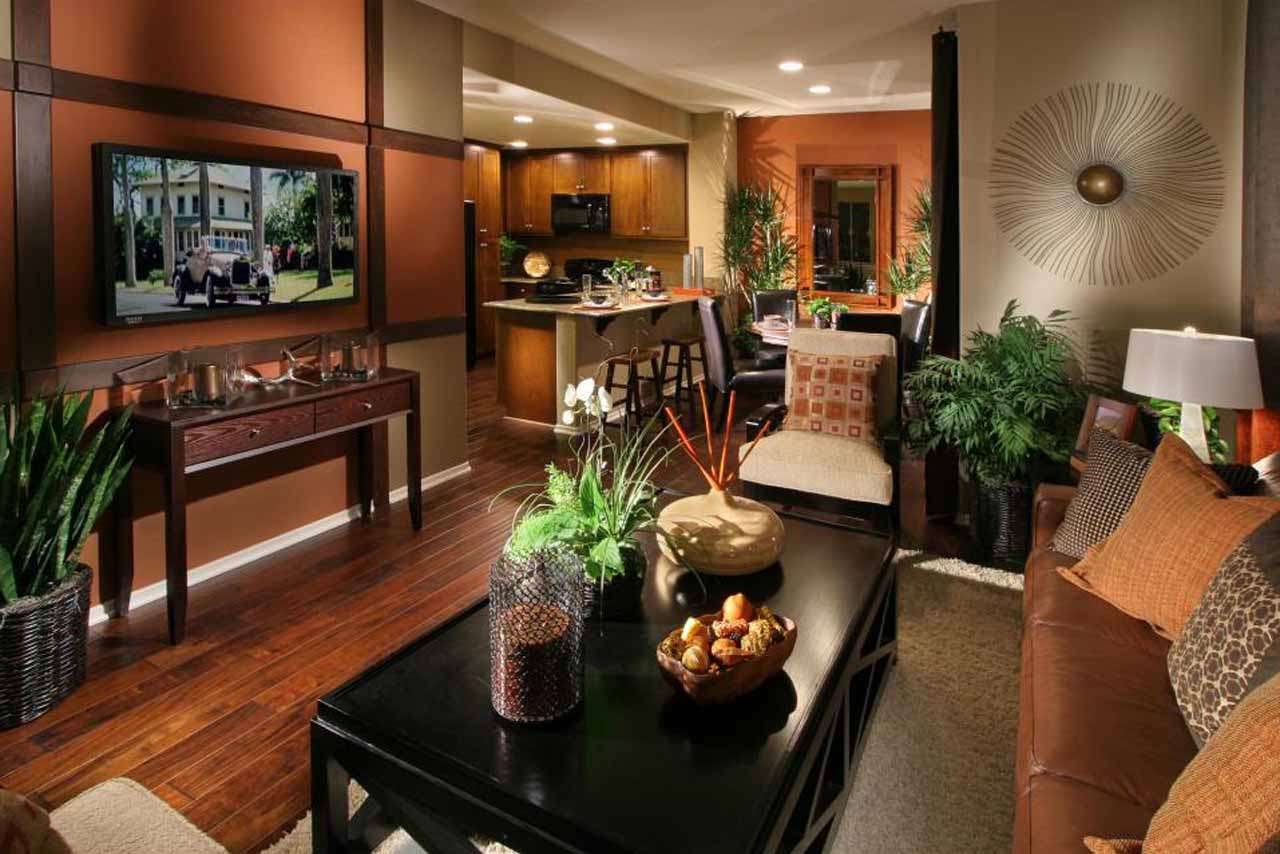
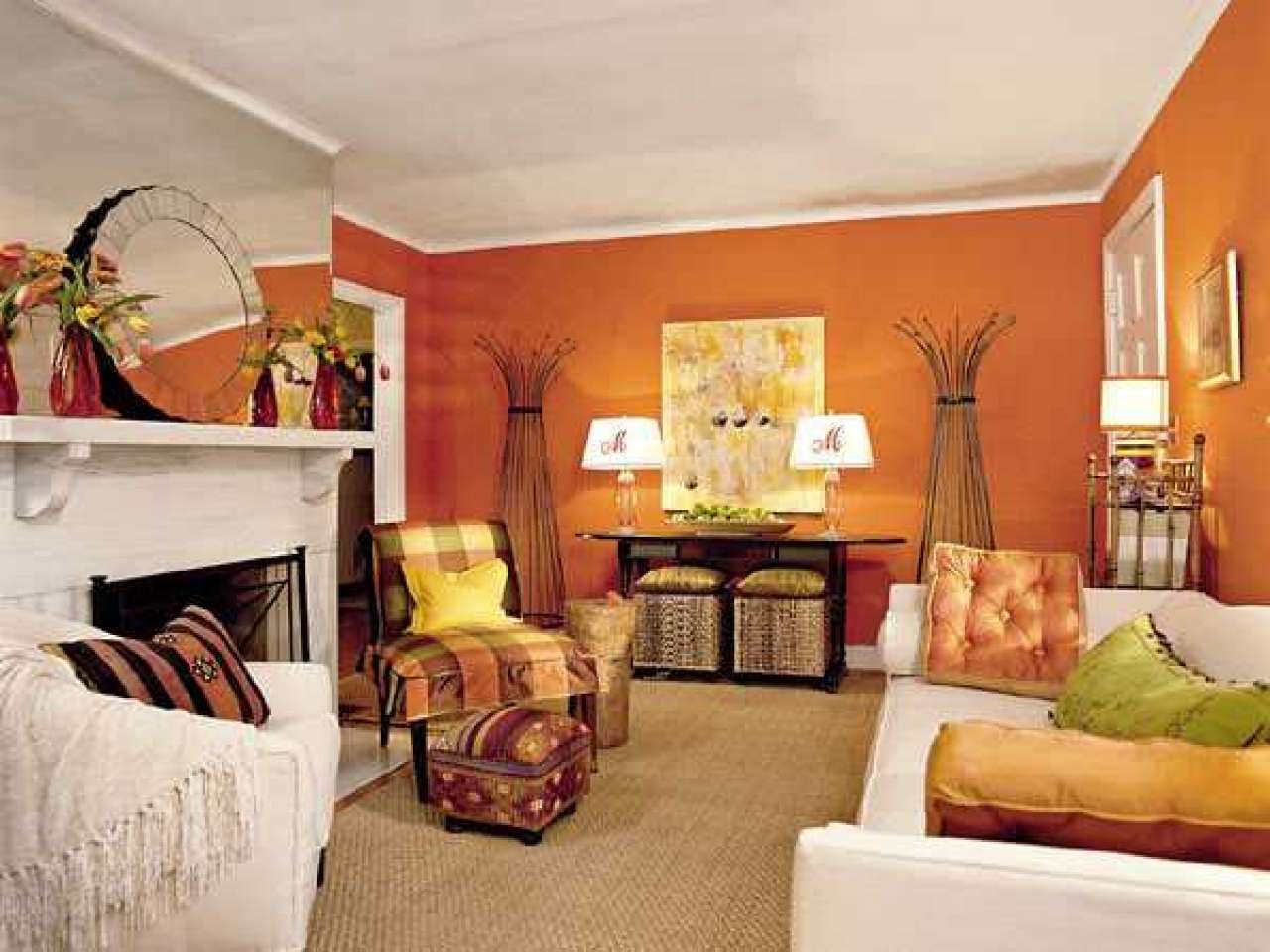
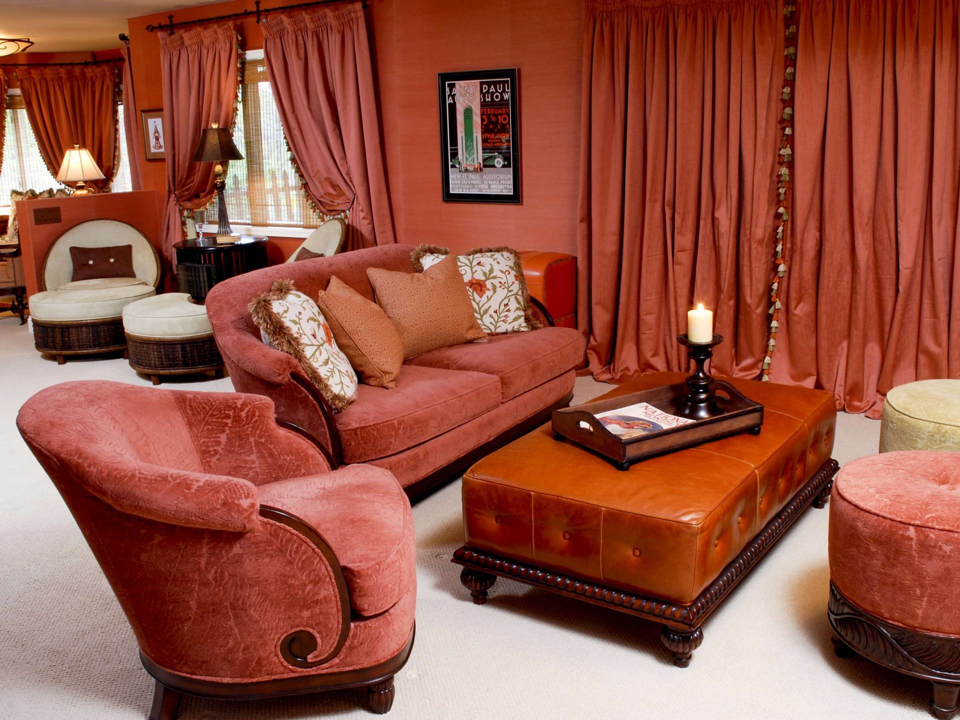
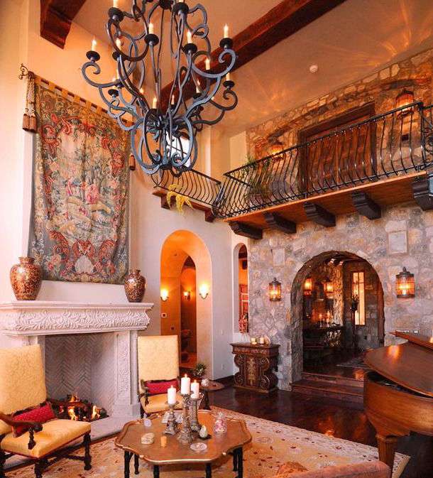
The Tuscan-style palette takes a ton of warm tones that can be found in the southern Italian countryside. Burnt siena, olive green, golden ocher, dark brown, coal black, red — all these sunny shades inevitably make us think of summer. If you decorate your house in a Mediterranean style, the walls will be covered with the most dynamic shades of terracotta.
Armchairs and walls to match - the perfect combination
For a more reliable effect, consider adding a decorative coating of red ocher, such as Venetian plaster. In addition, this type of wall covering gives the impression of depth and "luxury". You will want to use the possibilities of terracotta with all its subtlety. Focus on adding this color in soft upholstery sofas and armchairs add this shade to wall tapestries and artistic art. Decorate it with dark wood furniture or wrought iron.
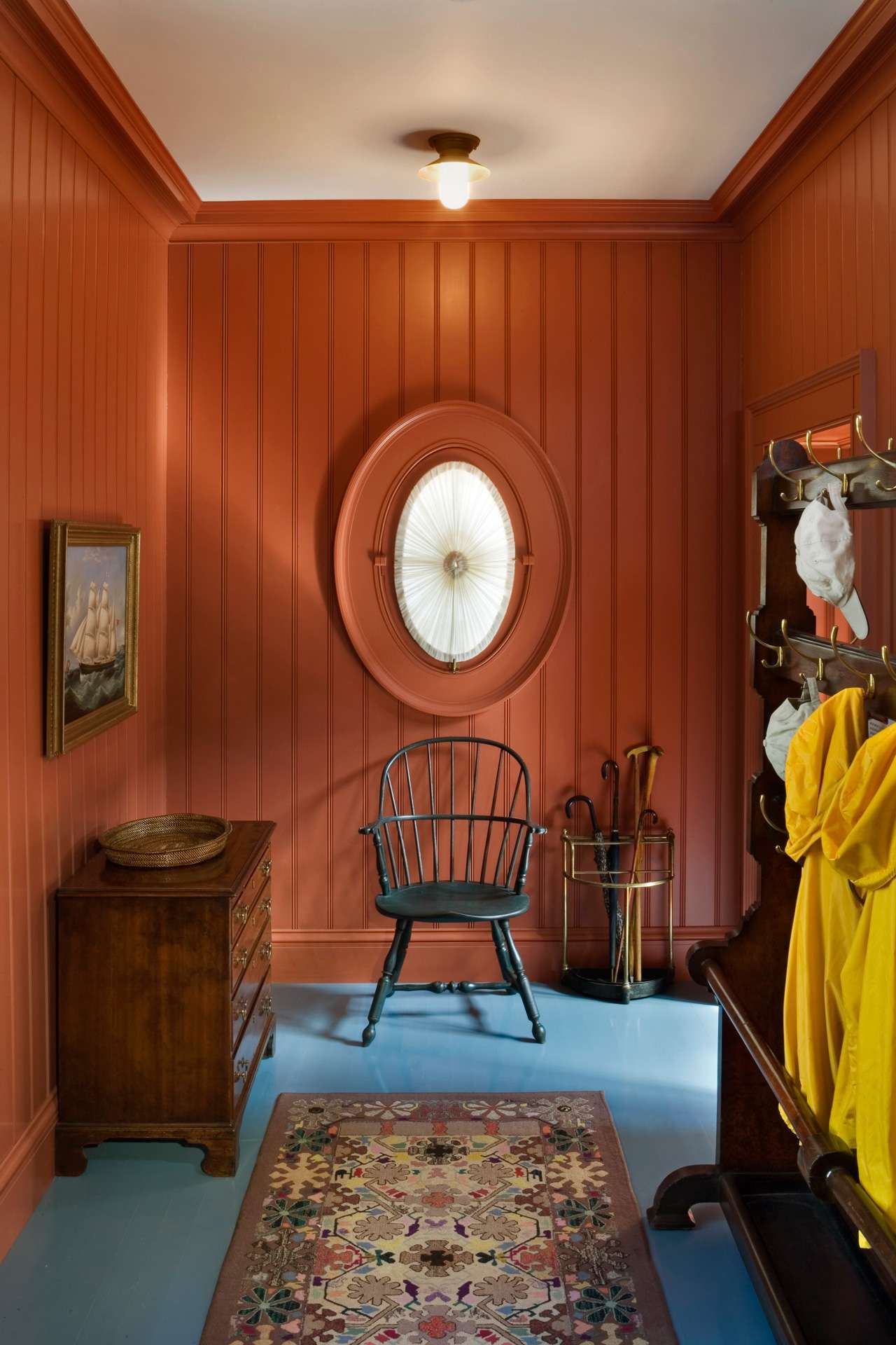
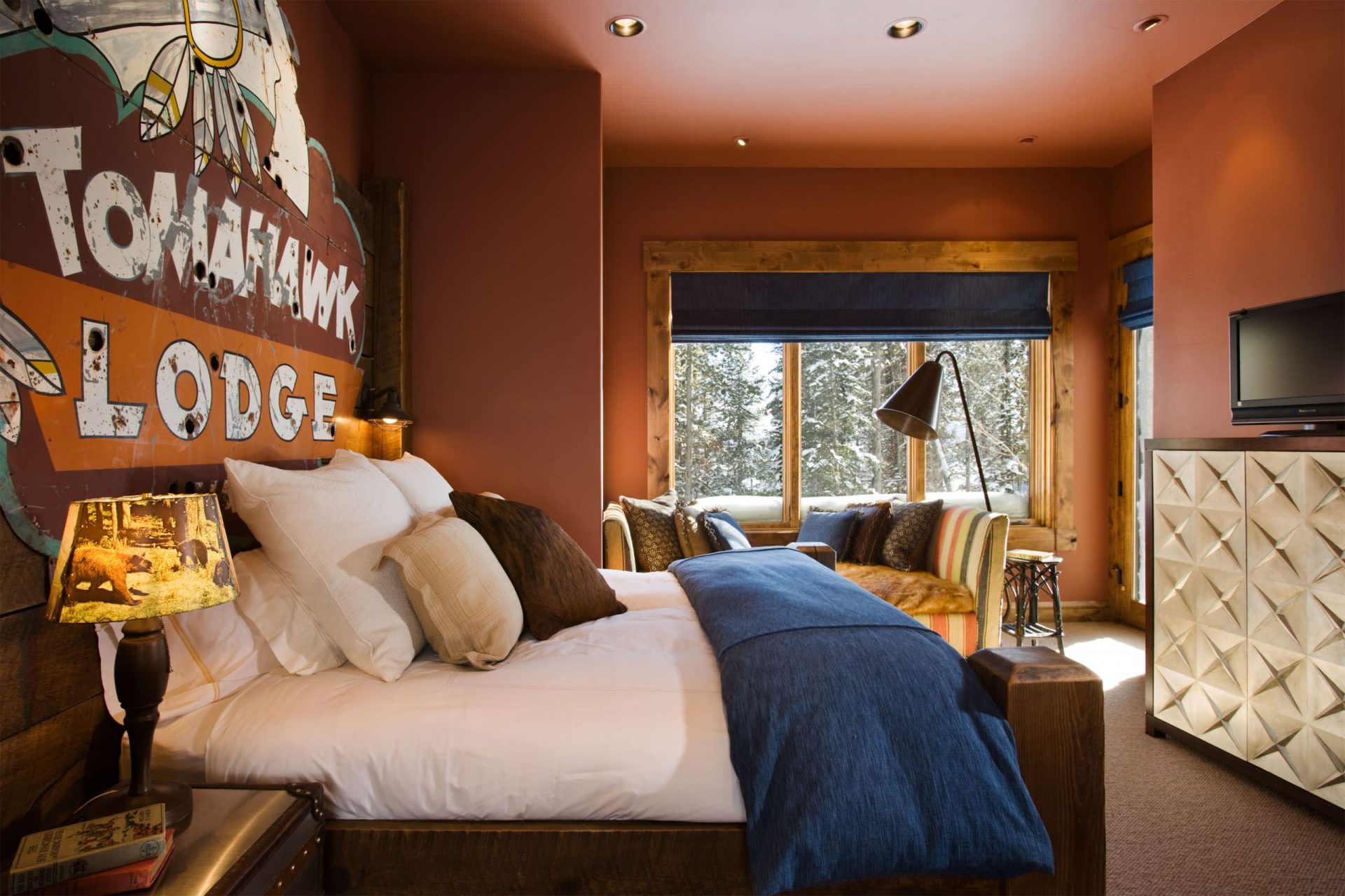
In southwest
South-western style unites an entire era in a single genre of interior design. The famous view of the "Wild West" allows you to combine elements from several cultures and periods of history, but also transferred to modern homes.
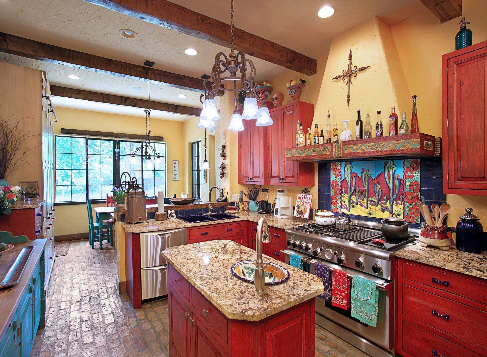
Southwestern style note combined with a red tinge of terracotta
This friendly atmosphere of ethnic style becomes a fertile land for earthly flowers. To gently present it in your home, add it to the upholstery and decorative accents.
Spanish motives
Traditional Spanish Style
The Spaniards were the first Europeans who successfully settled in the American southwest, which makes the Spanish style extremely influential in the region to this day. Traditional Spanish-style houses are still being built in the area.This look highlights the orange terracotta color with textured plaster walls, with an interior, usually made in white plaster with molded edges and nooks and corners.
Along with white walls, interiors in houses inspired by the Spaniards almost always have clay tiles as floor coverings and finishes, and sometimes elegant decorative tiles, especially in the kitchen and bath. BUTArchitectural details, such as railings and gratings, usually consist of wrought iron or beautifully carved wood products in more high-class rooms.
return to menu ↑Native American
Before the Spaniards arrived, Native Americans were the only inhabitants of the American southwest, and the Navajo tribe was the most influential when it came to style. Navajo have a long history of textile craft, they passed their patterned traditions of weaving through hundreds of years. You will recognize this graphic style in your blankets, as it is now very popular.
Along with woven textiles, Native Americans introduce other arts in a southwestern style, such as:
- weaving baskets;
- ceramics;
- turquoise;
- Leather Products.

Indian style for lovers of exotic
While many modern retailers sell copies of Indian designs, the most respectful way to buy a Navajo style rug is to buy it from Navajo artisans who make carpets. A simple Google search will show some well-known Navajo providers.
return to menu ↑American
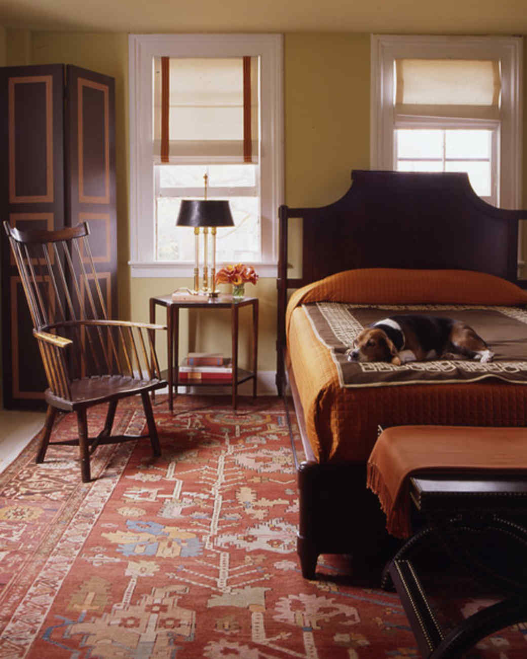
The first modern Americans who settled in the west were mostly ranches and missionaries. Hardworking men and women ventured on a dangerous adventure to tame cattle and master the land. They led a simple life in village houses, often made of clay. Their textiles were rough handmade or unprocessed animal skins.
With a hint of southwest
The missionaries who inhabited the West also clearly had simple structures. The style of furnishing is often based on the fact that they brought with them in their cars, or the fact that they could easily be made in new houses. Most of the missionaries lived a simple life even in the East, so the furniture was also simple, in the style of a shaker. These were chairs with backrests and large wardrobes and dressers with simple decorations, such as a heart-shaped neckline.
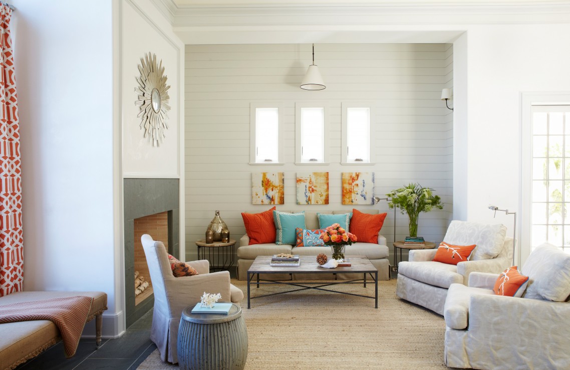
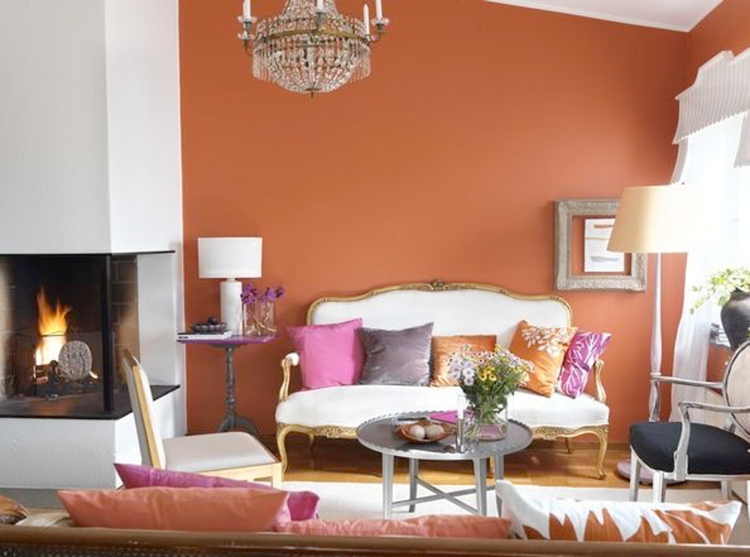
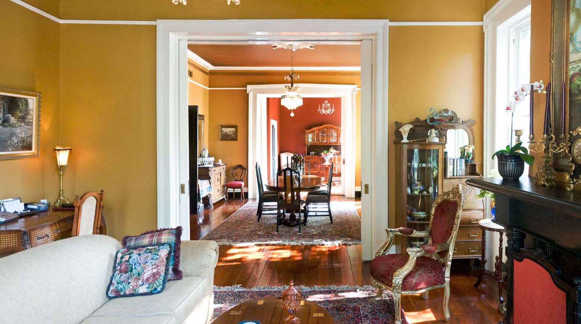
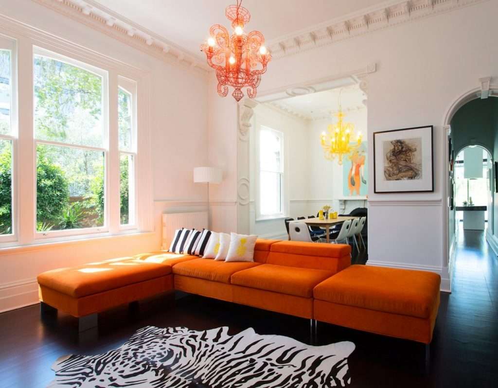
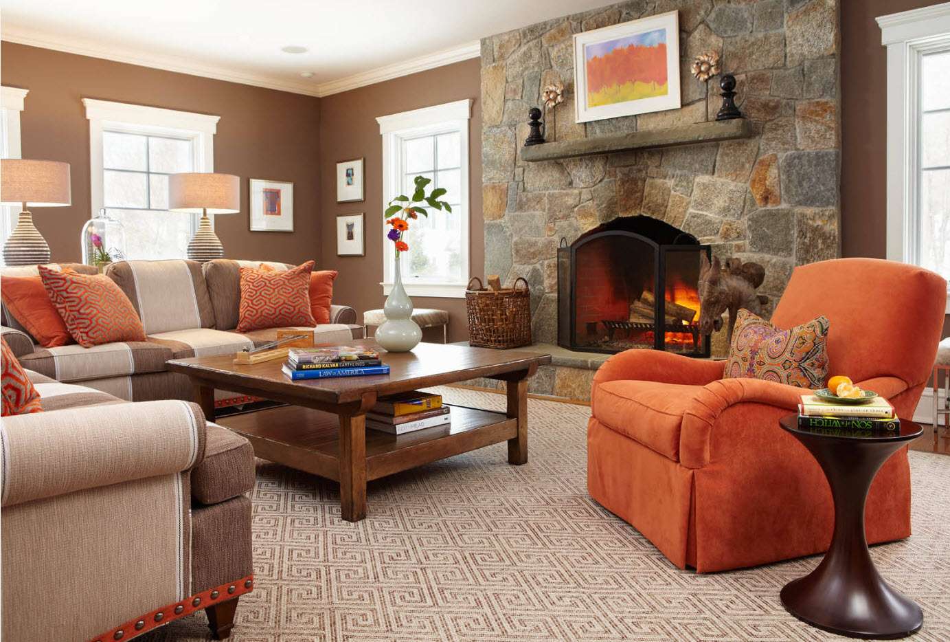
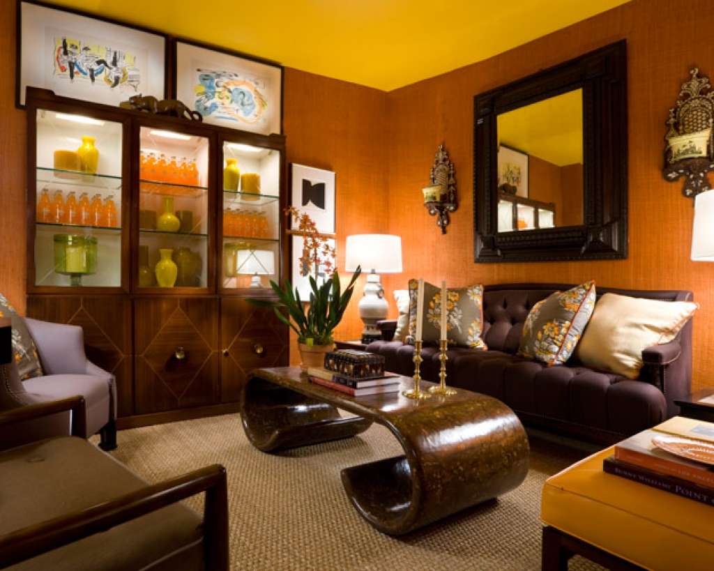
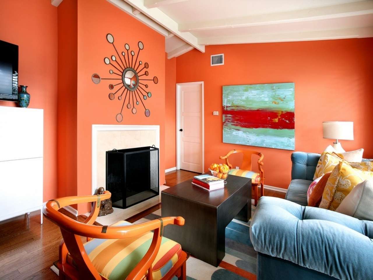
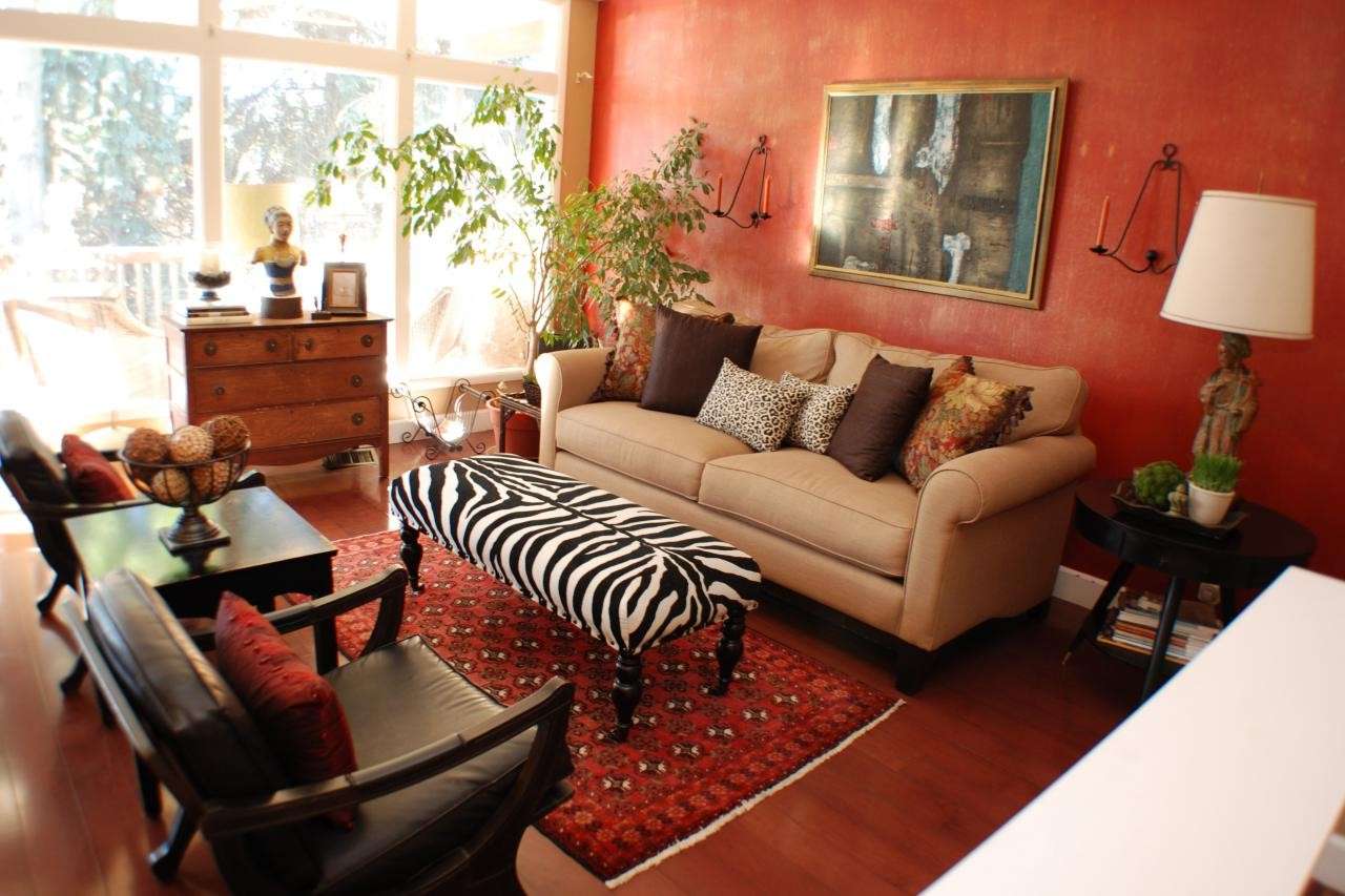
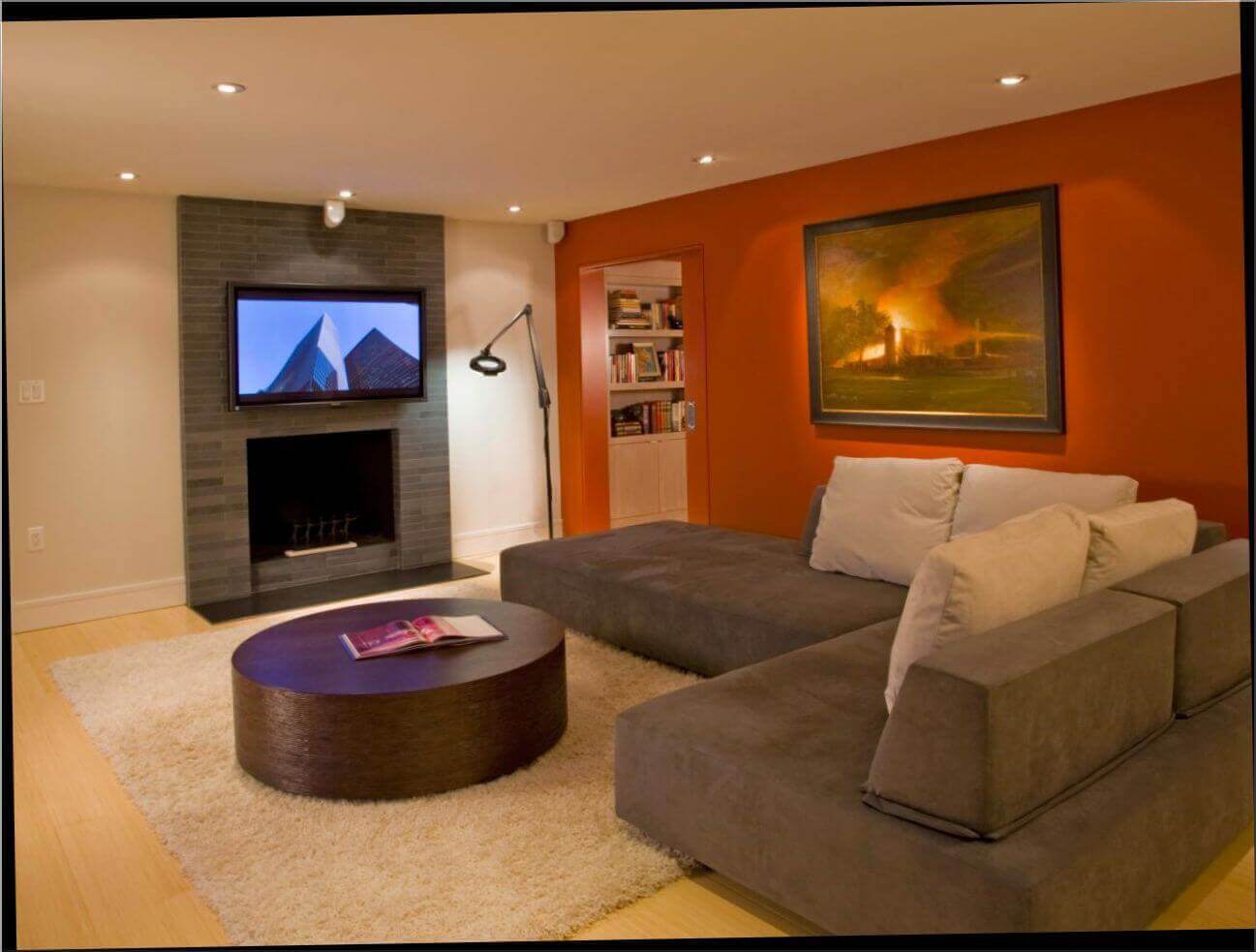
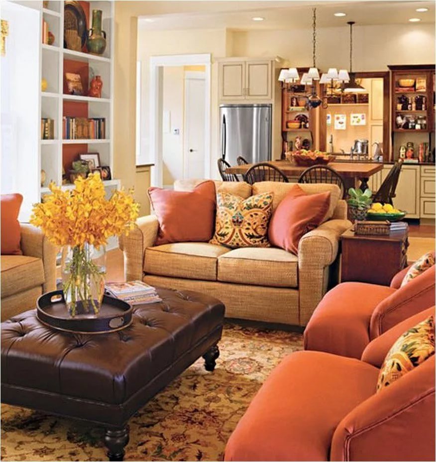
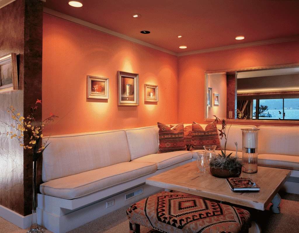
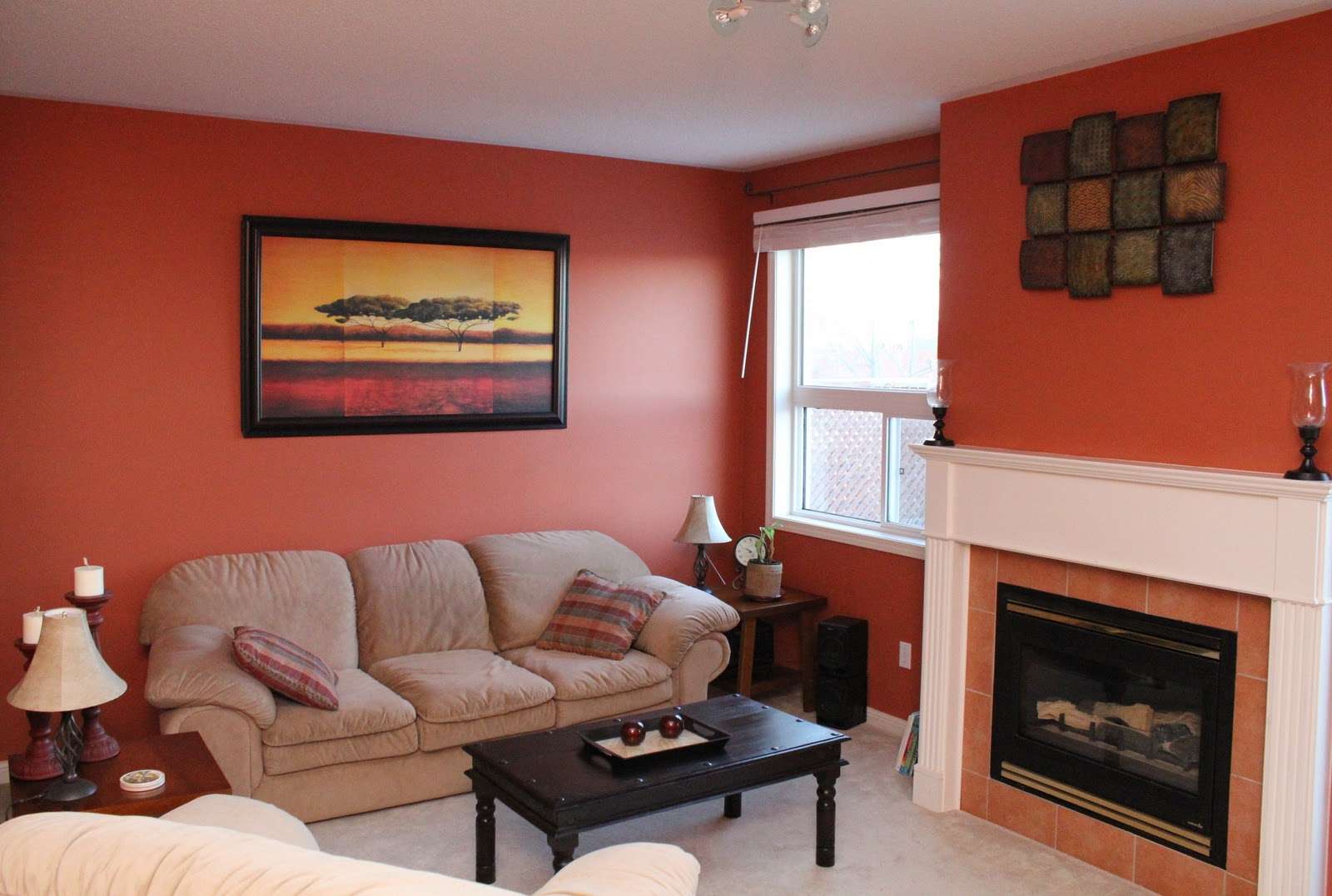
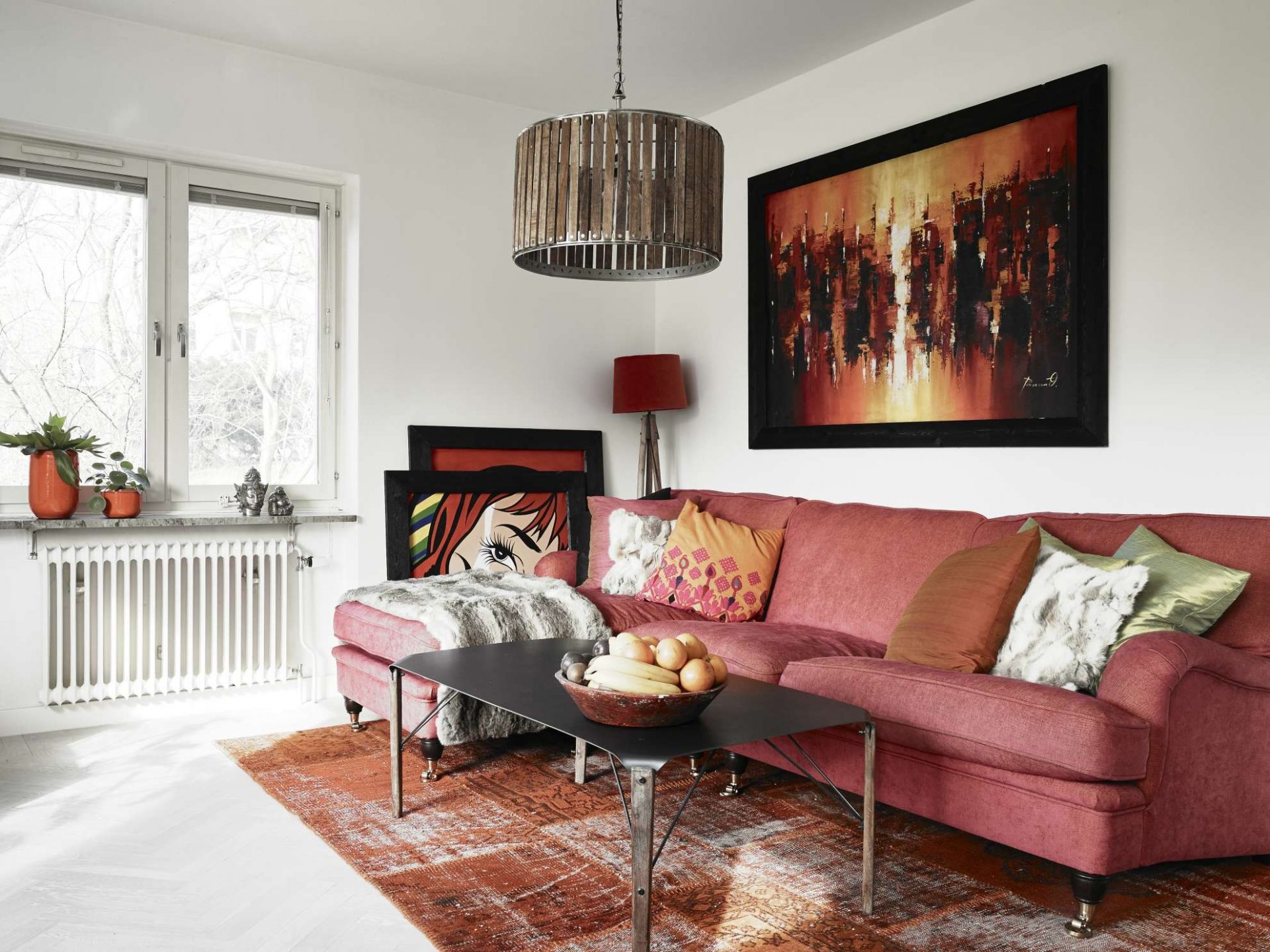
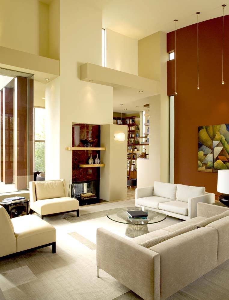
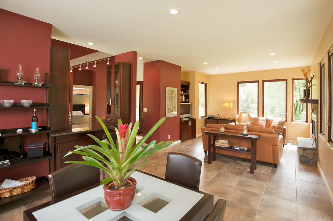
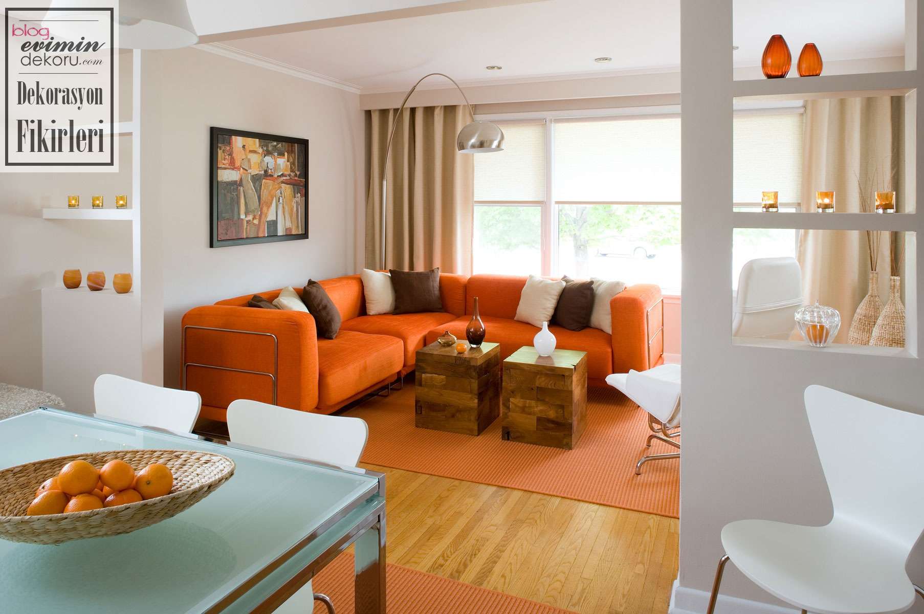
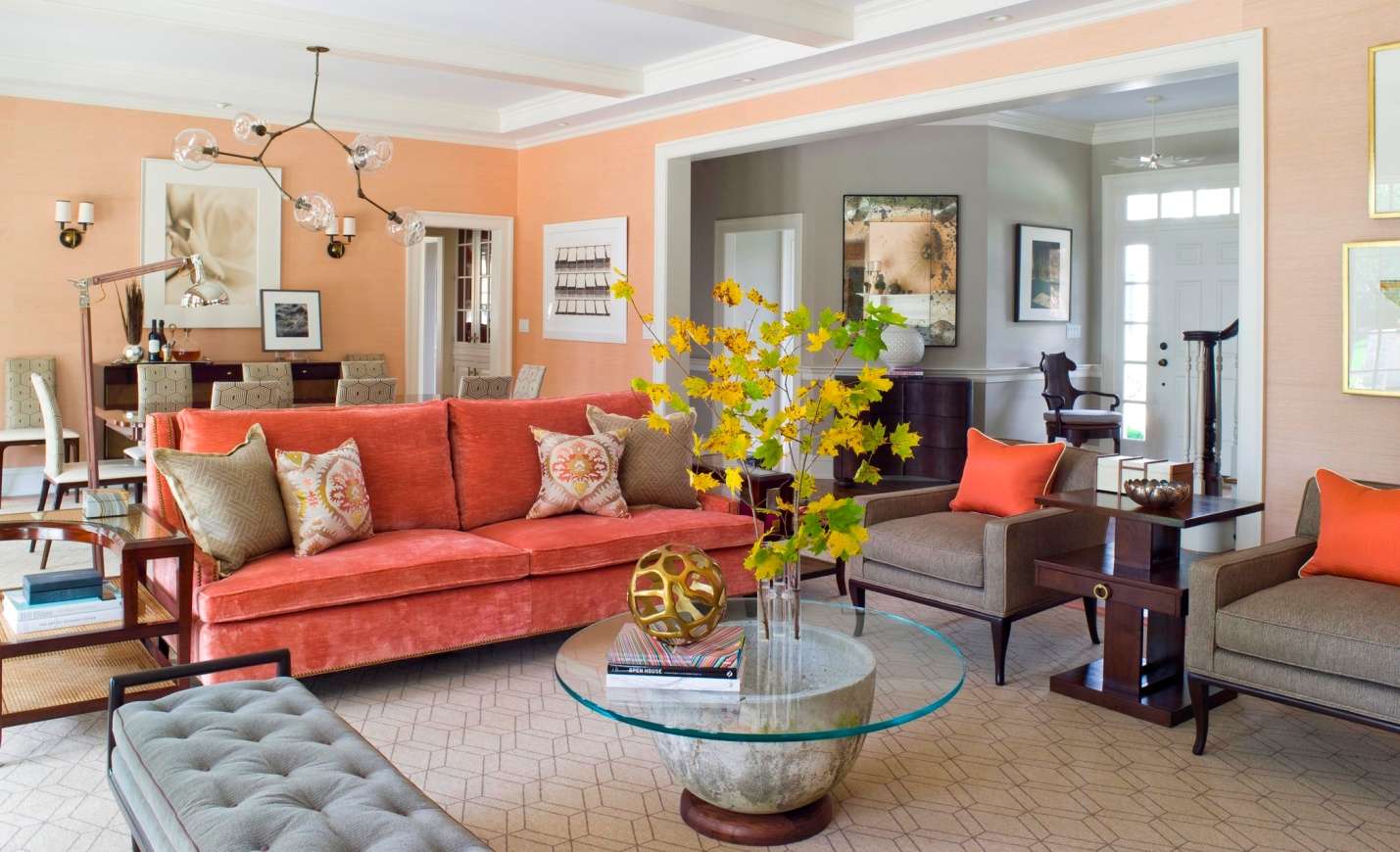
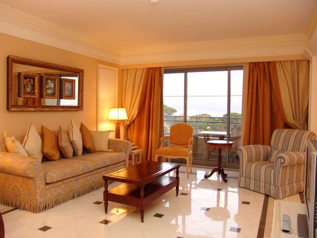
return to menu ↑In the interior of the living room
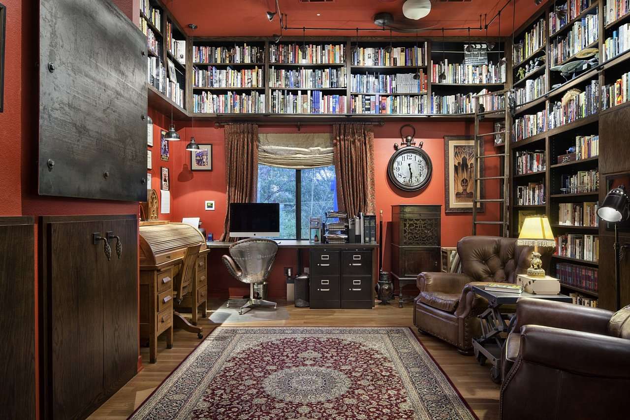
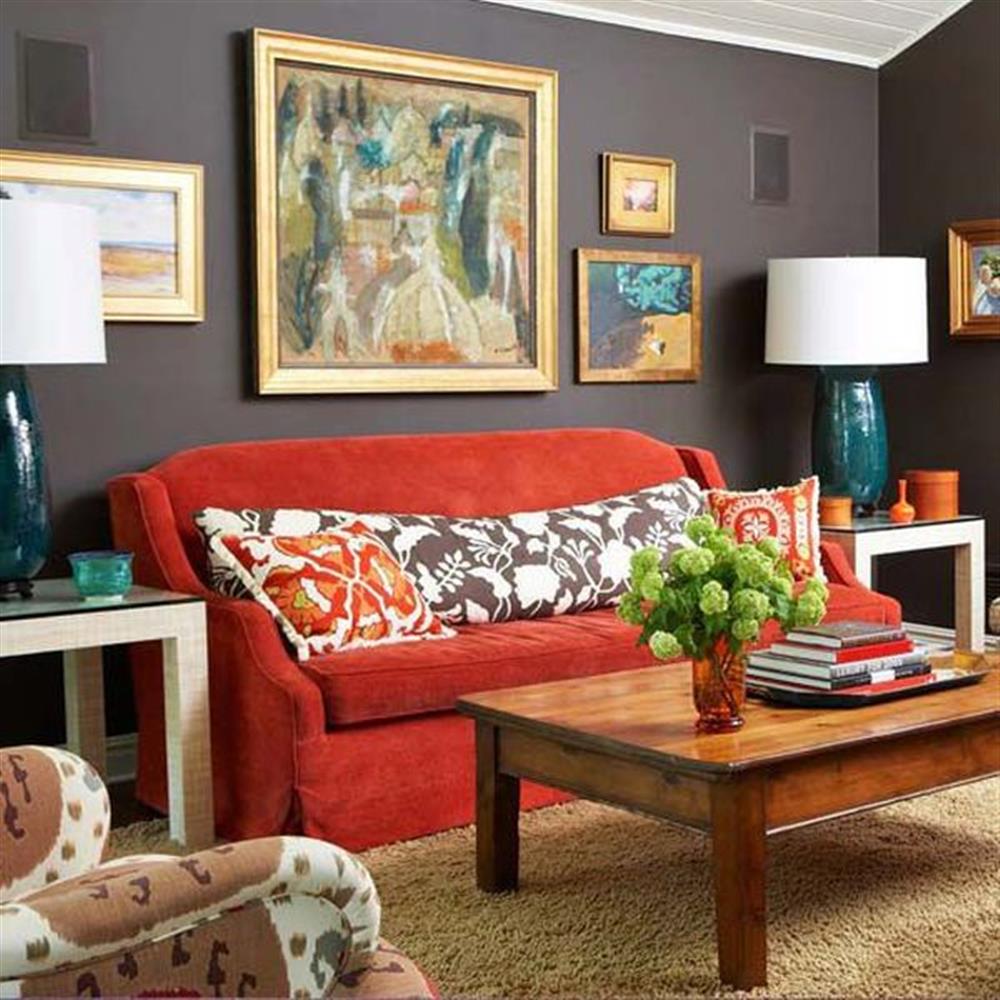
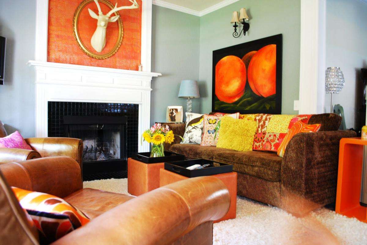
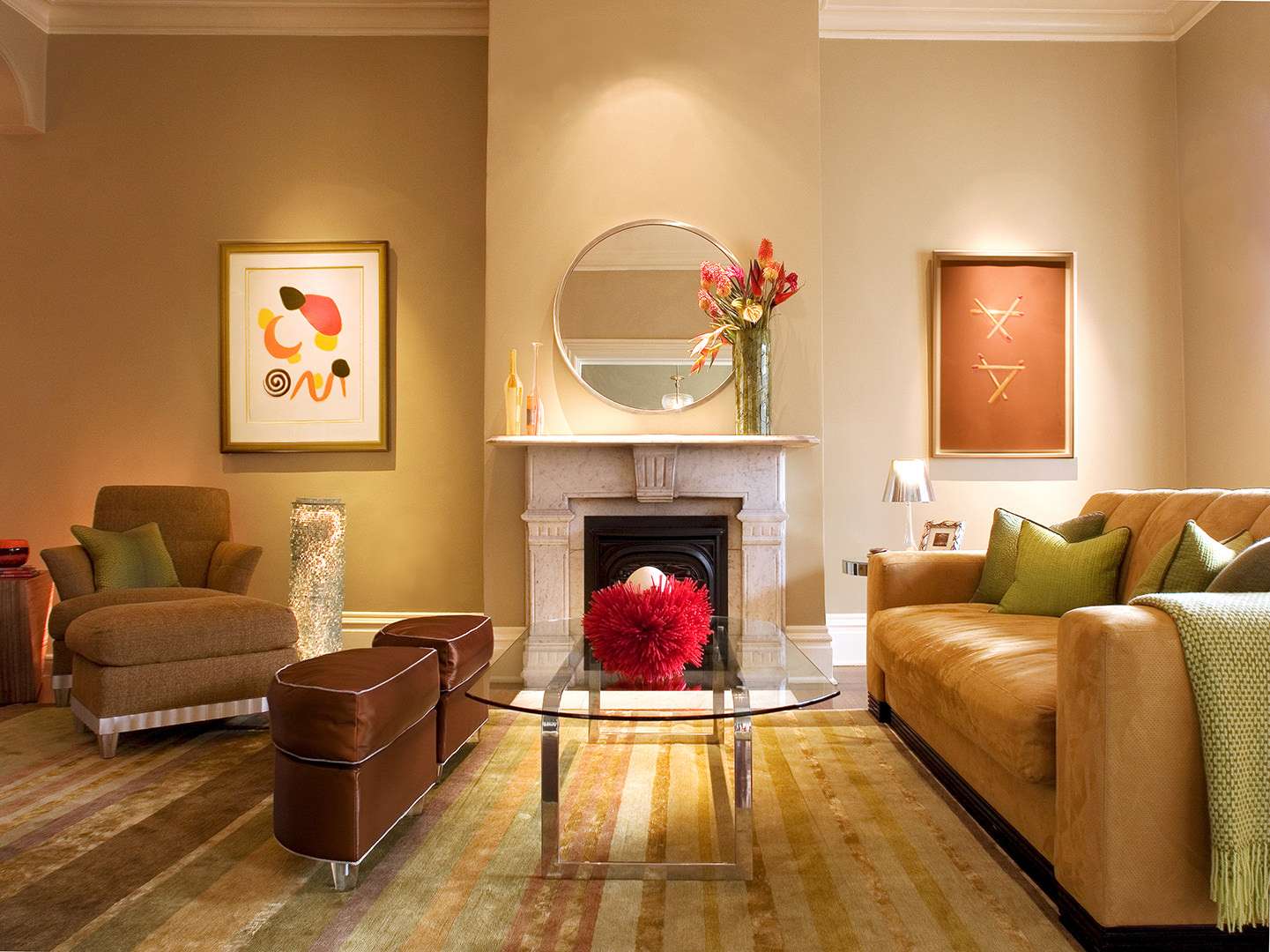
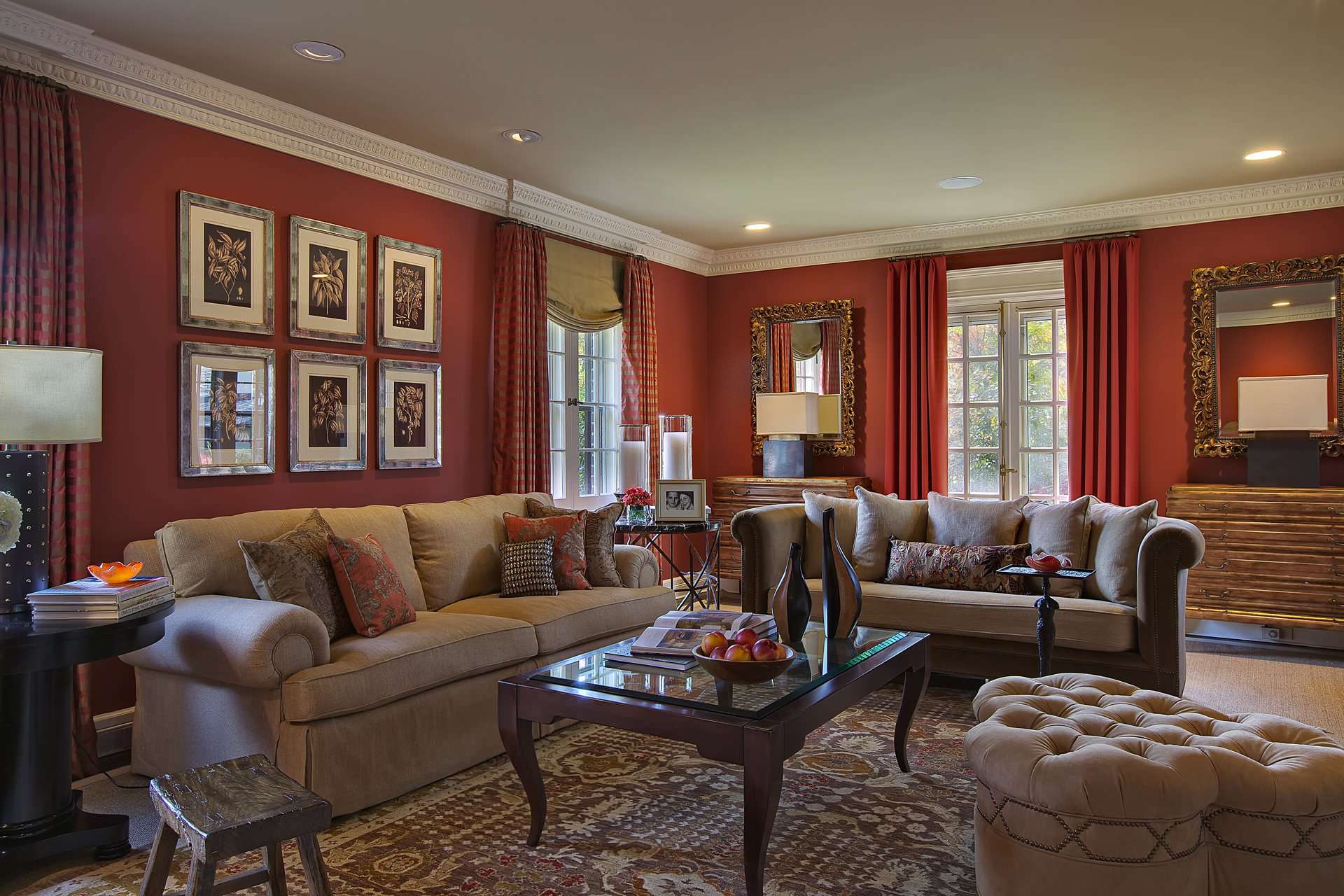
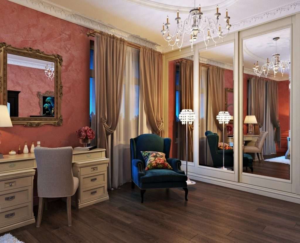
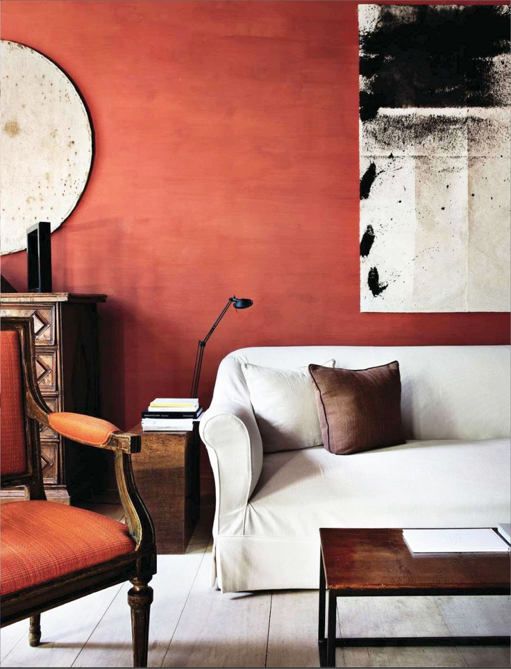
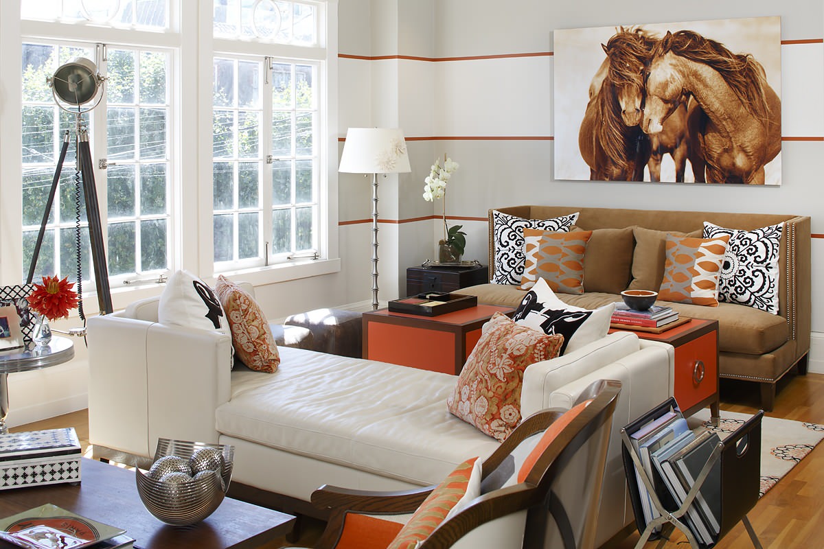
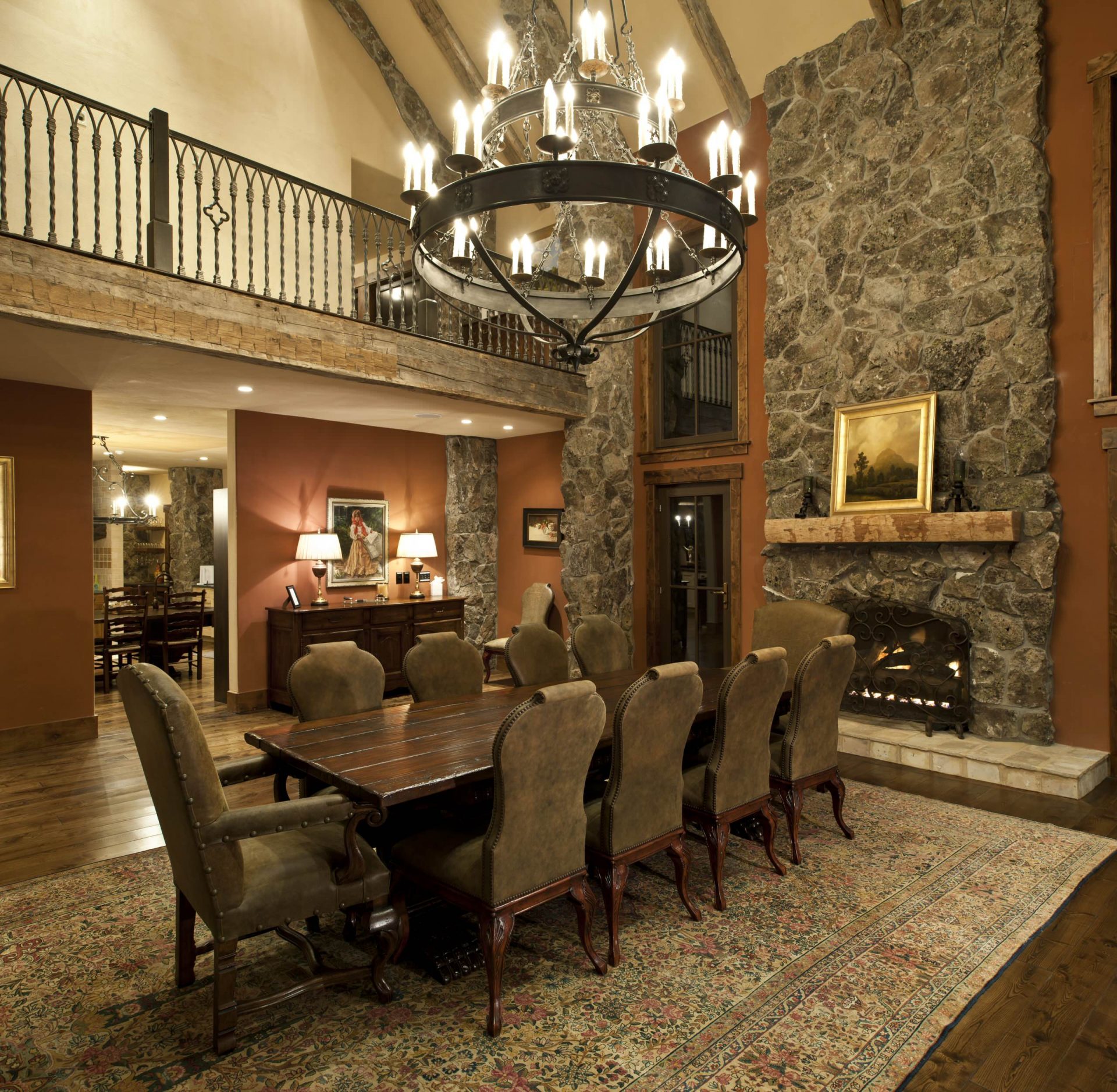
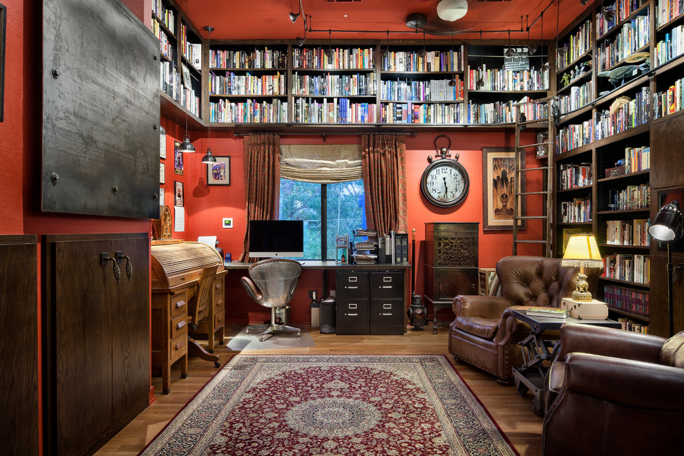
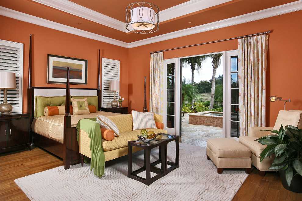
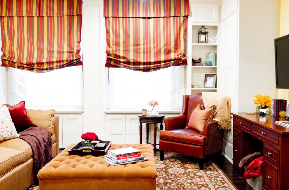
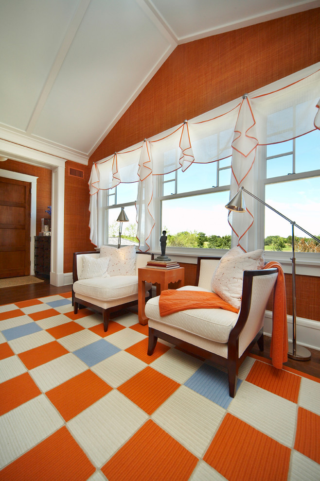
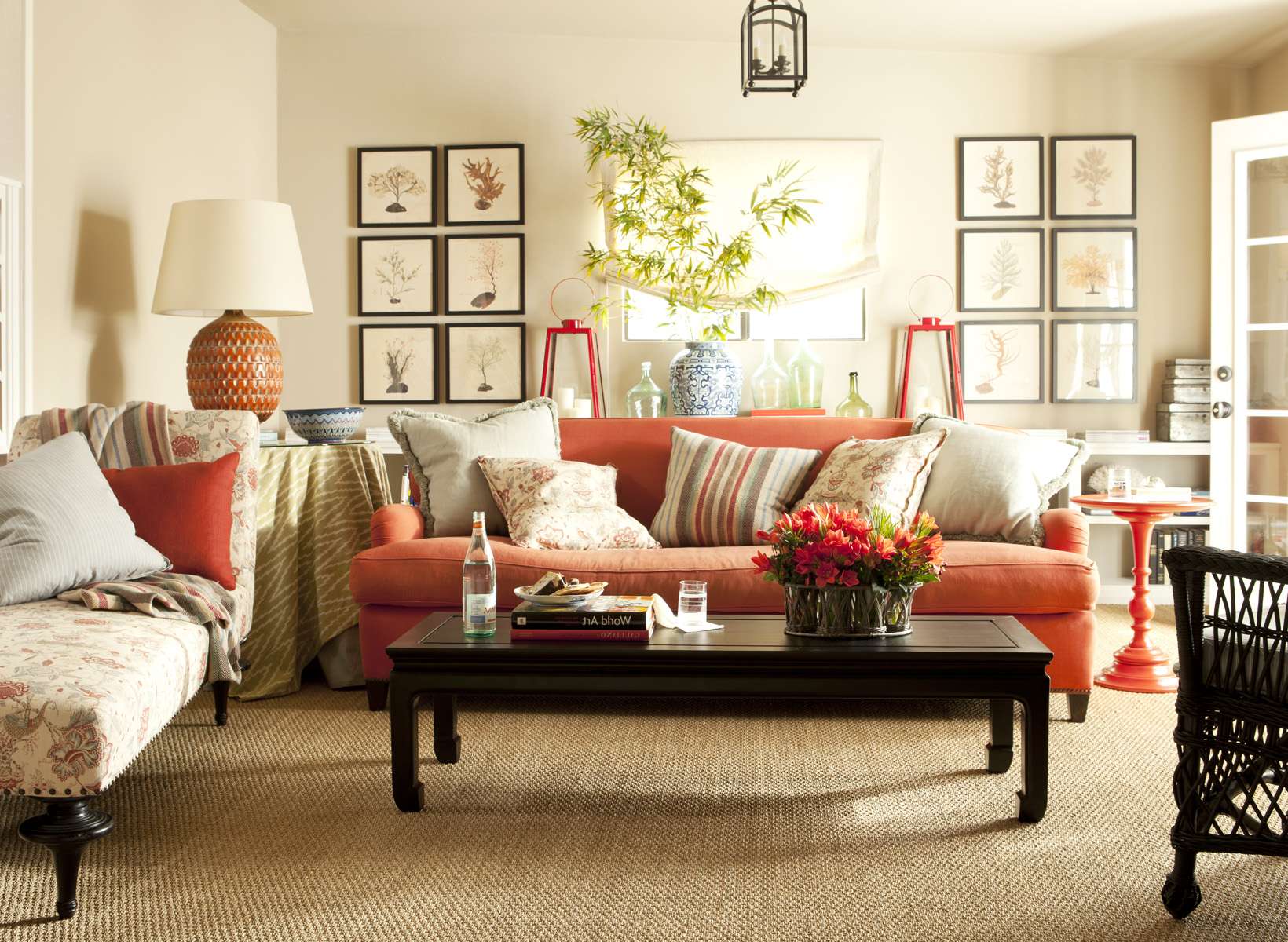
Terracotta color in the interior living room adds warmth and generosity, it perfectly enlivens the atmosphere. Terracotta can also bring a sense to our home. Of Provence or Tuscany or the lifestyle of the Indians of America. Twarm and bright, terracotta is a color that gives the impression of luxury, gives the character of the room. Intensive rust in the interior will make a strong impression, but use it wisely.

Enliven the atmosphere in the living room
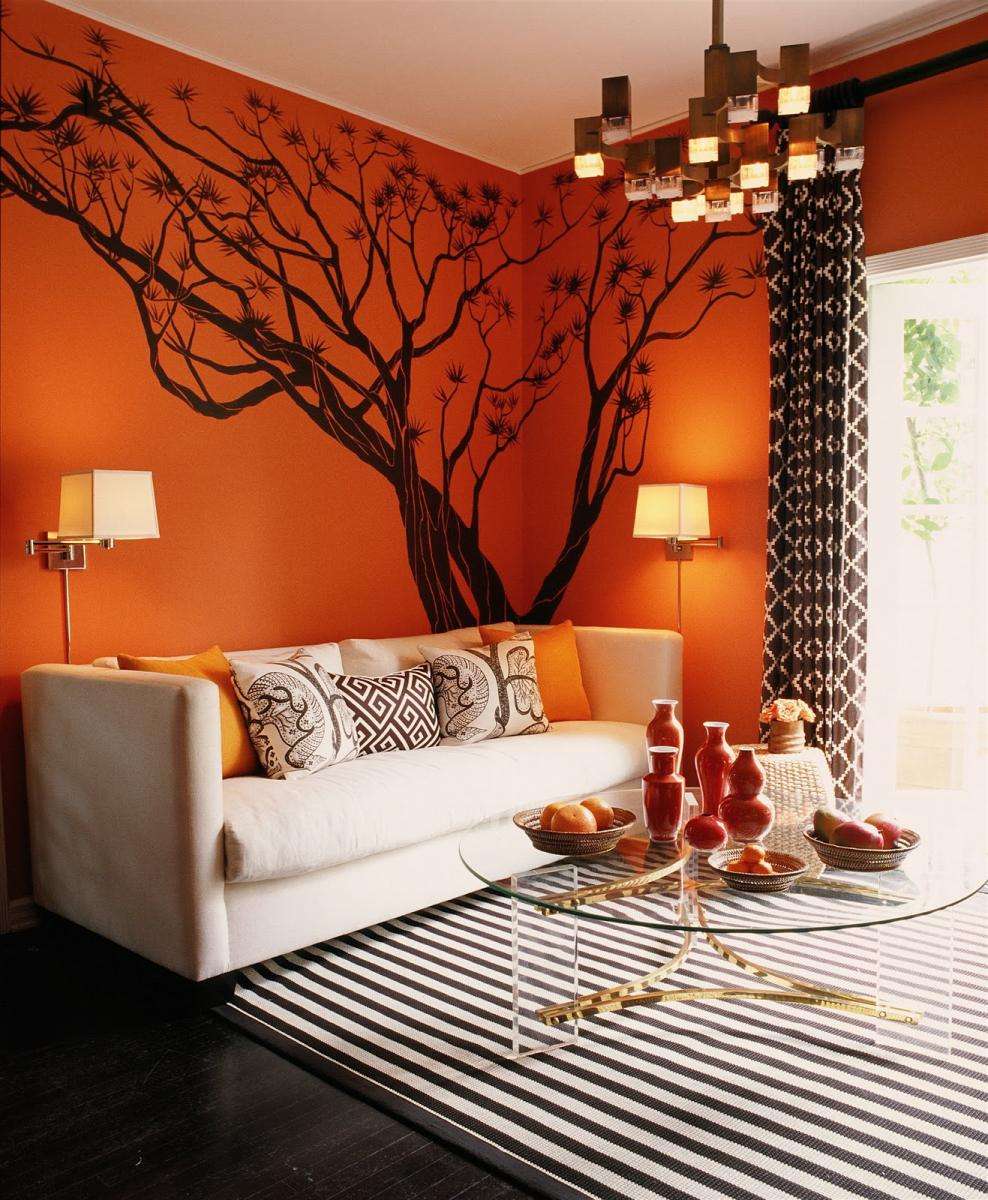
Although this color seems rather tense, it is one of those tones that blend easily.
Coordinating with neutral and light shades such as white or beige will soften the intensity of the tone.
Mix colors to soften the atmosphere
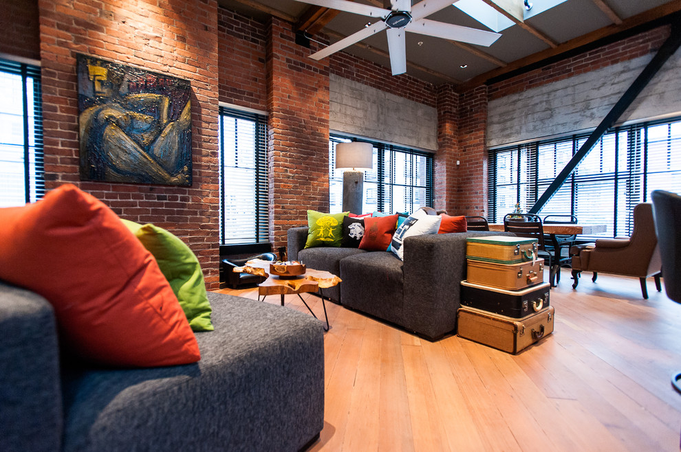
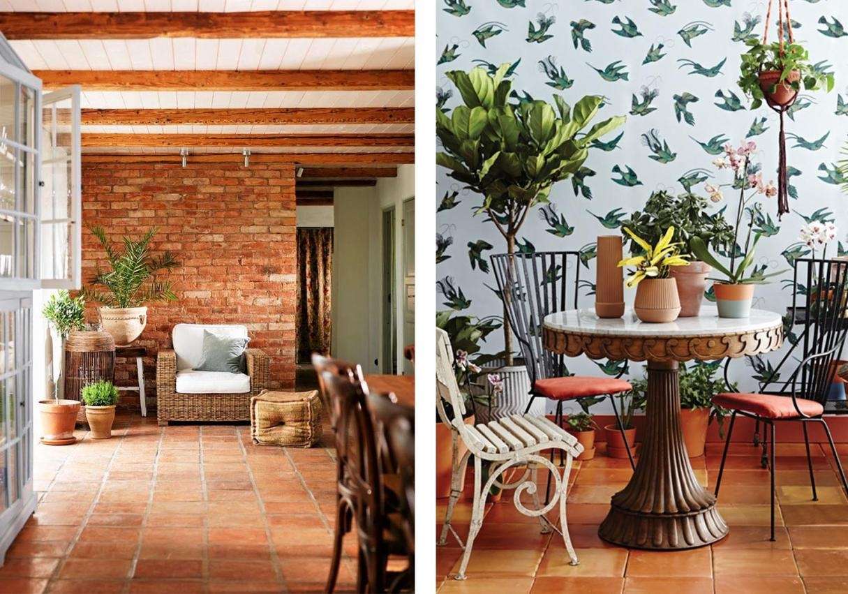
You are lucky if you have an open brick wall, because it can also be terracotta. If you want to go further, underline a wall with similar tones. The lighter shade of terracotta on the sectional section works well on a dark concrete floor and with a brilliant copper accent. Patterned rug in warm neutral shades with splashes of gray or black will look, and natural texture will give the space depth.
Brick wall can be terracotta
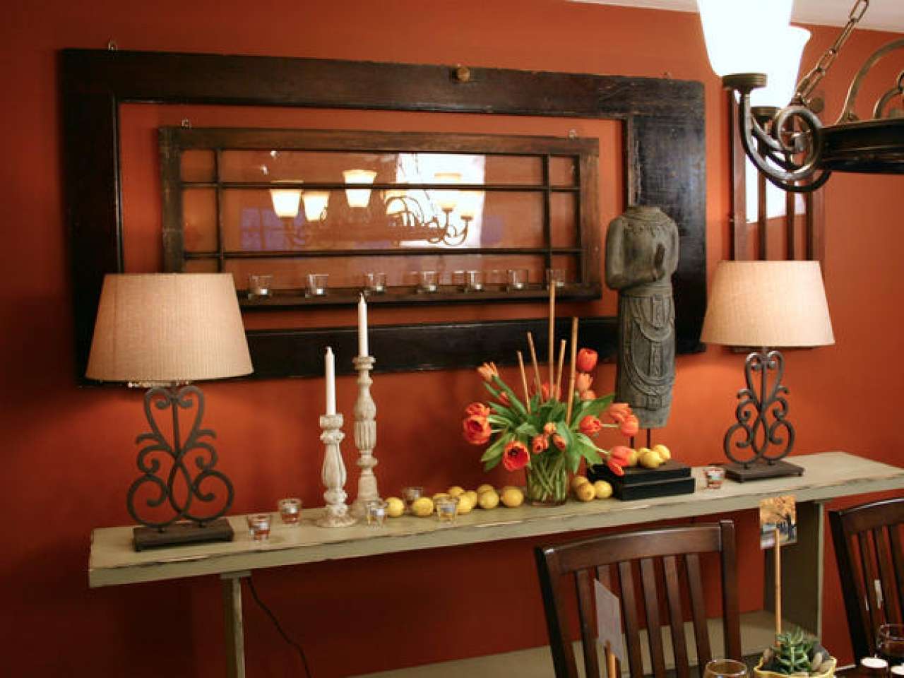
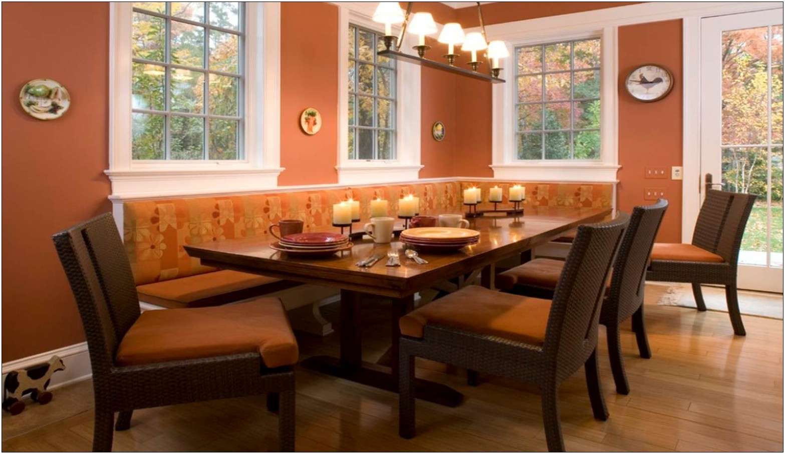
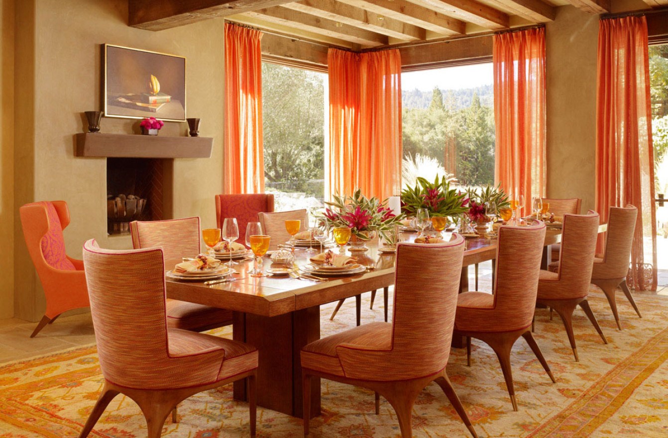
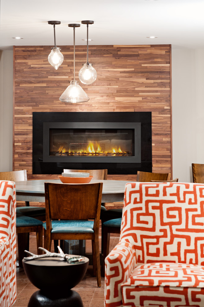
In the kitchen and dining room
For a simple way to turn terracotta into the room, use pots. To add rusticity, consider handmade ceramic dishes and handmade candlesticks in a color that is already in the design.
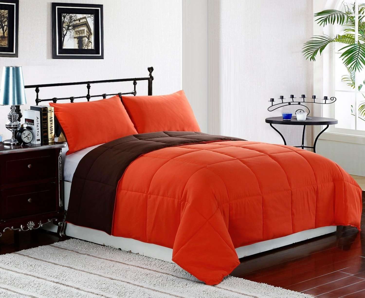
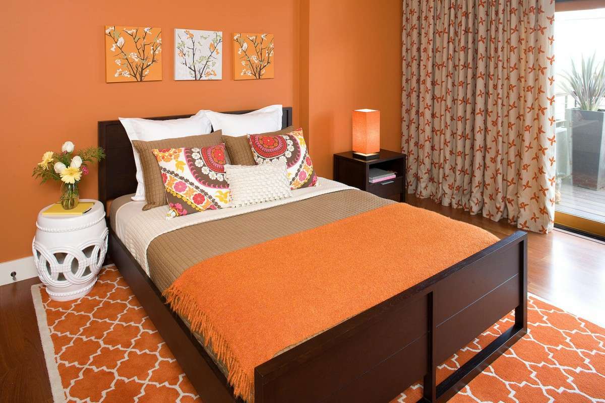
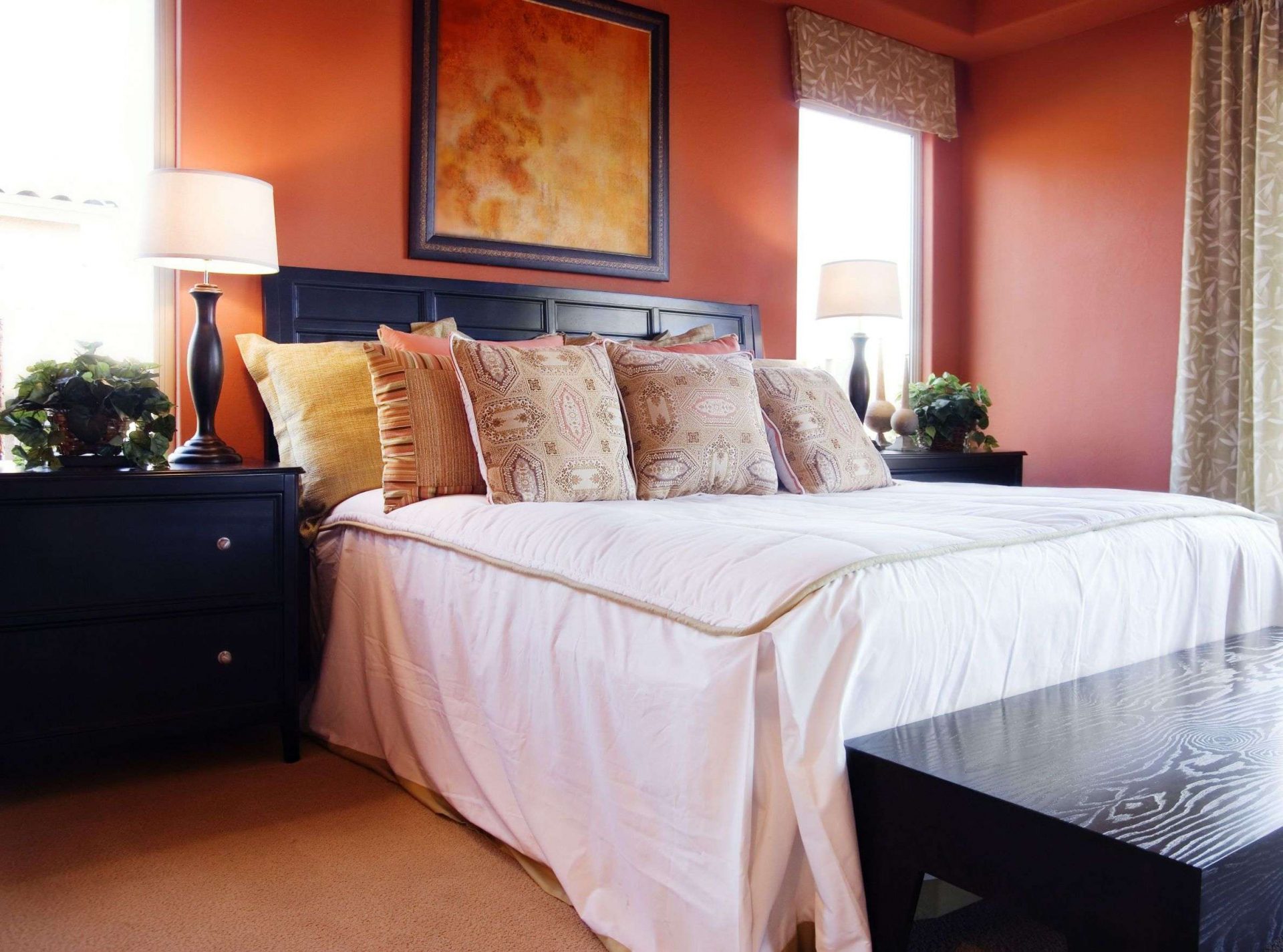
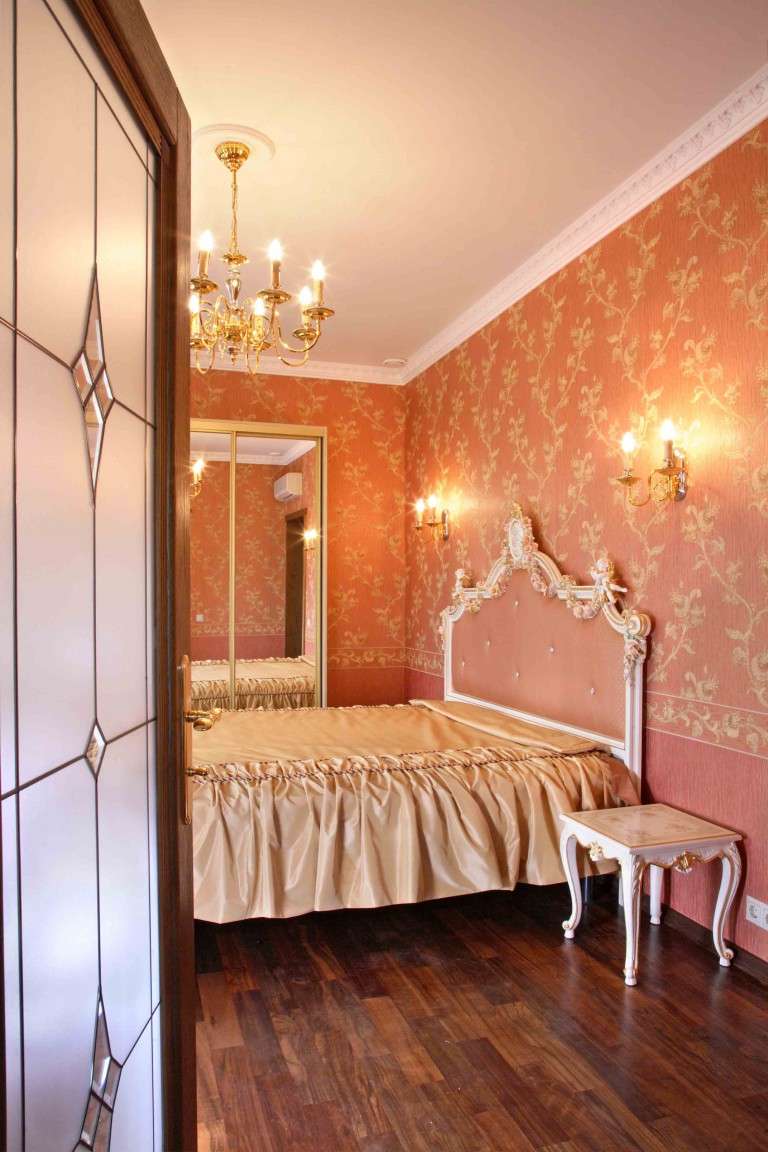
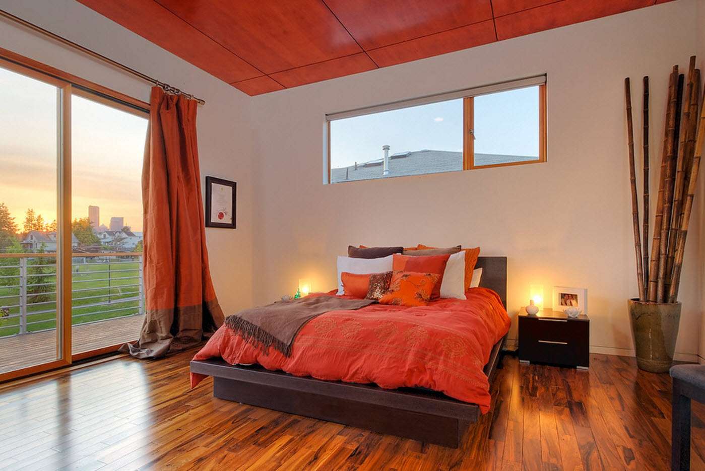
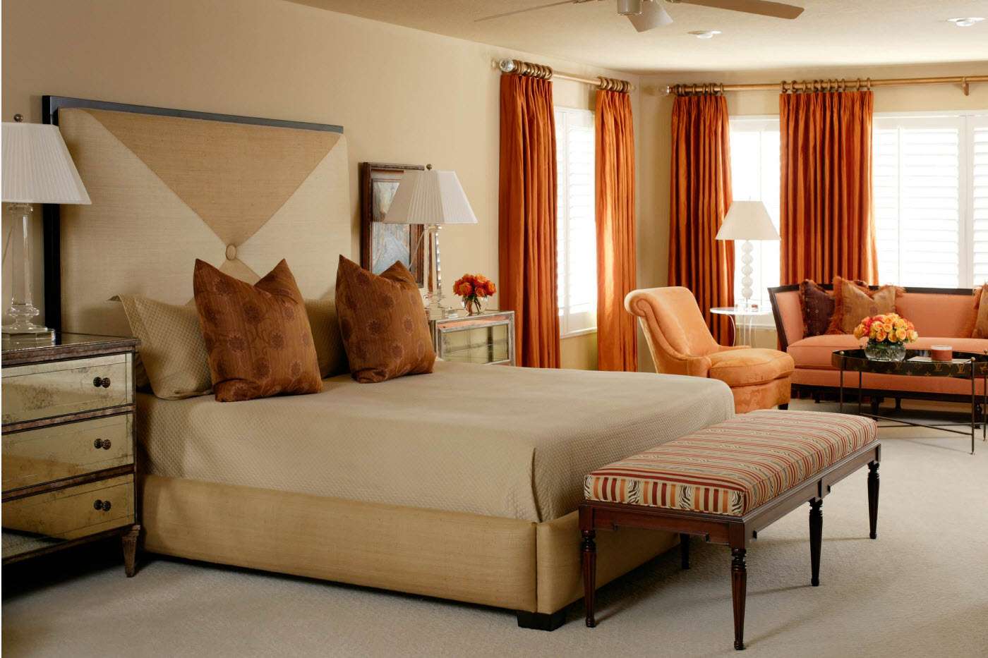
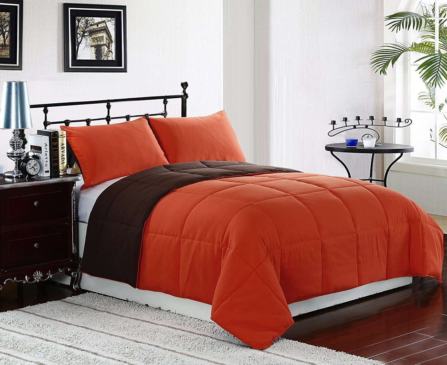
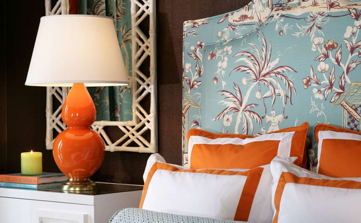
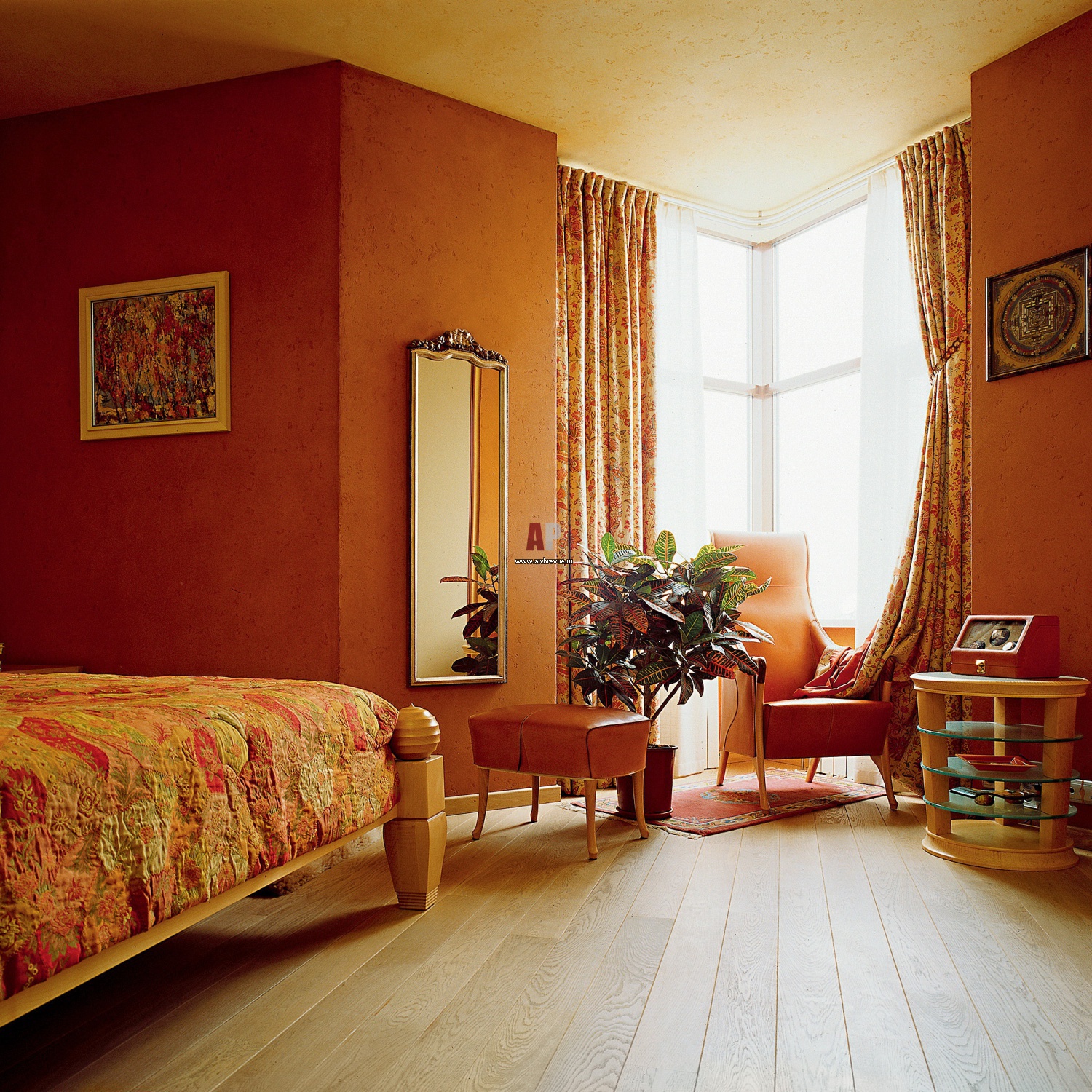
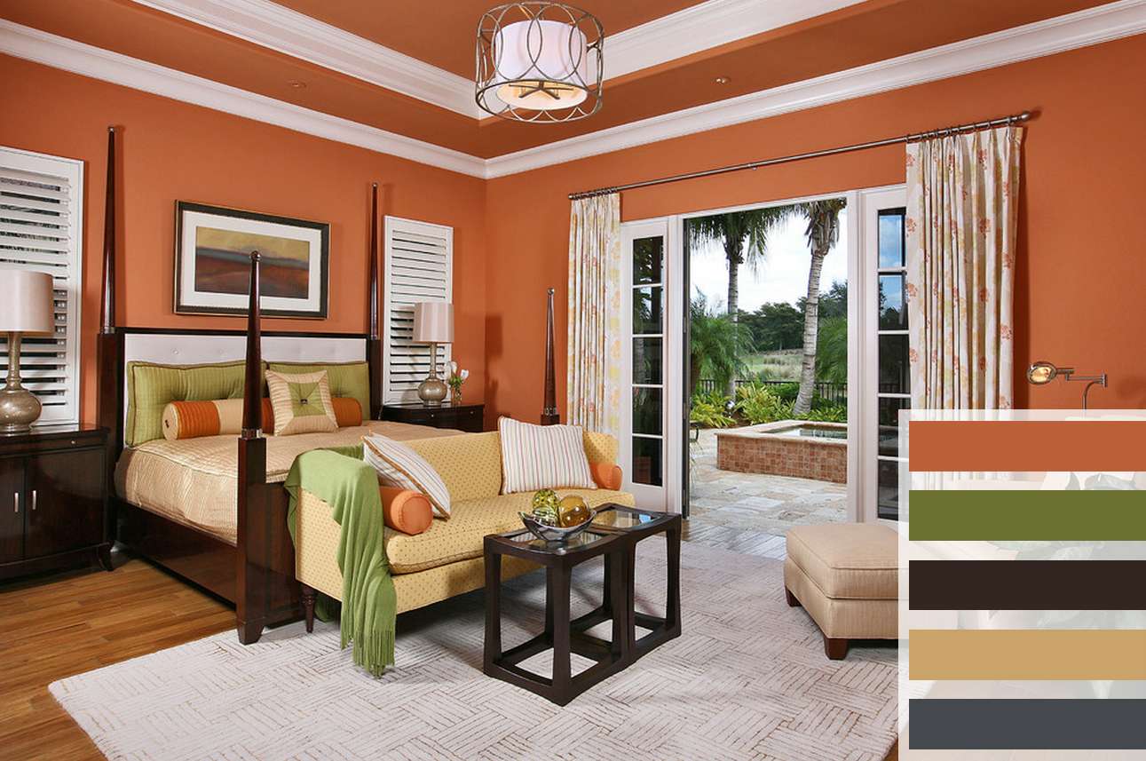
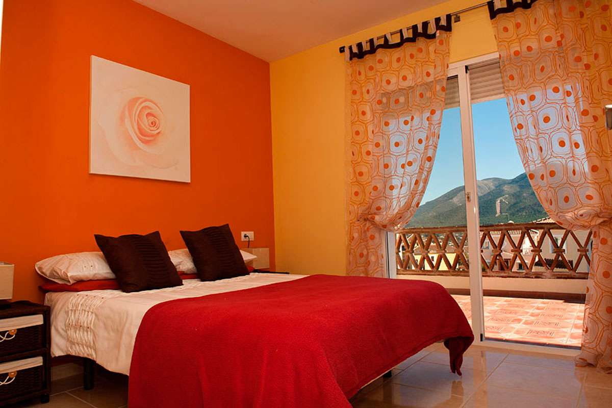
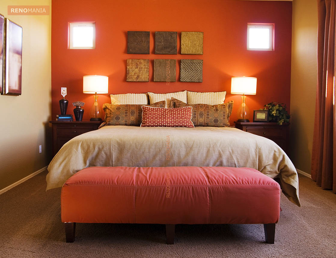
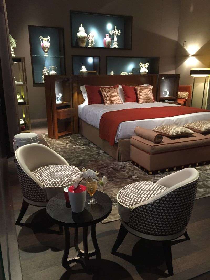
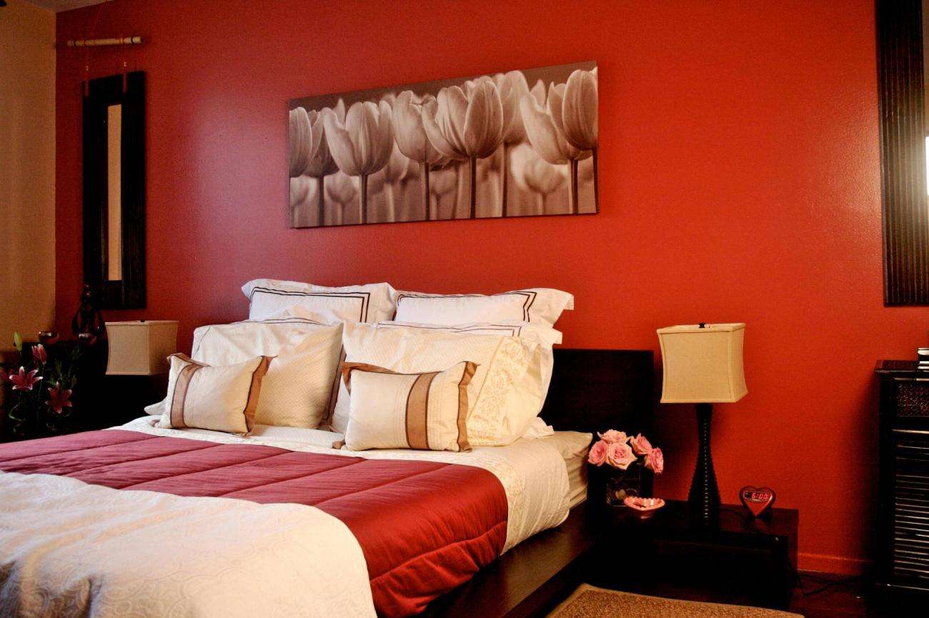
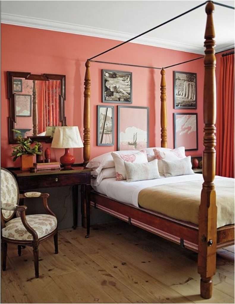
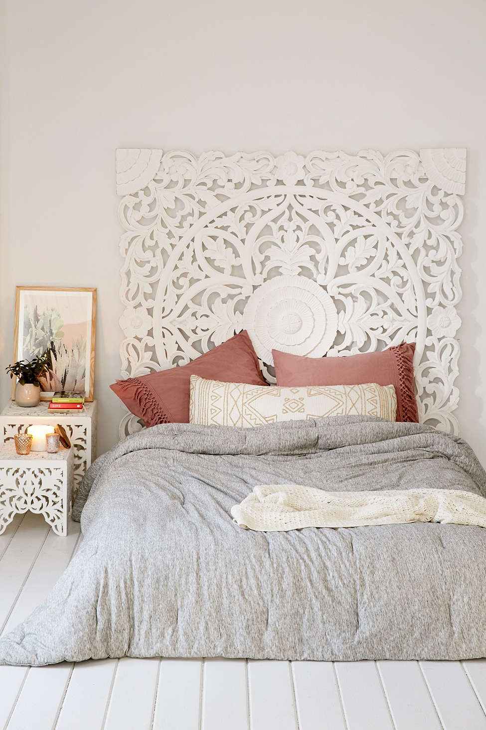
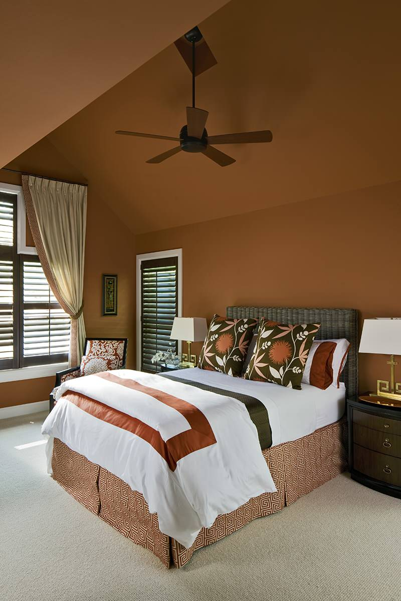
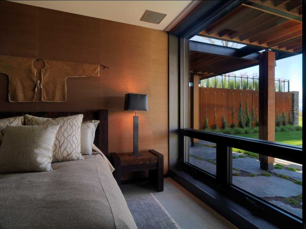
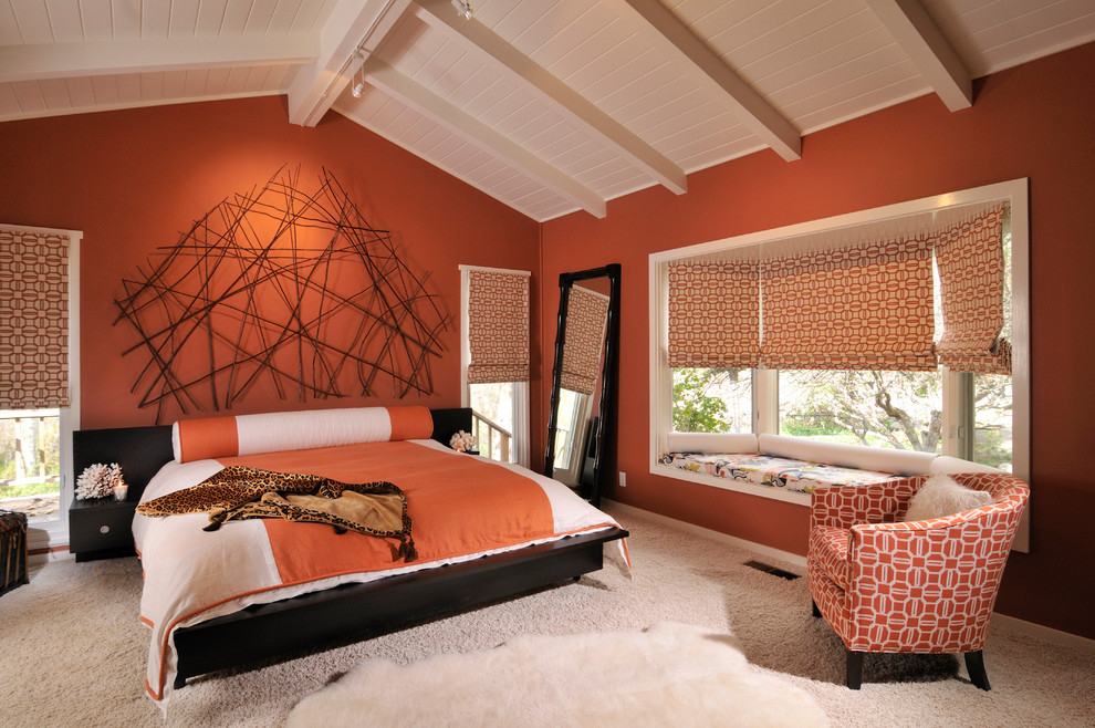
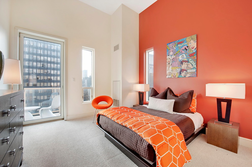
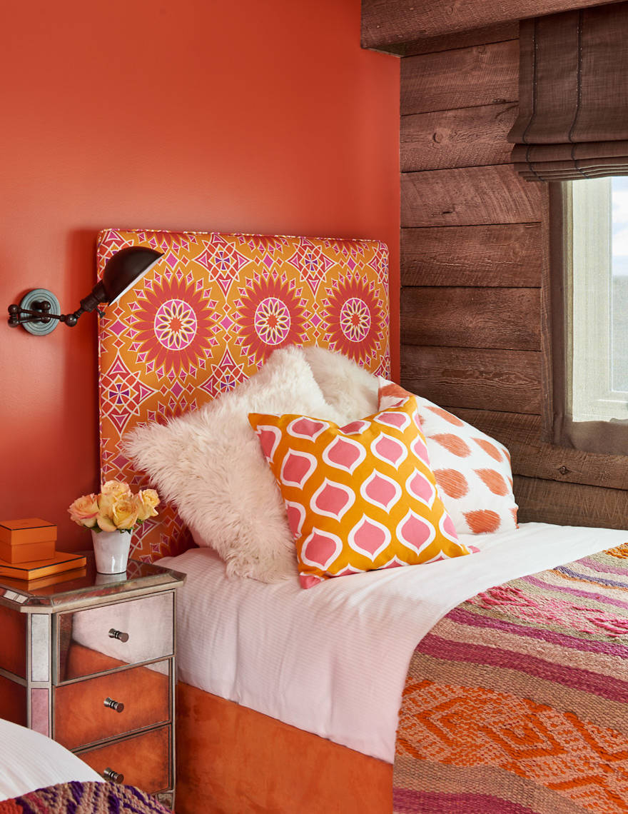
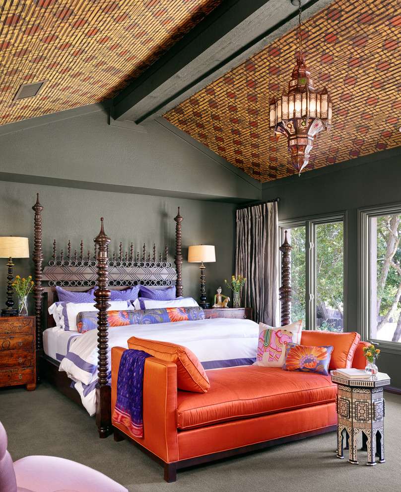
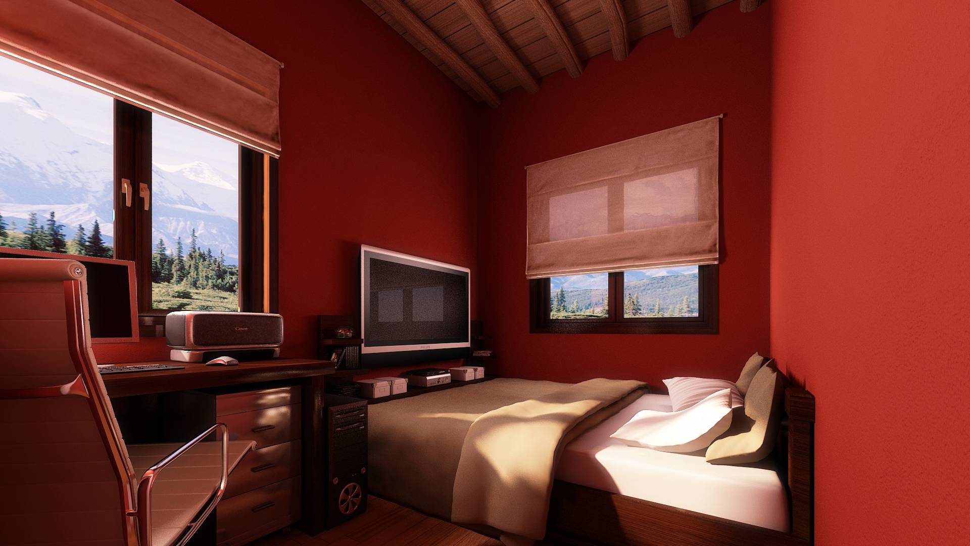
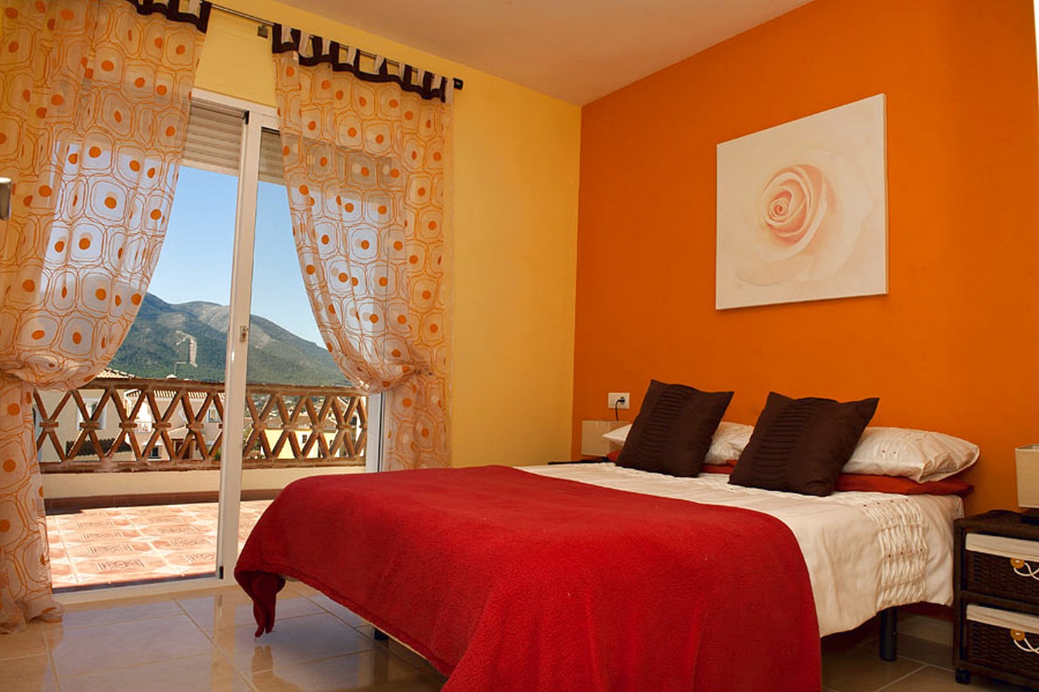
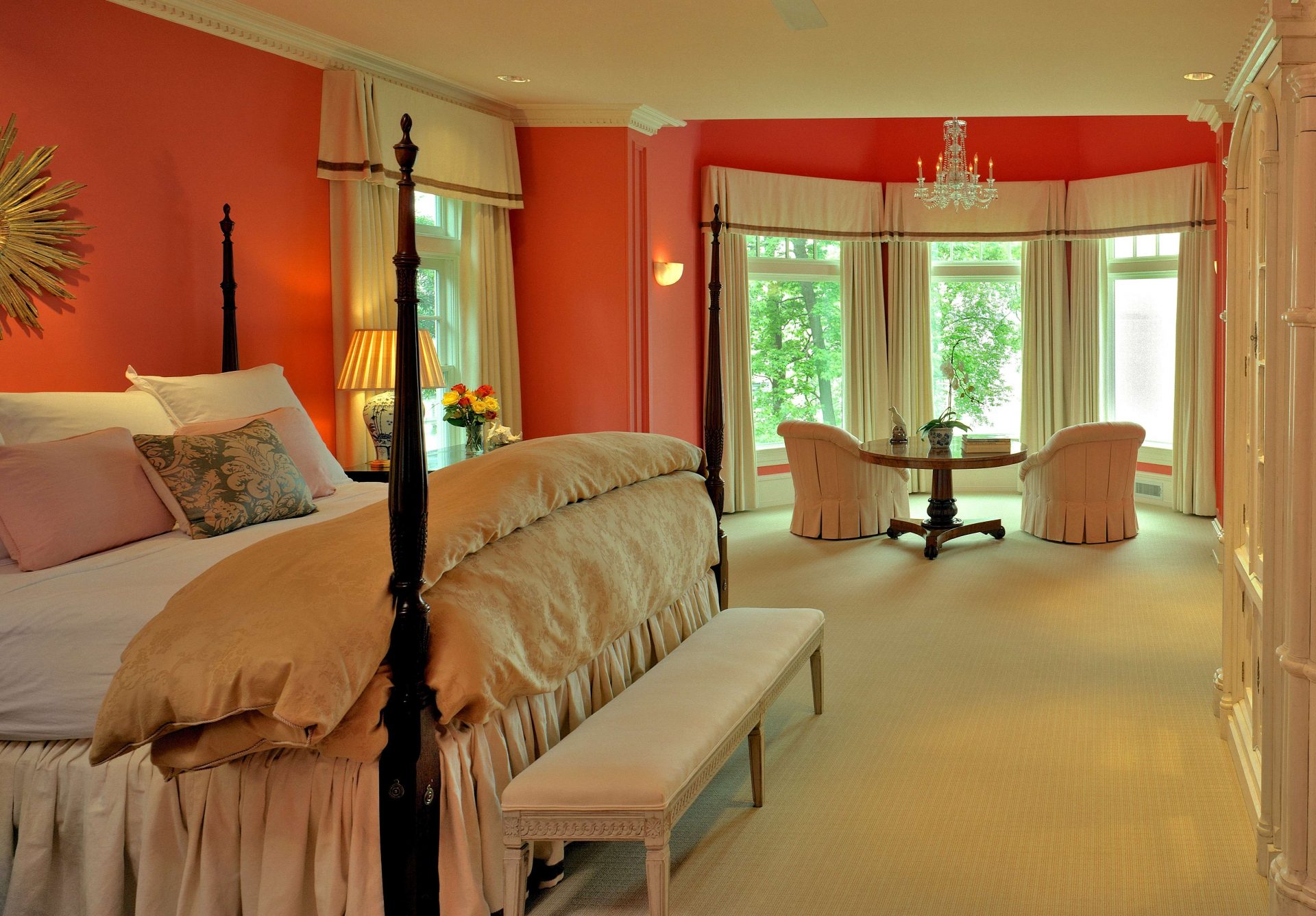
In the bedroom
The terracotta can be thin and soft enough to keep calm. Dilute it with ivory, textured pillows and greens.
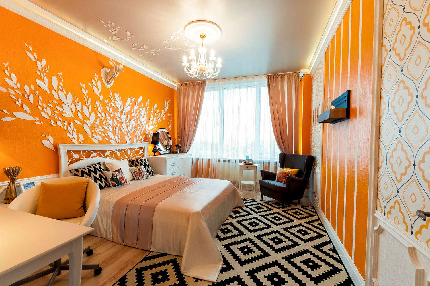
Saturated color can be easily diluted with pillows.
To emphasize the existing scheme of neutral pastels, consider a small spray of terracotta in decorative accents. Turkish pillows are another good way to turn on the color. Or use geometric rugs with terracotta and other pastels to add personality to the room.

 Compatibility of bright colors")
 Compatibility of bright colors")
 Compatibility of bright colors")
 Compatibility of bright colors")
Terracotta color
We update the interior